The network for creativity
Join 1.25M professional creatives like you
Connect with clients, get discovered, and run your business 100% commission-free
Creatives on Contra have earned over $150M and we are just getting started
Back to feedPost
Taste Test
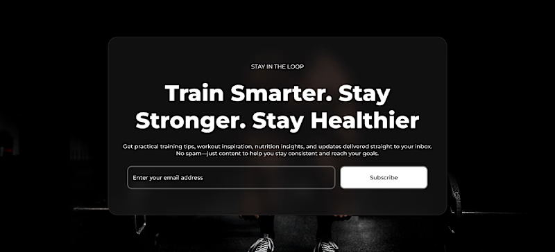
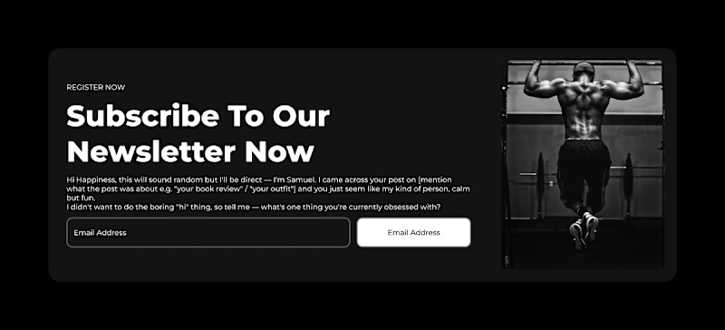
Currently refining a fitness brand UI kit in Figma and testing two different layout approaches for the newsletter opt-in section.
Option A (Centered Focus): A classic, balanced UI layout with full background image focus, keeping text and CTA strictly centered.
Option B (Split Grid Layout): Left-aligned text paired with a prominent right-side action image for visual grounding.
I'd love to hear from fellow designers and creators on Contra:
1. Which version feels cleaner to you?
2. Does Option B draw more focus to the CTA button, or does Option A feel more seamless?
Drop your vote (A or B) in the comments! If you like the design, hit the ❤️ upvote to help support my work.
4 voted
57%
3 voted
43%
7 votes
Closed


A looks good because it just point you to what to do

A sells better

option B

I like both, but I like A more. For me, I would like to see more contrast between the sign up card and the background.

Thank you for your feedback

This is a really polished presentation. Nicely done!
The network for creativity
Join 1.25M professional creatives like you
Connect with clients, get discovered, and run your business 100% commission-free
Creatives on Contra have earned over $150M and we are just getting started

Related posts

i create a 3D cube component for a Framer website to add creativity. which one is better dark or light? Check the live preview here
22 voted
51%
21 voted
49%
43 votes
Closed

Snap to the position in the last will feel more real

Two color directions for an AI governance explainer. A draft AI use policy becoming the questions nobody can answer yet.
20 voted
77%
6 voted
23%
26 votes
Closed

blue for sure 💯

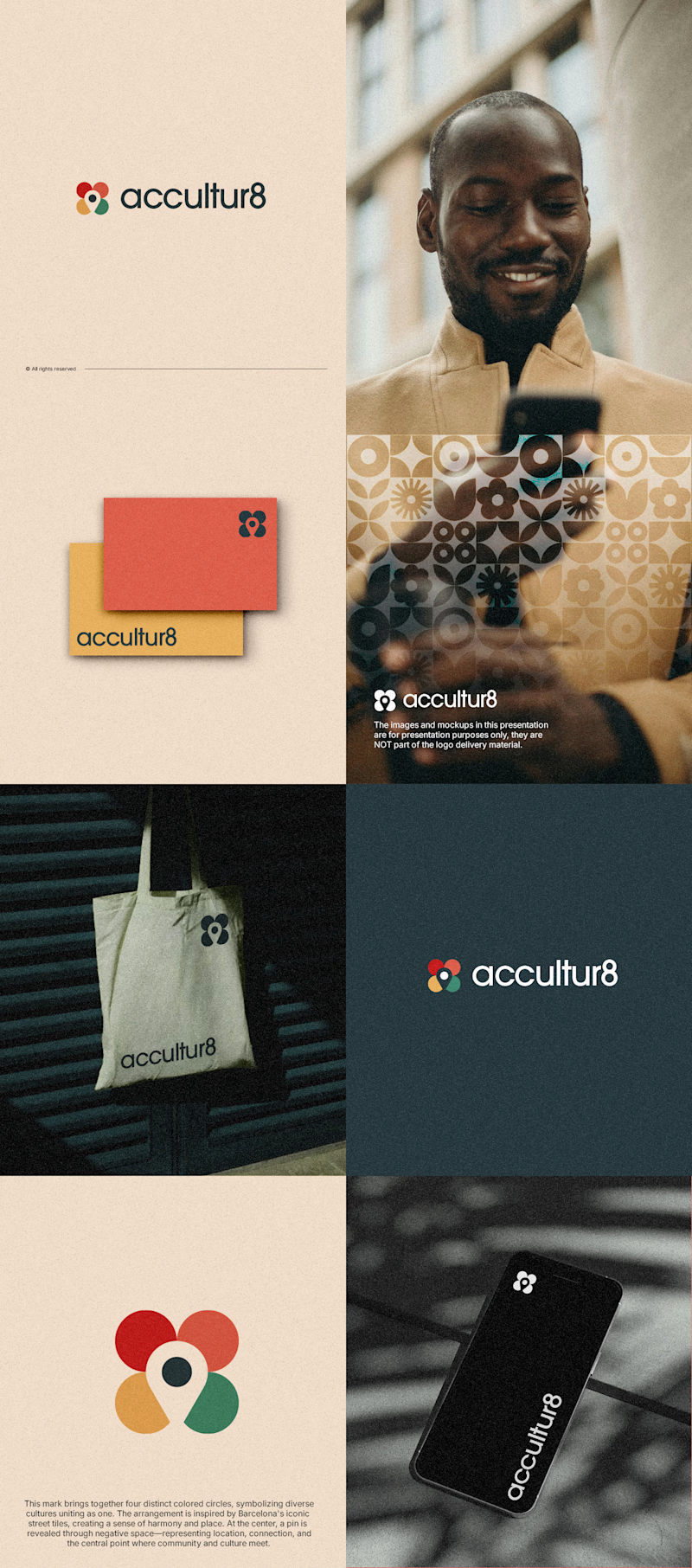
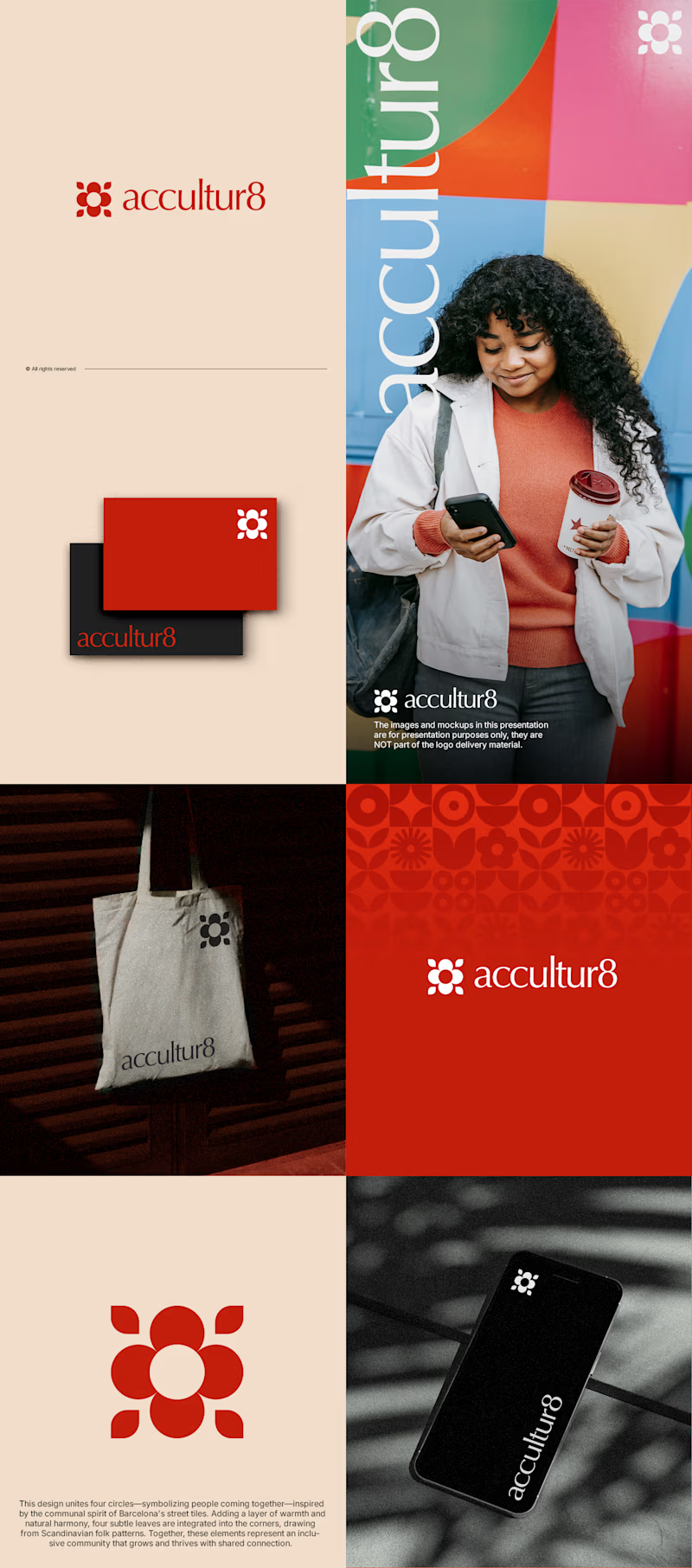
The client really liked Barcelona typical floor tiles, so I presented these logo options. Which one you liked the most?
4 voted
13%
26 voted
87%
30 votes
Closed

Love option 2, which one do you like most ?
Challenges
View all


