
Cody Dix
Designing digital experiences that convert.
New to Contra
Cody is ready for their next project!
Good responsive design removes things. Not because they don't fit, but because less sometimes says more.
The layered slider on desktop creates atmosphere and depth. On mobile, the essence remains: the project, large, immediate, with all the context that matters. Name. Space....
Same concept. Three different personalities.
Every direction starts with the same question: What should this feel like?
The answer shapes everything. Typography, layout, colour, space.
Which direction would you take it? 👇
V1- Minimal
V2- Playful
V3- Clean
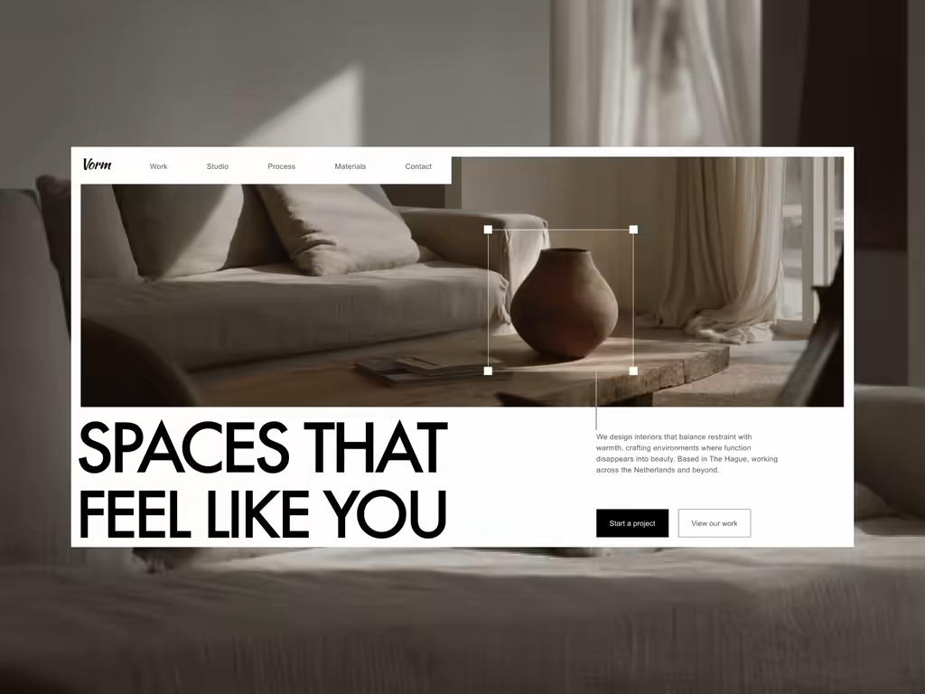
Editorial responsive website - Studio Blanco
Editorial. Minimal. Intentional.
A layout where rooms speak for themselves, bold type grounded in calm, delivering a magazine-like experience across every screen. The slider doesn’t scroll, it glides. Because luxury isn’t loud. It’s...
Vöidé: desktop layout, in motion.
An editorial take on an interior brand, where type and image carry the story, and now hand it off.
Negative space as a design language: oversized type, generous margins, imagery allowed to sit and be seen. Then it moves. Immersive transitions turn...