The network for creativity
Join 1.25M professional creatives like you
Connect with clients, get discovered, and run your business 100% commission-free
Creatives on Contra have earned over $150M and we are just getting started
Back to feedPost

Good responsive design removes things. Not because they don't fit, but because less sometimes says more.
The layered slider on desktop creates atmosphere and depth. On mobile, the essence remains: the project, large, immediate, with all the context that matters. Name. Space. Square metres.
The CTA copy adapts without losing urgency. The warm cream palette carries the whole, the same feeling of quiet luxury across every screen.
This is how you build a site that represents a studio that knows what it's doing.


Nice work 🙌


insane work bro 🔥
The network for creativity
Join 1.25M professional creatives like you
Connect with clients, get discovered, and run your business 100% commission-free
Creatives on Contra have earned over $150M and we are just getting started




Related posts

Designed and built this for Haunted Boulder City, a ghost and UFO tour just outside Vegas.
Had a lot of fun playing with the night photography, fog, and scroll effects on this one. Pretty happy with how it all came together.
Check it out: https://www.hauntedbouldercity.com/ 👻 👽 🛸

Really nailed the atmosphere here. The night photography, fog, and scroll effects make the site feel like part of the tour experience rather than just a booking page. 👻 Which effect took the most experimenting to get right?

Which style wins for you? 🤔
We’re testing out two theme directions for Avenra’s dashboard component cards; featuring real-time spending breakdowns, project progress metrics, and time-off tracking.
Curious to hear your thoughts! 💬
8 voted
42%
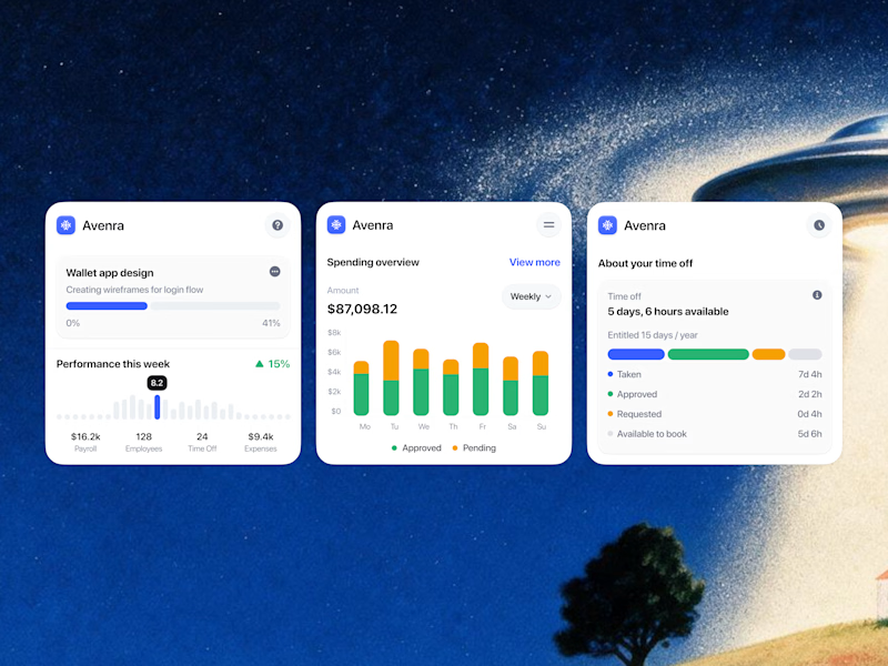
11 voted
58%
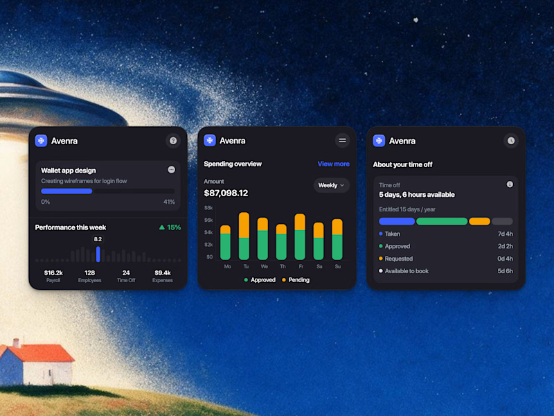
19 votes
Closed

I spent whole morning on Monday to created a case study for my website
Let's take a look to learn more about the story behind it, and if you like it, a like and share would mean a lot.
https://contra.com/p/PQZEMQN6-kota-studio-website-2026?r=madebykota


That's too smooth to be a design


