Christian Williams
Product Designer · Mobile & Web Design · UI/UX Designer
- 1
- Followers


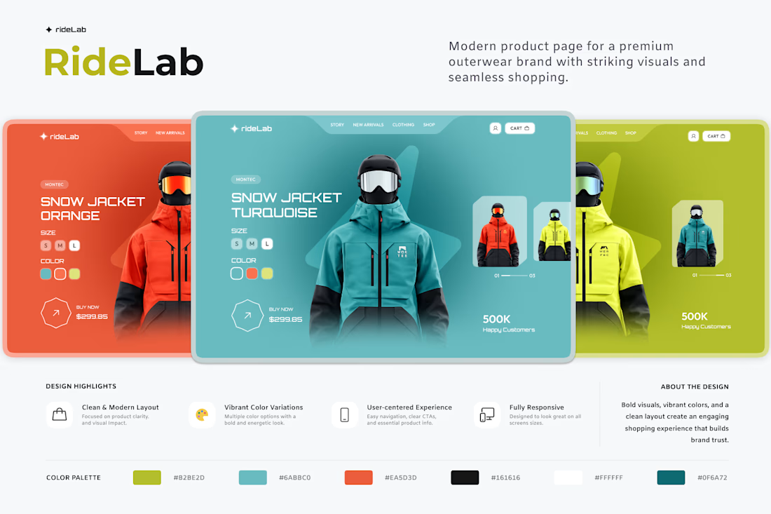
A little e-commerce concept I’ve been working on — clean, modern, and focused on making the products stand out.
Designed in Figma. ✨

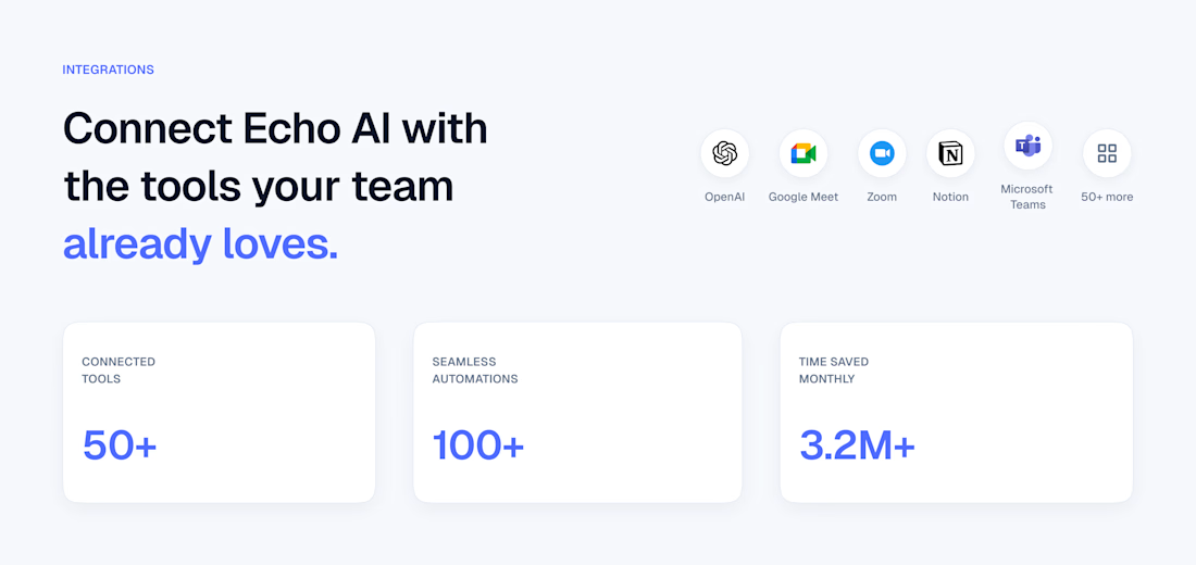
Just wrapped up the integrations section for the Echo AI marketing website. I'd love to hear your thoughts — what stands out, and what could be improved?
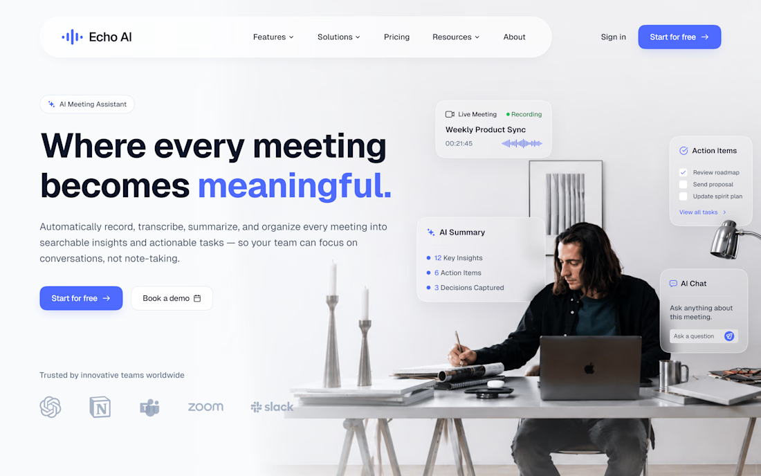
Started working on Echo AI today — this time, I’m designing a marketing website for the AI meeting assistant.
Right now, I’m getting started with the layout, hero section, colors, and overall structure. It’s still a work in progress, but I’m excited to see it come together.
...
Echo AI – AI Meeting Assistant Dashboard | UI/UX Design
Designed a modern AI meeting assistant dashboard that streamlines collaboration with AI summaries, task management, analytics, and responsive UI.
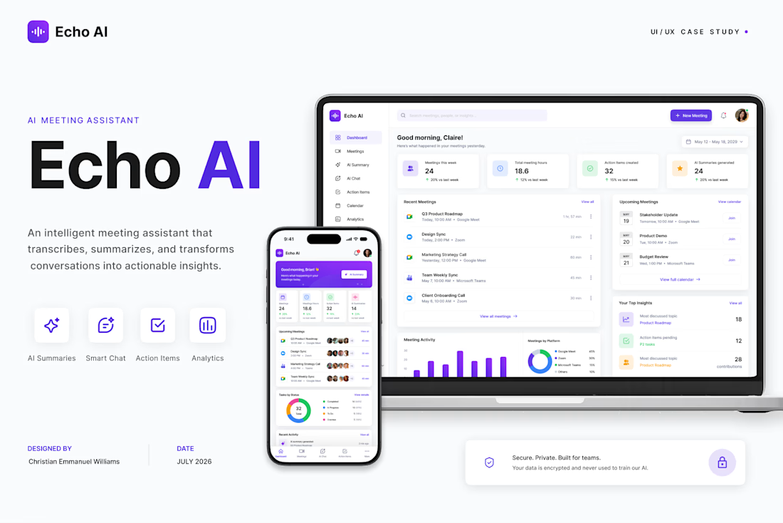
Designed this concept with one goal in mind: making browsing feel effortless while keeping the product front and center. The biggest challenge was finding the right balance between bold visuals and usability, but after a few iterations, the hierarchy and spacing fell into place....