The network for creativity
Join 1.25M professional creatives like you
Connect with clients, get discovered, and run your business 100% commission-free
Creatives on Contra have earned over $150M and we are just getting started
Back to feedPost

A little e-commerce concept I’ve been working on — clean, modern, and focused on making the products stand out.
Designed in Figma. ✨

The network for creativity
Join 1.25M professional creatives like you
Connect with clients, get discovered, and run your business 100% commission-free
Creatives on Contra have earned over $150M and we are just getting started







Related posts


Every element feels perfectly placed! 👏

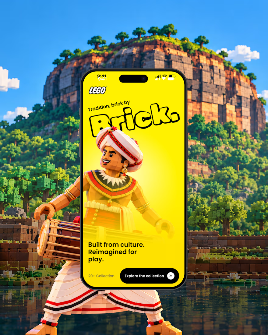
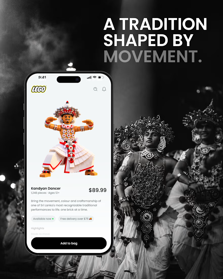
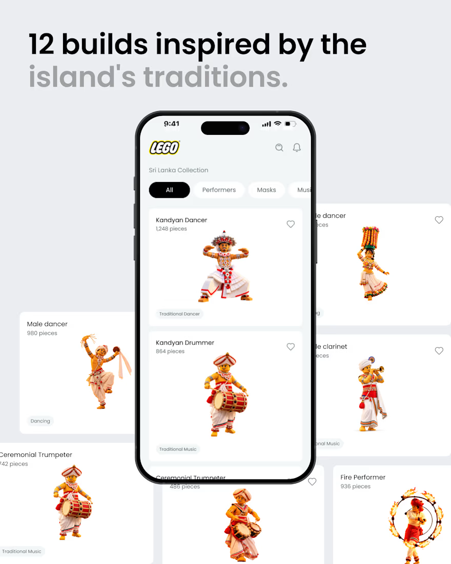
What if Sri Lankan tradition found its way into the LEGO app? 🇱🇰🧱
A small product design exploration.
Had a small idea and decided to visualize it. ✌️
I reimagined a few elements of Sri Lankan culture traditional dancers, masks, musicians, and instruments as brick built characters, then explored how they might live inside a LEGO style mobile experience.
Just a hypothetical design experiment combining culture, product design, and a little AI-assisted exploration.
Not affiliated with or endorsed by LEGO.
#ProductDesign #UIDesign #DesignConcept #DesignExploration #CreativeAI #SriLanka #SriLankanCulture #LEGO

That's awesome great job 🎉🎉


Yo Designers!
We're looking for a skilled product designer with an exceptional sense of visual design to create 5 high-end UI showcase visuals.

Sounds like a fun one! Looking forward to seeing the visuals that come out of this

