Chidiebube okpara
Graphic Design | Product Packaging & Flyers
- 1
- Followers

About the Project:
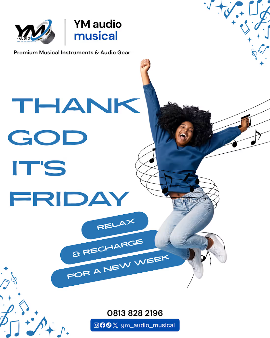
A custom social media poster created for YM Audio Musical.
The Challenge: Social media feeds are crowded, so the design needed to stop the scroll immediately.
The Solution: I utilized heavy negative space (the white background) to make the dynamic subject and the bold blue typography pop. The design uses a strong visual hierarchy: the eye goes first to the jumping figure, then to the bold "TGIF" text, and finally down to the contact details and social handles. The inclusion of floating 3D elements (like the audio jack) and musical notes adds depth and keeps the design playful and engaging. It is perfectly optimized for Instagram and Facebook.
1
25
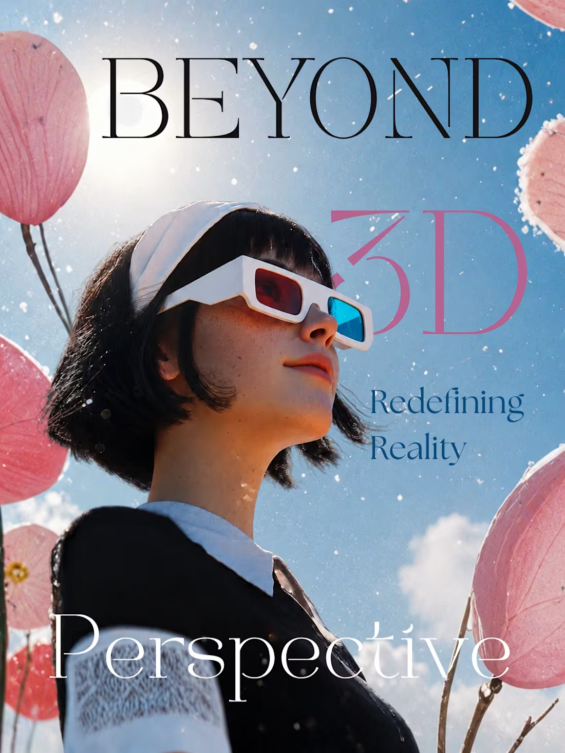
"Beyond 3D: Redefining Reality" is a visual exploration concept I designed to push my creative boundaries in poster composition and photo manipulation.
The Vision: I wanted to create a surreal, dream-like atmosphere (represented by the giant floating pink lotuses and the glowing sun flare) mixed with retro-pop elements (the 3D glasses). The typography was chosen to create a high-fashion, magazine-cover aesthetic that contrasts beautifully with the surreal background.
By playing with scale, lighting, and font pairings, I successfully created a piece that invites the viewer to stop and look closer. This project showcases my ability to develop a strong visual concept from scratch and execute it with high-end editorial polish.
2
47
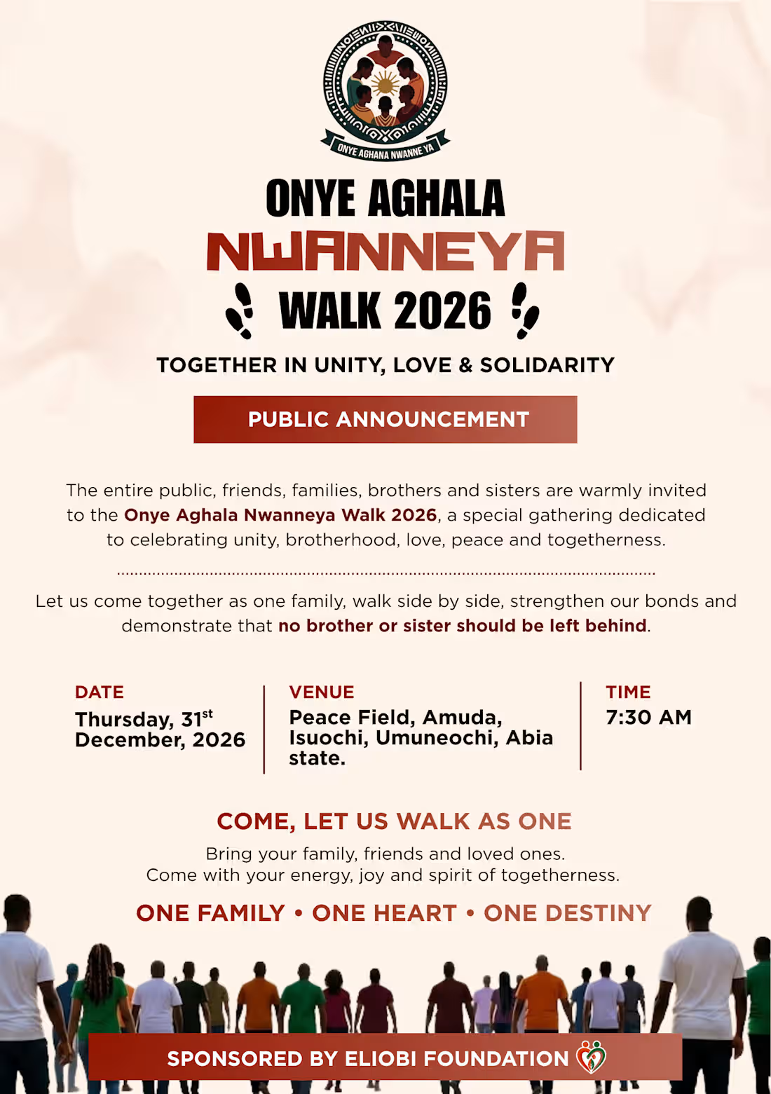
This project was an event flyer and public service announcement designed for a large-scale community walk focused on unity and solidarity.
The Challenge: The flyer contained a massive amount of text, a strict schedule (date, time, venue), and a long list of sponsors. The goal was to present all this information without making the design look cluttered.
The Solution: I utilized a strong visual hierarchy to guide the viewer's eye. The main title uses bold, high-impact typography with custom color overlapping to grab immediate attention. I divided the text into clean, distinct sections, using red accent bars to separate the event details (Date, Venue, Time) from the narrative text. The bottom section features a unifying image of the crowd to visually represent the theme "One Family, One Heart, One Destiny," ensuring the flyer felt both professional and emotionally resonant.
1
38
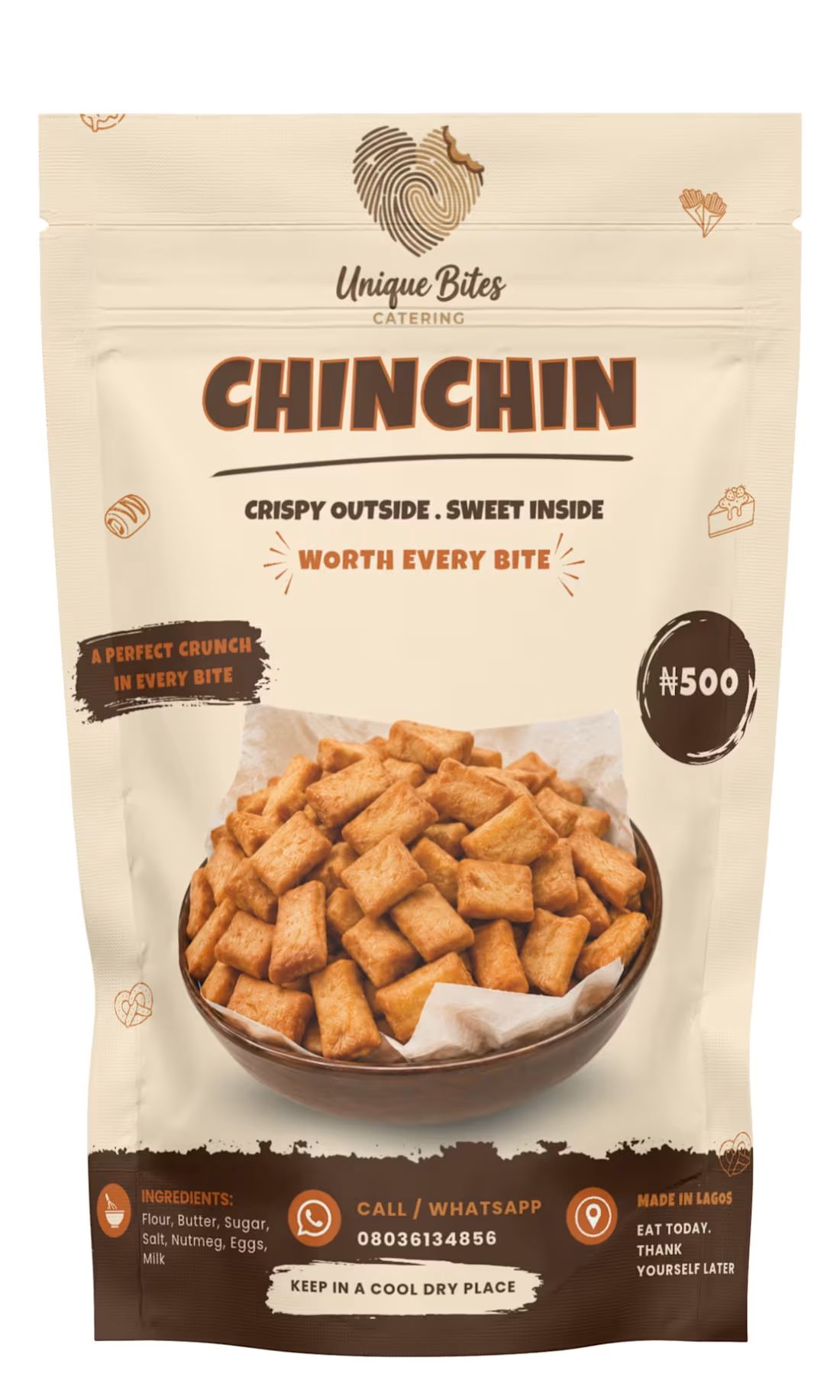
The goal for "Unique Bites Catering" was to create a packaging design that made their homemade Chin Chin feel like a premium, shelf-ready retail product. The challenge was to balance a feeling of nostalgic comfort with modern, hygienic packaging standards.
I designed a custom stand-up pouch that immediately communicates the product's quality. By using a warm, appetizing color palette and a prominent, mouth-watering product display, the design grabs attention. I incorporated a tactile "fingerprint" logo to subtly emphasize the handmade, unique nature of the brand. The result is a vibrant, clear, and professional package that builds trust and drives sales.
1
39