
pro
Caden
Hi, I’m Caden. I design modern high end brands & websites
- 5.00
- Rating
- 6
- Followers


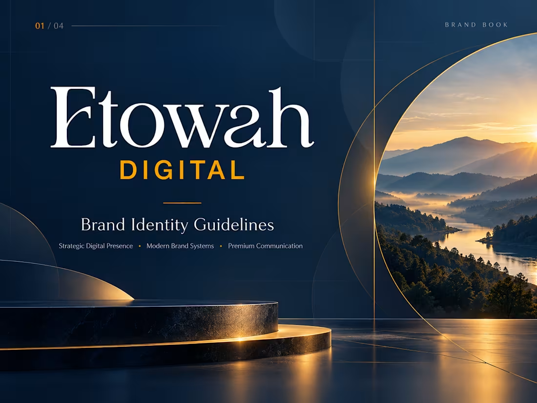
Etowah Digital — Premium Brand Identity for a Modern Digital Consultancy
A refined, high-impact brand identity created for Etowah Digital, designed to position the business as a credible, forward-thinking digital partner with a strong sense of strategy, clarity, and sophistication.
The goal was to build a visual system that feels premium, intelligent, modern, and trustworthy—giving Etowah Digital a polished presence across web, presentations, social media, and client-facing materials.
The Creative Direction
The identity is built around a confident combination of deep navy, crisp white, and energetic gold. The contrast creates a visual language that feels both established and progressive.
The existing Etowah Digital logo became the foundation of the system, supported by elegant typography, structured layouts, subtle geometric forms, editorial spacing, and aspirational imagery.
The result is a brand that feels capable of operating at a high professional level while remaining modern and approachable.
1
109
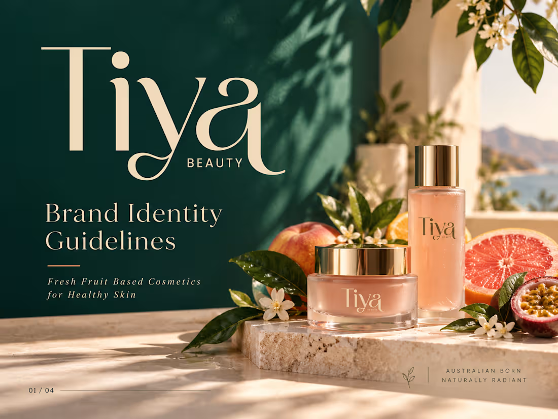
Tiya Beauty — Premium Brand Identity for Fresh, Fruit-Powered Skincare
A vibrant, elevated brand identity created for Tiya Beauty, an Australian skincare brand focused on fresh fruit-based cosmetics for healthy, naturally radiant skin.
The objective was to build a visual world that feels fresh, premium, feminine, modern, and naturally luxurious—while communicating the energy of fruit-powered skincare and the quality expected from a contemporary beauty brand.
Creative Direction
The identity combines deep emerald green, soft cream, peach, grapefruit, warm sand, and botanical tones to create a distinctive balance between nature and sophistication.
The existing Tiya Beauty logo became the foundation for a broader visual system built around fresh ingredients, healthy skin, Australian lifestyle, and modern beauty culture.
Elegant editorial typography, sunlit product photography, botanical details, fruit-inspired color accents, and refined packaging create a brand experience that feels premium without losing its natural freshness.
Brand Concept
Fresh ingredients. Radiant skin.
Tiya Beauty is positioned as more than a cosmetics brand. The identity communicates a lifestyle centered around healthy skin, natural ingredients, freshness, self-care, and effortless beauty.
The visual system was designed to feel aspirational enough for premium skincare while remaining bright, approachable, and relevant to modern beauty consumers.
2
1
159

Brad Kirsten — Premium Brand Identity for Media, Communication & Executive Performance
A bold, high-end brand identity created for Brad Kirsten, a specialist in media training, executive communication, presentation coaching, public speaking, corporate facilitation, and live Q&A moderation.
The challenge was to build a visual system that immediately communicates authority, confidence, clarity, professionalism, and performance—while still feeling premium enough for senior executives, leadership teams, and corporate organizations.
The Creative Direction
The identity is built around a sophisticated black, gold, white, and graphite palette, creating a strong executive presence with a polished, high-value feel.
The existing Brad Kirsten logo was retained as the foundation of the brand and developed into a complete visual system. Strong typography, cinematic lighting, structured layouts, premium presentation environments, and modern corporate imagery give the brand a confident personality designed for high-level communication.
The overall direction reflects the core promise of the brand:
Confident people. Clear messages. Greater impact.
1
127
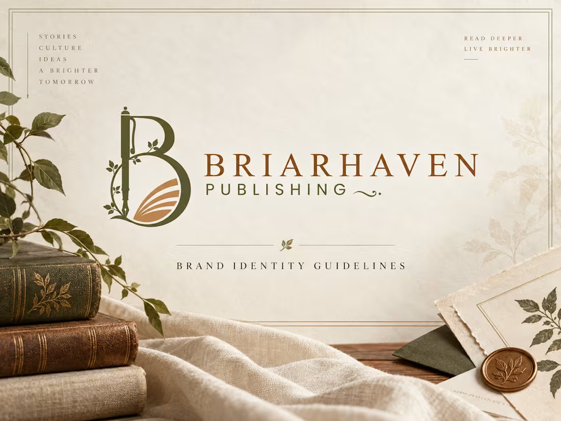
Briarhaven Publishing — Premium Brand Identity & Visual System
A refined, literary-inspired brand identity created for Briarhaven Publishing, designed to feel timeless, intelligent, warm, and deeply connected to storytelling.
The visual direction blends classic editorial elegance with a natural, contemporary sensibility. Rich olive tones, warm copper accents, parchment-inspired neutrals, botanical details, and sophisticated typography come together to create a publishing brand that feels established, thoughtful, and premium.
The existing logo was preserved and developed into a complete visual system that works consistently across both print and digital applications.
The Creative Direction
The identity was built around the idea of stories, culture, ideas, and a brighter tomorrow.
Rather than making the brand feel overly traditional, I created a balance between heritage and modernity. Editorial typography, soft natural textures, botanical elements, book-inspired compositions, and generous spacing give Briarhaven a distinctive visual language that feels both literary and contemporary.
What I Developed
Brand identity direction
Brand guidelines / brand book
Logo usage system
Light and dark logo applications
Clear-space and sizing guidelines
Premium color palette
Typography hierarchy
Editorial layout system
Business card and stationery concepts
Book cover applications
Bookmark design
Tote bag and merchandise direction
Notebook and print collateral
Website visual direction
Digital brand applications
High-end brand mockups Brand Applications The visual identity was extended across multiple touchpoints to demonstrate how the system can grow beyond the logo. From books, stationery, business cards, bookmarks, and journals to website design and branded merchandise, each application follows the same visual principles—creating a cohesive and recognizable experience wherever the audience encounters the brand. Project Outcome The final identity gives Briarhaven Publishing a more polished, credible, and memorable market presence while maintaining the warmth and character expected from a thoughtful publishing house.
The system is flexible enough to support future books, campaigns, digital platforms, editorial content, author communications, and branded experiences without losing consistency.
1
146