
Bautista Zimmermann
Brand identities with soul, from strategy to Webflow.
New to Contra
Bautista is building their profile!

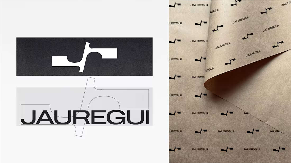
JAUREGUI — Brand Identity System. (https://www.behance.net/gallery/247654409/JAUREGUI-Branding)
A visual language rooted in clarity, proportion, and essential form. By pairing a structured typographic wordmark with an iconic monogram, the identity achieves an effortless equilibrium designed to outlast passing trends.
From custom typographic wordmarks to fluid physical and digital touchpoints. Open for premium brand inquiries.
0
2
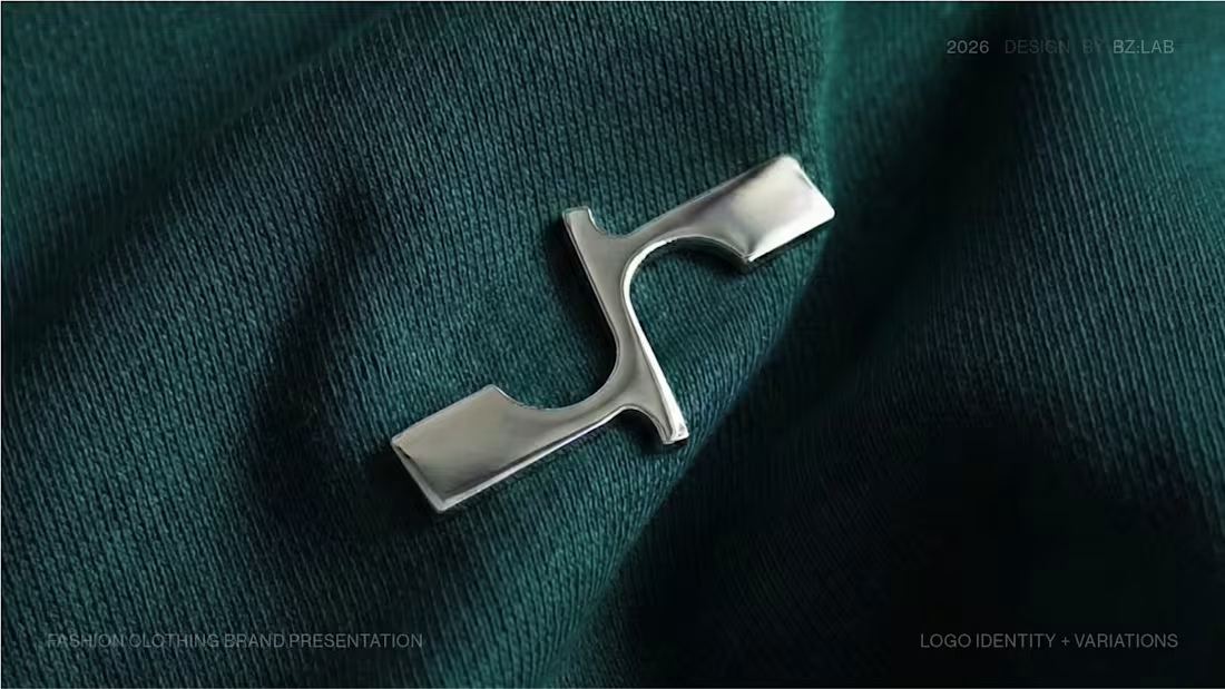
Brand Identity Design for JAUREGUI
0
0
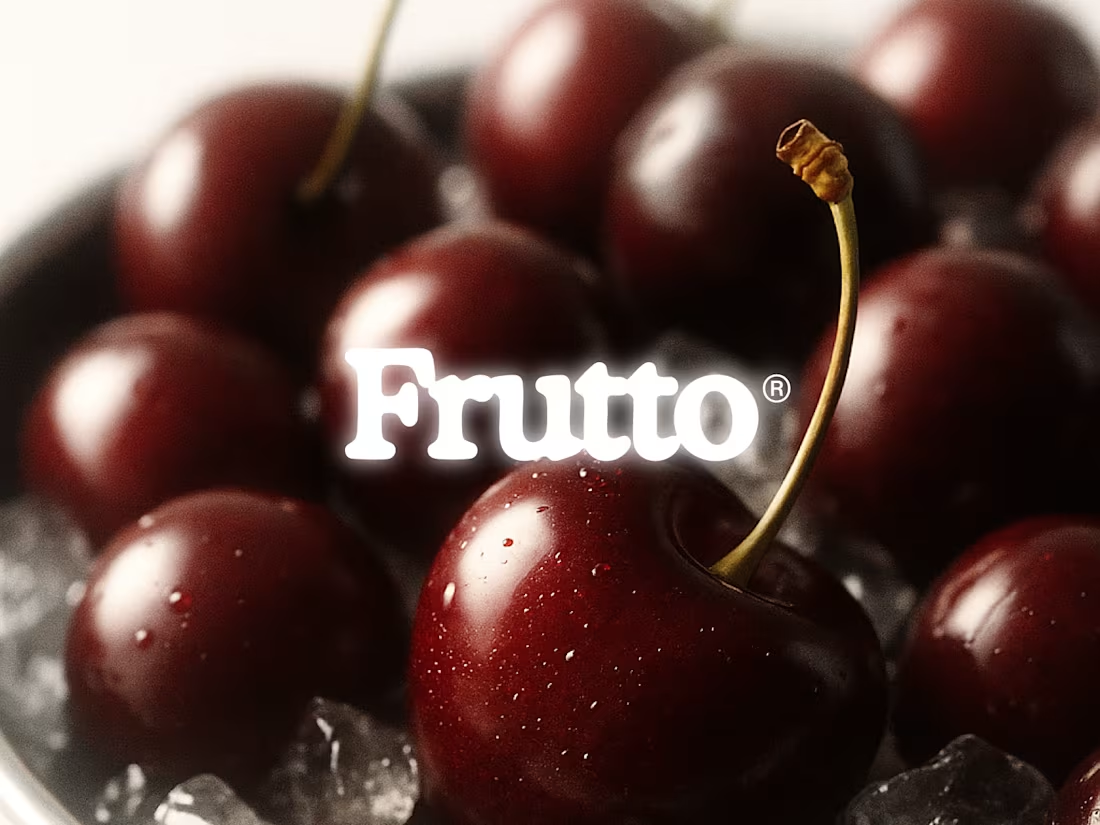
FRUTTO Brand Identity Development
0
0
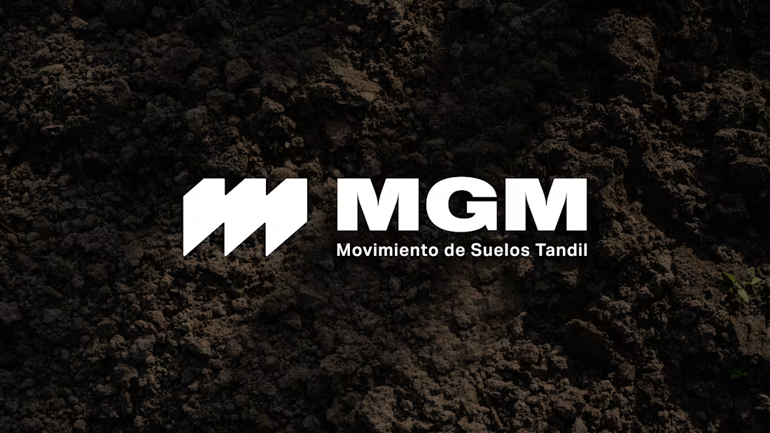
MGM is an earthmoving company based in Tandil, Argentina. The project involved developing a solid and functional visual identity aligned with the brand's industrial and operational character.
The identity centers on a "no-nonsense" approach, conveying trust and technical precision through bold geometric forms. The visual system features a high-legibility sans-serif typeface and a monogram that synthesizes land transformation and movement.
0
85
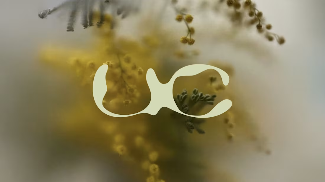
UNDERCRAFT explores the intersection of traditional craftsmanship and contemporary design. Through custom typography and a system of organic forms, the project translates manual work, the passage of time, and materiality into a modern visual language.
This morphological exploration results in an identity directly aligned with the raw and expressive character of the brand’s objects—where the logo becomes a tactile reflection of the craft itself.
1
2
152
This morphological exploration results in an identity directly aligned with the raw and expressive character of the brand’s objects—where the logo becomes a tactile reflection of the craft itself.
0
87

UNDERCRAFT | Branding
0
0