
Basit Oluokun
Brand & UI/UX Designer | Thumbnail Designer | Web Design
Ready for work
Basit is ready for their next project!
A client recently needed a testimonial video from one of his customers.
There was just one problem.
The customer didn't have the time to get on camera and record one.
Instead, the client sent me a photo of the customer along with the written testimonial and I handled the rest using AI.
The goal wasn't simply to generate a talking avatar.
It was to create a testimonial that felt believable.
That meant paying close attention to facial expressions, lip sync, camera movement, lighting, and the outdoor environment so everything felt natural and authentic.
AI can speed up the process, but realism is still in the details.
I also shared a behind-the-scenes screenshot in the comments if you're curious about the workflow.
What do you think of the final testimonial video?
2
43
I built the complete UI/UX of Kreightor an AI-powered YouTube creator platform designed specifically for African and emerging market creators. The product solves two pains I confirmed through user research I conducted last year across Nigerian, Ghanaian, and Kenyan creators: they don't know what to make videos about, and when they do have an idea, they freeze at a blank page not knowing what to say or how to structure a script that keeps people watching.
Kreightor combines two core features into one seamless workflow a trending idea discovery engine that shows creators what's blowing up in their niche right now, and an AI script generator that produces fully retention-optimised scripts structured around the YouTube algorithm, in the creator's own voice, in under 60 seconds.
The platform is priced at $9/month specifically because every tool that solves this problem today charges $49 to $299/month, built for creators in California and priced for American salaries. Nobody is building for Africa. That's the gap Kreightor fills.
The prototype covers 10 complete screens across the full user journey from landing page through authentication, a 4-step voice profile onboarding, the main idea discovery dashboard, script generator, script result with AI scoring.
The Prototype https://stitch.withgoogle.com/preview/6523870180566412732?node-id=3f6dc0afc5894a4d8df63fcf54e2dcea
How I Used Stitch
I used Google Stitch as the primary design tool for the entire product not just to generate screens, but as a core part of my thinking and iteration process.
I started by loading my design system directly into Stitch using the DESIGN.md (http://DESIGN.md) feature. I defined my brand tokens primary blue (#2563EB), dark navy (#060B1E), Darker Grotesque for headings, Inter for body so that every screen Stitch generated automatically respected the Kreightor visual language from the first generation.
From there I built all 10 screens using Standard Mode prompts, being very specific about layout, component hierarchy, copy, colour values, and interaction states. I treated Stitch less like a "generate and accept" tool and more like a collaborative design partner I would generate a screen, identify what wasn't right, write a targeted refinement prompt, and iterate until it matched my vision. For more complex screens like the dashboard and script result layout I used Experimental Mode with reference images to get the layout precision I needed.
Once all screens were complete I used Stitch's prototype feature to wire the full user flow together connecting every CTA, button, and navigation element across the entire 14-screen journey so the prototype is fully clickable from landing page to upgrade success state.
I then exported the designs to Figma using the Copy to Figma feature for layer cleanup and developer handoff, and extracted the React component code per screen for the development build.
Stitch Features I Used
The DESIGN.md (http://DESIGN.md) Loaded my complete brand token system before generating a single screen. This meant every generated UI automatically used my exact colors, fonts, and spacing without me having to correct it after the fact. This feature alone saved me hours of manual correction and made every screen feel like it came from the same design system rather than a series of disconnected AI generations.
Animate Feature Used to bring the Hero section image and cards around it to live and also applied hover states.
Prototype / Play Mode Used to wire all 10 screens into a single clickable user flow. What would have taken me hours of manual hotspot wiring in Figma happened automatically when I hit Play Stitch inferred the journey from screen names and content, and I only needed to manually wire a handful of connections it missed.
React Code Export Exported component code for each screen to hand off to my developer alongside the Figma file. Having production-ready React components come out of the design process rather than having to write them from scratch is a meaningful time saver.
My Experience Using the Platform
Stitch genuinely surprised me. I came in expecting a tool that would get me 60% of the way there and leave me doing heavy manual work to finish. That's not what happened.
The DESIGN.md (http://DESIGN.md) feature is the one I'd tell every designer to use first. Loading your design system before you generate anything is the difference between outputs that feel random and outputs that feel intentional. Once my tokens were in, Stitch stopped feeling like an AI generator and started feeling like a fast junior designer who already understood my brand.
The thing I appreciated most was the prompt iteration loop. You're not locked into the first generation. Every refinement prompt I wrote moved the design meaningfully closer to what I had in my head. By the third or fourth iteration on complex screens like the dashboard, I was looking at something I genuinely wanted to show to investors.
Where Stitch still has room to grow is in granular layout control. There were moments particularly on the two-column dashboard layout and the script result screen where I knew exactly what I wanted spatially but the prompt interpretation gave me something slightly different. I ended up regenerating multiple times with a reference image to solve this, which worked, but a manual drag-and-drop override would have been faster.
The prototype wiring was the biggest time save I didn't expect. The auto-connect on Play mode is genuinely magical the first time you see it work. I had a fully clickable 10-screen flow ready to share in minutes after I thought I was going to spend the rest of the afternoon doing it manually.
Overall for a founder or designer moving at speed, Stitch is the best zero-to-prototype tool I've used. The gap between what you imagine and what it generates is narrower than any other AI design tool I've tried, and it only gets narrower the more intentional you are with your prompts and your design system setup.
2
106
I made a motion Motion design for Keylight Development a modern home builder that uses modular grid in building homes 🏡 while reducing long construction timeline.
What's your take on this?.
I'm open to collaboration.
1
77
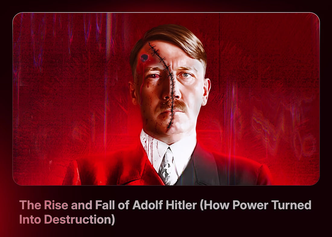
Thumbnail Design Package for a Documentary YouTube Channel
For this project, I approached the story of Adolf Hitler from a duality perspective highlighting both his rise and eventual fall.
The goal wasn’t just to design a thumbnail, but to create a visual narrative that sparks curiosity and evokes emotion.
Here’s the thinking behind the design:
• A duality composition to contrast power vs collapse
• Strong visual cues to guide the viewer’s attention instantly
• Emotional tension to trigger curiosity and clicks
I created two variations:
🅰️ A version with bold text: “Rise & Fall” to communicate instantly
🅱️ A minimal version with no text allowing the title to do the heavy lifting
I'd love to hear your thoughts on this.
Looking to work with a strategic thumbnail designer?
Let’s collaborate.
1
87
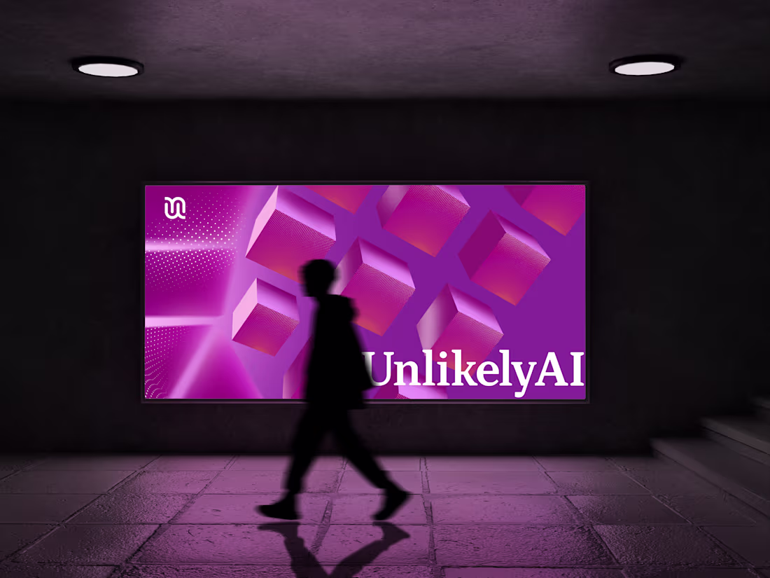
A few months ago, the CEO of Unlikely AI reached out with a clear problem:
They needed custom design assets for their website that were simple, non-AI-generated, visually clean, and aligned with their brand while still feeling innovative.
Here’s how I approached bringing that vision to life:
I started with foundational research to deeply understand Unlikely AI as a brand. What stood out was their mission building reasoning-based AI systems that go beyond traditional machine learning, designed to think more like humans through logic, adaptability, and deeper understanding.
With that in mind, I moved to sketching 2D abstract forms that were:
Less complex
Easily recognizable
Editable
Flexible for web use
Every design decision was intentional balancing simplicity, innovation, and brand integrity.
14
13
384
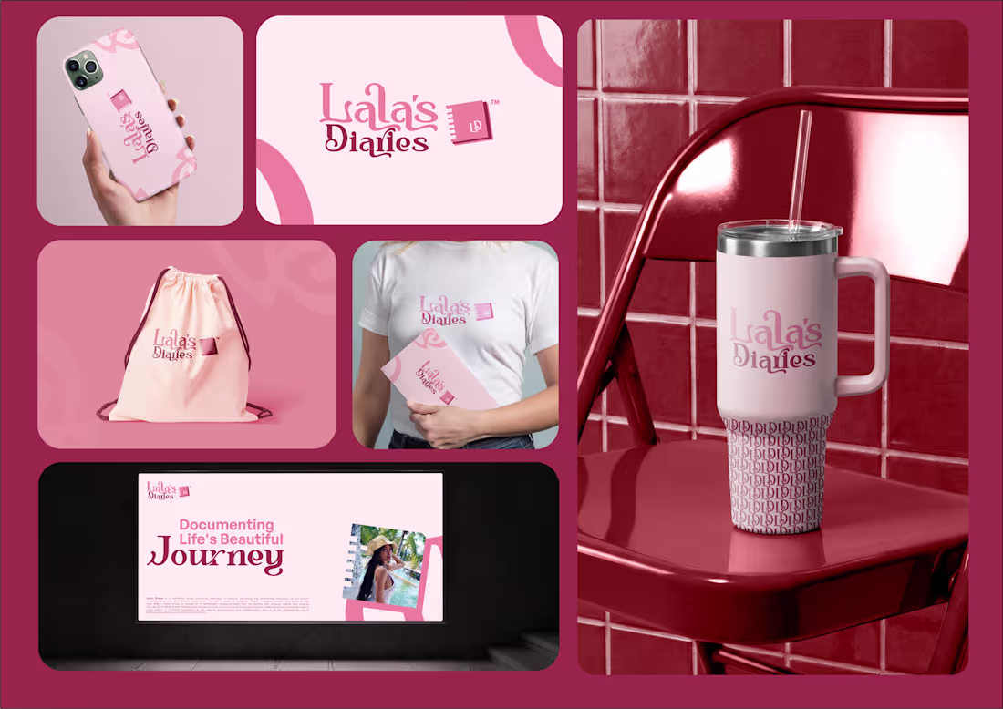
Brand identity design I created for Lala’s Diaries.
Lala’s Diaries is a captivating online platform dedicated to inspiring, educating, and entertaining individuals on their journey of entrepreneurship and lifestyle exploration.
Through insightful videos, engaging stories, and practical tips, the brand encourages viewers to:
• Discover their passions
• Unleash their creativity
• Build a fulfilling lifestyle
Whether it’s exploring the world of business, embracing personal growth, or finding joy in everyday moments, Lala’s Diaries is designed to empower people to grow and evolve.
Designing this identity was about creating a visual language that reflects inspiration, creativity, and personal transformation.
Would love to hear your thoughts on the design.
3
4
143
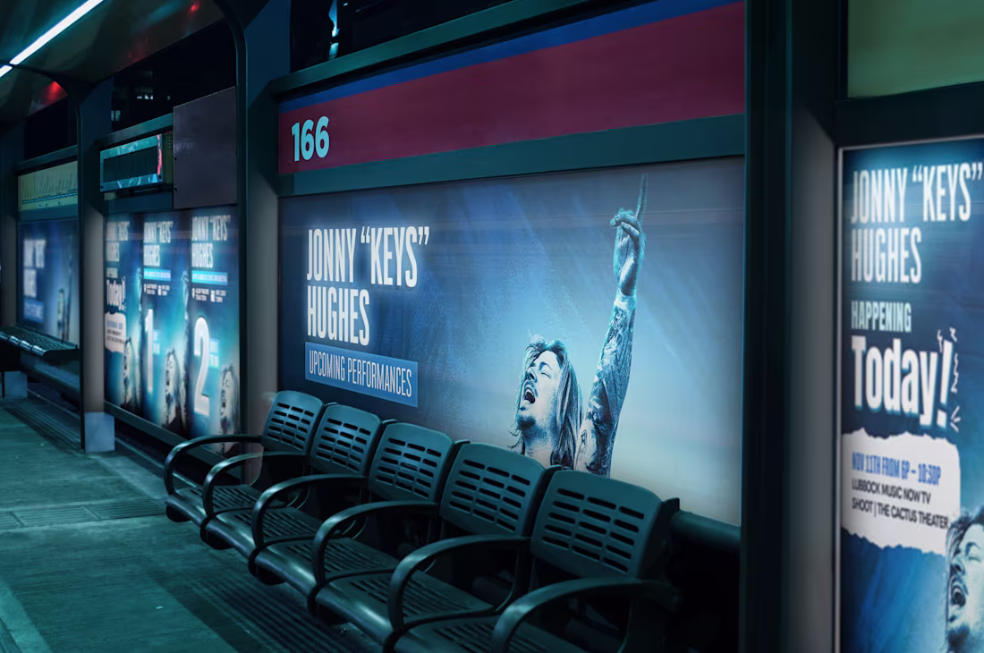
Poster Design i made for Johnny Keys Hughes Music Performance.
Let me know what you think
2
108
Thumbnail Designs i made for different Youtube Channels which has help increase there Views, CTR and Subscribers with the Implementation of Thumbnail Strategy and Title.
2
107
Here are some UI Screen I animated For a Music App website Assets. What do you think about this?.
2
2
101
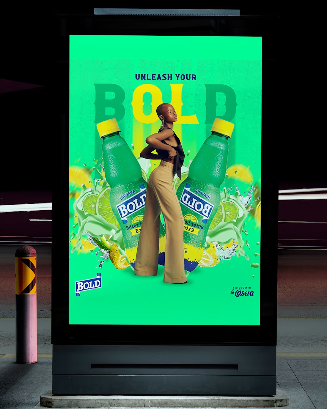
POSTER DESIGNS FOR BOLD DRINK on Behance
1
25
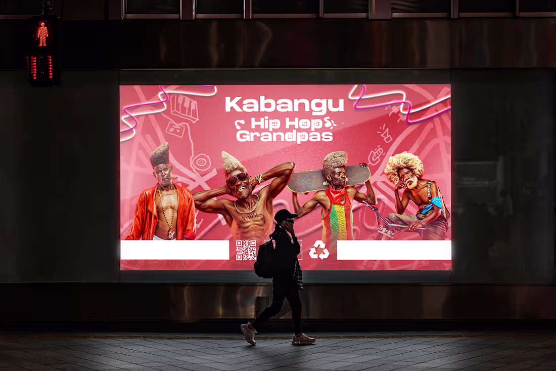
Hip Hop Grandpas (Kabangu) on Behance
1
23
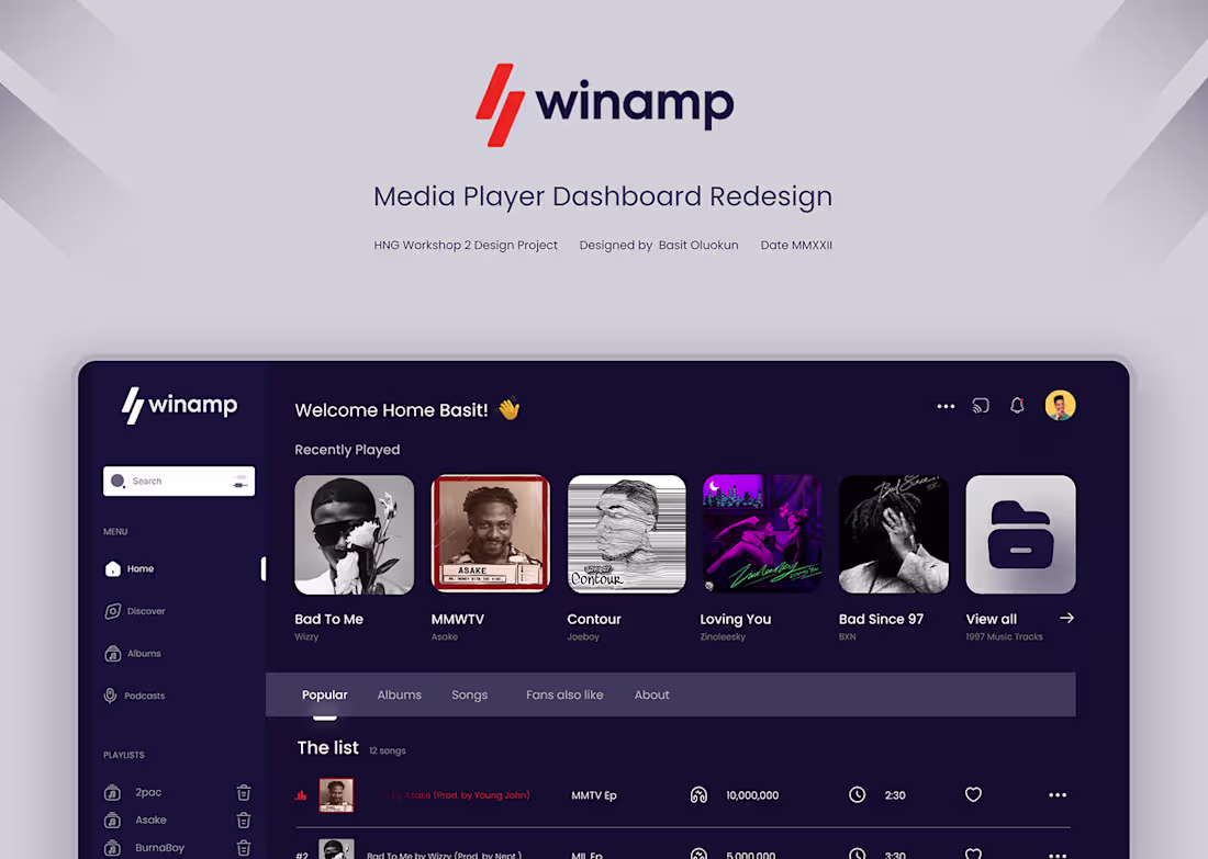
WINAMP MEDIA PLAYER REDESIGN on Behance
1
6
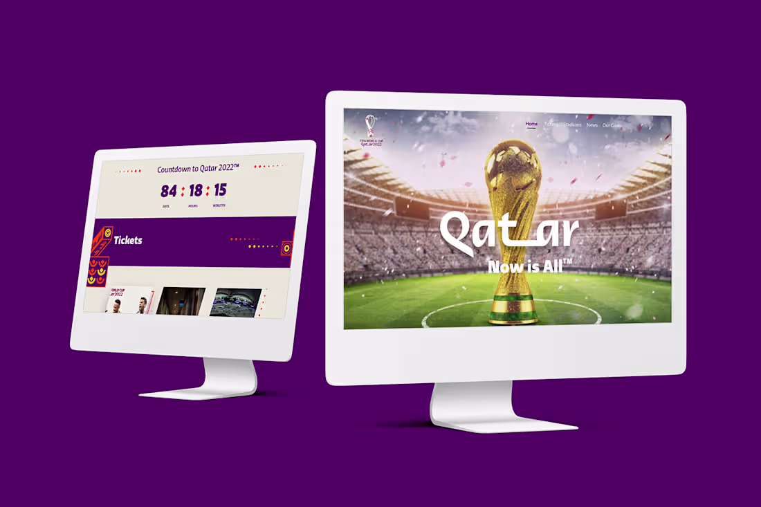
QATAR WORLD CUP LANDING PAGE REDESIGNED on Behance
1
6