How to turn a startup idea into a credible-looking venture:
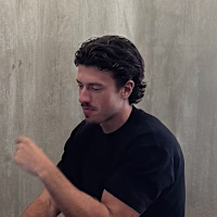
When shaping the direction for the Hugo website, we avoided the obvious
No lab samples
No vets in white coats
Instead, we led with emotional visuals
Joyful, everyday moments owners share with their pets.
Moments everyone instantly recognises
That choice does the heavy lifting
It quietly reinforces the promise:
you’re giving your pet a longer, healthier life
No explanation needed
No heavy-handed claims
Just a feeling that lands
Visuals evoke emotions
Emotional connection sells
Yes, premium design has a cost. But the wrong first impression or leaving viewers indifferent after the effort of attracting them in the first place, is a lot more expensive.
20
153
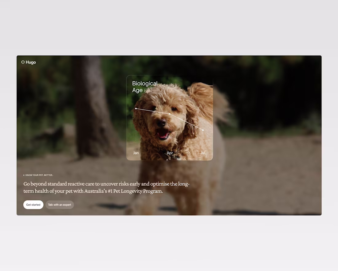
Turning startup ideas into credible ventures one landing page at a time.
1
48
Few web sections from an exciting venture we helped bring to life
1
47
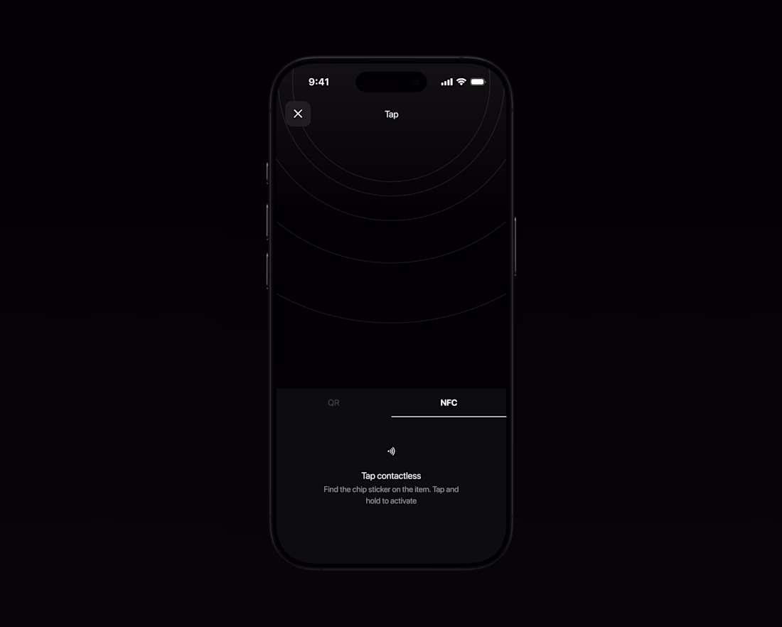
Success screen
1
3
71
Making my micro interaction feel natural ↓
In this feature, AI reviews uploaded photos. If you handed a person a stack of photos, how would they review it?
They'd shuffle them
1
55
Hover and click website interaction
4
30
224
Components from Fitted app
26
81
Music app
26
73
Project wrap up. Sound on!🔊
2
38
94
Vinyl navigation interaction
32
78
Persistent upgrade button animation
Designed to demand attention without overpowering the rest of the UI.
Small touches are often the biggest differentiator in interaction design. The right animation can guide attention gracefully.
Too much and it feels cheap, too little and it goes unnoticed.
Timings and subtlety tend to be all you need to nail a delightful moment.
In this instance, we aimed to pepper the CTA through the product experience. In features where users could be 'powered up' to complete their tasks.
Because of this, keeping the animation subtle reduces the intrusiveness and pressure a user could otherwise feel.
No one likes someone standing over their shoulder.
Completing tasks within the app with a more pressuring animation would have felt like an unnecessary tension.
Keep in simple.
6
38
104
Product Animation
0
115
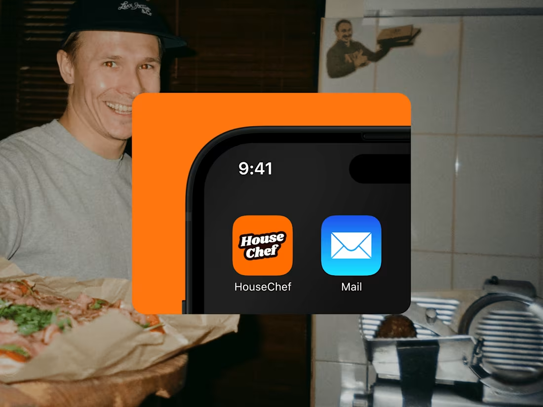
Flipping recipe finding on its head. App that reduces food waste
0
25