Aziz Akobirov
Product Designer with Data-Driven Approach
- 18
- Followers


Some onboarding screens from Slab, an app I’m designing for card collectors.


Designed the website for a premium protein bar brand.
Most bars in this category look the same on the shelf and online. Loud colors, macros in huge type, gym energy everywhere. This brand wanted to sit closer to specialty food than sports nutrition, so the site had to feel like...
Animated this entire widget set with Claude.
I expected to clean up a lot afterward. I didn’t. The easing feels natural, the transitions are smooth, and the small details like status badges and card reveals hold up even when you slow the video down.
My process was simple. I...
How it works section for an AI support platform
The product answers customer questions from your docs, hands off to your team when needed, and learns from every reply. The section had to explain all three steps without turning into a long scroll.
I used horizontal expanding...
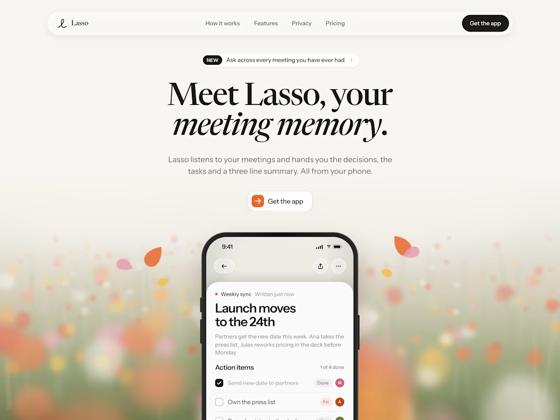
Hero exploration for Lasso, an AI notetaker app.
I wanted the page to feel warm and editorial from the first second. Big serif headline, “meeting memory” in italics, a soft blurry flower field with a few petals drifting around the phone.