
Azhar Ali
Turning founder ideas into revenue-driven Webflow sites.
Ready for work
Azhar is ready for their next project!


Im running a quick A/B vote on the hero design. V1 uses an illustrated scene to feel friendly and product-led, while V2 uses a real ocean photo for a more premium, realistic vibe. Which one feels clearer, more trustworthy, and makes you more likely to hit “Join Waitlist”?
1 voted
13%
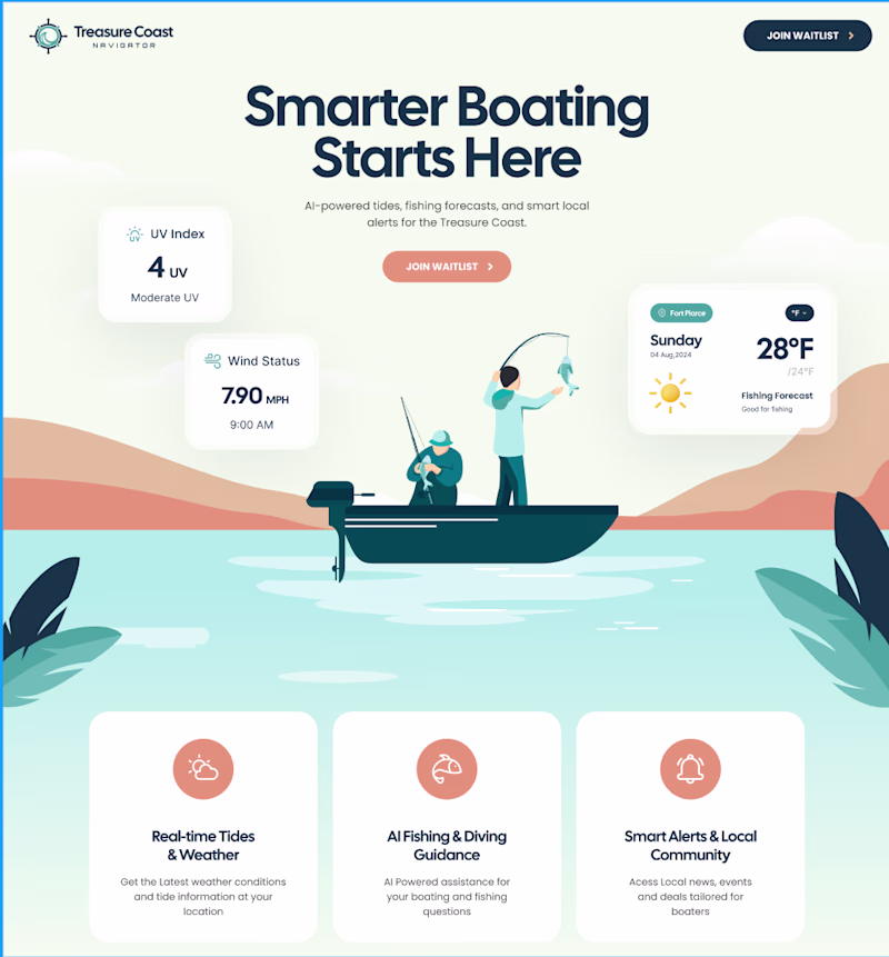
7 voted
87%
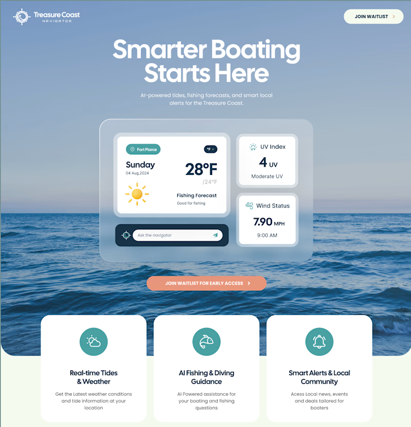
8 votes
Closed
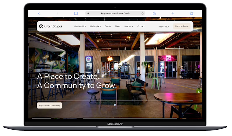
Before vs After, and no, this wasn’t just a color swap. I rebuilt the layout and hierarchy to make the page feel more premium, easier to scan, and more conversion-ready with clearer CTAs and a smoother inquiry flow. Design isn’t decoration, it’s positioning.
#webdesign #uidesign #uxdesign
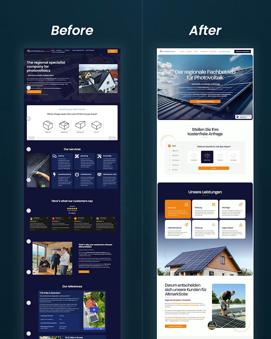
Which version makes you more likely to take action (book / inquire)?
0 voted
0%
33 voted
100%
33 votes
Closed
Just launched the "Tiemens Foundation website" in Webflow, built to spotlight their mission of supporting arts and culture across the Pikes Peak region, while making it easy for visitors to understand their impact, explore who they support, and take action through the Request...