

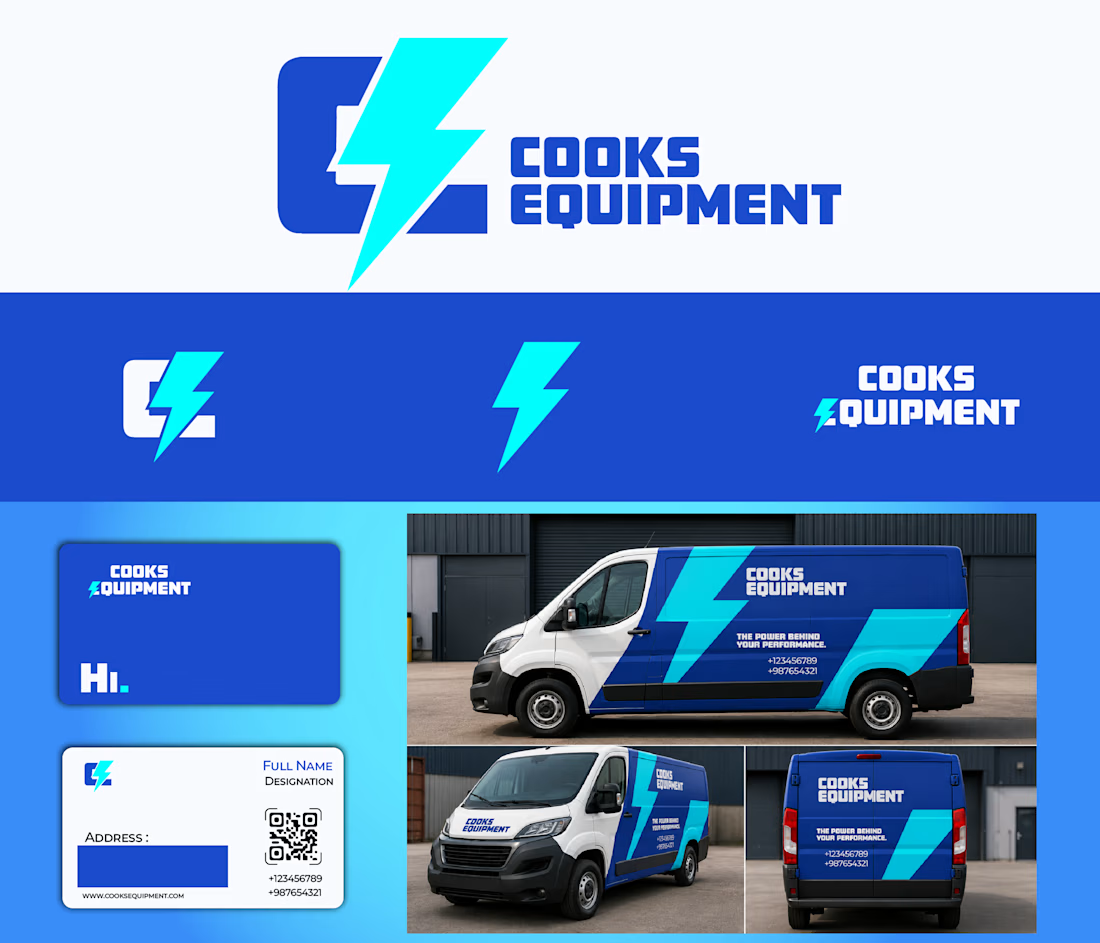
Cooks Equipment - Brand Identity Redesign
The client wanted to modernize their existing logo while keeping its original concept - the C connected to the E through a lightning bolt.
.
I simplified the curvy font to give it a stronger presence and create a unique monogram of it...

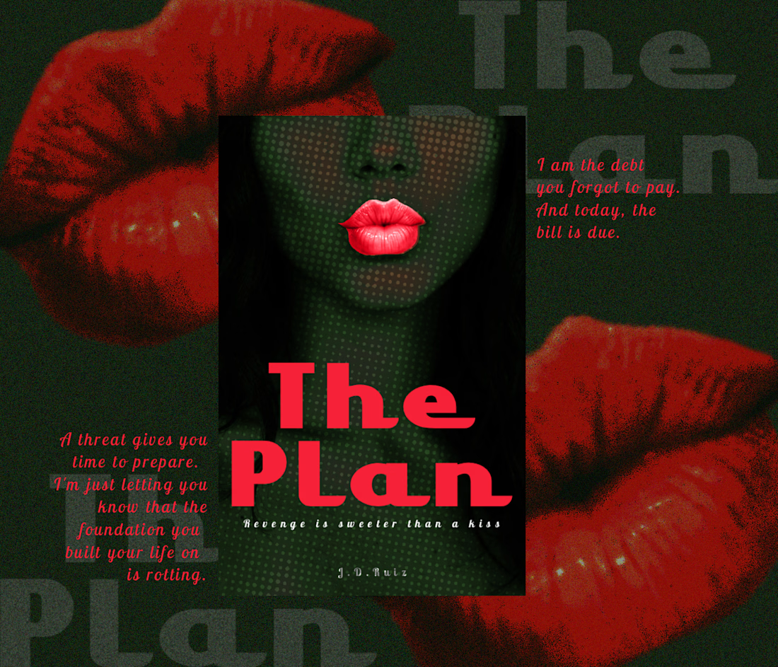
A woman. A plan. A revenge story waiting to unfold. 🩸
Designed a dark, suspense-driven eBook cover for a Wattpad psychological thriller, capturing the intensity and mystery behind a woman’s revenge.
What do you think of this cover? Would it make you curious to read the story? 👀
...