Tho Anh
A visual storyteller behind Rabbie Studio🐰
New to Contra
Tho is ready for their next project!

Hẻm — Editorial Art Collection
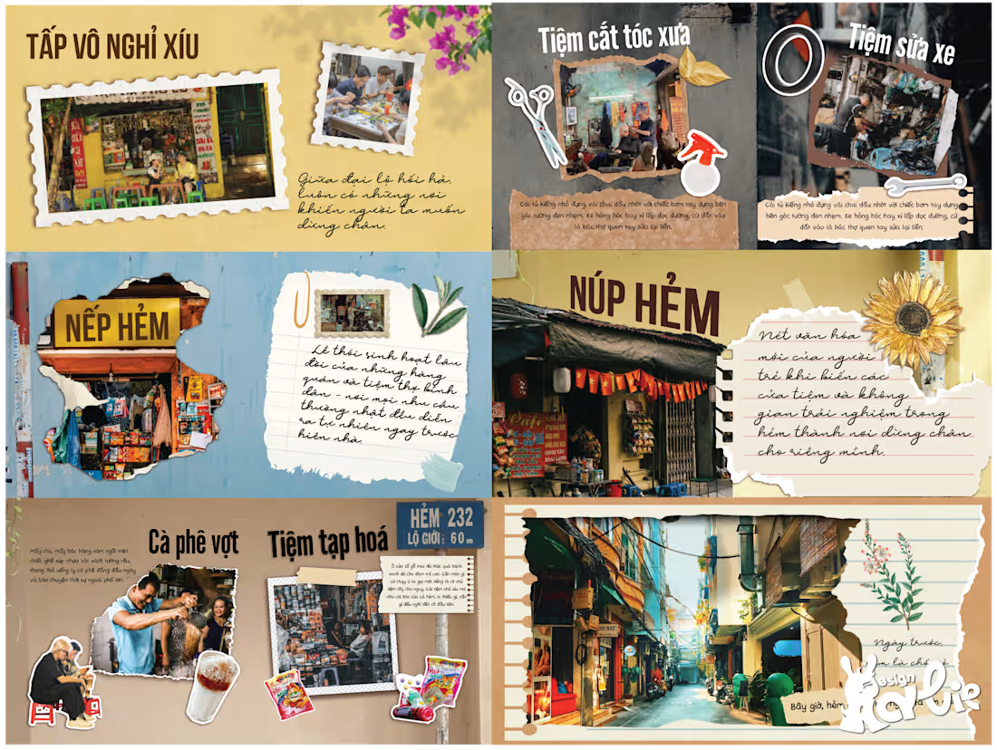
Hẻm is an editorial art collection exploring the quiet beauty and nostalgic character of Vietnamese alleyways.
The project was built around the idea of turning familiar street spaces into fragments of memory — like a personal diary or scrapbook documenting small moments found inside old Vietnamese neighborhoods.
The visual direction combines a torn-paper collage aesthetic with retro and vintage elements, using aged paper textures, handwritten typography and layered imagery to create the feeling of a collected keepsake from the past.
To develop the visual language, I explored different Vietnamese alleyways and selected imagery, textures and written details that reflected the atmosphere of each location. Instead of using one fixed background throughout the publication, I used the dominant colors and visual tones of each alley as the background for individual pages, allowing every spread to carry a sense of its own place and atmosphere.
The result is an image-driven publication designed to feel less like a traditional magazine and more like a visual diary of Vietnamese alleyways — inviting readers to pause, explore and reconnect with memories of familiar streets.
0
32
Moon Ca Lân La — Mid-Autumn Festival Key Visual
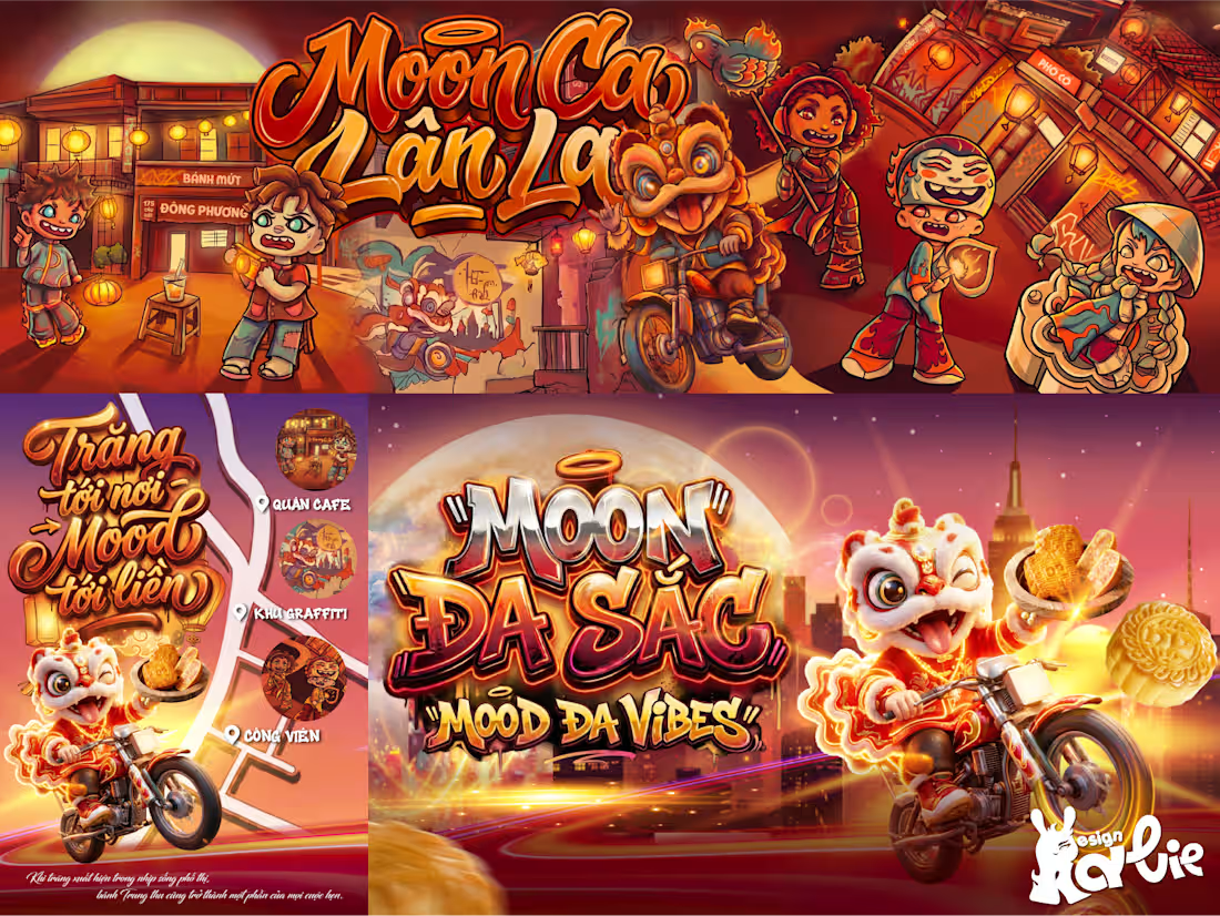
Moon Ca Lân La is a commercial artwork and key visual created for Đông Phương Mooncakes as part of a Mid-Autumn Festival campaign, with young audiences as the campaign’s primary target.
The client wanted to introduce the brand and its Mid-Autumn products through a visual direction that felt young, energetic and contemporary, while incorporating graffiti-inspired elements and the brand’s playful lion mascot riding a motorcycle.
To connect with a younger audience while maintaining a strong Vietnamese identity, I combined traditional cultural elements with a street-inspired visual language. Graffiti patterns were used to decorate the typography and surrounding architecture, while the characters were illustrated in a chibi style, wearing traditional Vietnamese áo dài redesigned with subtle hip-hop influences to create a more youthful and urban expression.
For the background, I drew inspiration from the ancient streets of Hội An, a place strongly associated with Vietnamese lantern culture. The architecture and lanterns help establish the Mid-Autumn Festival setting at a glance while giving the artwork a distinctly Vietnamese identity.
A warm color palette was chosen to create the cozy and familiar atmosphere requested by the client, while the energetic composition and graffiti details keep the overall visual fresh and engaging for a younger audience.
The final artwork was further developed into a broader campaign system, including promotional posters and standees, allowing the key visual to maintain a consistent identity across multiple campaign touchpoints.
0
30
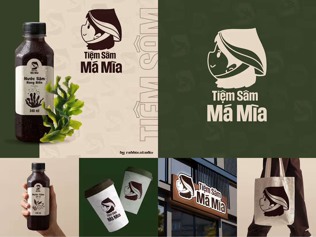
Tiệm Sâm Má Mìa — Mini Brand Kit
Tiệm Sâm Má Mìa is a Vietnamese herbal drink brand built around a simple idea: bringing familiar traditional herbal remedies into an approachable, refreshing drink for everyday life.
The challenge was to create a brand that could connect with a wide range of audiences — from younger customers to middle-aged and older generations — while still feeling distinctly Vietnamese.
I approached the visual identity by combining familiar cultural elements with a playful, friendly visual style. The girl wearing a Vietnamese conical hat became the brand’s main symbol, creating a warm and approachable personality while reflecting the simplicity and familiarity of Vietnamese everyday life.
Through this Mini Brand Kit, I wanted to create a visual identity that feels Vietnamese, friendly and easy to connect with, while giving traditional herbal drinks a younger and more approachable expression.
1
38
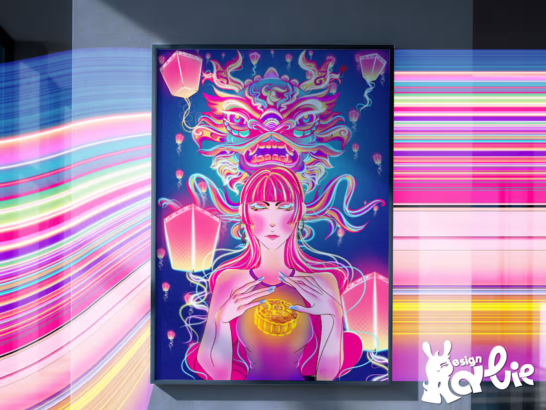
Moonlit Lantern Festival
Perhaps this is the opening chapter of my journey of telling stories through design.
Moonlit Lantern Festival is an experimental artwork created by Rabbie Studio, inspired by the atmosphere of the Vietnamese Mid-Autumn Festival and the familiar image of the lion dance — a symbol closely connected to childhood memories and Vietnamese culture.
For this artwork, I used neon light, vibrant colors and familiar cultural imagery as the main visual language, creating a contemporary interpretation of a traditional festival night.
Through light and color, I wanted to capture the warmth, excitement and nostalgia of Mid-Autumn while giving these familiar cultural elements a more modern and expressive visual identity.
A small story of Mid-Autumn, retold through light, color and design.
0
32