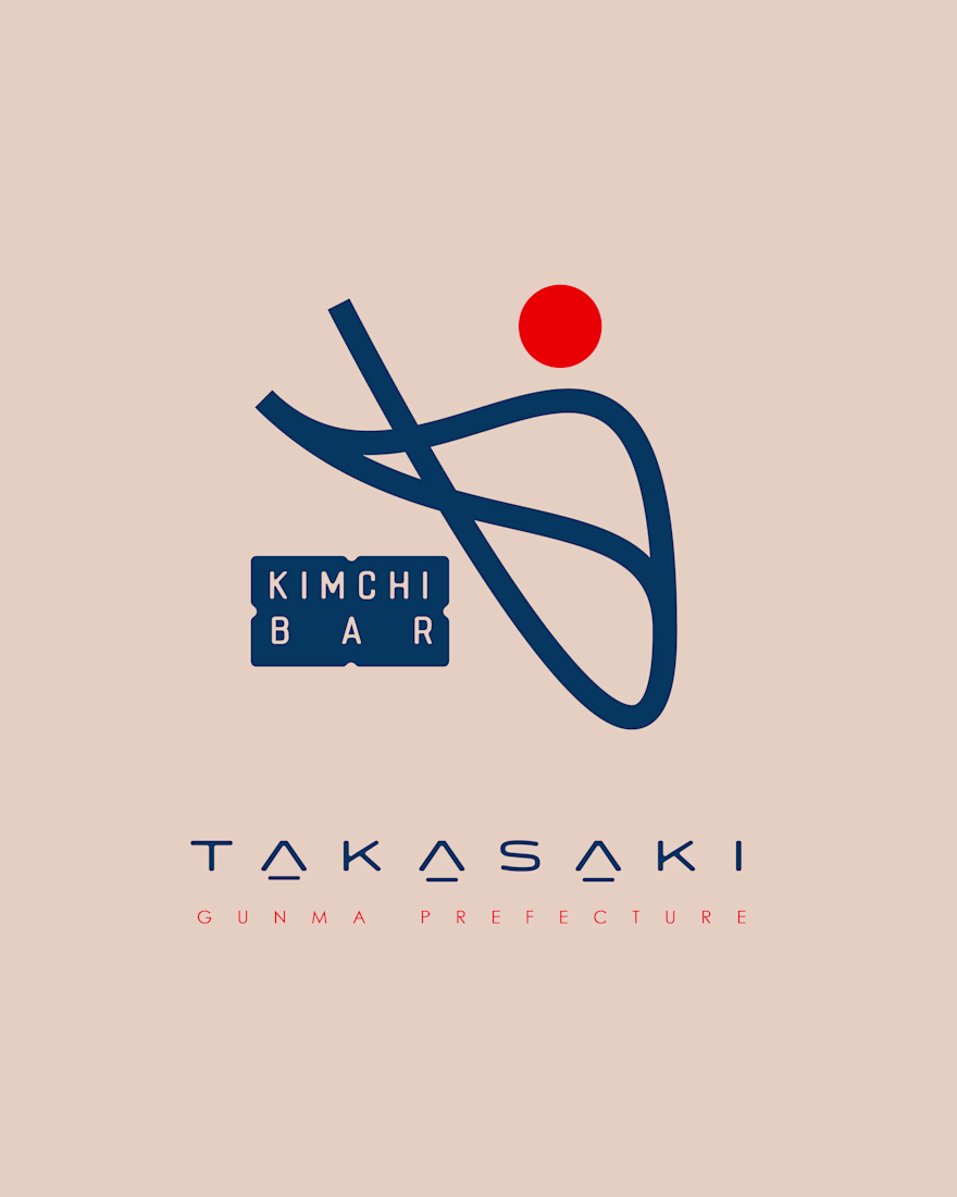
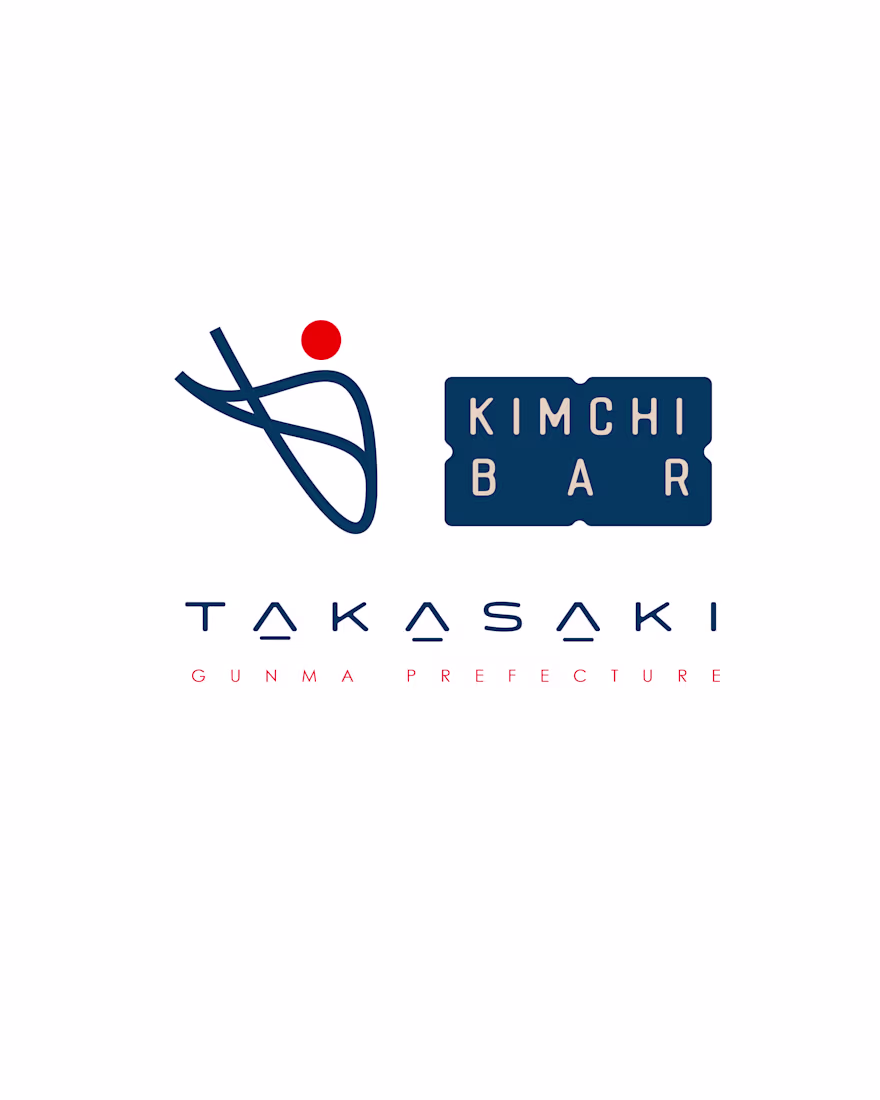
At the heart of the logo is an abstract, flowing form, an interpretation of traditional Korean calligraphy infused with the elegance of Japanese minimalism.
Its sweeping lines evoke movement, like chopsticks in motion or ribbons of fermented cabbage, the core of kimchi folding...


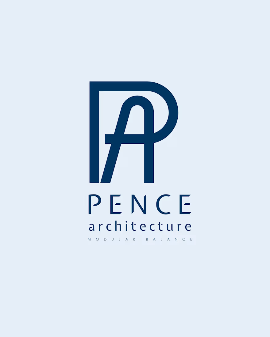
The letter P establishes a perimeter, a solid, grounded boundary that evokes foundations, walls, and grids.
The letter A emerges from within, ascending like a beam or truss, symbolising elevation and aspiration.

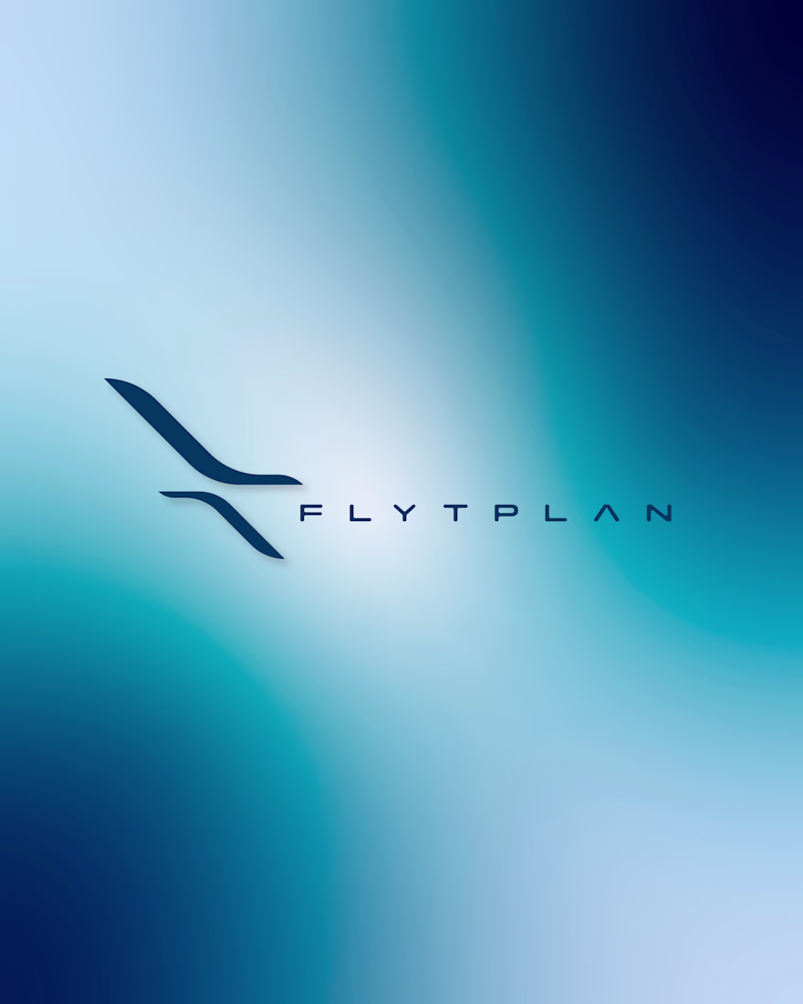
FLYTPLAN’s identity merges precision and serenity that embodies altitude, atmosphere, and ease.
The icon is a stylised flight trajectory abstracted to its purest form; it becomes a symbol of guidance, elevation, and smooth transition from ground to sky.
I've been thinking of what a digital tag would look like.
Especially when they play up to redeemable points.
Improving customer loyalty or user loyalty through tokenization
- An NFC-enabled wearable card or sticker
- A Blockchain-backed QR Coupon
- A Wallet-based identity token

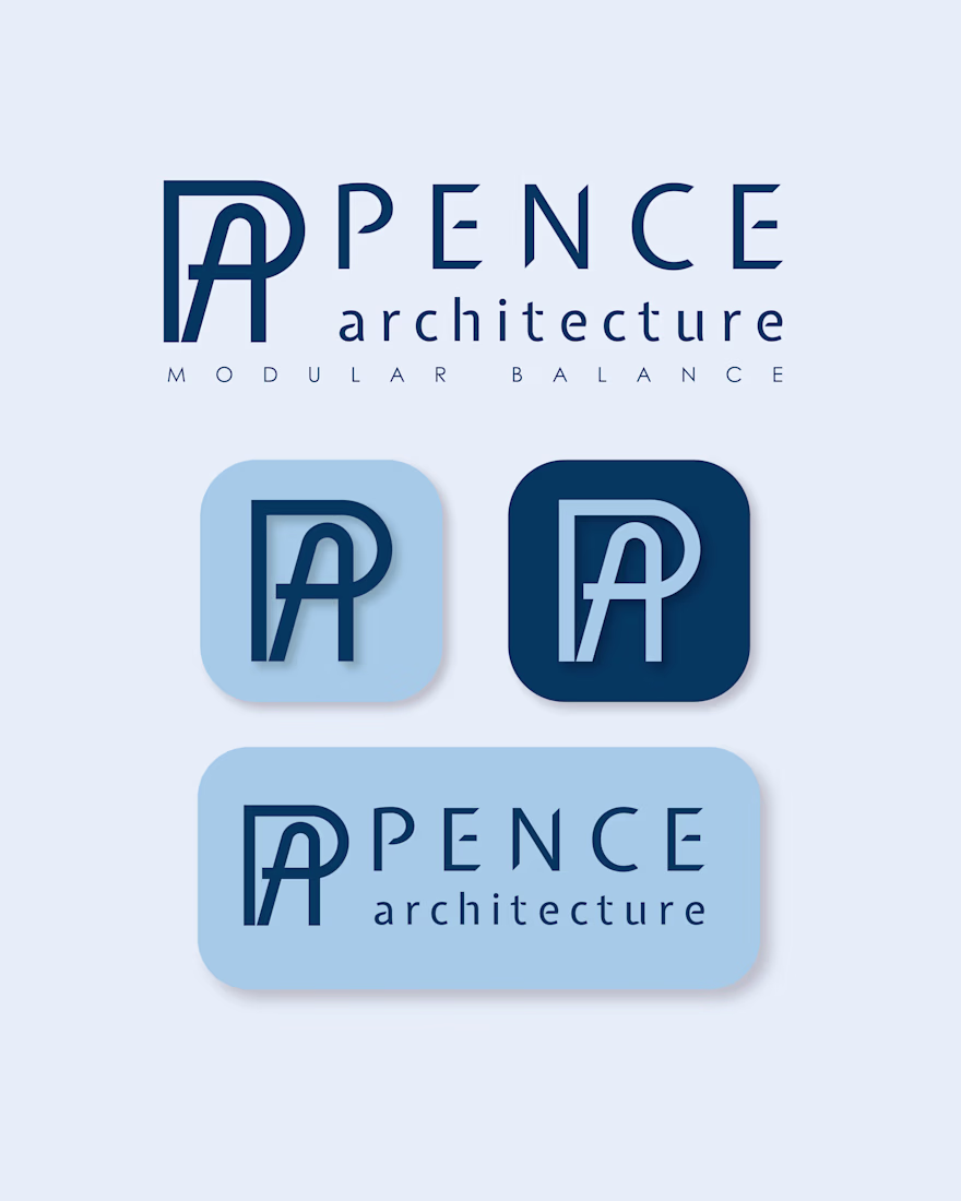
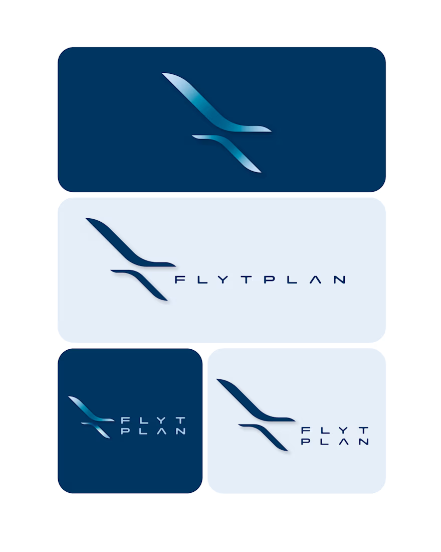
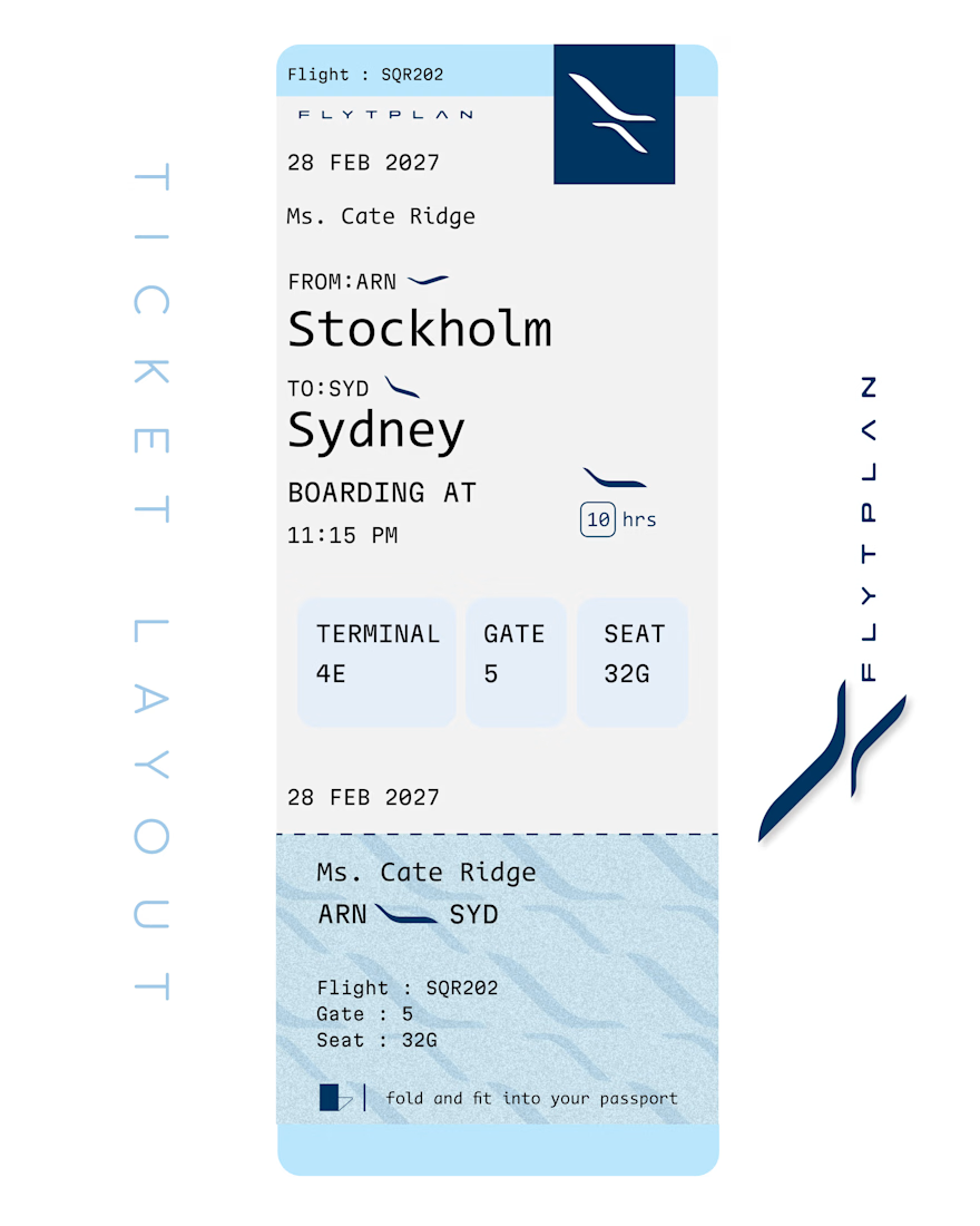
From time to time, I'd take screenshots of our page to keep as a reminder of the progress I was making with each design.
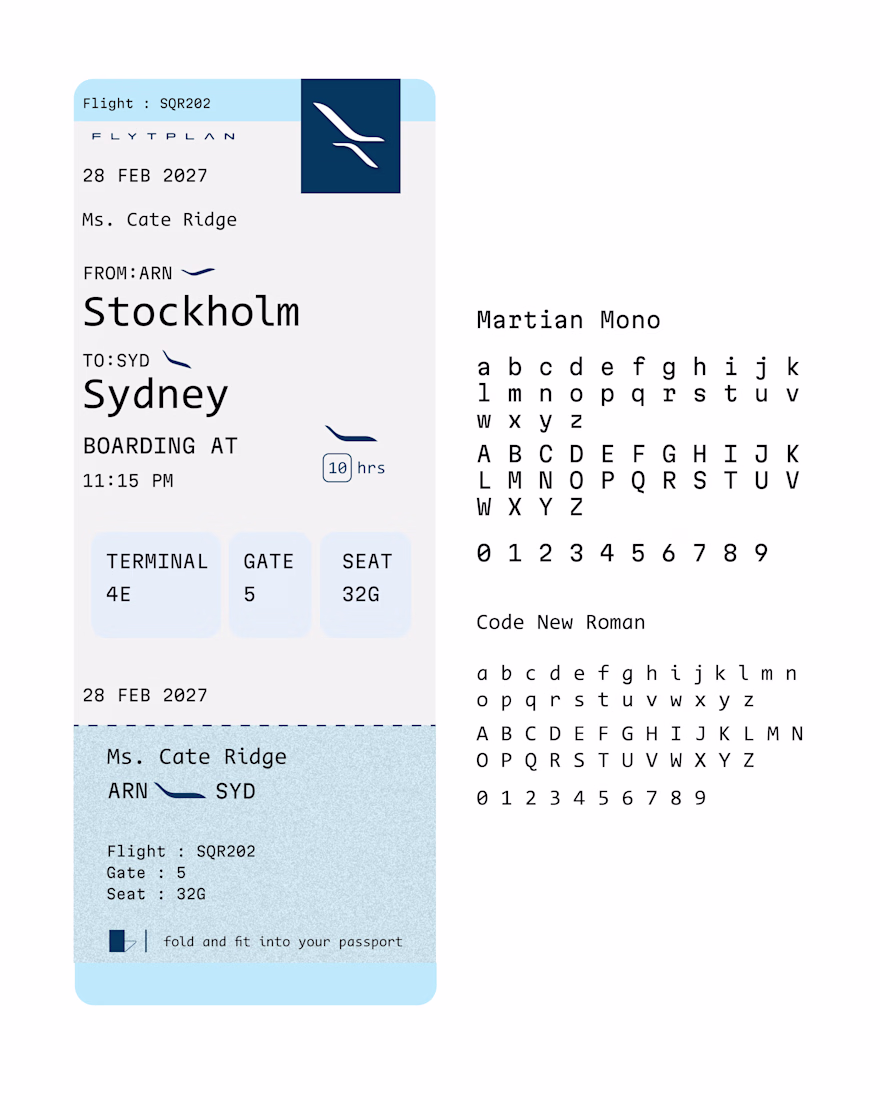
I have to admit that coming up with the copy for all the posts really gave me insight into typography, kerning, and tracking to make the words fit in the...