The network for creativity
Join 1.25M professional creatives like you
Connect with clients, get discovered, and run your business 100% commission-free
Creatives on Contra have earned over $150M and we are just getting started
Back to feedPost
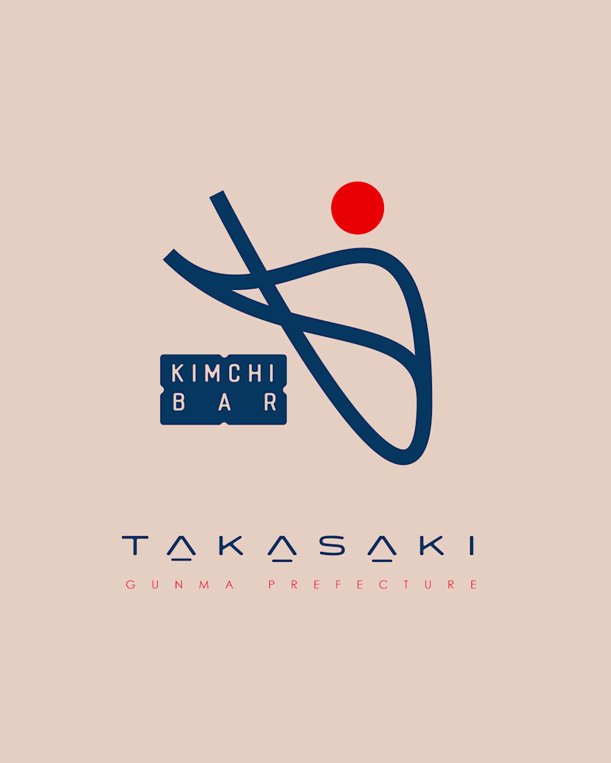
At the heart of the logo is an abstract, flowing form, an interpretation of traditional Korean calligraphy infused with the elegance of Japanese minimalism.
Its sweeping lines evoke movement, like chopsticks in motion or ribbons of fermented cabbage, the core of kimchi folding gracefully.
Above it sits a bold red circle, a symbolic nod to both the Japanese Hinomaru and the fiery essence of kimchi. This simple element anchors the design, adding warmth, balance, and cultural clarity.


The network for creativity
Join 1.25M professional creatives like you
Connect with clients, get discovered, and run your business 100% commission-free
Creatives on Contra have earned over $150M and we are just getting started
Trending
Claude
Claude has entered the design space. How are you using Claude Design?
Contra University
Learn from expert creatives how to earn more using next-gen AI tools.
MagicPath
The canvas is infinite, and exploration is becoming the workflow. How are you using MagicPath?
creativeaiflow
Creative AI workflows are evolving. What tools do you use, and what are their strengths and weaknesses?
freelancerlife
Freelancer life is wins, pivots, and everything in between. What’s yours right now?