CASE STUDY
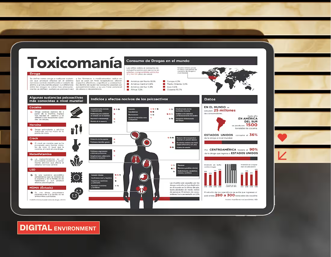
An editorial infographic developed as an academic project to communicate complex information about drug use in a clear, visual, and accessible way. The goal was to demonstrate how information design can improve understanding of extensive content through effective visual organization.
The main challenge was to structure a large amount of data without overloading the composition. To achieve this, principles of visual hierarchy, editorial grids, and information architecture were applied, combining typography, graphics, iconography, and visual elements to facilitate an intuitive reading experience.
The result was a balanced and functional editorial piece that showcases expertise in information design, content organization, and visual communication, reinforcing the importance of design as a tool for conveying knowledge.
PROJECT SUMMARY
Design of an editorial infographic for a study on drugs, applying principles of visual hierarchy, grids, typography, graphics, and iconography to communicate complex information in a clear and organized manner.
https://angrafista.com/es/project/drugs-infographic
0
13
CASE STUDY
Pinchita Estudio began as a personal initiative to create a creative agency and artistic community focused on brand development, content creation, and visual projects. As founder and director, I was responsible for defining the strategic vision, overseeing art direction, and building the studio’s identity from its earliest stages.
The main challenge was to transform an entrepreneurial idea into a brand with its own personality, developing a coherent narrative and a visual language capable of adapting to different formats and creative needs. The project included the creation of brand strategies, content, and a series of animations that showcase the scope and evolution of the work carried out.
The result was a solid identity that served as a platform to drive creative projects and solidified my first experience leading my own startup, laying the foundation for my current approach as a designer and brand strategist.
PROJECT SUMMARY
Creation and management of Pinchita Estudio, a creative agency and artistic community, developing its identity, brand strategy, art direction, and audiovisual content as part of my first entrepreneurial project.
https://angrafista.com/es/project/pinchita-estudio
0
15
Quantum logo reveal
1
30
CASE STUDY
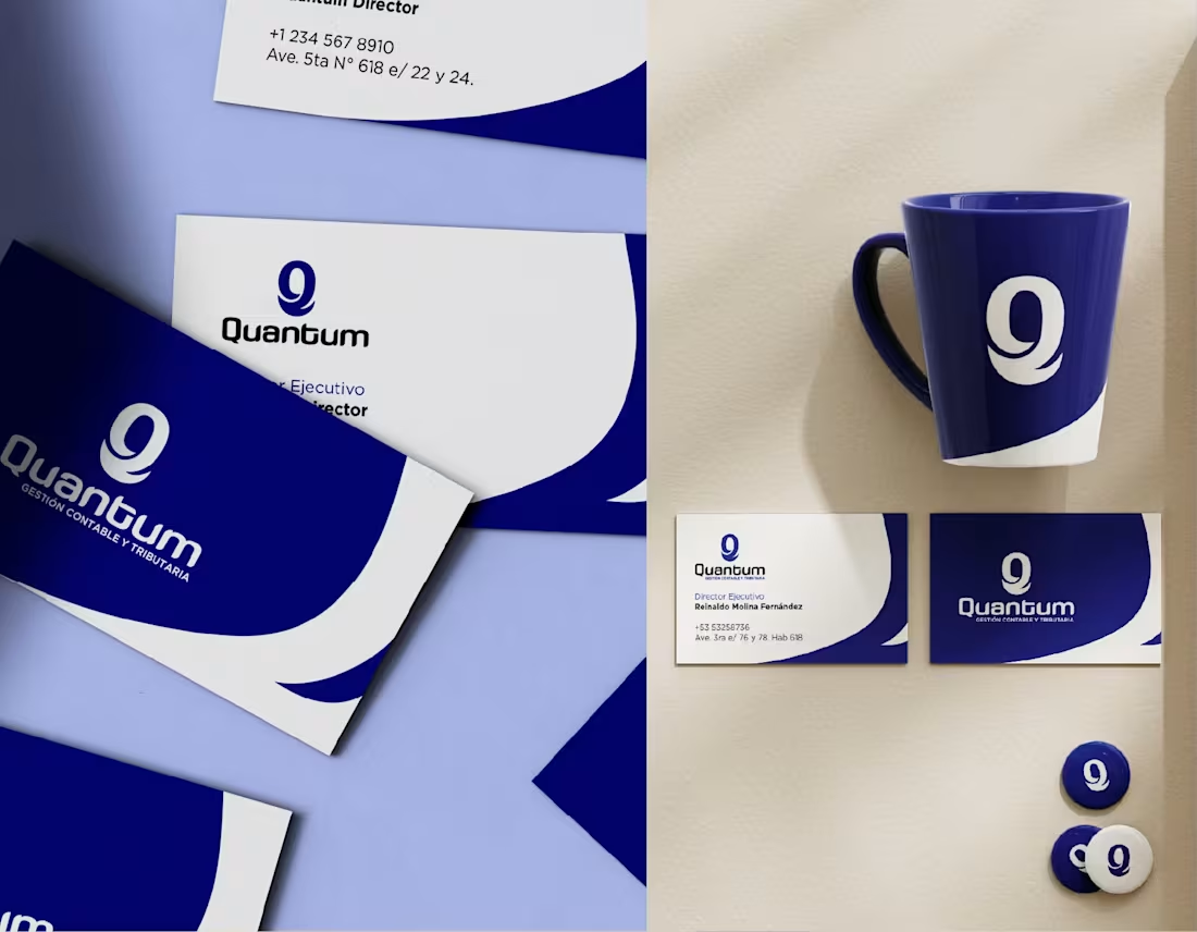
Quantum needed a corporate identity capable of conveying trust, professionalism, and reliability within the accounting and tax sector. The project began with the client’s desire to incorporate the concept of quantum mechanics as a distinguishing feature, combining it with a sober, corporate image.
The main challenge was to translate an abstract idea into a clear and functional visual identity. To achieve this, a logo was developed based on the letter Q, accompanied by a minimalist graphic system that reinforces the precision, order, and credibility characteristic of the financial sector.
The result was an elegant, contemporary, and versatile visual identity capable of setting the company apart without losing the institutional character required by this type of service. The project was delivered on schedule and received high satisfaction ratings from the client.
PROJECT SUMMARY
Development of a corporate identity for Quantum, an accounting and tax firm, creating a logo based on the letter Q and a understated visual system inspired by the concept of quantum mechanics to convey trust and professionalism.
https://angrafista.com/es/project/quantum
1
37
Cubamaps work sample
1
33
CASE STUDY
Cubamaps was conceived as a digital platform consisting of a website, a landing page, and a mapping app designed to facilitate the exploration of places through an intuitive, user-centered experience. The project focused on designing a modern interface capable of integrating multiple features without compromising visual clarity.
The main challenge was to make the map the centerpiece of navigation, organizing information, controls, and actions efficiently. A UI system was developed that incorporated points of interest, featured locations, favorites, contextual buttons, and various interaction flows, prioritizing the platform’s usability and scalability.
The result was a consistent digital experience that combined functional design with a clean interface, enabling seamless navigation and intuitive interaction on both the website and the app.
PROJECT SUMMARY
UI/UX design for a platform comprising a website, landing page, and map app, integrating interactive navigation, points of interest, and a clear visual experience to facilitate the exploration of locations.
https://angrafista.com/es/project/cubamaps
1
43
CASE STUDY
This project involved the editorial design of the menu for Havana Rouge, translating the restaurant’s retro-tropical identity into one of the most important communication elements of the customer experience. The goal was to create a visual system that remained consistent with the brand and made the content easy to read and navigate.
Every design decision—from composition and typographic hierarchy to the use of textures, colors, and graphic elements—aligned with the visual language previously defined for the brand. The result was an editorial piece that not only clearly organized the menu offerings but also reinforced the restaurant’s personality and character on every page.
PROJECT SUMMARY
Editorial menu design for Havana Rouge, applying the brand’s visual identity through a coherent composition, hierarchy, and graphic language to enrich the customer experience.
0
62
CASE STUDY
This project involved developing the visual identity for a restaurant inspired by the retro-tropical aesthetic of 1950s and 1960s Cuba, reinterpreted from a contemporary perspective. The proposal sought to evoke nostalgia for an iconic era through a deconstructed graphic language, aimed at a young audience.
My involvement extended beyond visual design, as I was also involved in defining the brand strategy and providing creative direction for the project. Based on a communication vision approved by the client, we established the graphic guidelines that shaped the brand identity and ensured its consistency across all touchpoints.
The result was a solid and coherent brand, capable of conveying a distinctive identity and maintaining a unified visual language across all media, combining strategy, branding, and design.
PROJECT SUMMARY
Development of a brand strategy and visual identity for a retro-tropical-inspired restaurant, creating a consistent graphic system applied coherently across all communication channels.
0
36
Biomat Logo Reveal
0
39
CASE STUDY
Biomat needed a brand identity system capable of positioning a biotechnology company specializing in biomaterials for the healthcare sector. The project ranged from the corporate visual identity and brand guidelines to a comprehensive wayfinding system and a launch campaign for a new product line.
The main challenge was to develop a consistent identity across multiple media and create a campaign with a distinctive concept: the shadows and reflections of biomaterials were transformed into iconic works of world architecture, drawing an analogy between scientific innovation and humanity’s greatest achievements.
The result was a comprehensive, robust, and scalable branding system that unified communication, spaces, and products under a single visual language, becoming one of the brand’s most complete projects and earning recognition through a design award.
PROJECT SUMMARY
Comprehensive branding system for a biotechnology company, including corporate identity, brand manual, wayfinding system, and product launch campaign featuring an award-winning visual concept.
1
48
CASE STUDY
This personal project explores the relationship between film and graphic design through a series of posters created for an international film festival. The project involved reinterpreting well-known quotes from Cuban cinema using a contemporary visual language, while preserving the legacy of Cuba’s poster-making tradition.
Each piece was developed using graphic elements characteristic of Cuban poster art as a reference, combining composition, typography, and visual synthesis to generate new interpretations of widely known works. The goal was to pay homage to one of the most representative expressions of Cuban cultural design from a contemporary perspective.
The result was a collection of posters with a strong conceptual character that celebrates Cuba’s graphic and cinematic heritage through a unique visual reinterpretation.
PROJECT SUMMARY
A series of conceptual posters for an international film festival, inspired by iconic phrases from Cuban cinema and developed based on the visual legacy of the Cuban poster school.
1
47
Tours Coabana website gallery
0
43
CASE STUDY
Tours Coabana began as a UI/UX design project for a travel agency but evolved into comprehensive involvement in the platform’s development. As the project progressed, I took on responsibilities ranging from design to technical implementation and digital strategy.
The challenge was to create an engaging and functional web experience for the tourism sector, optimizing both navigation and the presentation of services. In addition to interface design, I participated in site development, hosting management, SEO optimization, and the definition of strategies aimed at improving the agency’s range of experiences and market positioning.
The result was a robust platform that combined design, technology, and strategy to strengthen Tours Coabana’s digital presence and enhance its customers’ experience.
PROJECT SUMMARY
Design, development, and digital strategy for the Tours Coabana website, integrating UI/UX, web development, hosting, SEO, and tourism experience planning into a comprehensive solution.
0
49
CASE STUDY
Reserva'o was designed as an online booking platform aimed at providing an intuitive experience for both users and administrators. Developed entirely in Figma for the U.S. market, the project was carried out in collaboration with a management and development team.
The main challenge was to design a clean, scalable interface capable of integrating multiple features without compromising usability. The proposal included a comprehensive booking system with an interactive calendar, a statistics dashboard, payment gateways, and various functional pages, prioritizing clear navigation and a consistent user experience.
The result was a modern, functional, and implementation-ready interface, facilitating reservation management through an efficient and easy-to-use visual system.
PROJECT SUMMARY
UI/UX design for an online booking platform developed in Figma, incorporating a booking calendar, statistics, payment gateways, and a clear navigation system for the U.S. market.
1
64
CASE STUDY
This project involved designing a branding system for a collaboration between a restaurant with a classic Havana aesthetic and a Latin American film festival. The main challenge was to integrate two visual identities with distinct personalities into a coherent and balanced whole.
The proposal drew on the festival’s graphic elements and combined them with the restaurant’s visual language, seeking a natural harmony between the two brands without either one taking center stage. Through a careful visual hierarchy, typographic selection, and graphic treatment, a system was created that effectively communicated the collaboration.
The result was a brochure that served as a meeting point between gastronomy and culture, reinforcing the identity of both institutions within a unified visual experience.
PROJECT SUMMARY
Design of a publishing system for a collaboration between a classic Havana-style restaurant and a Latin American film festival, integrating both identities into a coherent and balanced visual proposal.
1
57
Some of the posters for Fangio Restaurant
1
49
CASE STUDY
Fangio Habana needed a series of promotional materials capable of conveying the essence of its culinary and hospitality concept, inspired by 1950s Cuba. The challenge was to develop a cohesive visual identity for posters, social media, and physical media, capturing the elegance and cultural appeal of one of Havana’s most iconic eras.
The creative proposal was based on reinterpreting the visual imagery of 1950s tropical luxury, drawing inspiration from brands such as SelvaRey Rum and combining them with the restaurant’s own values. Through retro-vintage graphic elements, warm colors, and a visual direction inspired by the glamour of the era, a consistent and recognizable promotional system was created.
The result was a collection of pieces that reinforced the brand’s positioning and successfully conveyed the exclusive, nostalgic, and sophisticated atmosphere that characterizes the Fangio Habana experience.
PROJECT SUMMARY
Design of posters, social media content, and promotional materials for Fangio Habana, inspired by vintage tropical aesthetics and the luxury of 1950s Havana.
1
2
67
Audiovisual work for FiestoRon
1
53
CASE STUDY
FiestoRon needed new promotional materials for one of Gran Canaria’s most renowned rock festivals. The project included short- and long-form audiovisual content, posters, billboards, and bus wraps, maintaining the visual essence of previous campaigns while incorporating new creative concepts.
The main challenge was to quickly understand a brand we had not worked with before and translate its identity into multiple communication formats. Drawing on signature elements such as the lightning bolt and the red color palette, we developed new graphic solutions, including the incorporation of the visual concept of a ticket across various promotional materials.
The result was a cohesive campaign adaptable to various media, reinforcing the festival’s identity and introducing new creative perspectives that were very well received by the client.
PROJECT SUMMARY
Design of a promotional campaign for FiestoRon, including audiovisuals, posters, billboards, and urban signage, combining brand continuity with new visual concepts to reinforce the festival’s identity.
0
44
CASE STUDY
DistrEato was looking for a series of menus that would reflect its youthful and carefree personality, combining fast food and Asian cuisine with an aesthetic inspired by retro video games. The challenge was to adapt this visual language without sacrificing clarity or functionality.
The project involved the remote design of five menus, incorporating pixelated typography, themed iconography, shadows, and graphic elements typical of the retro gaming universe, while maintaining the brand’s colors and identity.
The result was a cohesive, attractive, and distinctive visual experience that aligned with the restaurant’s concept and exceeded the client’s expectations.
PROJECT SUMMARY
Design of five menus for DistrEato, blending brand identity with retro gaming aesthetics through visual elements inspired by classic video games.
1
74
CASE STUDY
Let's Eat needed to transform its delivery backpacks for Popeyes into a communication medium capable of strengthening the brand’s presence on the streets of Grand Cayman. The challenge was to make the most of every available surface on the backpack, ensuring that the information was clearly visible and legible to both pedestrians and drivers.
The project included the comprehensive graphic design of the backpack, as well as a 3D modeling and rendering process to validate the application of the brand identity on the actual volume of the medium. The proposal focused on optimizing the layout of the visual elements, ensuring brand recognition and legibility from a distance.
The result was a solution that transformed a functional delivery item into a mobile advertising tool, increasing the brand’s visibility and consistency in the urban environment.
PROJECT SUMMARY
Branding design applied to delivery backpacks for Popeyes in Grand Cayman, combining visual identity, packaging, and 3D modeling to maximize brand visibility in urban spaces.
Translated with DeepL.com (http://DeepL.com) (free version)
1
91
CASE STUDY
This brand of jams and fruit-based products was born with a strong emotional and family-oriented focus. Its name, inherited from the founder’s father, became the starting point for building a visual identity capable of conveying tradition, authenticity, and approachability, while standing out in a highly competitive market.
The challenge was to develop a cohesive brand that would reflect the artisanal quality of the products and make it easy to identify each fruit variety. To achieve this, a visual identity was created based on a color palette directly inspired by natural ingredients, using colors associated with each fruit to reinforce the perception of freshness and flavor.
The project included the design of the logo, the labeling system, and various packaging elements. Beyond the main applications, specific details were designed for the metal lid and the tamper-evident seal located between the lid and the neck of the container, transforming functional components into additional carriers of brand identity. This strategy helped reinforce the product’s visual recognition across multiple touchpoints.
The result was a consistent, attractive, and easily scalable branding system capable of communicating the brand’s family heritage while highlighting the freshness and quality of its products at the point of sale.
PROJECT SUMMARY
Comprehensive branding and packaging development for a brand of jams and fruit products, combining family heritage, visual freshness, and an identity system applied from the labels to the packaging’s security and closure elements.
2
1
75
Kairos Creative Studio Logo Reveal
0
57
MAZZE Dj Posters
0
60
Hino website
0
54
CASE STUDY
MAZZE was looking for a visual identity capable of representing seemingly contradictory concepts: delicacy and strength, fragility and resilience, nature and energy. Inspired by phenomena such as Rupert’s Tears, the challenge was to condense these ideas into a single, recognizable symbol for his career as a DJ and music producer.
The solution was to develop a completely custom lettering-based logo, built around an organic and fluid structure. The visual concept drew inspiration from molten metal, creating a three-dimensional aesthetic that conveys transformation, movement, and intensity. The curves lend a sense of naturalness and sensitivity, while the sharp edges introduce tension, character, and visual strength.
Each letter was carefully adjusted to achieve formal coherence and structural balance, allowing the whole to function as a single, distinctive piece. The result is an identity capable of communicating both the energy of electronic music and the conceptual complexity behind the artistic project.
PROJECT SUMMARY
Custom logo design for DJ and producer MAZZE, developed from a lettering system inspired by molten metal, combining organic forms, energy, delicacy, and strength within a unique and memorable visual identity.
0
55
CASE STUDY
Kairos Creative Studio KY was founded out of the need to build a strong visual identity capable of reflecting its creative vision and standing out in an increasingly competitive market. As a Caribbean-based design studio inspired by the Greek concept of “Kairos”—the opportune moment to act—the brand needed to convey creativity, transformation, and strategic thinking without losing its bold, contemporary personality.
The project began with the comprehensive development of the visual identity, including the creation of the logo, graphic system, brand applications, and website design. The challenge was to transform a philosophical and intangible concept into a coherent visual experience capable of connecting with both local and international clients within a fully digital environment.
To achieve this, a visual language was developed based on contrasts between structure and abstraction. Typography with strong visual impact was incorporated to convey character and confidence, along with color gradients that evoke transformation and movement, grainy textures that add depth, and a duotone photographic treatment to reinforce the studio’s contemporary personality. Each element was designed to function as part of a flexible and scalable system.
The result was a distinctive and memorable identity that positioned Kairos Creative Studio KY as a modern, cohesive, and professional creative brand. The project was carried out entirely remotely, establishing a successful collaborative relationship that later led to my joining the studio as a Senior Lead Designer.
0
59
CASE STUDY
Hino Trucks needed a web experience aligned with the brand’s global standards for the U.S. market. The project brought together a multidisciplinary team of designers, developers, strategists, copywriters, and creative directors, all working entirely remotely.
My role focused on digital interface design, translating corporate guidelines and brand identity manuals into a clear, functional, and consistent experience. Collaborative work in Figma enabled constant communication between teams and ensured quality throughout the process.
The project was executed using Agile, Lean, and Six Sigma methodologies, promoting efficient work cycles, continuous validation, and better coordination between design and development.
The result was a professional and scalable platform capable of communicating the brand’s values while offering a robust and consistent user experience for the North American market.
PROJECT SUMMARY
Corporate web experience design for Hino Trucks USA, developed alongside an international multidisciplinary team using Agile methodologies and collaborative processes focused on efficiency, consistency, and usability.