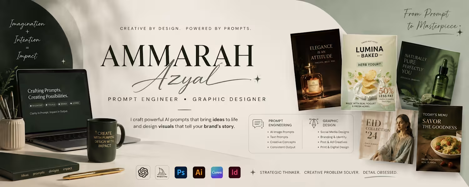
Ammarah Azyal
Graphic Designer & Prompt Engineer
- 5.00
- Rating
- 5
- Followers


Behind every polished aesthetic is a mountain of rough drafts, late-night edits, and a whole lot of creative chaos. 🤫✨ Lately, I’ve been deep in the trenches bringing a few new visual concepts to life balancing client work, refining brand assets, and experimenting with dynamic new ways to make products pop on screen.
Whether it's dialing in the exact color grading, tweaking packaging details, or staging the ultimate golden-hour shot, the process is just as rewarding as the final output. If you’ve ever wondered what goes on behind the grid, it’s mostly coffee, endless iterations, and chasing that one perfect frame. ☕️🎨
What project are you pouring your energy into this week? Let’s talk about it in the comments! 👇
0
119
AI Art Direction & Product Campaign — Hair & Body Care
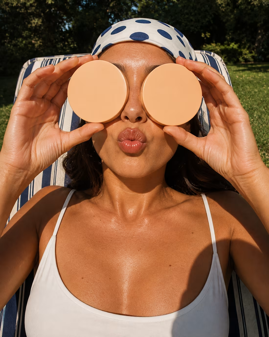
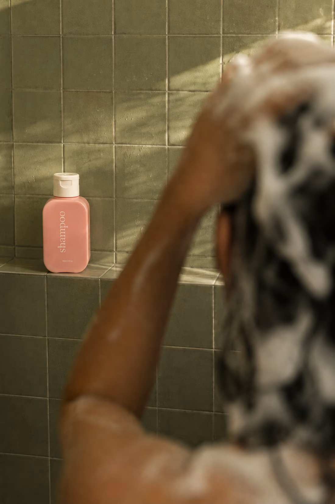
I explored how a single beauty-product line could be translated into a series of premium campaign visuals without losing its visual identity.
The project focused on AI-assisted product photography and art direction, placing the products into different lifestyle environments, from a warm, sunlit bathroom and tropical poolside setting to a playful retro-inspired composition and a close-up beauty portrait.
The main challenge was maintaining consistent product packaging, proportions, colours, typography and brandingwhile changing the entire environment, lighting and photographic language around it.
I treated each image like a real commercial shoot: defining the composition, camera perspective, lighting, colour palette, depth of field, styling and supporting elements before generating the final visuals.
The result is a cohesive visual campaign that explores how the same product can feel editorial, nostalgic, luxurious and contemporary depending on the art direction.
0
130
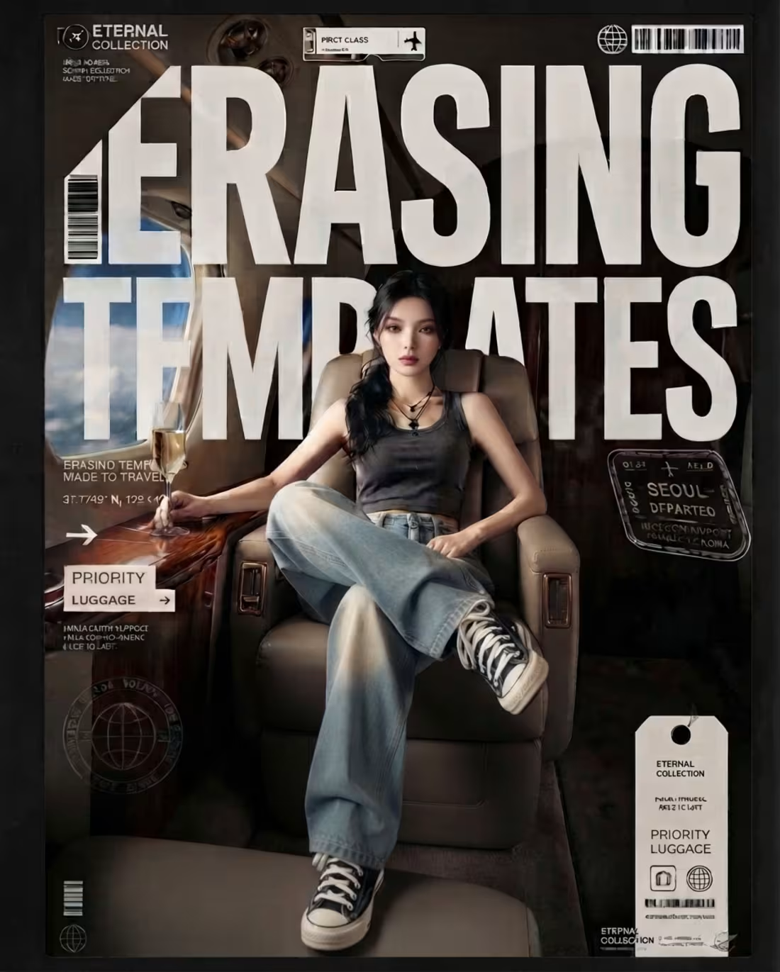
Lately, I’ve been spending a lot more time thinking about typography not just as something you place on a design, but as something that shapes the entire visual language.
These pieces are all AI-generated, but the part I’ve been intentionally exploring is what happens after the image: how typography can interact with scale, perspective, composition, movement, and the subject itself.
From oversized type becoming part of the image, to hand-drawn lettering carrying the energy of an illustration, to bold editorial type creating structure around a photograph. I’ve been experimenting with different ways for type and imagery to feel like one composition rather than two separate elements.
The goal isn’t simply to make AI images look good.
It’s to use AI as a visual tool while pushing the art direction, typography, hierarchy, and composition further.
Still experimenting. Still learning. And honestly, typography is becoming one of my favorite parts of the process.
Which of these approaches do you think works best, and is there one where the typography made you stop and look twice?
1
227
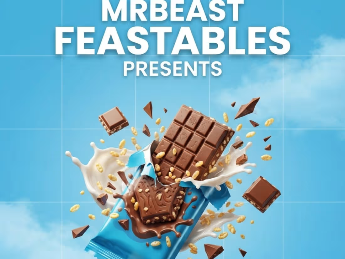
I use prompt engineering and graphic design together to turn concepts into polished visual content, from product advertisements and campaign concepts to food & beverage creatives, social media ads, and branded visuals
0
192