Lately, I’ve been spending a

Ammarah Azyal


Lately, I’ve been spending a lot more time thinking about typography not just as something you place on a design, but as something that shapes the entire visual language.
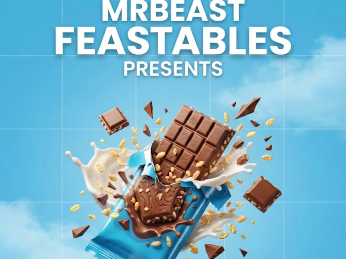
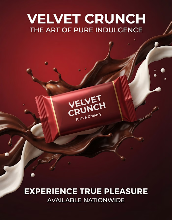
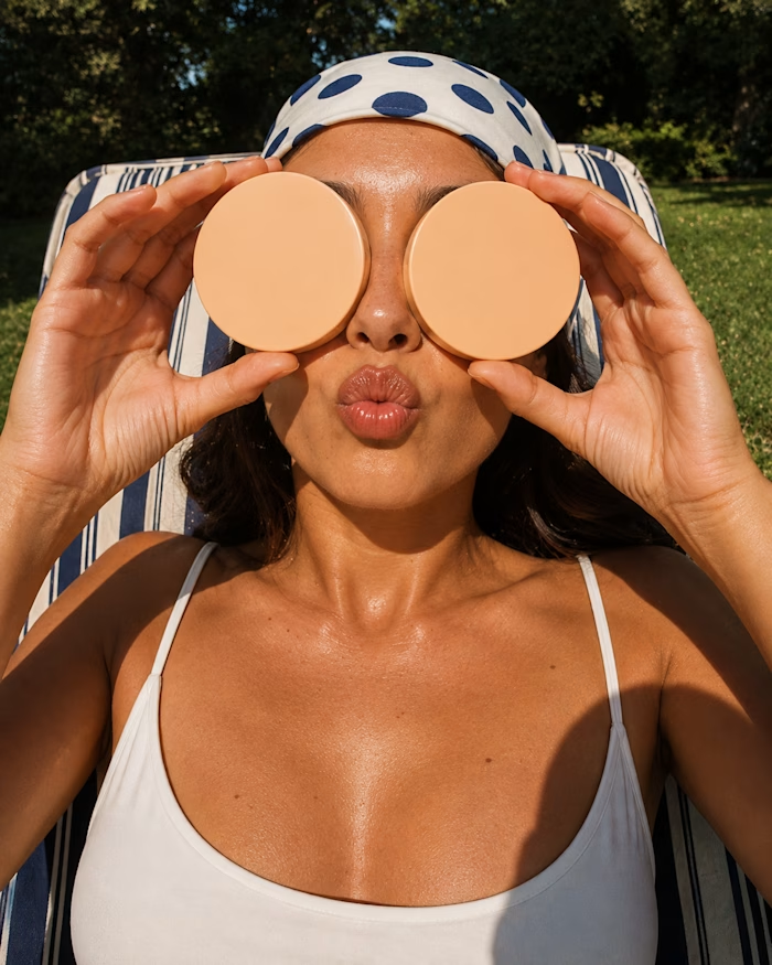
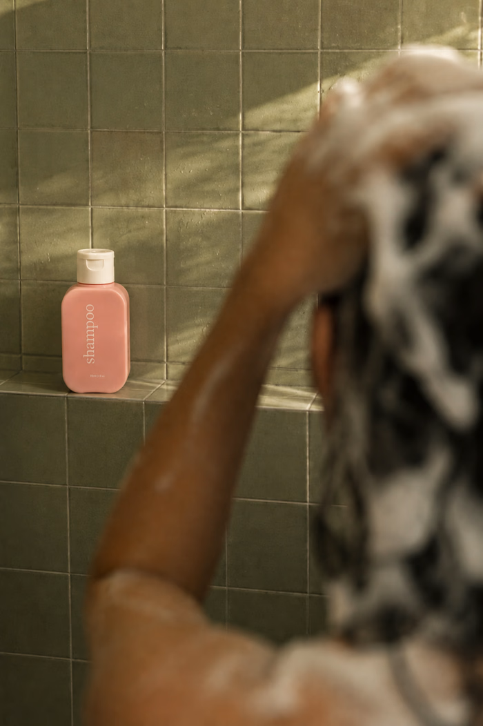
These pieces are all AI-generated, but the part I’ve been intentionally exploring is what happens after the image: how typography can interact with scale, perspective, composition, movement, and the subject itself.
From oversized type becoming part of the image, to hand-drawn lettering carrying the energy of an illustration, to bold editorial type creating structure around a photograph. I’ve been experimenting with different ways for type and imagery to feel like one composition rather than two separate elements.
The goal isn’t simply to make AI images look good.
It’s to use AI as a visual tool while pushing the art direction, typography, hierarchy, and composition further.
Still experimenting. Still learning. And honestly, typography is becoming one of my favorite parts of the process.
Which of these approaches do you think works best, and is there one where the typography made you stop and look twice?
Like this project
Posted Aug 17, 2026
Lately, I’ve been spending a lot more time thinking about typography not just as something you place on a design, but as something that shapes the entire vis...