Alex Tatu
I design and ship products leveraging AI orchestration.


Signal Room · Andromeda
An audio console built on Andromeda, a design system I've been developing around technical readouts and monospace detailing. The waveform sits next to the live telemetry so the numbers and the sound read as one instrument, not two panels.
Most of the work went into restraint: one accent colour, corner brackets instead of borders, and typography doing the hierarchy. Dark by default because that is how people actually listen.
Part of the Andromeda system on aicanvas.me (http://aicanvas.me).
1
118
Resource Planning Dashboard • Andromeda Design System
A responsive resource planning dashboard designed for monitoring capacity, allocations, usage, workloads, and requests.
The interface was built using the Andromeda Design System, with reusable components, design tokens, and predefined rules that make the product consistent and scalable.
0
92
Mission Control is one of the templates from Andromeda, an AI-native design system built for designers, developers, and AI.
✨ Responsive
⚛️ React-ready
🎨 Built on reusable components and design tokens
🧠 Powered by the Andromeda Brain
3
3
363
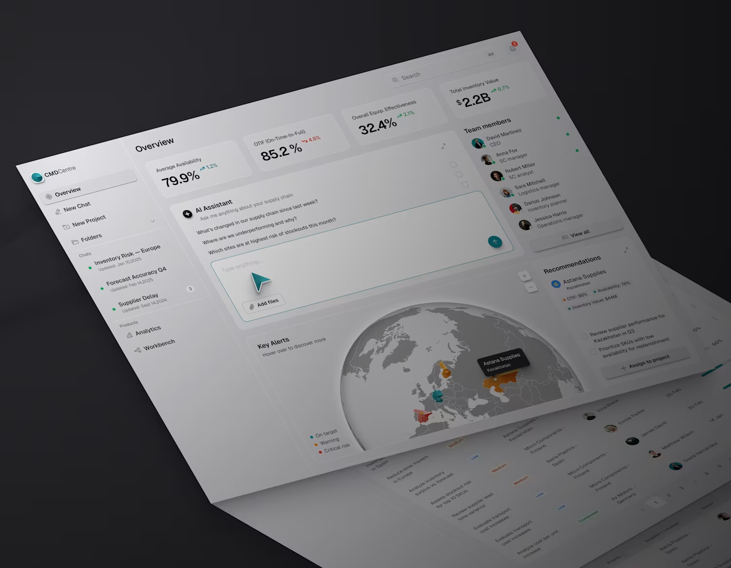
Data-heavy dashboard.
Design systems are evolving.
This is a data-heavy dashboard built with Andromeda, an AI-native design system designed for designers, developers, and AI working from the same foundation.
✅ Responsive
✅ Code-ready
✅ Built for AI-assisted workflows
1
104