
pro
Alex Robertson
Award-Winning Logo & Visual Identity Designer
New to Contra
Alex is ready for their next project!

Logo design for a Polo academy pivoting from B2B sports data to a B2C digital education platform.
Client loved it, 95% complete, but an internal misalignment meant it never launched.
Which do you think they chose before they pulled the plug?


1 vote
Ends in 1d
Sup, Contra. I'm new to this platform 👋🏻
Brand designer, based in London, UK 🇬🇧
How's everybody doing?


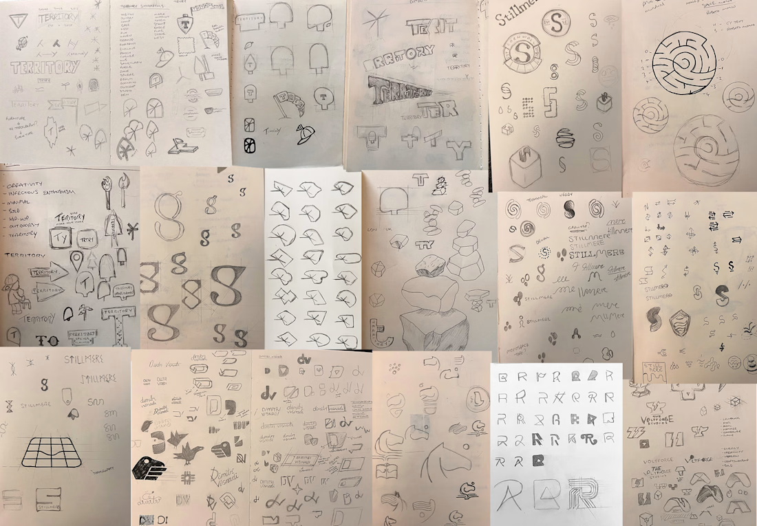
Speaking to my fellow designers here...
Let’s normalise showing our sketches without the apology.
No one is thinking your sketches are crap.
They're sketches.
Anyway, here's some crap from my sketchbooks.
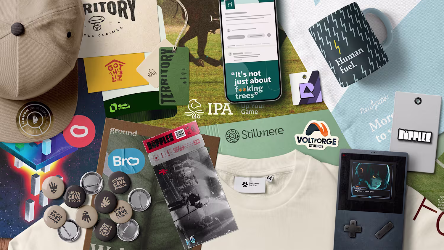
One of my favourite recent logo design projects.
I proposed renaming this workspace in London from its generic street address to "Ground".
A play on words with a dual meaning.
In a professional sense, it reflects workplace language such as “let’s touch ground".
In a more...