Alex Mileva
I help lifestyle, beauty brands build clear visual systems
Ready for work
Alex is ready for their next project!
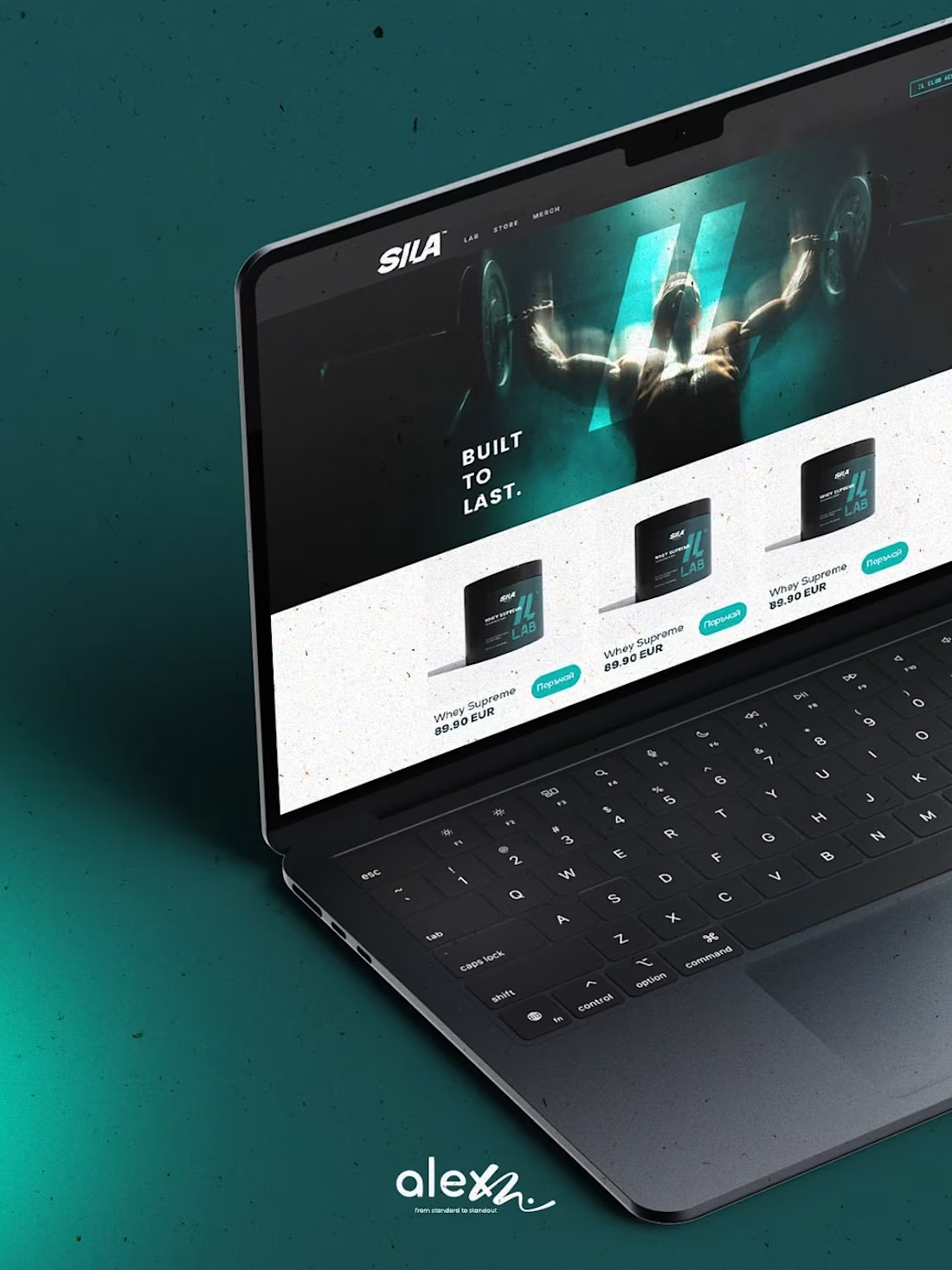
What if Bulgaria’s largest supplement retailer stopped acting like a middleman and started acting like a leader?
SILA BG has 13,000+ products and thousands of loyal customers. But until now, they’ve had almost no brand.
I tried to reimagine their identity for 2026. My goal was to shift from a "cheap shop" aesthetic to a "Performance Authority."
If you want to win the market, DM me or book a meeting at www.alexm.life
(http://www.alexm.life)⚠️ Disclaimer: This project is a personal concept and a strategic branding exercise. It is not an official commission by SILA BG. I do not have access to their internal market data or proprietary information; all insights are based on independent observation and strategic analysis of the 2026 retail landscape.
2
2
70
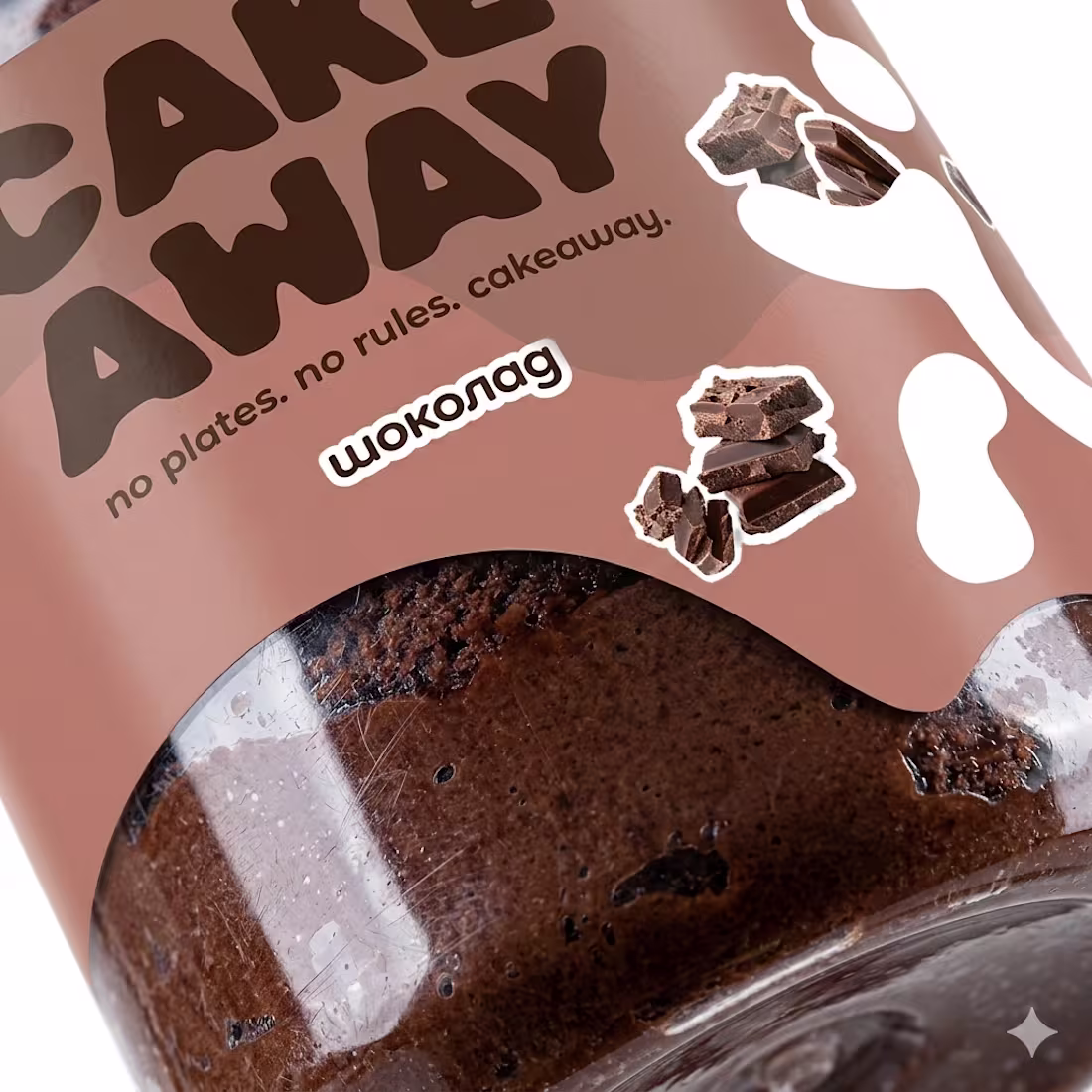
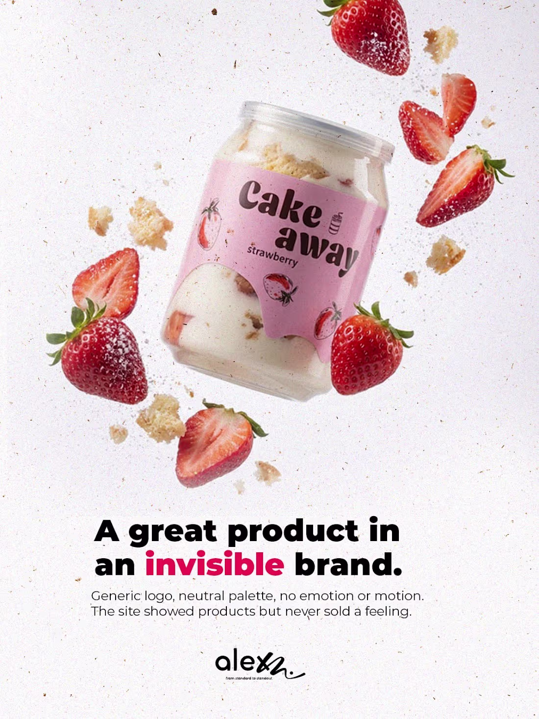
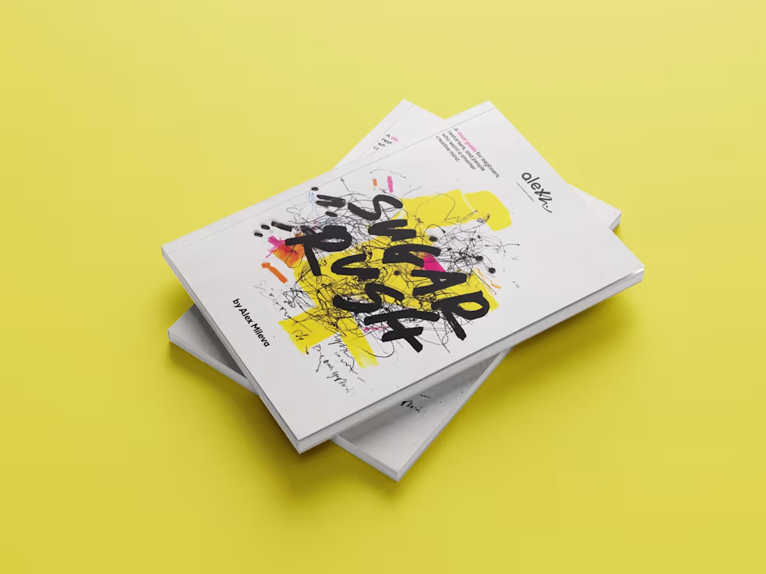
Cakeaway - Brand & Digital Rebrand
From invisible product to lifestyle movement
Cakeaway had something genuinely rare - fresh cake in a jar, no preservatives, 40-day shelf life, already distributed in Sofia Ring Mall, Mangi Piangi and through an in-house Cake ATM (the first of its kind in Bulgaria). The product was real. The brand wasn't.
When I first audited the site, the numbers told the story: 711 sessions per week, 0% returning customers, 7 abandoned carts weekly, zero email list, and social channels driving traffic that converted to nothing. A great product, trapped in an invisible brand.
The brief was clear: transform Cakeaway from a product into a lifestyle movement.
2
47
moved faster.
We redesigned the brand. We rebuilt the website and made it easier to choose, order, and enjoy on the go.
No plates. No waiting. No compromise.
If you live in motion, this is for you.
Visit the new website. - www.cake-away.eu (http://www.cake-away.eu)
Pick your flavor.
Order your cake. Life moves. Eat accordingly and share your thoughts :)
1
47
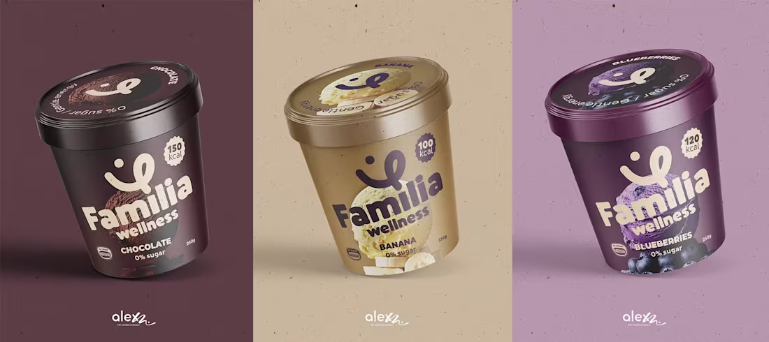
I've reimagined the Familia Wellness brand to bridge the gap between peak performance and everyday family joy. The new matte, minimalist aesthetic transforms ice cream into a post-workout recovery staple that looks as good as it feels. This design celebrates the "real" side of fitness unfiltered, joyful, and shared with the people who matter most. DM or book a meeting at alexm.life (https://alexm.life)
2
3
81
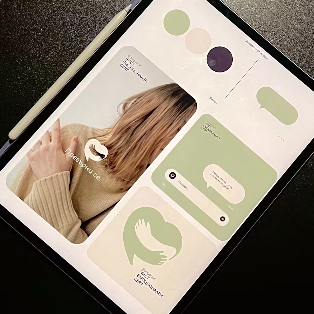
60% of people who need emotional support don't seek it. Help exists, but the visual language makes it feel institutional.
I designed for a client launching a mental health foundation that solves this at a behavioral level:
Sage palettes that calm instead of clinical blue that distances.
Organic shapes that invite instead of rigid geometry that intimidates.
Typography that signals conversation instead of clinic.
Every decision tested against one question: Does this remove barriers to vulnerability?
Introducing Фондация Чист Емоционален Свят, where behavioral research drives design, and design builds trust.
If your brand operates in health, education, or social impact and your visuals create distance when they should create connection - let's change that.
DM me or book a meeting at www.alexm.life (http://www.alexm.life)
30
182
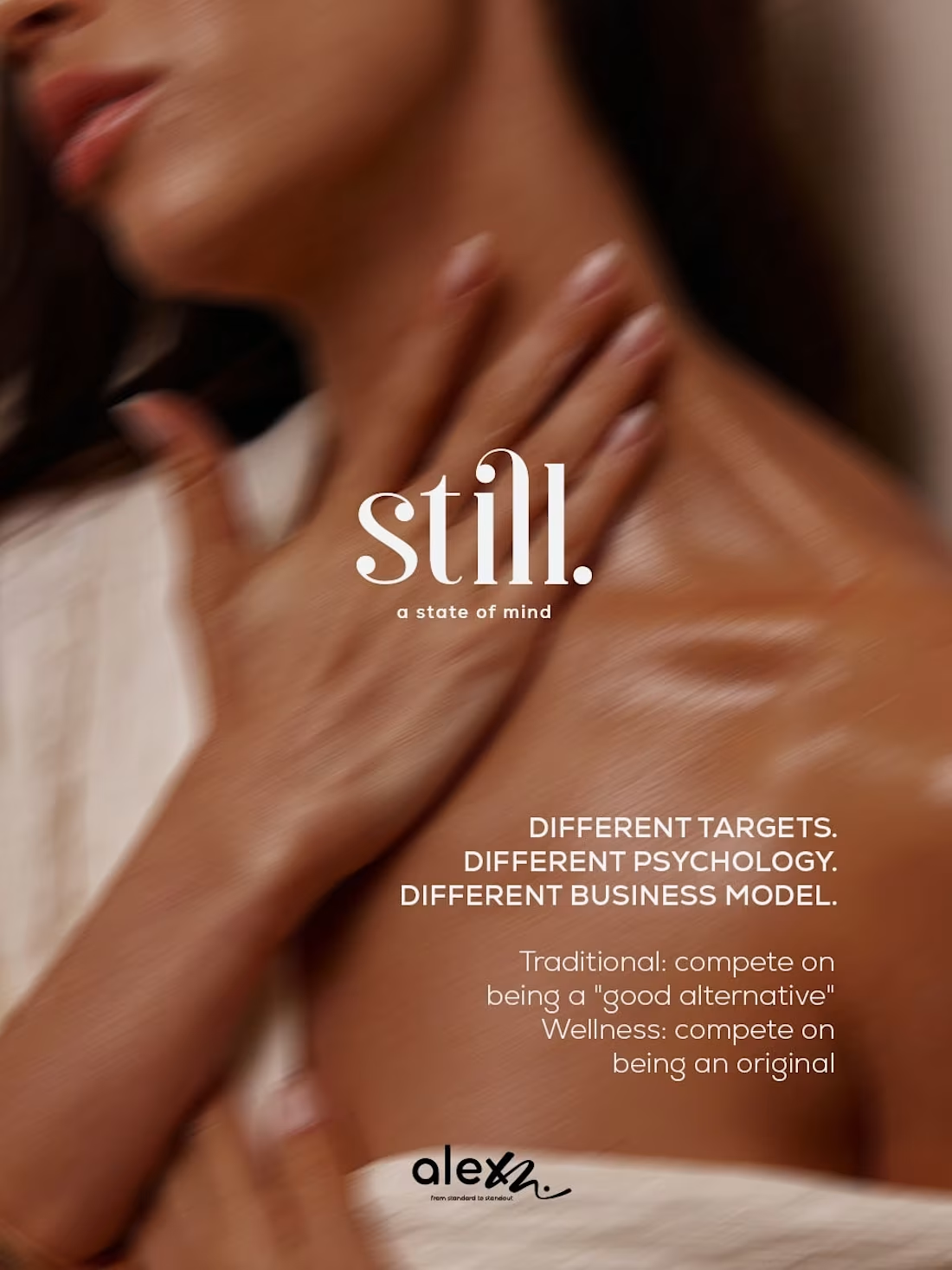
Bulgarian fragrance brands are stuck copying luxury.
Meanwhile, an entire category sits empty: Wellness.
I created the concept brand still. to show what's possible when we stop imitating French perfume and start building around what Bulgaria actually has - natural ingredients, and the ability to create honest products.
Old approach: Gold accents, heavy bottles, ornate typography, trying to look expensive
Wellness approach: Frosted glass, minimal design, skincare language designed to feel honest
Same manufacturing capability. Different positioning. Different price point. Different future.
Want to build a brand that owns a category instead of chasing one?
Let's talk - DM me or book a meeting at www.alexm.life (http://www.alexm.life)
3
24
160
This redesign concept answers two uncomfortable questions Bulgarian FMCG brands must face:
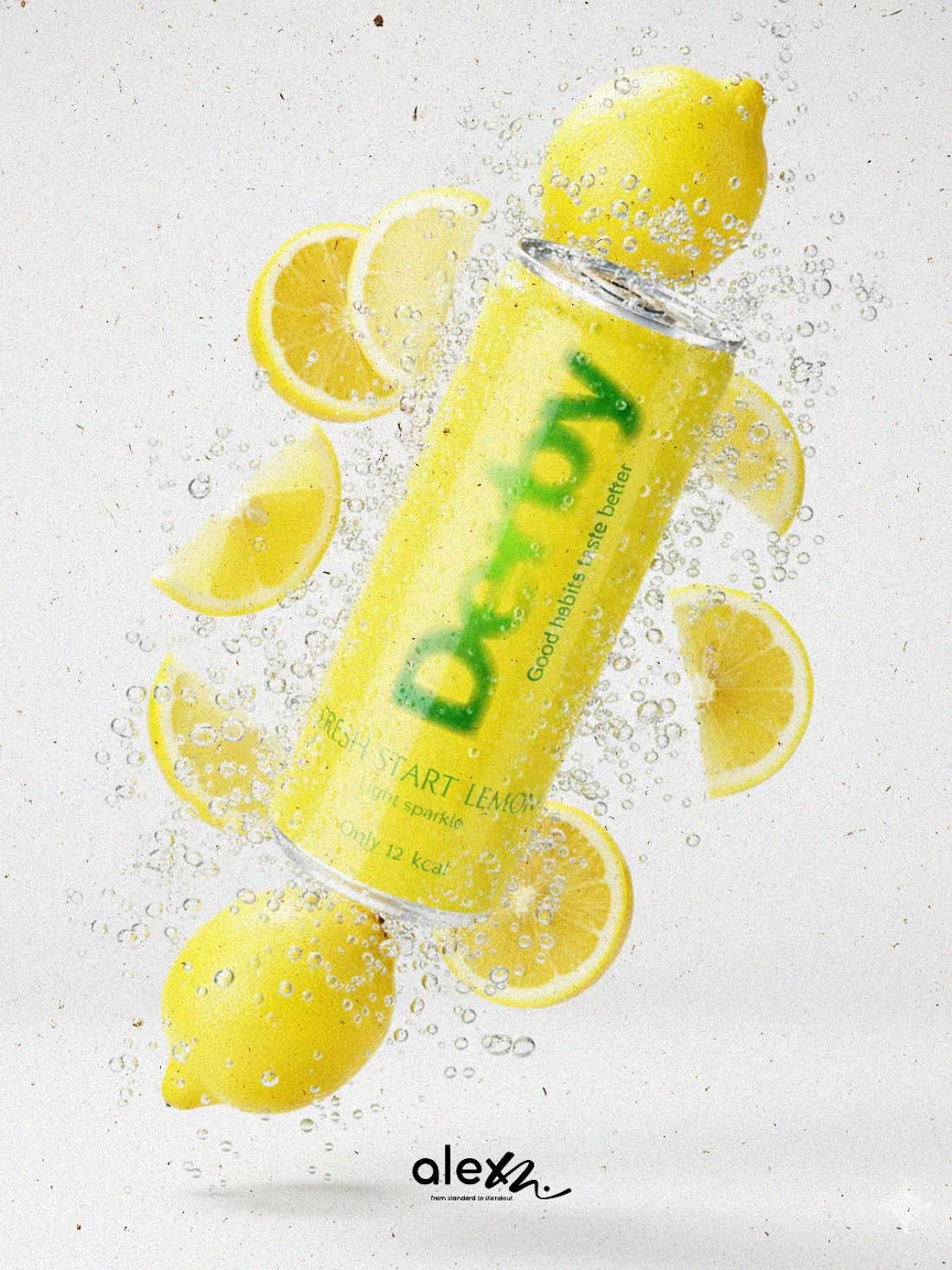
Why are we still selling sugar-heavy drinks in plastic?
And why does our packaging still scream instead of explain?
I moved Derby from plastic to cans because health repositioning starts with the format. Cans: – Signal moderation (portion control) – Cool faster, feel lighter, travel better – Are already mentally coded as “edited”, not excessive – Reduce plastic dependency without preaching sustainability
My mission is to help Bulgarian brands switch to healthier formulas, design smarter packaging systems and win back trust on shelf.
Health is the next competitive advantage for mass brands!
DM or visit alexm.life (http://alexm.life) and book a call :)
2
22
153
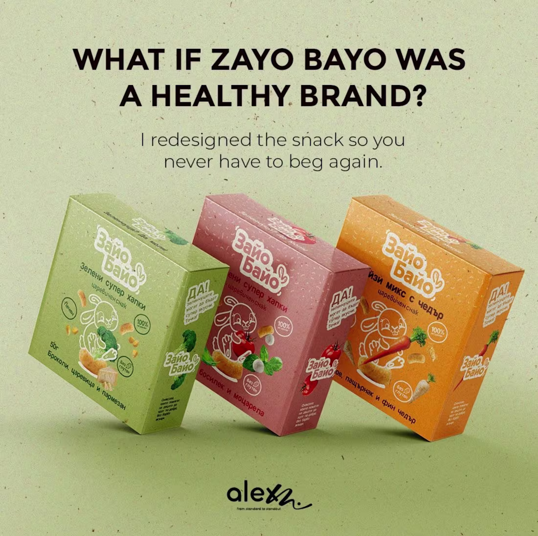
I redesigned Zayo Bayo (Bulgarian snack) because I fundamentally rejected the notion that the best-tasting, most-desired snacks for children must be the unhealthy ones.
The mission was to reverse the decades-long compromise parents have been forced to make: choosing between health and happiness.
The visual and material change moving from a cheap, noisy bag to a premium, colorful box.
I designed Zayo Bayo to be the primary, desired treat. The fun, playful animation and the clean, natural color palette make the healthy choice the exciting choice. I want to shift the market position so that the snack that powers their playtime, the wholesome option, is the one they crave, without any begging required.
Zayo Bayo now screams "Reward," not "Processed".
100% Wholesome, 100% Desired. Eat! Play! Win!
4
20
153
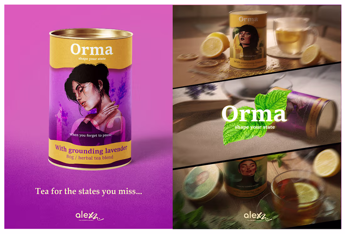
We live in constant noise. Orma is the antidote - a return to yourself.
The premium tea category is saturated with minimalism - white boxes, delicate leaves, and predictable serif fonts. While elegant, this "sea of sameness" creates a visual blur for the consumer. The Brief: Create a visual identity for Orma that actively competes for attention. The goal was to shift the focus from ingredients (what is inside) to outcome (how you feel).
Orma is a visual interruption.
The design system turns the physical package into a behavioral cue, ensuring that the product is seen, felt, and remembered.
1
17
148
I love experimenting with new tools, so I mixed a bit of everything here - AI voice, AI shots, a few After Effects tricks and built a quick reel for a Bulgarian snack concept.
It’s not perfect, but that’s the point.
Creative momentum > waiting for flawless.
Every test teaches me something new I can use in real client work.
16
161
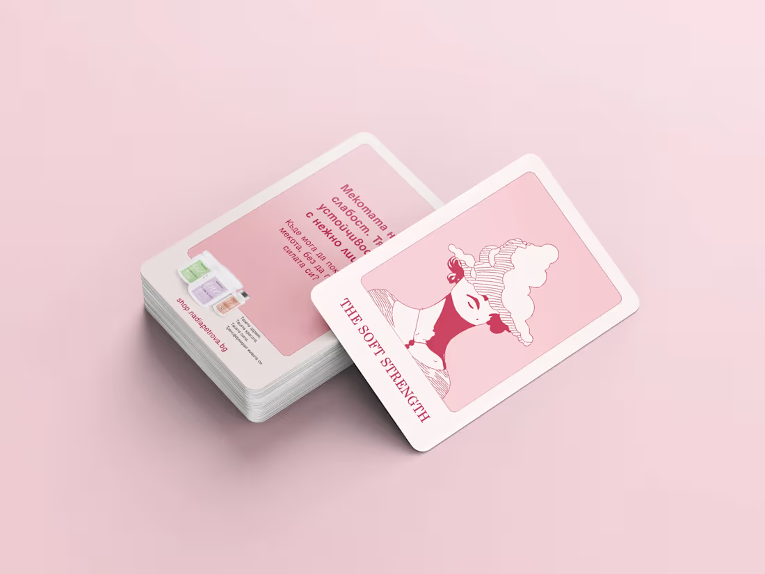
This campaign was designed by Nadia Petrova to create a deeper emotional bond between brand and customer by transforming every order into a small, meaningful ritual.
We developed a limited-edition deck of 21 cards, each inspired by the symbolism and aesthetics of Tarot, carrying unique affirmations and empowering messages for women.
The project combines graphic storytelling, symbolism, and gamification to drive repeat purchases, build community, and turn packaging inserts into a powerful brand experience
3
20
170
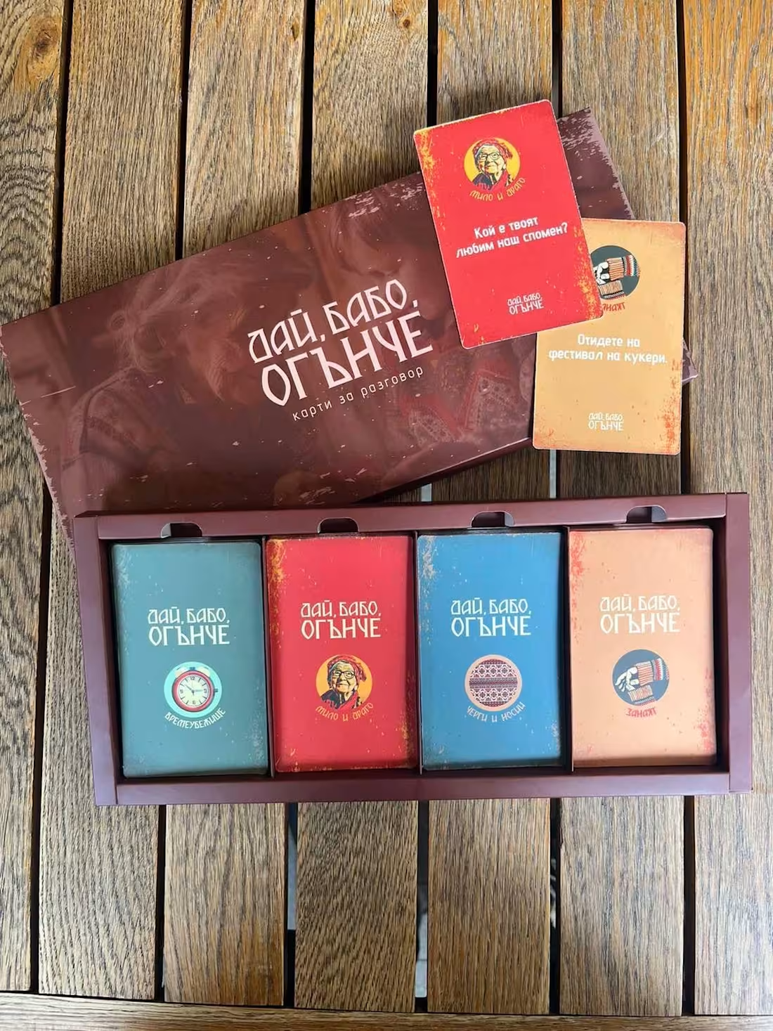
Teenovator invited me to help a wonderful Bulgarian group of students turn their idea into a real product.
I designed the conversation cards “Дай, бабо, огънче” and I think they turned out beautiful 🥹
A simple deck that sparks stories between generations.
Because sometimes, the most valuable wisdom is sitting right next to us, waiting to be asked.
Let’s find more time to talk to our grandparents. ❤️
3
62
I needed a website to finally have a home for everything I create.
So I opened Webflow, learned it from scratch, broke things, fixed things, and somehow built it.
It’s not perfect, but it’s my little hub where I can share my work, my process, and my world.
Bulgarian creatives deserve better education, not another “here’s how to use the Pen Tool” tutorial.
Real skills we can actually use so I wrote and design a handbook for Bulgarian creatives.
A small start. A practical guide. Something I wish I had when I began.
If you want to see what I’m building next, everything lives here now: www.alexm.life (http://alexm.life)
28
46
254
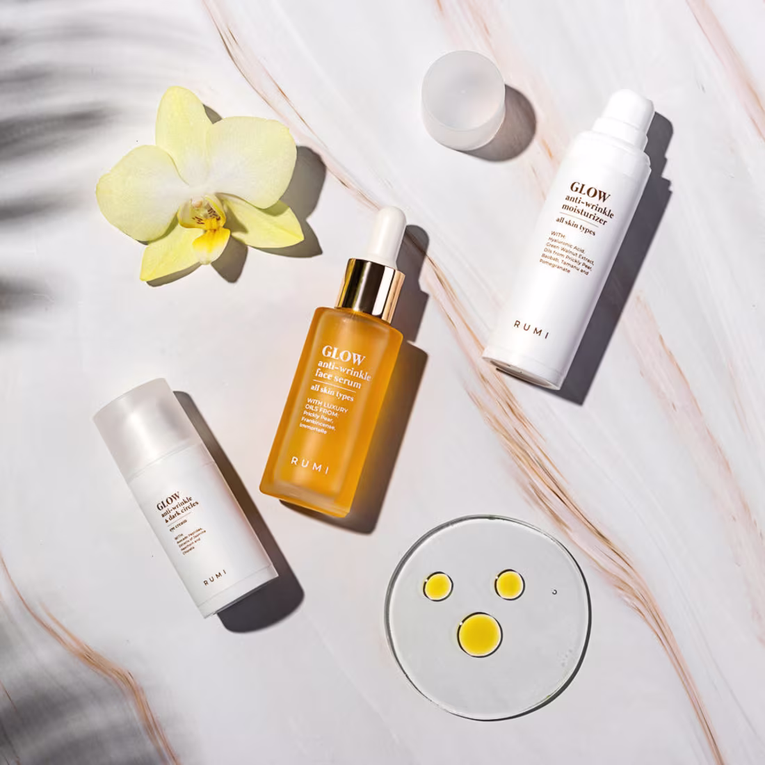
From “me too” to meaningful.
The previous packaging had a non-consistent, “everyone else” look bright, crowded, and disconnected from the product’s natural essence.
My direction focused on raw simplicity and honest materials.
We moved to uncoated paper stock, no artificial white carton, letting the natural texture communicate what words often over-explain: purity, care, and origin.
What do you think?
If you’re looking for thoughtful brand consultation or design that drives results - contact me. 😊 https://www.alexm.life/
2
3
66
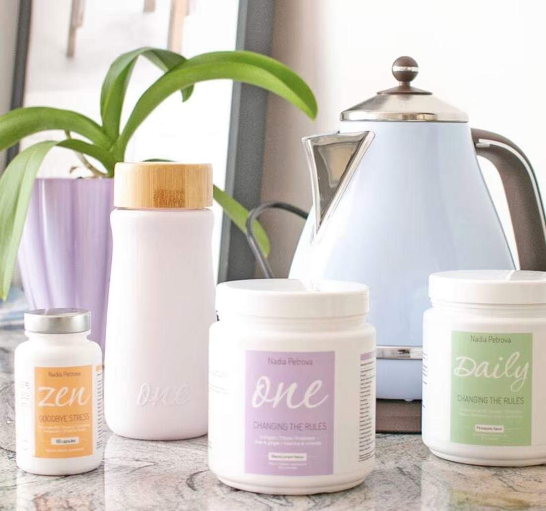
The goal was to create a calm, minimal supplement identity that reflects Nadia Petrova’s philosophy of simple, daily wellness. I built a clean white packaging system supported by soft pastel colors for quick recognition and a handwritten product name to add warmth and trust. The result is a gentle, modern design that turns supplements into a soothing self-care ritual and works as a cohesive system across all SKUs.
1
60
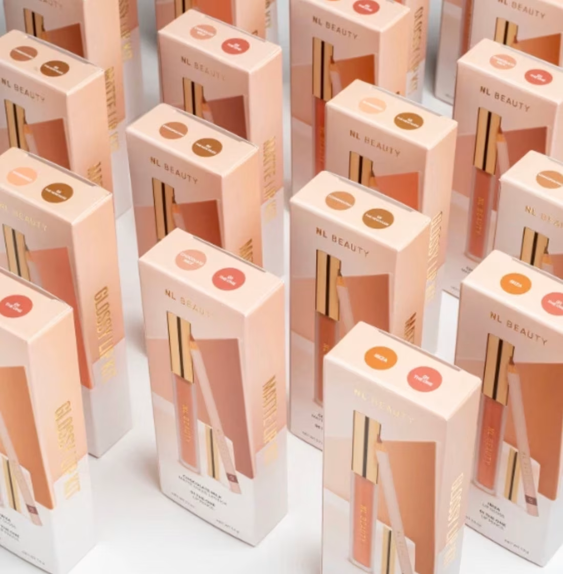
Design premium lip kit packaging for NL Beauty's exclusive edition - targeting sophisticated consumers seeking luxury beauty experiences
Design strategy: Luxury positioning: Museum-quality packaging that elevates the unboxing ritual into a premium experience
Tactile excellence: Premium materials and finishes that communicate quality before the product is even opened
Market Differentiation: While competitors focus on trendy packaging, we've created timeless luxury that customers will want to keep and display. The kit transforms from product packaging to decorative object.
A luxury lifestyle accessory that positions NL Beauty in the premium beauty market alongside Chanel and Tom Ford.
Result: A design system that transforms routine beauty purchases into coveted luxury experiences.
22
183
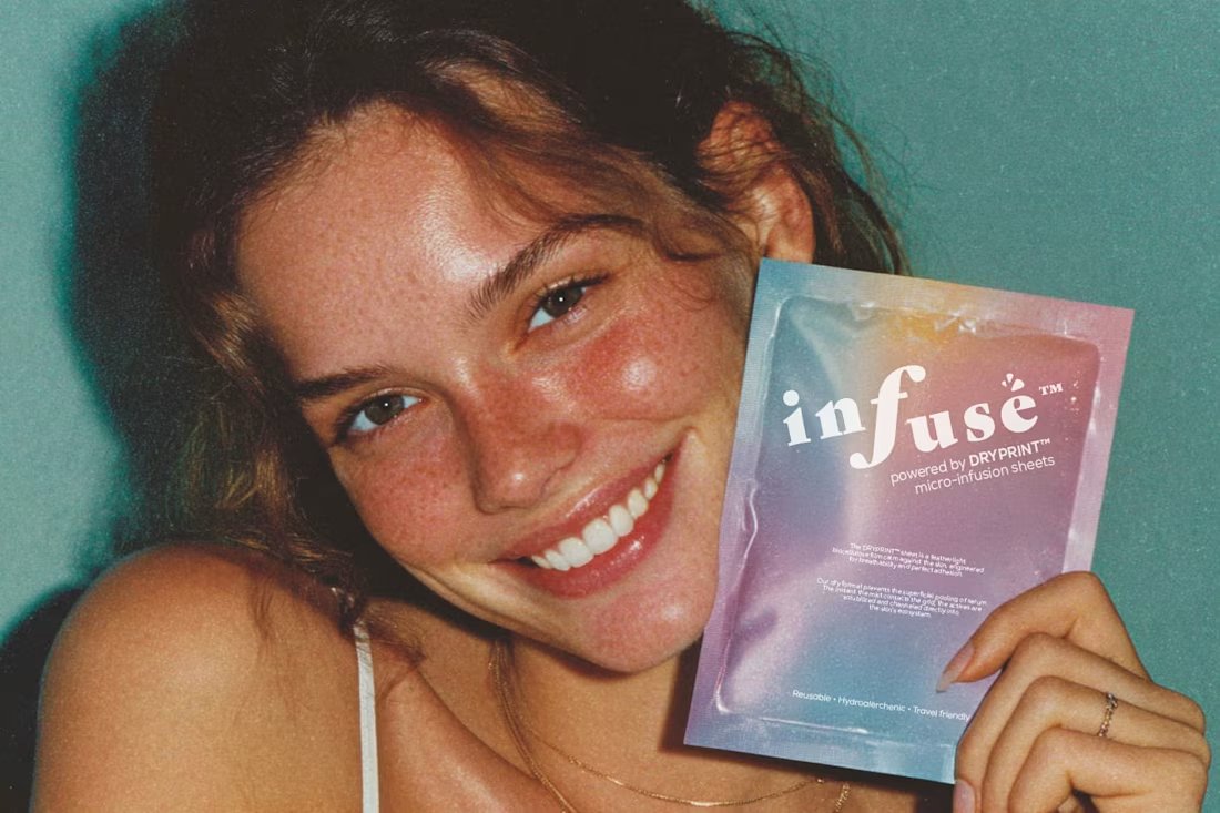
According to Mintel and Euromonitor, over 68% of Gen Z and millennial consumers now look for products that “adapt to their changing skin.”
However, less than 5% of brands address skin variation driven by hormonal or cyclical changes despite this being one of the most scientifically measurable variables in skin health.
That’s the gap INFUSÉ™ aims to bridge merging precision dermatology with cycle-awareness and sensorial design.
15
153
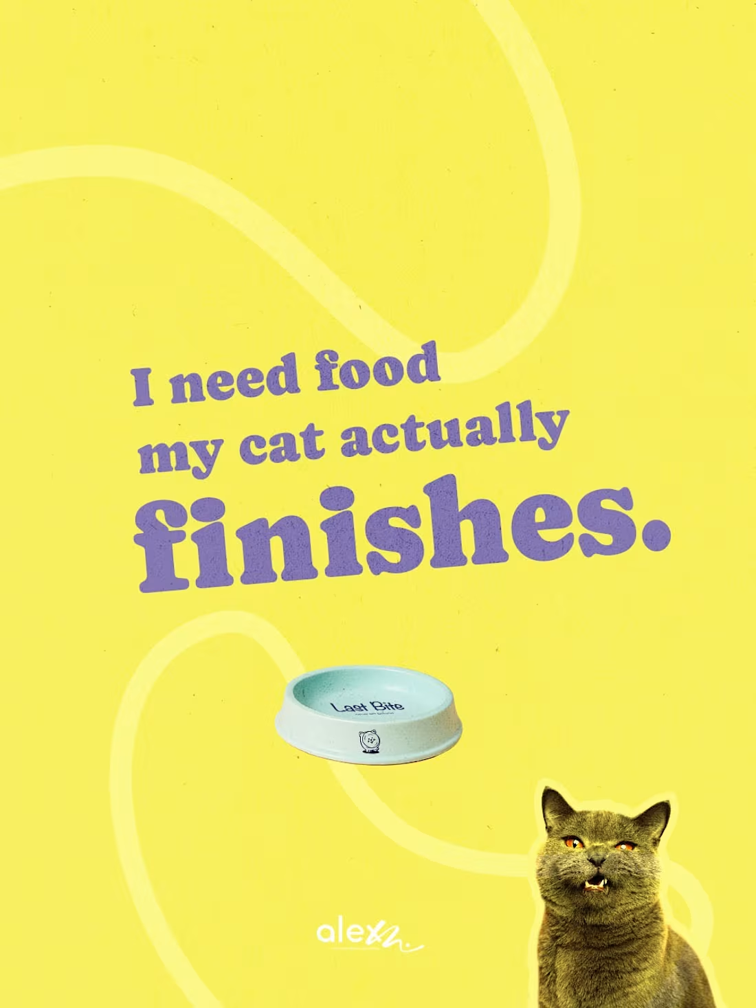
The best ideas come from small frustrations. For me, it was my cat Tommy who never finishes his food. That “last bite” always ends up wasted. So I turned that pain point into a packaging concept. Last Bite is a cat food brand designed around behavior, not marketing fluff. Because great packaging solves real problems.
Moist texture cats actually finish.
Zero waste in the bowl.
Playful, smart design that makes people smile.
Contact me if you’re building a brand that deserves to stand out with creative branding and packaging.
I’d love to help bring it to life :)
#branding #packagingdesign #fmcg #catfood
18
148
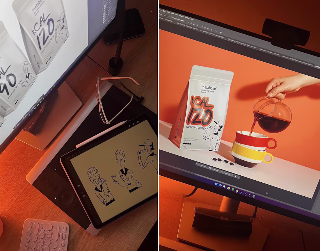
Every project takes a different kind of focus and I’ve always felt that creativity has its own metabolism.
Every idea, every sketch, every decision costs energy.
That became the insight behind metabolic™, a conceptual coffee brand built around the real math of being human. I experimented with the idea that energy can be designed, measured, and seen.
Each roast, color, and kcal level reflects how we actually spend focus.
A reminder that focus isn’t free - it’s fuel :)
2
14
150