
Alex Donahue
Graphic designer creating clear, purposeful brand identities
New to Contra
Alex is ready for their next project!

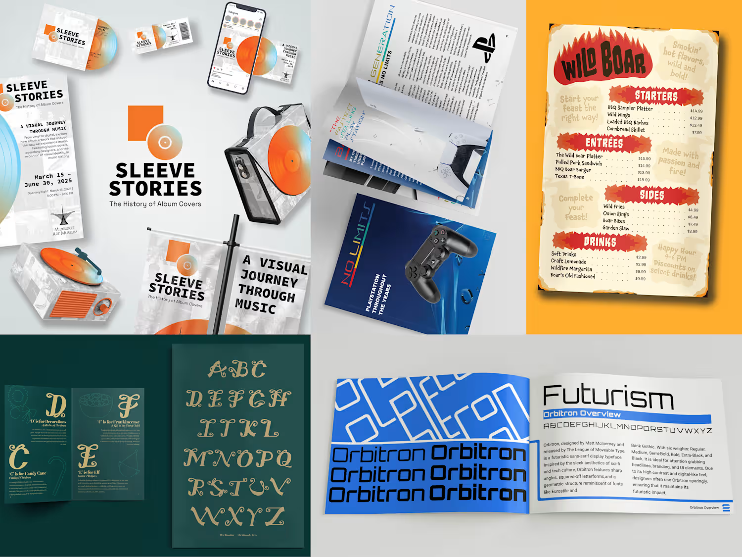
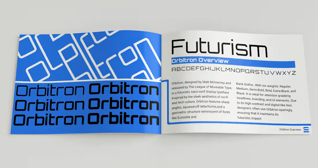
Neotype is a type specimen book pairing Orbitron and Roboto, two faces that read as opposites. Orbitron is rigid and geometric, built for headlines and branding. Roboto is humanist and meant to disappear into body copy. Rather than using the usual display-plus-safe-body pairing, the book sets out to show that these opposites can coexist.
The layout system is built on circuit-board geometry instead of a neutral grid. That gives Orbitron's mechanical character a structural role in the page design rather than a purely decorative one, while Roboto carries the explanatory text without competing for attention.
1
2
33
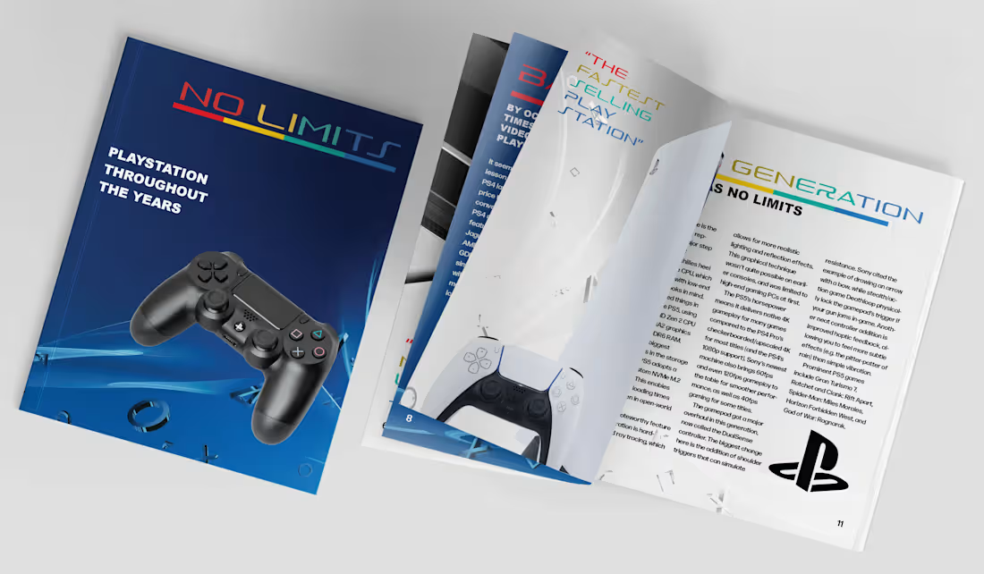
No Limits is a 12-page brochure tracing PlayStation's console history. The brief called for tying typography, image, structure, and pacing around one theme. The five console generations give the book a built-in pacing structure, and each one has its own visual identity to work with.
The layout draws on tech catalogs and product manuals rather than typical editorial spreads. A modular type hierarchy handles dense, spec-style copy without clutter. Full-bleed photography lets each generation feel distinct while sharing the same underlying grid.
1
14
MuralWalk is a self-directed mobile app concept. Public art is usually stumbled upon, if it's noticed at all, and people walking a neighborhood have no easy way to find nearby pieces or learn who made them and what they mean. MuralWalk makes that discovery deliberate, much like using a map app to plan a trip.
The core loop runs from map to detail to route. You tap a pin to learn about a piece and its artist, save the ones you like, and string saved pieces into a walkable route with turn-by-turn guidance. The project covers information architecture (how murals, artists, and multi-stop routes connect), interaction design (a draggable bottom sheet and a variable-driven map state), and a lightweight brand system built for an app rather than print.
0
26
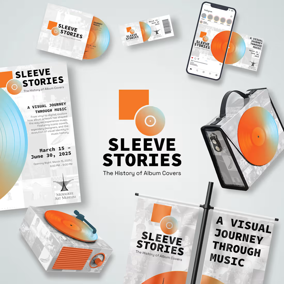
Sleeve Stories is an identity system for a conceptual museum exhibit on the evolution of album cover art. The brief was to appeal to longtime vinyl collectors and streaming-native audiences at the same time, bridging the vinyl, CD, and streaming eras under one visual voice.
The logo pairs a circle (the record) with a bold square (the sleeve). A low-opacity grid of iconic album covers runs behind every piece, tying today's cover art back to decades of design history. Orange and blue gradients bring warmth, and clean black type keeps the system current rather than purely nostalgic. The system carries across a poster, an Instagram carousel, and a 3D object.
1
29