Akya Vey
The problem isn't your product. It's your message.
- 1
- Followers

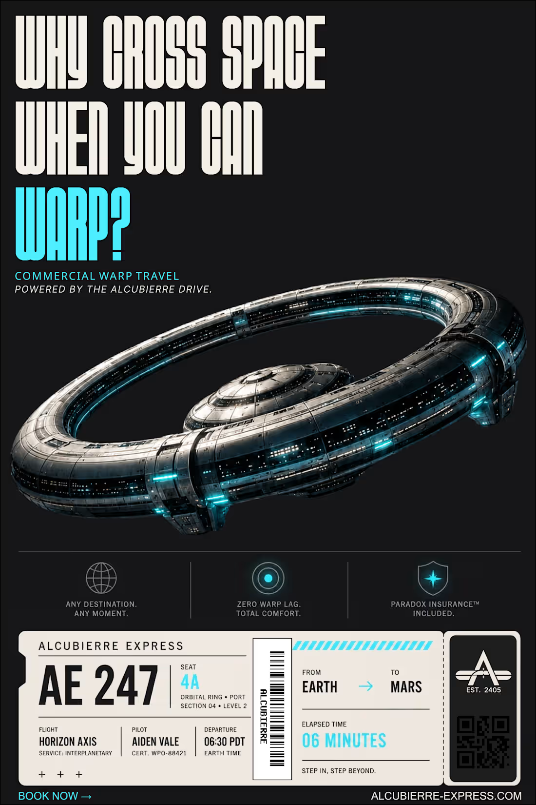
THE ALCUBIERRE EXPRESS: Making Spacetime Commutes Mundane
When you ask Al to imagine a warp-drive airline, it almost always reaches for the same visual language – neon lights, holograms and dystopian sci-fi.
But revolutionary technology doesn't stay extraordinary forever.
Eventually, it becomes infrastructure.
For the @Envato #EnvatoChallenge, I built Alcubierre Express – a fictional commercial airline based on the theoretical Alcubierre warp drive. The goal wasn't to make space travel feel futuristic. It was to make it feel routine.
THE HUMAN BY DESIGN MOMENT:
Early generations looked visually impressive, but they didn't feel believable.
Instead of pushing further into sci-fi, I went in the opposite direction.
I borrowed visual language people already associate with commercial aviation – clean corporate layouts, restrained typography, safety cards, boarding passes, airport signage, and travel advertising inspired by NASA's Visions of the Future poster series.
WORKFLOW:
Using Envato's creative tools, I built an entire brand system rather than individual images.
• Generated custom visual assets with Al
• Combined them with Envato stock
• Built a consistent visual identity through typography, colour, copywriting and layout
• Designed every asset around a real-world context instead of treating it as a standalone graphic
DELIVERABLES:
• Brand identity
• Airport advertising campaign
• Boarding pass
• Employee profile
• Passenger safety card
• Booking website
• Ad commercial
• Behind-the-scenes process video
LinkedIn post: https://www.linkedin.com/posts/akya-vey_envatochallenge-share-7487353754216767488-Dkur/?utm_source=share&utm_medium=member_android&rcm=ACoAAGq7neQBTPrj_o4TBbgdyDNkzPBWGRSbkx4
3
2
401
I almost didn't submit anything for this challenge.
Not because I couldn't build.
Because I couldn't find a business that felt right.
For the first two days, I researched businesses across different niches and even built base templates for five different companies.
Technically, I could've submitted any of them.
But none of them felt like they had a story worth telling.
I could've picked any business and built a decent website. But that wouldn't have satisfied my creativity - especially when we were given such an incredible opportunity with this challenge.
Then I found Tour My Choice.
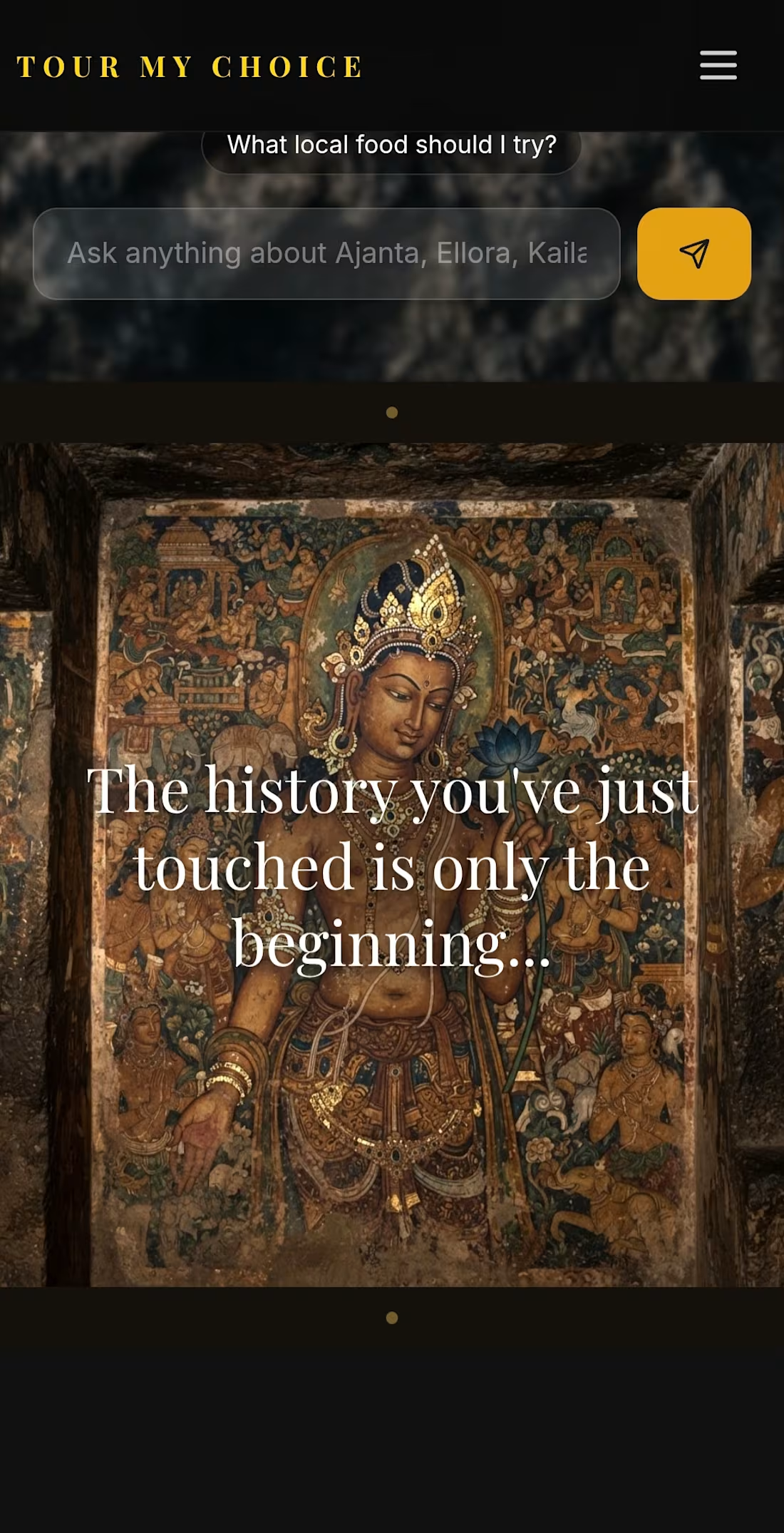
A local tour operator introducing travelers to the timeless heritage of Ajanta, Ellora, Hampi, and beyond.
Everything clicked.
But when I looked at their online presence, I felt there was a disconnect.
Their website was filled with long blocks of text, inconsistent presentation, and very little that reflected the premium, immersive journeys they actually offer. India's incredible heritage deserves more than paragraphs of information – it deserves an experience that sparks curiosity from the very first scroll.
From that moment, this stopped being a website redesign.
It became an attempt to make people feel the journey before they ever booked one.
Over the next 30+ hours, I obsessed over every detail – from typography, layouts, animations, imagery, and storytelling to refining tiny interactions that most people may never consciously notice, but all contribute to the overall experience.
Here's what I built:
•An immersive homepage designed to spark curiosity from the very first scroll.
• Ask the Stones – an Al heritage guide that answers questions about Ajanta, Ellora, Hampi, hidden stories, local culture, and more.
• A personalized Al journey planner that recommends the best tour based on each traveler's preferences.
• Comprehensive database covering detailed itineraries, inclusions, and pricing for all eight core tour packages.
• Enterprise-style booking automation that first saves every enquiry to the business's internal database before generating a perfectly pre-filled WhatsApp message containing the traveler's recommended itinerary, group size, preferences, add-ons, and package details-ensuring no lead is ever lost.
• Beyond redesigning the experience, I wanted to solve a real operational problem. Every enquiry is now captured internally before the customer is redirected to WhatsApp, giving the business a reliable lead record even if the conversation is never completed.
• A dynamic INR (₹) and USD ($) currency switch for international travelers.
• A history quiz for travelers who want to dive deeper into India's past.
• Curated tour packages, authentic reviews, and a premium booking experience.
• Every WhatsApp button, social link, email address, phone number, and contact point is connected directly to Tour My Choice's official channels – making it a fully functional website, not just a design concept.
• Fully optimized for mobile devices – although I'd still recommend experiencing it on a bigger screen.🥹
I also made a conscious decision not to reinvent the business itself. Every package, itinerary, price, and business detail remains faithful to the original website. The focus was on eliminating repetition, improving clarity, and creating an experience that communicates their value more effectively.
🎥 The video below showcases the complete before-and-after transformation.
00:00-00:09: Original Tour My Choice website.
00:09-01:36: Complete redesigned experience walkthrough.
This challenge reminded me that the hardest part isn't building.
It's finding a story worth building for
A huge thank you to @Base44 and Contra for creating such a fun challenge.
BEFORE:
[https://tourmychoice.in/]
AFTER:
[https://tour-my-choice.base44.app]
I'd genuinely love to know what you think.
Explore both versions, watch the walkthrough, and let me know –
Which experience would make you book the trip?
2
4
269
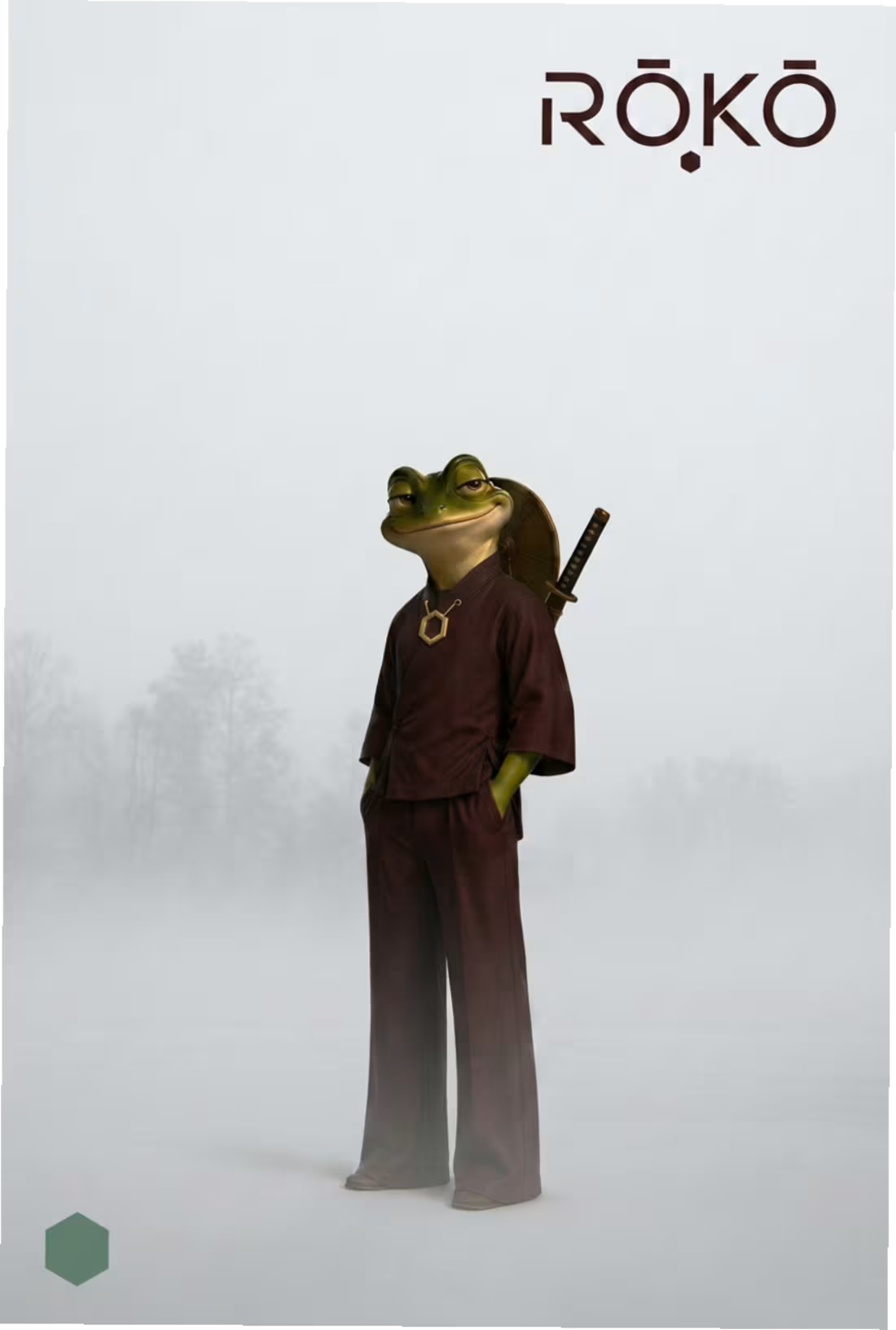
Mascot Name - RŌKŌ
🍃A mascot for a lifestyle brand that values less, but better.
Description: RŌKŌ is more than a character.
• He is a reminder – a small nudge to live with intention, appreciate what we have and leave things better than we found them.
• He chooses intention over excess.
• Calm [His sword has never been unsheathed], observant and quietly amused by unnecessary complexity, he reminds others that enough is already enough.
• IMPOSSIBLY LIKABLE: That smirk has no business being that convincing.
RŌKŌ [THE BRAND]
• RŌKŌ is a lifestyle brand built around deliberate living.
• We create fewer, better objects that encourage clarity, craftsmanship, and everyday rituals.
• We don't chase more. We choose enough.
• The goal isn't to have more. It's to waste less of it.
• OWN LESS, CHOOSE BETTER, KEEP IT LONGER.
Project link - https://www.recraft.ai/project/2e4bee3a-61e7-4133-8f26-140e12c62584
3
4
468