
Aakaash Kr
Designing interfaces that feel simple and trustworthy




ARCHON is an AI-powered architecture platform that turns ideas into spaces.
Describe what you imagine, sketch your thoughts, and explore architecture through AI — from concept and floor plans to 3D forms, facades, and spatial design.
We’re building something new for architects, designers, creators, and anyone who believes great spaces can start with a simple idea.
Something big is taking shape.
Turn notifications on and stay tuned. ◇
Have a project or collaboration in mind?
Let’s build something together. 📐
#ARCHON #AIArchitecture #Architecture #GenerativeDesign #SpatialDesign #ArchitectureAI #DesignTechnology #AIDesign #FutureOfArchitecture
2
15
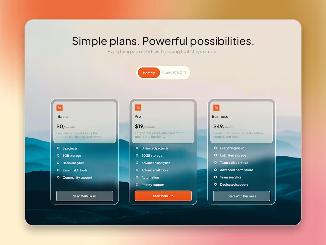
Simple plans. Powerful possibilities. ✦
Designed a pricing section focused on keeping the decision simple — clear hierarchy, minimal cards, soft gradients, and a strong visual focus on the recommended plan.
I wanted the section to feel premium without feeling complicated.
A few details I focused on:
— Clear pricing hierarchy
— Simple 3-tier structure
— Monthly / yearly toggle
— Strong CTA for the recommended plan
— Glassmorphism + atmospheric background
— Enough contrast while keeping the visual softness
Which plan would you choose — Basic, Pro, or Business? 👀
#UIDesign #WebDesign #UIUX #UXDesign #ProductDesign #WebDesigner #UIDesigner #Figma #FigmaDesign #PricingPage #LandingPageDesign #SaaSDesign #DesignInspiration #MinimalDesign #Glassmorphism #Dribbble #DesignCommunity
1
4
After countless iterations, I decided to rebuild Nourish Box from scratch.
Instead of making small improvements, I rethought every screen, interaction, spacing, typography, and visual detail to create a cleaner, more modern experience.
This is the final result of that journey. ✨
Every redesign teaches something new, and this one pushed me to become a better UI/UX designer.
I'd love to hear your thoughts! 💚
1
13
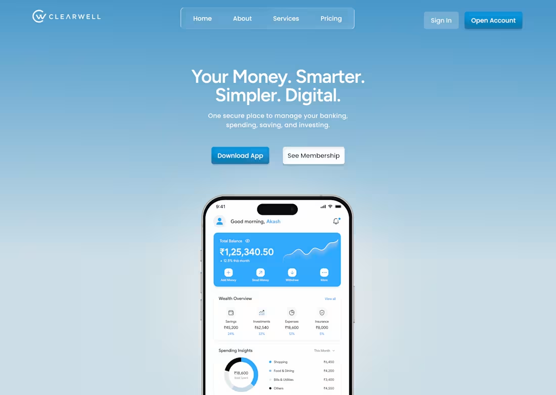
Designed a landing page concept for Clearwell, a digital banking app — focused on making finance feel simple, modern, and trustworthy.
The Challenge
Most fintech interfaces feel either too corporate or too cluttered. I wanted to design something calm and premium, where users feel confident managing their money without visual overload.
What I Focused On
→ A soft blue gradient to build trust without feeling cold
→ The balance card as the primary visual anchor — everything else supports it
→ Generous spacing, since financial data is already dense
→ Clear CTA hierarchy — primary action (Download App) stands out, secondary (See Membership) stays subtle
Tools: Figma
This is an evolving project — currently working on v2 with refined spacing, color consistency, and micro-interactions.
Open to freelance UI/UX and frontend work — let's build something together.
1
31