
pro
Akibul Hasan Akash
Branding | Product Design | SaaS Design | App Design
Ready for work
Akibul Hasan is ready for their next project!


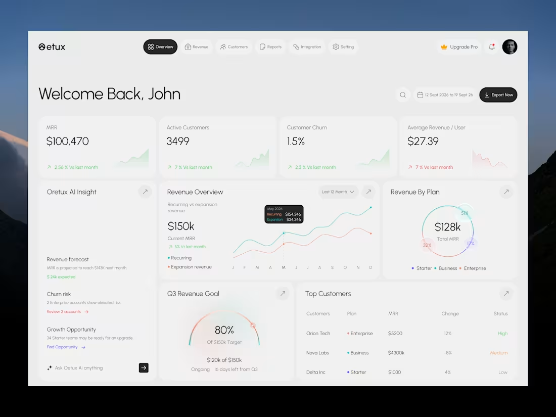
Oetux – SaaS Revenue Analytics Dashboard
The client had a lot of data, but the real problem was making sense of it.
MRR, revenue, churn, active customers, growth, customer performance, goals. Every metric was important, but when everything gets the same attention, users don’t know where to look first.
The existing experience made users spend too much time switching between information and trying to connect the numbers.
So we focused on how SaaS teams actually read their business data. We structured Oetux around the questions that matter most.
How is revenue performing?
Are we growing?
Are customers staying?
Where are we losing revenue?
What needs attention right now?
Then we organized KPIs, revenue trends, customer performance, churn insights, goals, and AI powered insights into one clear experience.
The goal wasn’t to remove data.
It was to organize the data so users could understand it faster.
That’s what we solved with Oetux.
Turning a data heavy SaaS dashboard into an experience that helps teams see their business clearly and make better decisions.
2
2
114
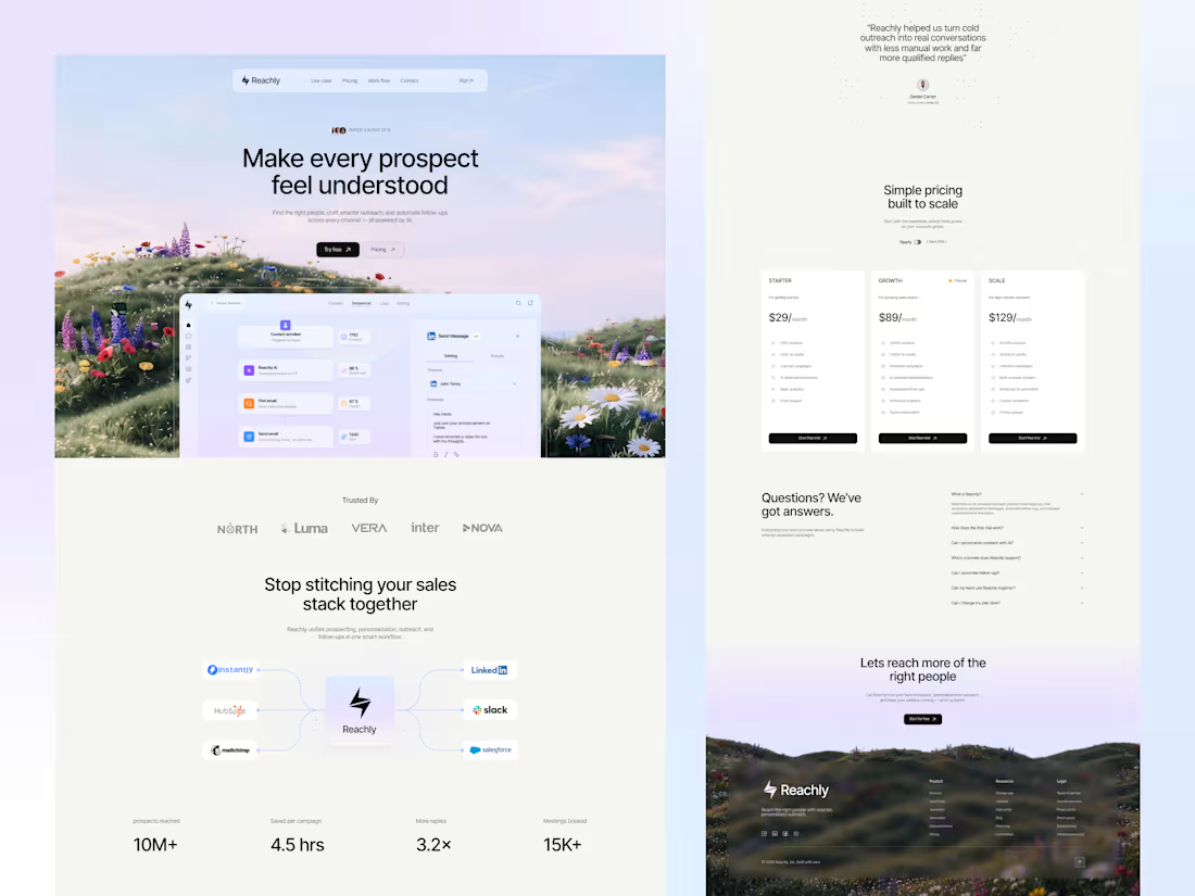
Reachly – AI Outreach SaaS Landing Page
Reachly brings prospecting, personalization, outreach, and follow-ups together in one place.
What makes the design stand out?
→ Clean and modern SaaS interface
→ Clear product storytelling from start to finish
→ AI-powered sales features presented simply
→ Smooth UX across the entire sales workflow
→ Strong visual hierarchy with focused CTAs
The goal was simple: make a complex sales platform feel easy to understand and easy to use.
What do you like most about the Reachly website design?
Have a project in mind?
→ Reach out at: hello@orvio.agency (mailto:hello@orvio.agency)
0
22
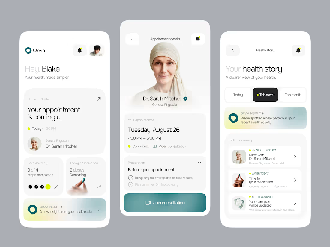
Health apps need a different kind of simplicity.
We took a different approach with Orvia:
design the experience around the patient, not the features.
The UX focuses on:
→ Clear information hierarchy
→ Contextual health information
→ Obvious next actions
→ Less cognitive load
→ A smoother care journey
The goal wasn’t to make another polished healthcare UI.
It was to make a complex healthcare experience feel simple, calm, and easy to navigate.
Good UX doesn’t show users more. It helps them understand faster.
Building a healthcare product?
Let’s make it simple, intuitive, and built for real users.
📩 hello@orvio.agency (mailto:hello@orvio.agency)
0
30
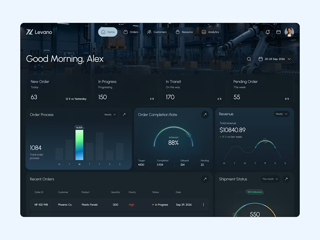
Most e-commerce dashboards give you a lot of data.
Very few make that data easy to understand.
That is the gap we wanted to solve with Levano.
We didn’t just show orders, revenue, and charts.
We designed the dashboard so business teams can understand what’s happening and act without digging through multiple screens.
→ A clear overview of orders, revenue, and customers, so teams can understand business performance at a glance
→ Quick order and shipment status, so operational issues are easier to spot
→ Structured tables and data visualization, so large amounts of information stay easy to scan
→ A focused dark UI with strong hierarchy, so important numbers stand out without creating visual clutter
When business data feels clear, decisions become easier.
For an e-commerce product, the goal isn’t to show more data.
It’s to help teams understand the right data faster.
At Orvio, we design and build digital products that are clear, easy to use, and built for real business needs.
If you’re building a SaaS, e-commerce, fintech, or digital product, let’s design it right.
📩 hello@orvio.agency (mailto:hello@orvio.agency)
1
70