Ahmed Sultan
Brand & Visual Identity Designer
Profile in progress
Ahmed is building their profile!
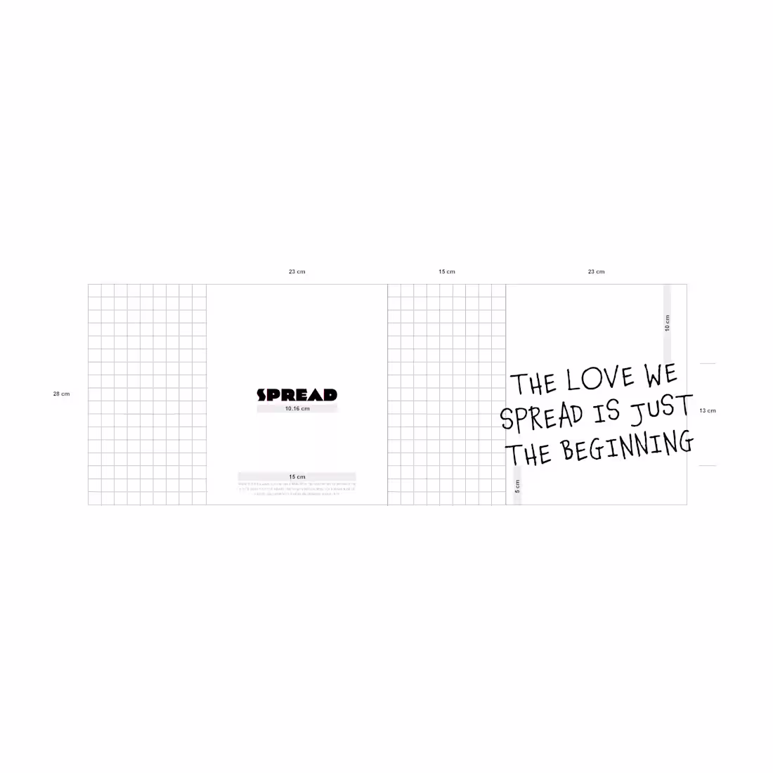
Work Series: SPREAD
Scope: Design | Rebranding | Packaging | Brand & Marketing
Consultation | Social Media Management I Photography
1
16
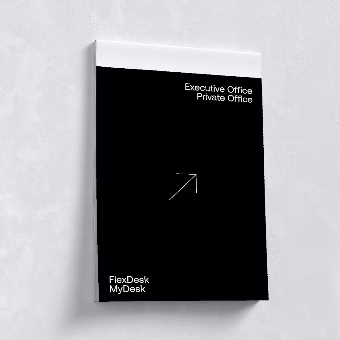
Work Series: SPACE 101
Scope: Branding | Creative | Social Media Management | Brand & Marketing Consultation
1
9
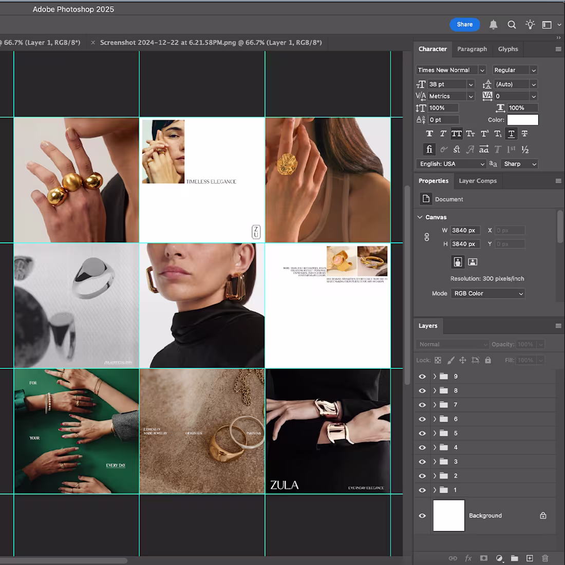
ZULA, meaning brilliant and ahead, redefines versatility in jewelry, pieces designed for every occasion, from work to evening wear. At CREATR, we built a brand identity that embodies this balance: refined, effortless, and timeless.
As we explored ZULA’s identity, the essence of its designs became clear: jewelry that elevates without overpowering, that feels natural yet polished. This inspired the tagline Everyday Elegance - a reflection sophistication and practicality.
Work Series: ZULA
Scope: Brand Identity | Brand & Marketing
Consultation | Design | Social Media Design
1
9
ZULA, meaning brilliant and ahead, redefines versatility in jewelry, pieces designed for every occasion, from work to evening wear. At CREATR, we built a brand identity that embodies this balance: refined, effortless, and timeless.
As we explored ZULA’s identity, the essence of its designs became clear: jewelry that elevates without overpowering, that feels natural yet polished. This inspired the tagline Everyday Elegance - a reflection sophistication and practicality.
Work Series: ZULA
Scope: Brand Identity | Brand & Marketing
Consultation | Design | Social Media Design
6
8
28
To be BLUNT is to be direct, clear, and unapologetic - qualities that define BLUNT STRATEGIES.
This clarity had to be reflected visually. We chose blue for trust and stability, contrasted with neon green to signal action and momentum. The motion graphics further reinforce this movement - dynamic, precise, and always forward.
The brand’s core symbols: the plus sign, round target, and X target, represent BLUNT’s strategic approach. The plus sign signifies growth, the round target reflects precision, and the X target marks decisive action. Together, they form a bold visual language that speaks to the agency’s impact-driven mindset.
Scope: Brand Identity | Brand & Marketing Consultation | Motion Graphics & Animation
4
18