
Adebola Afolabi
Brand Designer | Strategy | Marketing Communications


Project Overview
1. The Challenger
A dandruff monster challenges Head & Shoulders to a boxing bout, creating a playful visual battle that ends with the monster defeated.
2. The Hair-Combing Discovery
A woman discovers dandruff while combing her hair. Head & Shoulders appears as the solution to her problem.
3. The Moving Flakes
Animated dandruff flakes move onto the screen from different directions, visually highlighting the hair problem before Head & Shoulders is introduced as the solution.
My Contribution
I developed the creative concepts and executed the video editing and visual storytelling for all three videos. My role involved turning the product message into engaging visual narratives, planning the sequence of events, and using animation and visual effects to highlight the dandruff problem and present Head & Shoulders as the solution.
0
51
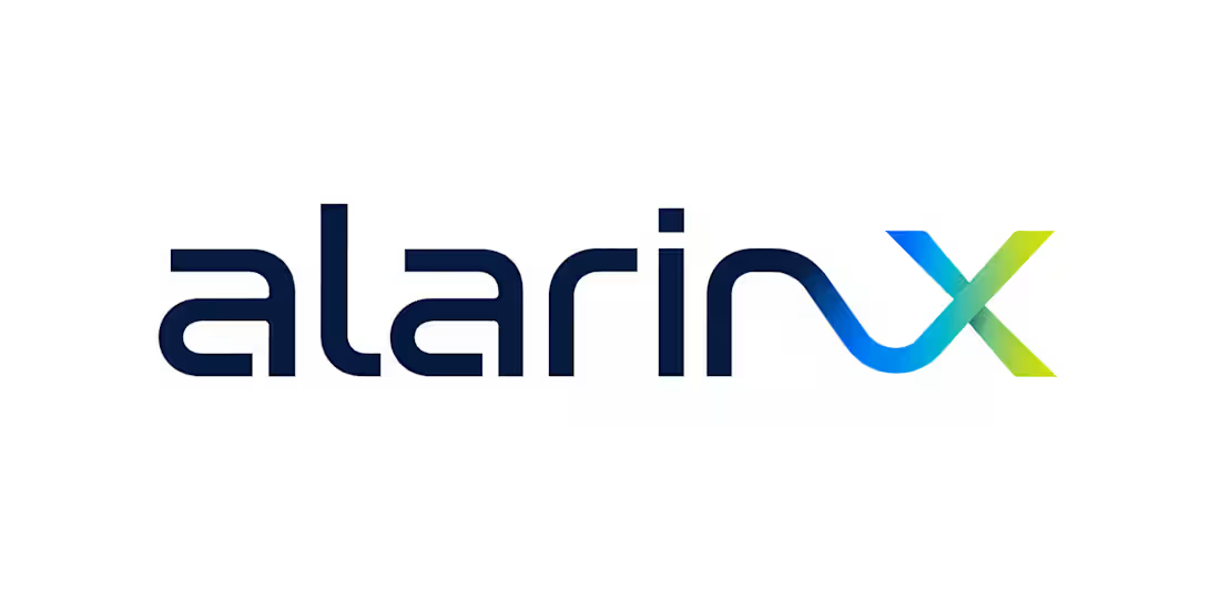
AlarinX — Brand Identity Concept
AlarinX was conceived as a forward-looking brand built around the ideas of innovation, technology, intelligence and limitless possibility.
The name itself has a contemporary, technology-oriented character. The visual identity therefore avoids conventional symbols and instead uses a clean, geometric approach that communicates precision and progression.
At the heart of the concept is the “X”—a visual representation of convergence, connection and the point where different possibilities meet. It also introduces a sense of experimentation and the unknown: the idea that the brand operates at the intersection of what exists today and what could exist tomorrow.
The identity was designed to feel modern, confident and scalable, allowing AlarinX to operate across digital products, technology services, communications and future-facing ventures without being restricted to a single category.
Core ideas:
Innovation • Technology • Intelligence • Connection • Progress • Possibility • Transformation
Design philosophy:
Simple enough to recognise. Distinctive enough to own. Flexible enough to evolve.
0
69

HAVEN’TAN — Brand Identity Concept
HAVEN’TAN was conceived as a modern African storytelling and digital entertainment brand built around one central idea: Where Stories Find a Home.
The name combines HAVEN, suggesting a place of belonging, safety and discovery, with ÌTÀN, the Yoruba word for story. This creates an identity rooted in African storytelling while remaining accessible to a contemporary global audience.
The logo concept explores the idea of a threshold into a story. The distinctive “H” construction uses solid vertical forms and an intentional opening of negative space. That opening represents an invitation—a doorway through which the audience enters another world, another experience or another story.
The identity deliberately avoids predictable African or cinematic symbols. Instead, it uses a restrained, contemporary form that can grow beyond a single programme or production into a broader entertainment and intellectual-property platform.
Core ideas:
Story • Home • Belonging • African Identity • Discovery • Connection • Imagination • Global Reach
Positioning:
Where Stories Find a Home.
0
52
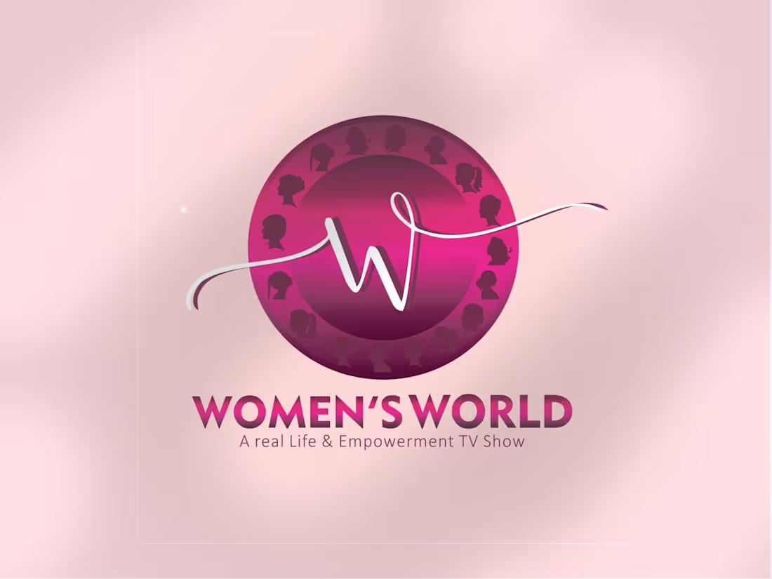
Women’s World — Logo Concept
The identity was developed around the idea of women as a connected global community—diverse in background, experience and ambition, yet united by shared identity and purpose.
The logo explores the relationship between femininity, movement and global connection. Rather than relying on a literal female symbol, the concept uses a more refined visual language that can work across professional, social, media and community contexts.
Core ideas behind the mark:
Women — the visual character expresses strength, confidence and feminine identity without becoming overly decorative.
World — circular/global forms suggest a world that is interconnected and inclusive.
Connection — the relationship between the elements represents women connecting with one another, sharing experiences, opportunities and influence.
Movement — the flowing construction gives the identity a sense of progress and forward momentum.
Empowerment — the overall form is intended to feel confident rather than passive, reflecting women as active participants and leaders.
0
50