
Adesina Toromade
Building AI systems, Web3 products & digital experiences.


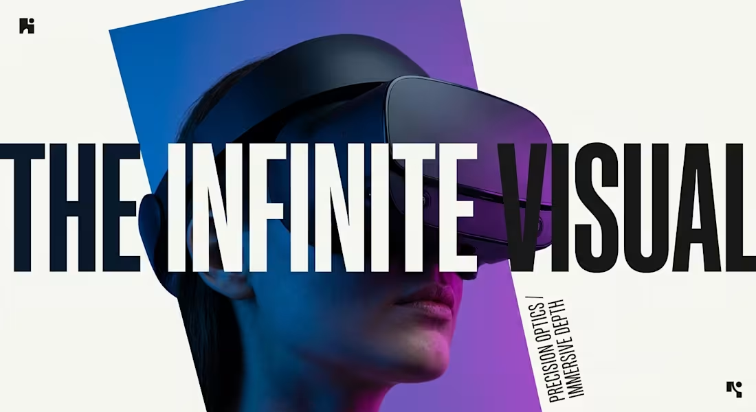
Working on something a little different lately, focusing on scale and depth. How does this visual feel to you? Drop your thoughts below!
2
207
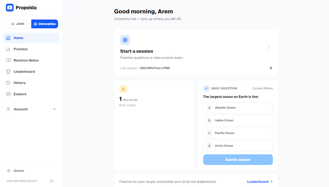
Most Nigerian students prepare for JAMB and Post-UTME with random PDFs and no clear path after the exam. I built Propeida to fix that. It is a full web application with timed mock exams, verified questions, student progress tracking, dual dashboards, and Paystack integration for optional upgrades. Over 250 students now use it regularly to practice and explore real career options connected to their courses. The platform feels light on data, works smoothly on any phone, and finally connects exam preparation to what comes next.
3
1
309
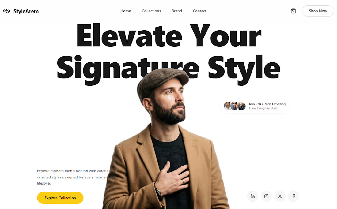
I created StyleArem because I wanted a fashion website that helps modern men feel more confident in their everyday style. Too many clothing sites look crowded and pushy, and they make shopping feel like a chore instead of something exciting. My goal was to build a clean, premium experience that feels personal and inspiring from the first scroll. The main challenge was to show high-quality men’s fashion without overwhelming the visitor. People want clothes that look good and feel like them, but most sites either look too flashy or too plain. I needed the design to feel refined and trustworthy while still making it easy and enjoyable to explore different styles. I started with a strong hero section. A confident man in a camel coat and beret stands against a clean white background with the bold message “Elevate Your Signature Style.” Right away visitors understand this is about building a personal look that feels natural and elevated. A simple yellow button invites them to explore the collection, and a small social proof badge shows that over 25,000 men are already joining. Next I designed the category section so people can quickly find what matches their personality: Streetwear, Classic Formal, Everyday Essentials, Sports & Active, and more. Each product card is clean and clear, with good photos, short names, and prices, so shopping never feels confusing. Then came the about section, where I mixed timeless tailoring heritage with modern craftsmanship. Soft photos of stylish men walking city streets sit next to big numbers like 245K style-inspired users and 9.5/10 customer satisfaction, building trust. I added a testimonial row with real-sounding reviews so visitors can hear how the clothes actually feel and look in daily life. The FAQ section answers common questions in a calm, helpful way, and the dark footer keeps everything organized with clear links for collections, brand story, and client care. The finished website feels like a modern digital store that respects the visitor’s time and taste. It shows that good style is not about following trends blindly, it is about choosing pieces that fit your life and make you feel more like yourself. From the clean layout to the soft colors and strong product photography, every part works together to turn a simple fashion site into a place that inspires confidence. This project reminded me that when you design with the customer’s real feelings in mind[ the wish to look good without trying too hard], the website becomes more than just pages. It becomes a quiet guide that helps men discover and elevate their own signature style.
0
153
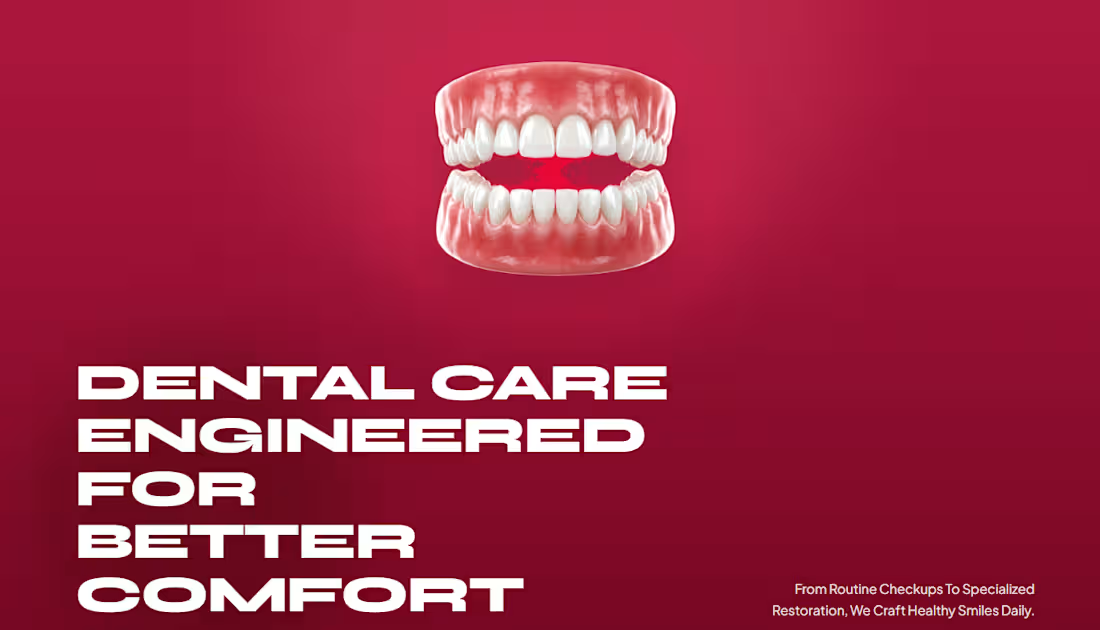
I built this website because I wanted to change the way people feel about going to the dentist. Most dental clinic sites look cold and clinical, and they make visitors feel even more nervous the moment they open the page. I wanted Oralcare to feel different, warm, modern, and genuinely caring so that the first thing a visitor experiences is comfort instead of fear. People already feel anxious about dental visits, so the website had to do more than just show services. It needed to calm them down, build trust quickly, and make them believe this clinic truly cares about their long-term comfort and confidence. Every section had to work together to create that feeling. I started with a strong hero section. A soft deep-red background, a clean 3D model of healthy teeth, and the bold message “Dental Care Engineered for Better Comfort” set the tone right away. From the first second, visitors understand this is not a regular dental site. Then I added clear numbers — more than 10,000 happy smiles, 15 years of experience, 850+ patients helped, and 98% satisfaction, so trust starts building immediately without forcing people to read long paragraphs. Next came the about section and the team cards. I used friendly photos and simple, honest language to show the human side of the clinic. Each specialist has their own card with ratings, experience, and a clear “Book” button, making it easy for visitors to choose someone they feel comfortable with. The four-step process section walks people through the entire journey, from the first conversation to ongoing wellness care in a calm and easy-to-follow way. I also added a real patient story with a five-star review and a short video. Hearing how Sarah went from anxiety to complete confidence makes the experience feel real. Finally, a clean blog area and a simple footer keep everything useful and easy to navigate. The finished website lives at oralcare-omega.vercel.app (http://oralcare-omega.vercel.app). It tells one clear story from top to bottom: modern dental care that puts comfort first. The soft colors, clear layout, friendly photos, and smooth flow work together to turn a regular clinic website into a place that makes people feel hopeful instead of scared. This project showed me how powerful a website can be when every part is designed around the patient’s feelings. When you focus on reducing anxiety and building quiet confidence, the design becomes more than just visuals, it becomes a real tool that helps people take the first step toward a healthier smile.
0
153