


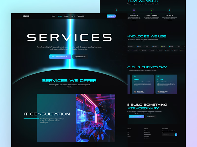
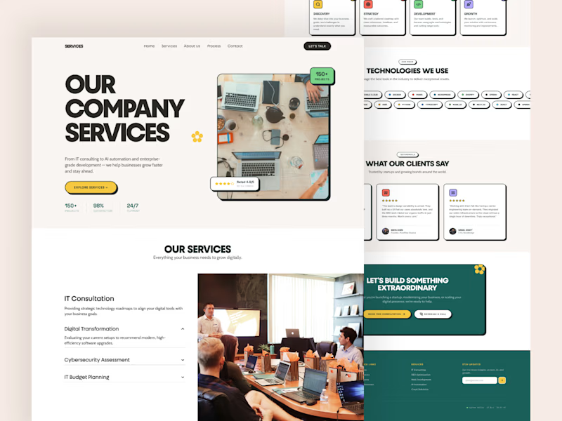
Same content, almost same User experience but two different UI Designs. which one do you pick?
#UIUX #uidesign #uxdesign #websiteuiux #websitedesign #web #landingpage #figma

1 voted
33%
2 voted
67%
3 votes
Closed
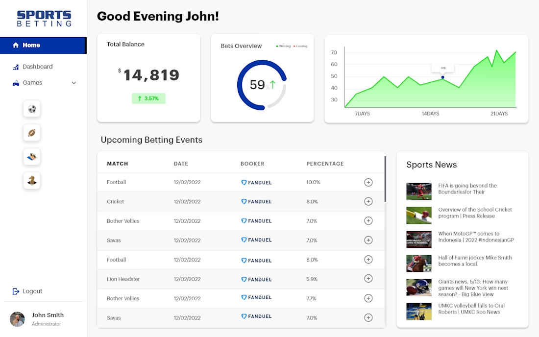
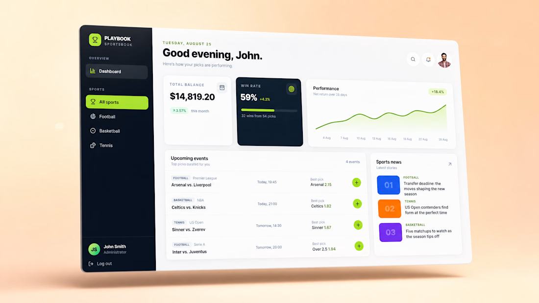
A redesign for my previously designed Dashboard, See before and After.


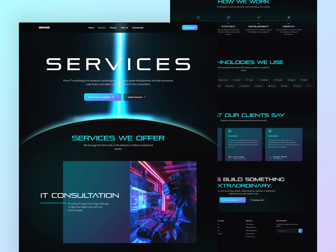
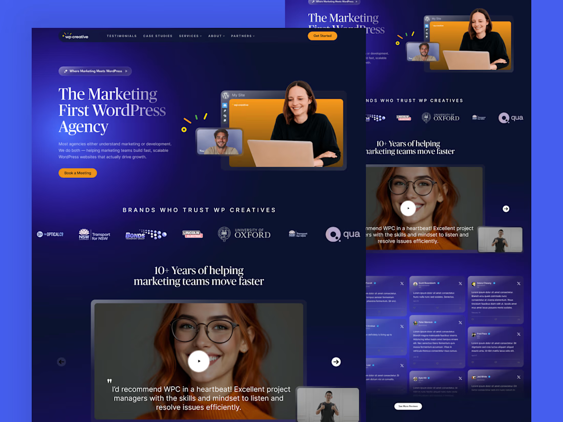
Hi Contra Community, Dropping in my new piece of work for a development agency. Your comments and Insights would be appreciated.

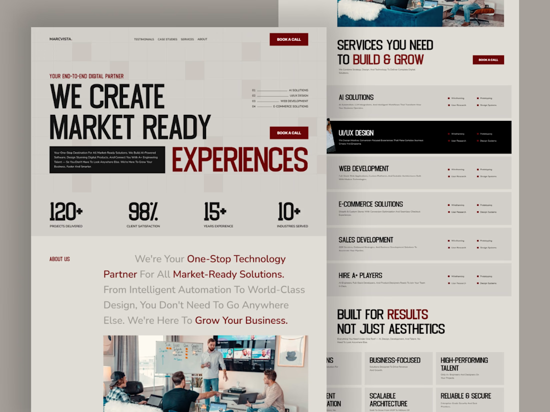
Hi Contra Community, Dropping in my recent work for a Development agency, Need Insights on the design but I'm already Starting to work on the improvements. Your comments can be helpful.