The network for creativity
Join 1.25M professional creatives like you
Connect with clients, get discovered, and run your business 100% commission-free
Creatives on Contra have earned over $150M and we are just getting started
Back to feedPost

Hi Contra Community, Dropping in my recent work for a Development agency, Need Insights on the design but I'm already Starting to work on the improvements. Your comments can be helpful.



The network for creativity
Join 1.25M professional creatives like you
Connect with clients, get discovered, and run your business 100% commission-free
Creatives on Contra have earned over $150M and we are just getting started







Related posts

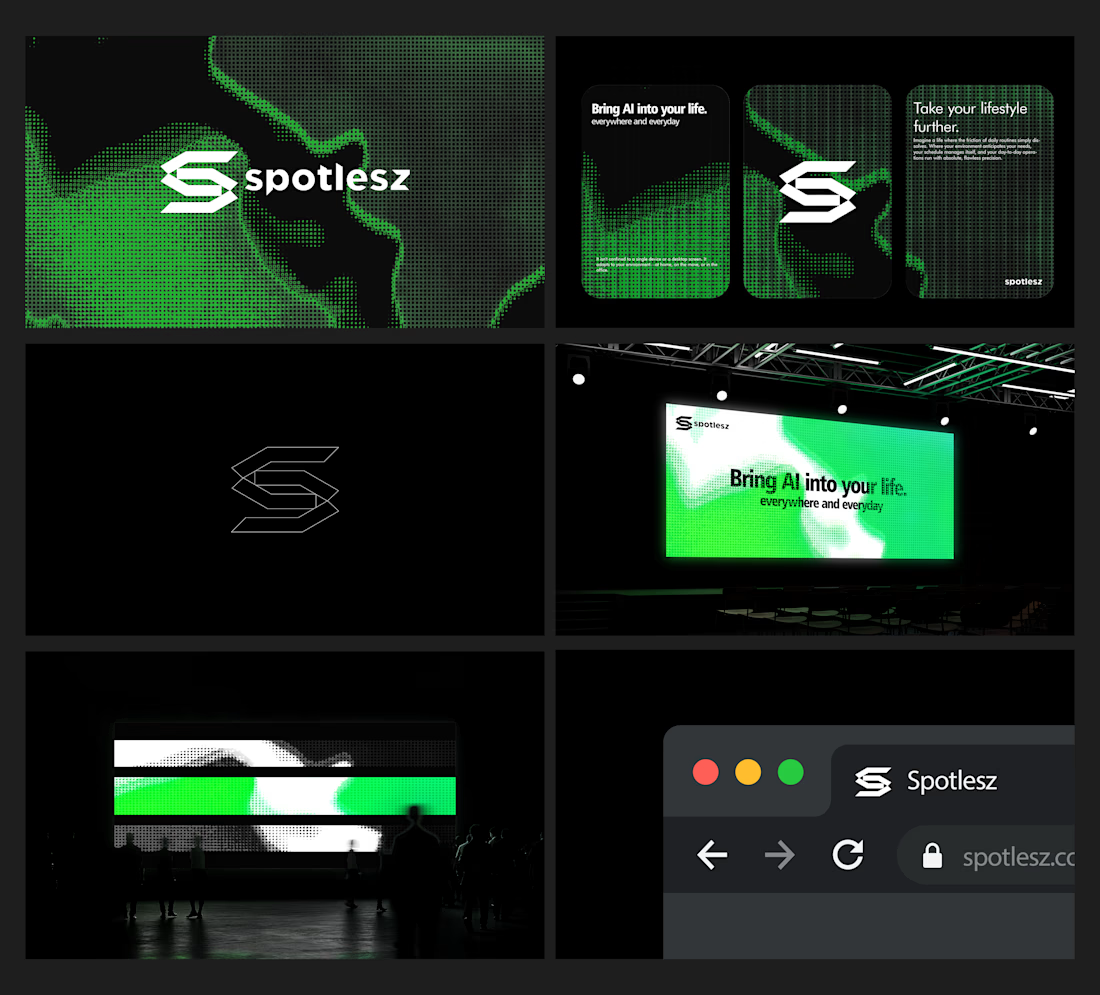
Branding identity completed for Spotlesz in just few days!


Same collection. Two different experiences.
Would you choose the bold, playful catalogue or the calm, architectural gallery?
Both complete websites are free to download — source code, assets and animations included.
Grab the kit: https://contra.com/products/FNrYmtZe-stillform-two-animated-landing-pages
10 voted
53%
9 voted
47%
19 votes
Closed


MAGMA: A Liquid Light Instrument
A single HTML physics-driven lava lamp. Every blob carries heat it soaks it up at the floor plate, rises on buoyancy, sheds it at the cap, stalls, and sinks-the canonical lava-lamp circulation, with nothing keyframed.
Blobs merge by transferring mass through sustained contact; overheated giants pinch off children. Total volume is conserved, so the lamp never empties. The surface is a metaball scalar field shaded through a palette LUT, with marching-squares iso-contours stroked on top as a glass rim and a fresnel crown. Run it hot and champagne micro-bubbles boil off the plate - flip gravity mid-rise and they hang weightless.


Anyone who wants to check this build live can visit my JSFiddle here: https://jsfiddle.net/Saminsami/1rvay2bx/1
jsfiddle.net
MAGMA - SAMIN
SAMIN - a HTML example you can edit and run in your browser on JSFiddle.