Pro

Abun – Webflow SaaS Website
The Brief
Abun needed a bold SaaS website that instantly communicates power, speed, and scale. Their old visuals felt flat and didn’t reflect the sophistication of their AI tools.
The Direction
I leaned into a dark, high-contrast UI with glowing...


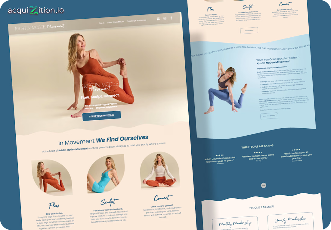
Kristin McGee Movement – Kajabi Website
The Brief
Kristin needed a Kajabi site that felt calm, clear, and centered around movement. Her old design lacked warmth and didn’t reflect the depth of her yoga and Pilates programs.
The Direction
I used soft curves, warm neutrals, and...

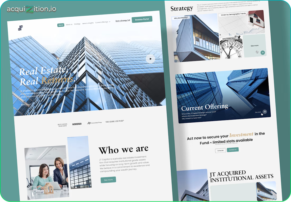
JT Capital – GoHighLevel Website
The Brief
JT Capital needed a clean, credible site to present their real estate fund. Their old site felt dated and didn't communicate trust or sophistication. The goal was a modern investor-focused layout with strong clarity and structure.
The...

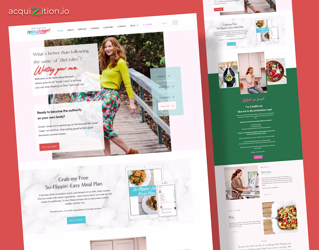
No Rules Nourishment – Kajabi Website
The Brief
The client wanted a Kajabi site that felt warm, and welcoming. Their old look felt generic and didn’t reflect their playful, anti-diet brand. The goal was to create a space that feels friendly, confident, and grounded in real-life...
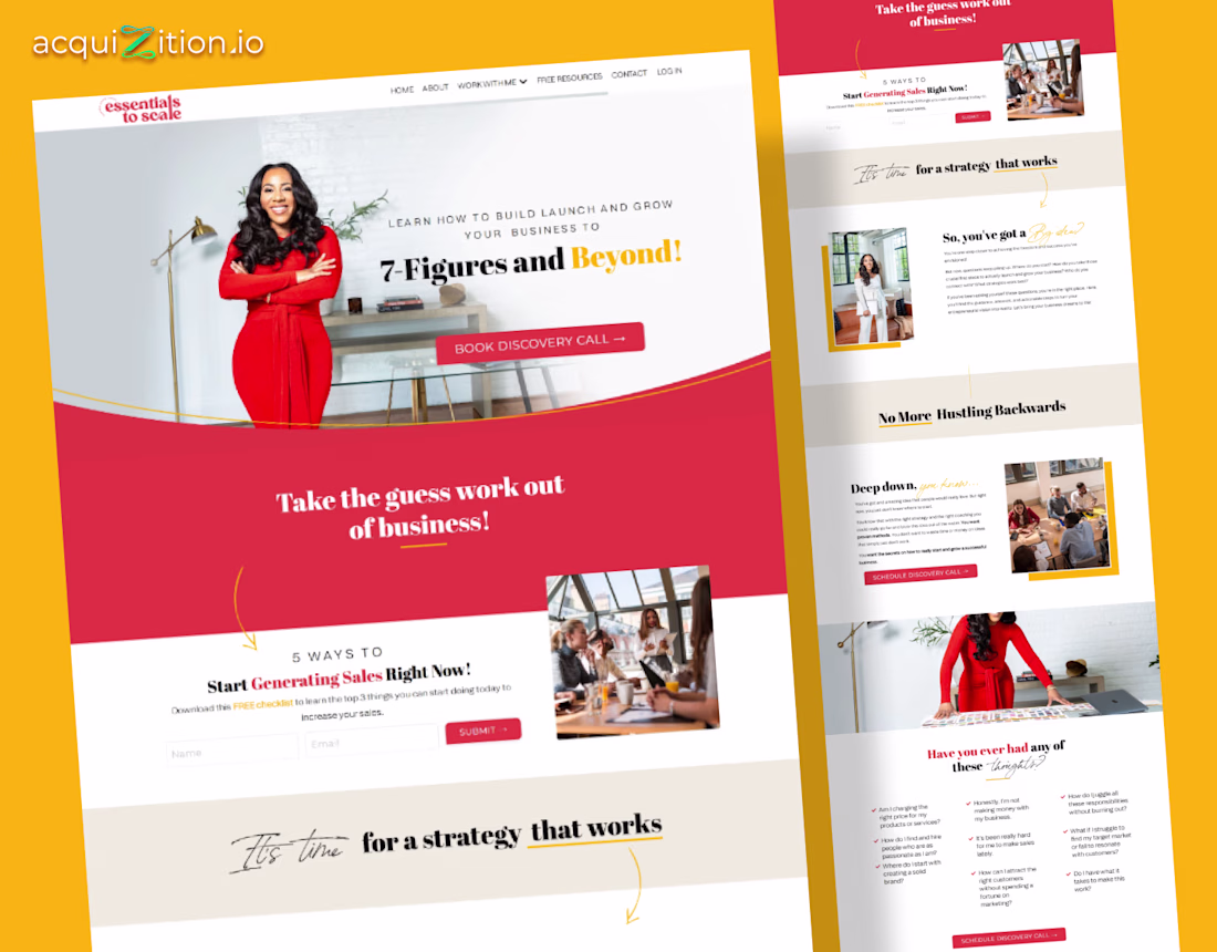
Essentials to Scale – Kajabi Website
The Brief
The client needed a Kajabi site that felt strong, clear, and built for conversions. Their old layout didn’t match their authority as a coach helping founders scale to 7 figures. The goal was to mix personality with structure.
The...