
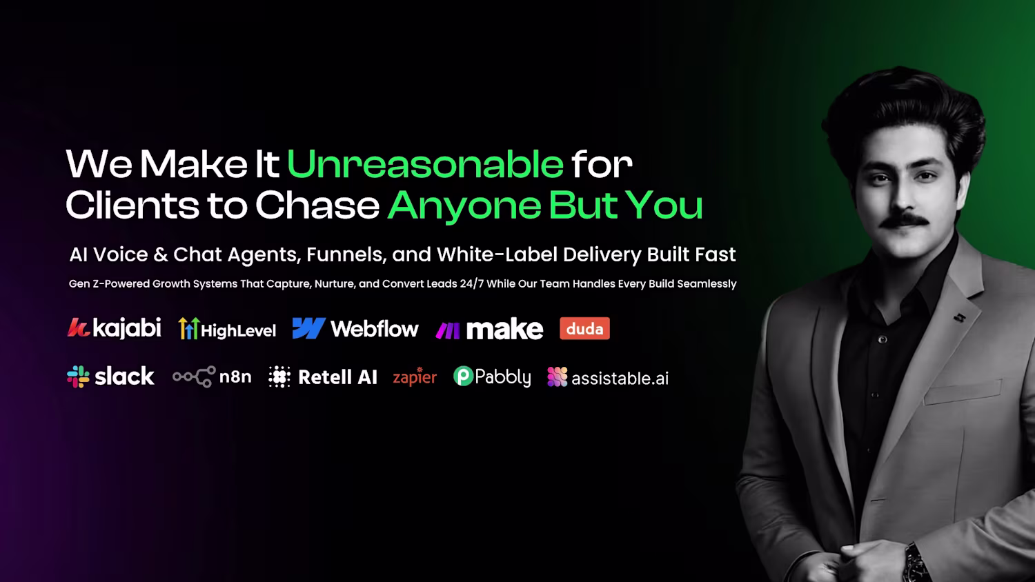
pro
Abdullah Khan
Verified Kajabi & GHL Expert ✅ | 100+ Happy Clients ✨
- $10k+
- Earned
- 9x
- Hired
- 5.00
- Rating
- 69
- Followers
Kajabi + GHL Subscription System Rebuild & Customer Migration
2
43
Discipline & Devotion Collective Kajabi Platform Build
3
37
Zahra Gozal - Kajabi Coaching Website Build
Full coaching ecosystem built on Kajabi for an ICF-accredited transformational coach.
Delivered:
- Homepage + brand storytelling
- Emotional Bodywork service architecture
- Archetypal Transformational Coaching pages
- Women Who Run With The Wolves community hub
- Mandala workshops + retreat funnels
- Automations and workflows
- Blog, activities, contact integration
Outcome: a website that matches the depth of the coaching work. Calm, grounded, feminine, conversion-focused.
Open to similar projects, coaches, healers, transformational practitioners.
5
472
The thinking behind this one
2
737
Manual setup
Wrong access
Missed steps
Delayed onboarding
That’s where trust dies.
We built alarmgrowth.ai (http://alarmgrowth.ai) and fixed this.
Three plans.
Three different backend flows.
Zero humans touching setup.
Purchase → automation fires
Sub-account created
User added
Correct snapshot loaded
Everything drops in clean
No Slack pings.
No “give us 24–48 hours.”
No excuses.
If you’re still onboarding clients manually while selling multiple plans, you’re building on friction.
Watch the backend.
This is how scalable delivery actually looks.
👇
#GoHighLevel
#AutomationSystems
#zapier
#SaaSBuild
#BackendMatters
5
646
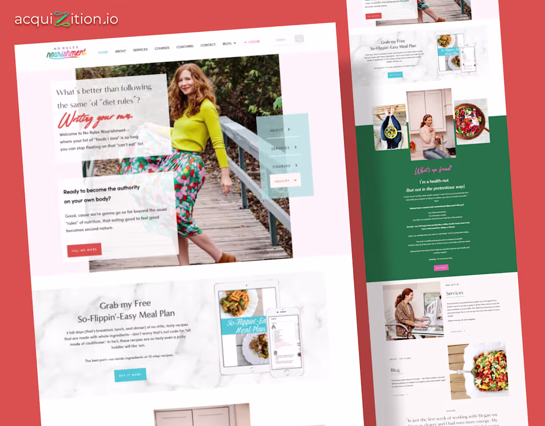
No Rules Nourishment – Kajabi Website
The Brief
The client wanted a Kajabi site that felt warm, and welcoming. Their old look felt generic and didn’t reflect their playful, anti-diet brand. The goal was to create a space that feels friendly, confident, and grounded in real-life nutrition.
The Direction
I used soft pastels, handwritten accents, and open layouts to keep everything light and human. Real photos lead the story. Clear sections for services, courses, and freebies
The Build
Built in Kajabi with custom content blocks, mobile-first spacing, and integrated opt-ins for the meal plan freebie. Designed in Figma, then rebuilt to stay consistent across pages.
The Impact
The new site feels honest and approachable. It supports her brand voice, increases opt-ins, and gives visitors a clear path to book, learn, and connect.
1
4
622
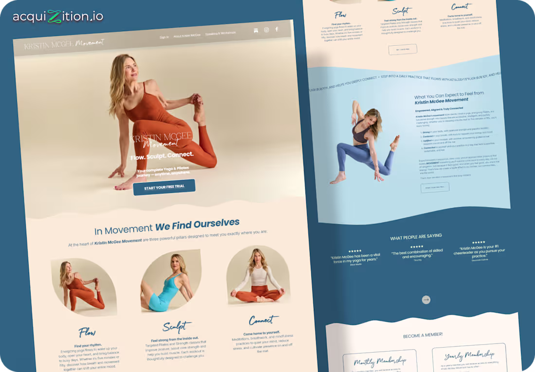
Kristin McGee Movement – Kajabi Website
The Brief
Kristin needed a Kajabi site that felt calm, clear, and centered around movement. Her old design lacked warmth and didn’t reflect the depth of her yoga and Pilates programs.
The Direction
I used soft curves, warm neutrals, and grounded photography to create a sense of flow. Each section highlights a pillar, Flow, Sculpt, Connect, making the journey feel approachable and intuitive.
The Build
Built in Kajabi with custom spacing, wavy section dividers, and clean modular blocks for programs, testimonials, and membership options.
The Impact
The new site feels calm, premium, and purposeful, helping visitors quickly understand the offer and start their free trial with confidence.
2
561
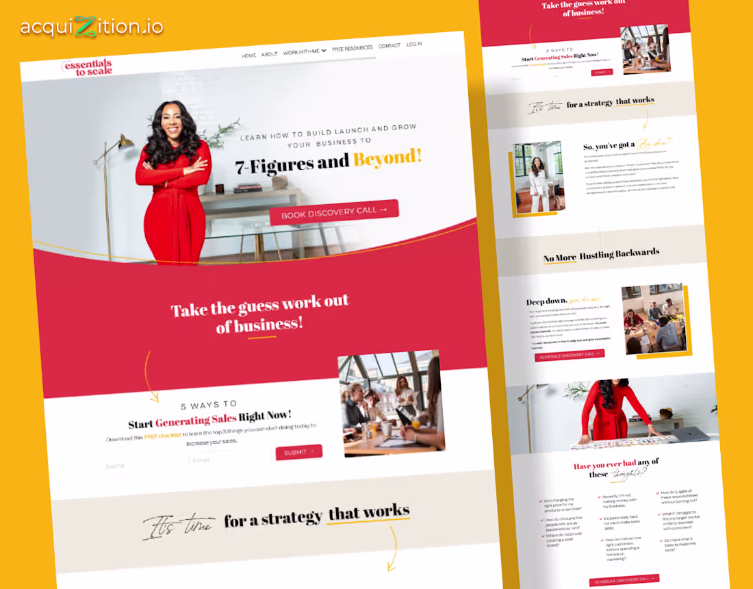
Essentials to Scale – Kajabi Website
The Brief
The client needed a Kajabi site that felt strong, clear, and built for conversions. Their old layout didn’t match their authority as a coach helping founders scale to 7 figures. The goal was to mix personality with structure.
The Direction
I used bold reds, warm gold accents, and confident headlines to create a sense of momentum. The layout moves like a guided coaching session, simple sections, real photos, and direct CTAs that make the offer easy to trust.
The Build
Built in Kajabi with custom sections, a clean opt-in flow, and responsive layouts. Lead magnet delivery and booking were tied directly into their funnel.
The Impact
The new site feels polished and intentional. It supports the brand’s authority and converts faster by giving visitors a clear path from interest to booking.
1
4
460
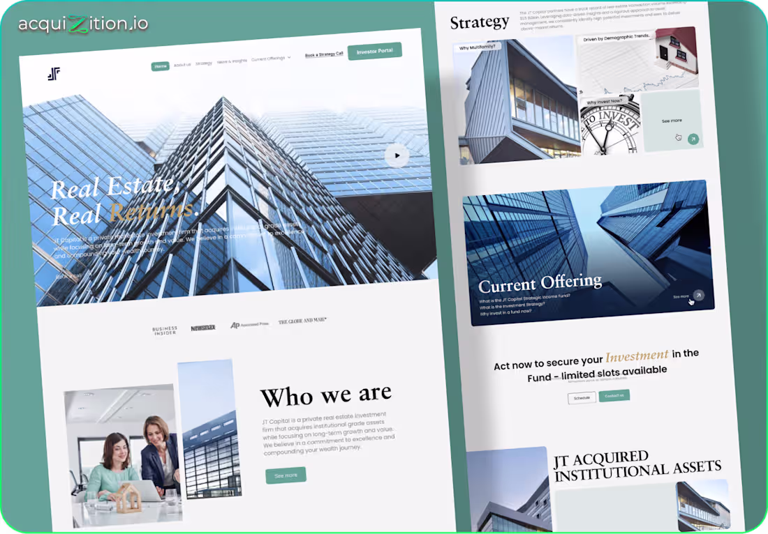
JT Capital – GoHighLevel Website
The Brief
JT Capital needed a clean, credible site to present their real estate fund. Their old site felt dated and didn't communicate trust or sophistication. The goal was a modern investor-focused layout with strong clarity and structure.
The Direction
I used a calm palette, sharp typography, and architectural imagery to build authority. The layout moves like an investor strategy, offering, proof and action. Each section is simple, direct and confidence-driven.
The Build
Built in GoHighLevel with custom CSS for spacing, grids, and polish. Modular blocks allow fast edits for offerings and news updates. Fully optimized for mobile investors.
The Impact
The new site elevates JT Capital’s credibility and makes it easier for prospects to understand the fund and book a strategy call.
1
2
373
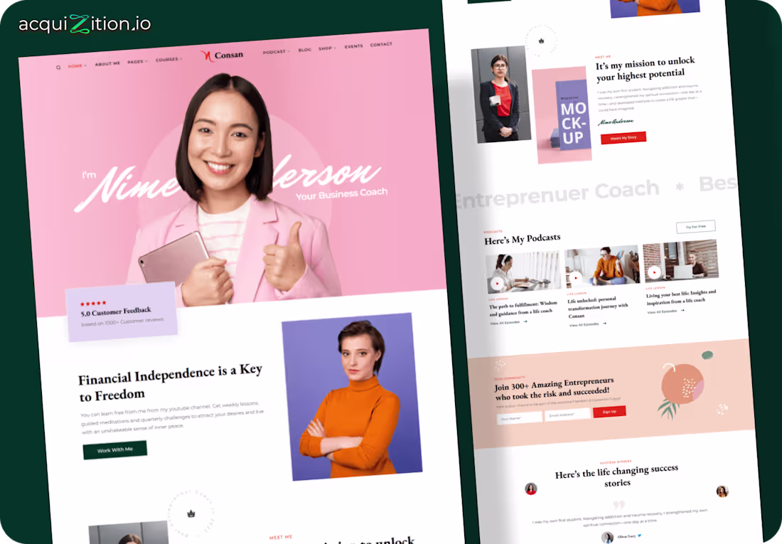
Consan Coaching – Kajabi Website
The Brief
Consan needed a Kajabi site that felt warm, modern, and trustworthy. Their old layout lacked personality and didn’t show the depth of their coaching, podcast, and community work.
The Direction
I used soft pink tones, rounded elements, and confident photography to create a friendly, approachable feel. Each section guides visitors naturally intro story, services, podcast, community, success stories making the journey clear and encouraging.
The Build
Built in Kajabi with custom blocks for podcasts, testimonials, and opt-ins. Designed for clean mobile reading and quick edits.
The Impact
The new site feels human and inviting, helping visitors connect instantly and converting more traffic into leads and course members.
1
2
341
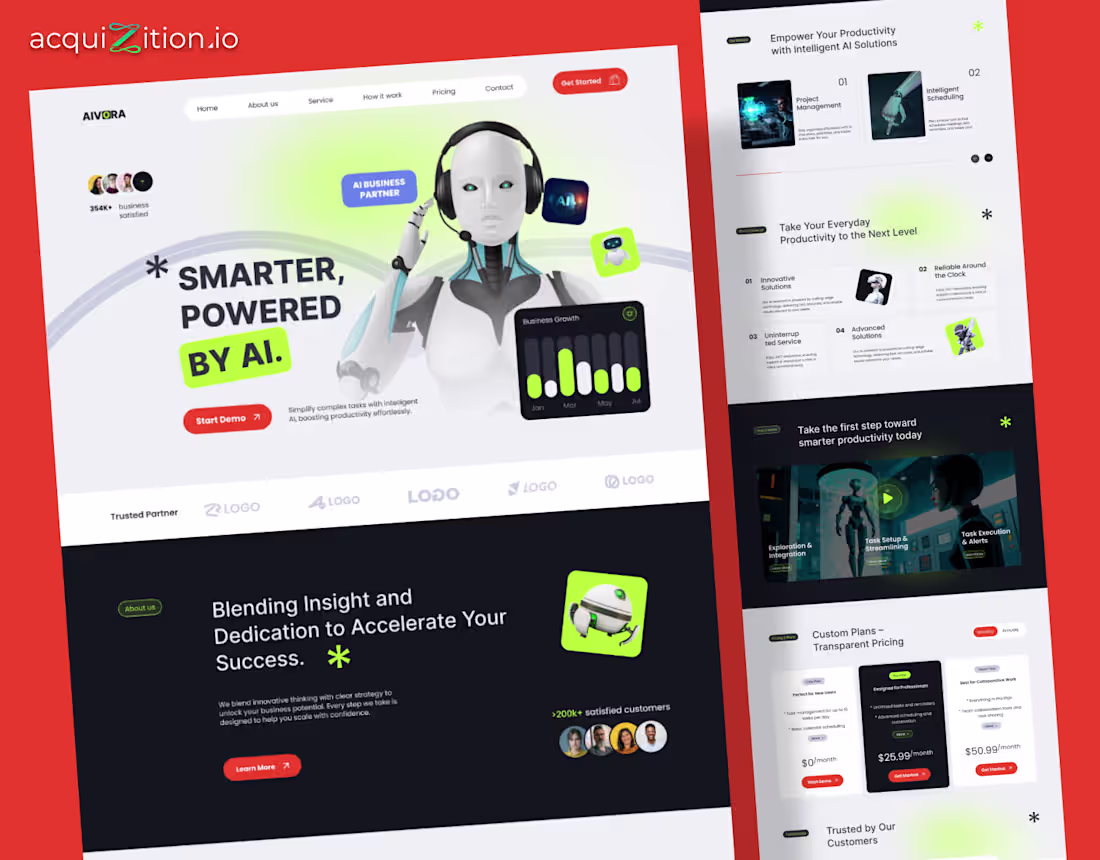
Aivora – Framer Landing Page
The Brief
Aivora, an AI startup, needed a clean landing page that made their product feel smart, futuristic, and human. The goal was clarity, help users instantly see what Aivora does and book a demo without friction.
The Direction
- We designed around a “modern AI partner” theme.
- Hero built around the Aivora bot as a visual anchor
- Neon green on matte black for energy and trust
- Modular sections showing productivity and automation use cases
- Transparent pricing cards and trust badges to drive action
The Build
Built in Framer with scroll animations, reusable sections, and optimized load speed. Everything editable without code.
The Impact
The site helped Aivora stand out as a credible, modern AI brand, boosting engagement and demo signups.
5
6
398
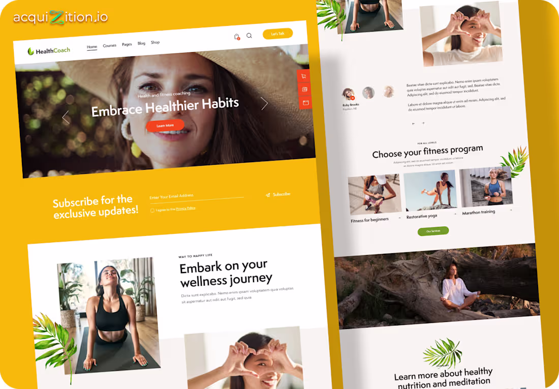
HealthCoach – Kajabi Wellness Website
The Brief
HealthCoach needed a site that felt calm, motivating, and real. Not aggressive. Not salesy. A place where people feel safe starting their wellness journey.
The Direction
Warm yellow tones, natural imagery, and plenty of breathing room. The layout flows gently. Hero inspiration first, then programs, then trust. Nothing rushed. Everything intentional.
The Build
Built in Kajabi using native sections for courses, blogs, email capture, and program showcases. Mobile-first and easy for the client to update without touching design.
The Impact
The site feels human. Approachable. It invites people in instead of pushing them. Perfect for converting readers into subscribers and long-term clients.
4
269
🚨 1386 Location Based Pages. Fully Automated. Built for Local SEO Domination.
We built 1,386 hyper-local landing pages for a UK waterproofing brand. Each town and county gets its own SEO-optimized page, all editable from one place. One CTA change? Done. Leads go straight into your CRM. This is how you turn local searches into sales on autopilot.
Comment “1386” and I’ll send you the full breakdown.
1
28
541
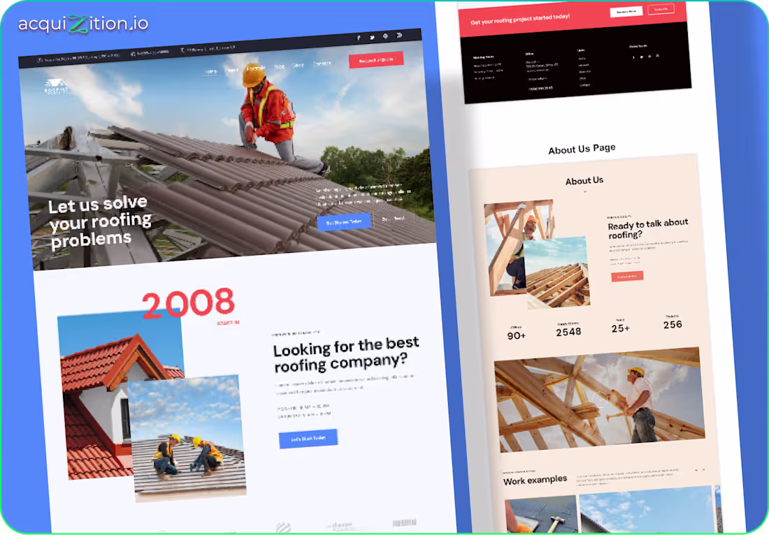
𝐖𝐡𝐨 𝐚𝐫𝐞 𝐲𝐨𝐮?
𝐇𝐨𝐰 𝐥𝐨𝐧𝐠 𝐡𝐚𝐯𝐞 𝐲𝐨𝐮 𝐛𝐞𝐞𝐧 𝐚𝐫𝐨𝐮𝐧𝐝?
𝐂𝐚𝐧 𝐈 𝐭𝐫𝐮𝐬𝐭 𝐲𝐨𝐮?
𝐖𝐡𝐚𝐭 𝐡𝐚𝐩𝐩𝐞𝐧𝐬 𝐢𝐟 𝐈 𝐜𝐥𝐢𝐜𝐤 𝐭𝐡𝐢𝐬 𝐛𝐮𝐭𝐭𝐨𝐧?
Every homeowner asks this.
Because homeowners don’t want clever.
They want certainty.
This kind of roofing site works because it does three things quietly:
• It pre-qualifies serious homeowners
• It reduces junk and price-shopping calls
• It increases booked estimates without begging for them
𝐍𝐨 𝐩𝐨𝐩𝐮𝐩𝐬 𝐬𝐜𝐫𝐞𝐚𝐦𝐢𝐧𝐠 “𝐋𝐈𝐌𝐈𝐓𝐄𝐃 𝐎𝐅𝐅𝐄𝐑”.
𝐍𝐨 𝐠𝐢𝐦𝐦𝐢𝐜𝐤𝐬.
𝐍𝐨 𝐟𝐚𝐤𝐞 𝐮𝐫𝐠𝐞𝐧𝐜𝐲.
𝐉𝐮𝐬𝐭 𝐬𝐭𝐫𝐮𝐜𝐭𝐮𝐫𝐞.
𝐏𝐬𝐲𝐜𝐡𝐨𝐥𝐨𝐠𝐲.
𝐅𝐥𝐨𝐰.
🏠 #roofingcontractor
⛈️ #RoofingMarketing
📍 #LocalServices
1
3
246
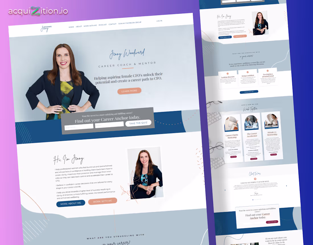
Jenny Woodward – Kajabi Career Coach Website
The Brief
Jenny helps aspiring female CFOs move from stuck to strategic. Her old site didn’t show her authority or warmth. The goal was to design a personal brand site that felt credible.
The Direction
I built around soft blues and handwritten accents to match her calm but confident tone. Each section guides the visitor from empathy to action, story first, offer second. The quiz banner adds an interactive touch that builds trust before the sell.
The Build
Built on Kajabi, it integrates her coaching programs, podcast, and quiz seamlessly. Designed modular sections for clarity and reusability.
The Impact
After launch, she saw higher quiz completions and more coaching inquiries. The new design communicates her expertise clearly and gives visitors the confidence to take the next step.
4
295
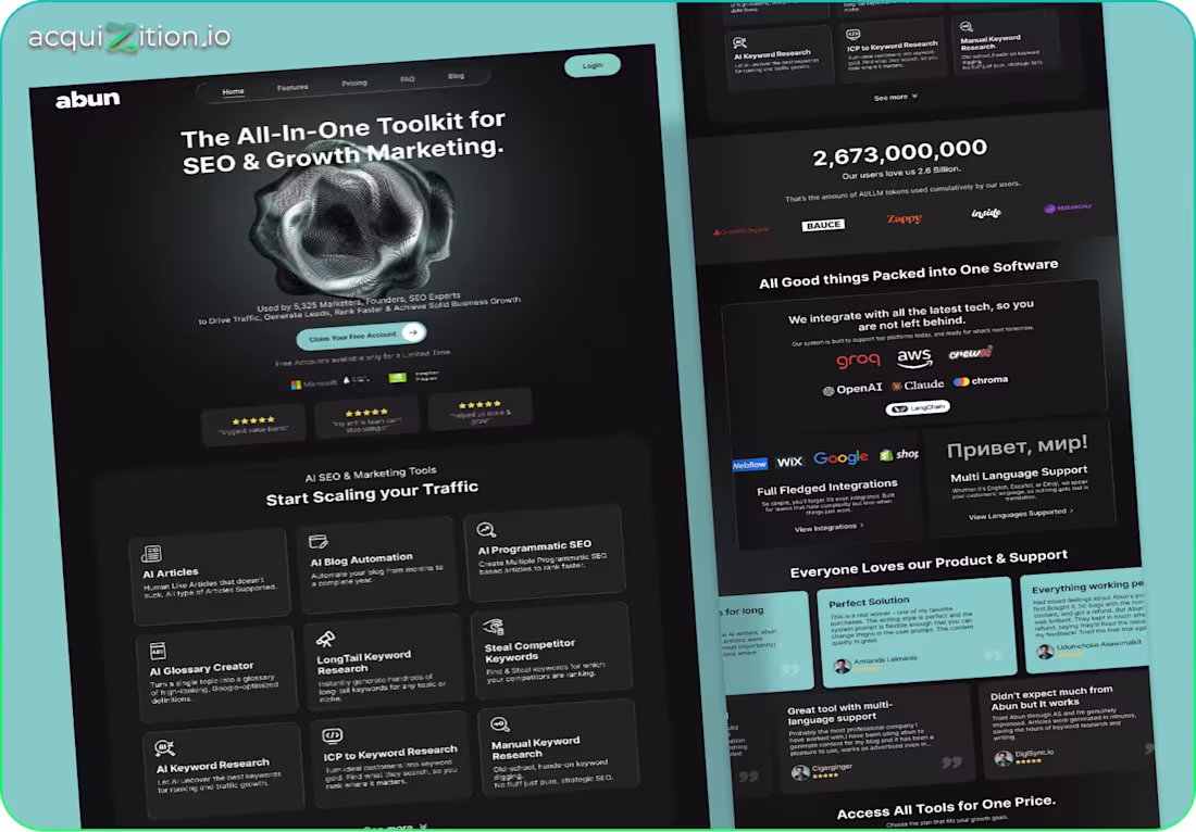
Abun – Webflow SaaS Website
The Brief
Abun needed a bold SaaS website that instantly communicates power, speed, and scale. Their old visuals felt flat and didn’t reflect the sophistication of their AI tools.
The Direction
I leaned into a dark, high-contrast UI with glowing elements and modular grids. The design showcases tools, integrations, and social proof without overwhelming the user. Everything flows like a modern SaaS demo, fast, clean, confident.
The Build
Developed in Webflow with CMS-driven tool cards, responsive grids, and lightweight motion effects. Optimized for clarity across long-scrolling pages.
The Impact
The new site gives Abun a polished SaaS identity, helping users understand the product quickly and boosting sign-ups.
2
3
248
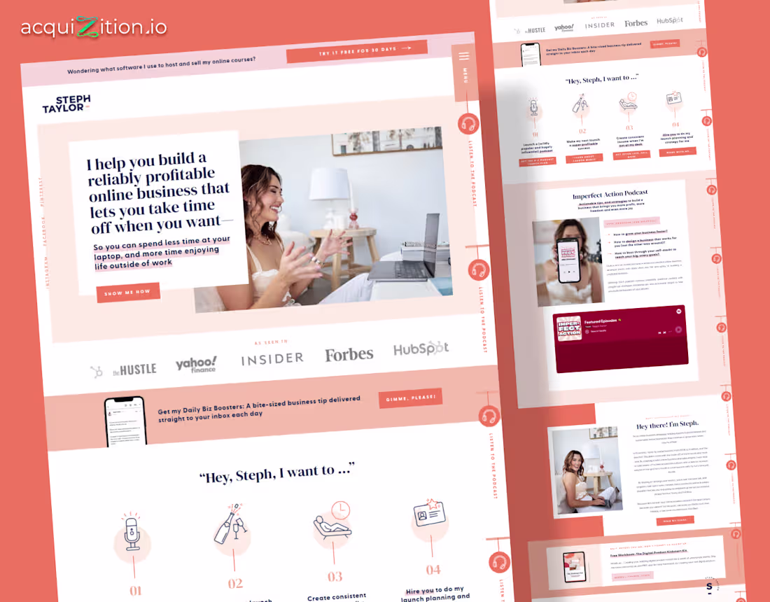
Steph Taylor – Kajabi Website Redesign
The Brief
Steph wanted a site that felt like her, calm, confident, and real. She teaches creators how to build profitable online businesses, but her old site buried her message.
The Direction
We leaned into a warm coral palette and clean, editorial layout. Wide spacing and short copy made it feel open and easy to read. Icons replaced walls of text. Each section guides the visitor through her story without pressure or noise.
The Build
Built on Kajabi, since it’s perfect for coaches with courses, podcasts, and email funnels. The layout was broken into modular sections for reuse, with optimized sign-up forms and lightweight navigation to keep load times fast.
The Impact
After launch, sign-ups rose, bounce rates dropped, and visitors finally understood her value.
3
263
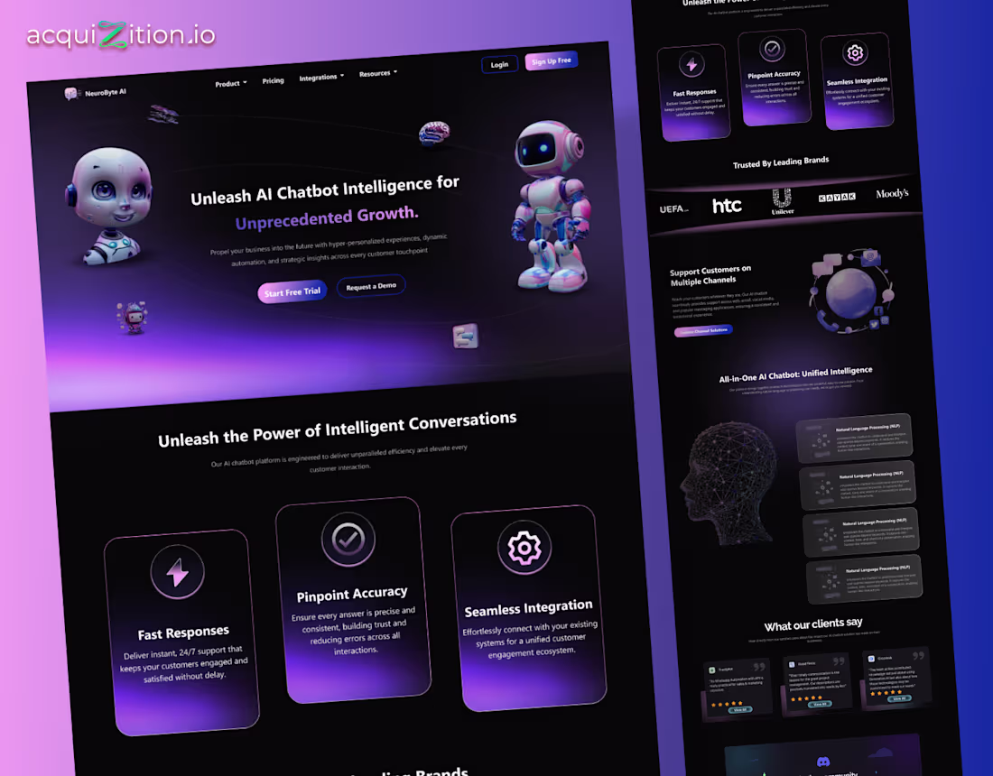
NeuroByte AI – Webflow Landing Page
The Brief
NeuroByte AI needed a landing page that looked intelligent, modern, and human. The goal was to create a high-converting design that explained their chatbot platform clearly while keeping a futuristic edge.
The Direction
I built the site around depth and contrast, dark gradients, neon highlights, and clean grids. The 3D mascots make the tech feel friendly, while each section leads with clarity. The layout flows smoothly, and the tone feels confident without trying too hard.
The Build
Built in Webflow using modular sections, custom animations, and CMS flexibility for features and testimonials. Designed in Figma, then refined with lightweight 3D assets and responsive optimization across devices.
The Impact
The redesign made NeuroByte AI’s brand feel premium and approachable.
2
4
368
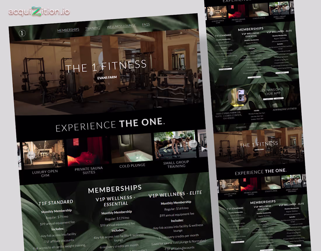
The 1 Fitness – Webflow Website
The Brief
The 1 Fitness team wanted a site that felt exclusive and high-end, like the gym itself. The goal was to build a sleek, modern layout that showcased the space, memberships, and wellness amenities with clarity and luxury.
The Direction
We leaned into a dark, moody palette with rich textures, elegant typography, and clean symmetry. Each section introduces a key offering open gym, private sauna, cold plunge, small group training using cinematic imagery and concise copy.
The Build
Developed in Webflow with responsive design, layered visuals, and CMS-powered membership plans. Integrated Google Maps, app links, and a structured FAQ for quick access.
The Impact
It feels polished, immersive, and premium, helping turn more visitors into members by showcasing the full luxury experience online.
1
327
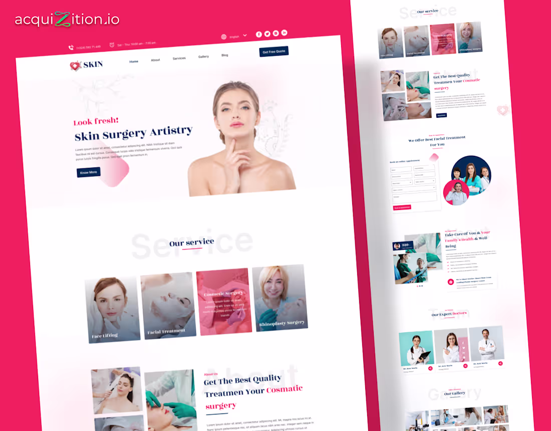
Skin Surgery Artistry – WordPress Website
The Brief
The clinic wanted a website that felt clean, confident, and easy to trust. Their old layout looked outdated and clinical. The goal was to rebuild everything around warmth and credibility, to make patients feel safe booking cosmetic treatments online.
The Direction
We used a soft, medical aesthetic, white backgrounds, coral accents, and calm photography that feels professional but human. Each section focuses on patient trust.
The Build
Built in WordPress, with Elementor for structure and responsiveness. Each section was modular for quick updates, with forms integrated directly into their CRM for booking requests. The layout was optimized for mobile-first users searching for treatments on the go.
The Impact
The redesign gave the brand a polished and inviting online presence.
3
294
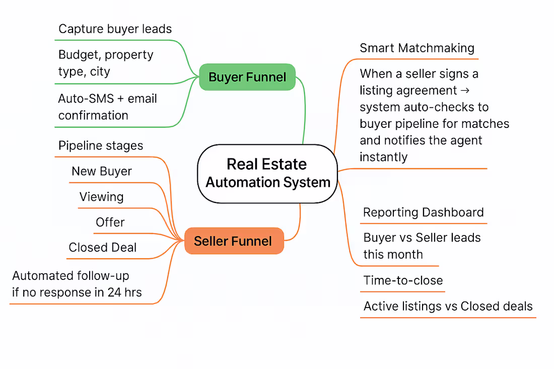
🏡 Real Estate Agents Stop losing hot leads.
We built an AI-powered automation inside GHL that captures buyer & seller leads, auto-sends follow-ups, moves them through smart pipelines, matches buyers to new listings, and shows deal insights in one dashboard. Agents focus on closing while the system handles everything.
31
455