
pro
Abayomi Egbemode
UI/UX Designer and Webflow Expert crafting intuitive digital
- 5.00
- Rating
- 26
- Followers
need your opinion guys
Which home page design do u prefer
A or B?
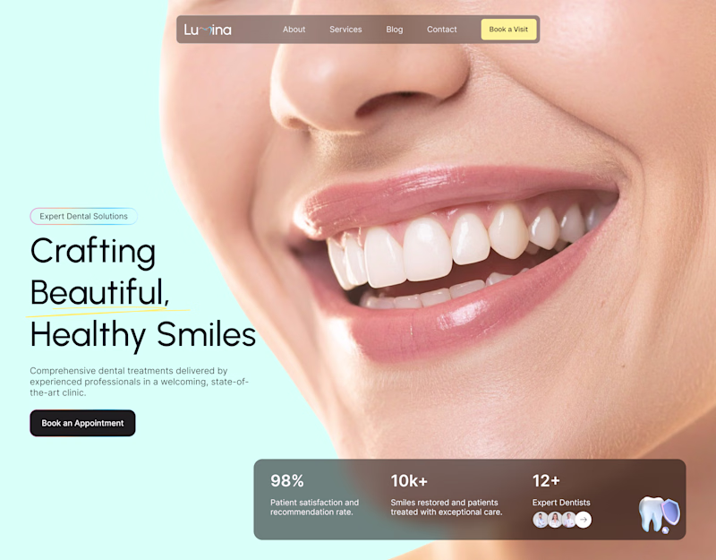
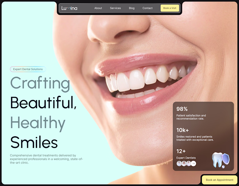
11 votes
Ends in 1d
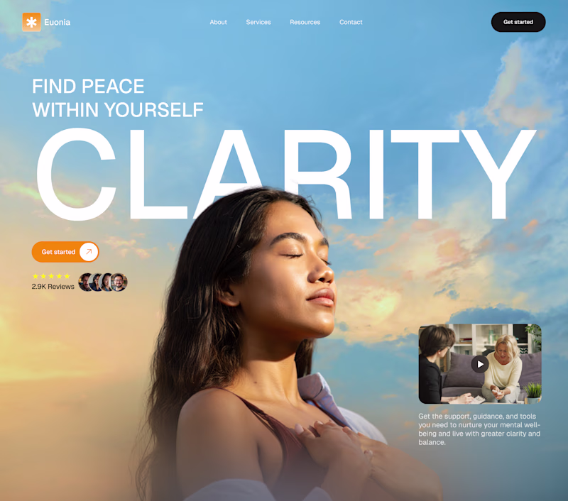
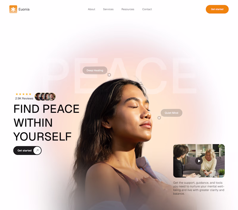
Which hero section best captures a Wellness website
A or B?
42 voted
81%
10 voted
19%
52 votes
Closed
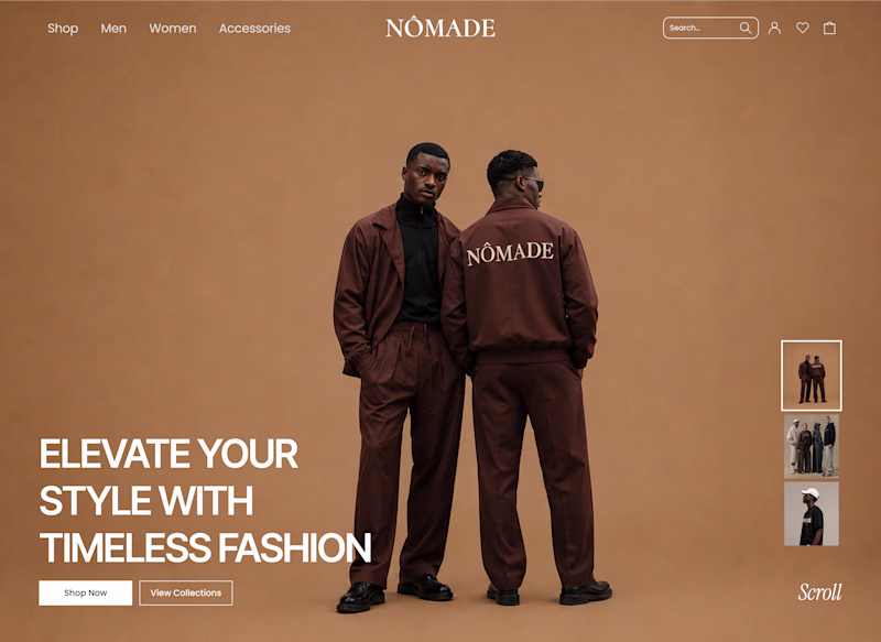
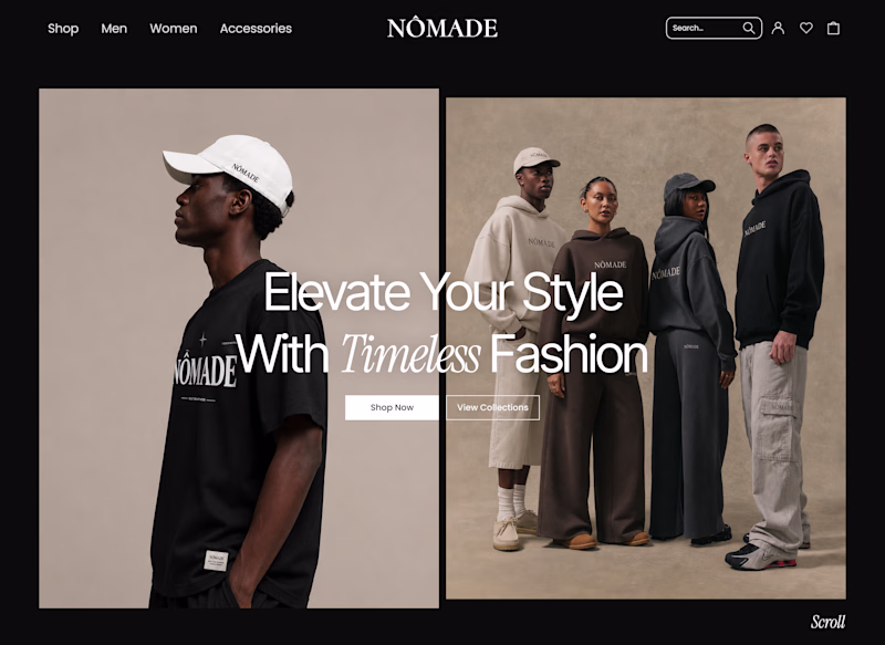
Exploring two hero directions for an ecommerce website
Which direction do you prefer?
A- Split Hero Layout
B- Single Hero Layout
5 voted
45%
6 voted
55%
11 votes
Closed
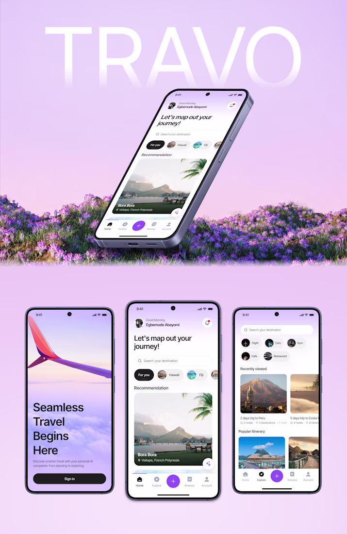
Exploring a fresh direction for AI in travel.
Built a mobile experience that helps users discover destinations, plan smarter, and travel with confidence.
What are your thoughts?
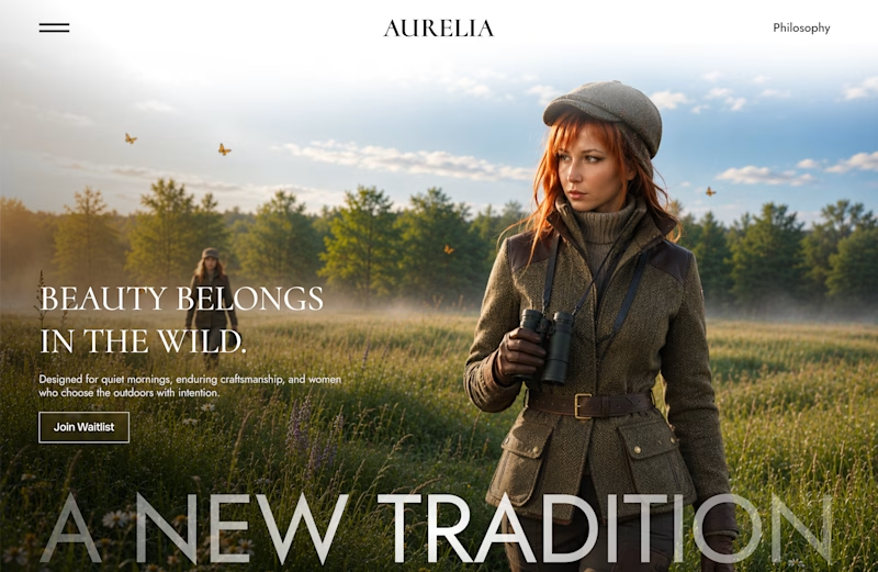
I'm exploring two visual directions for a fashion brand that blends premium design with technical outdoor performance.
Which direction would you choose?
A - Bright morning
B - Warm golden sunrise
7 voted
64%
4 voted
36%
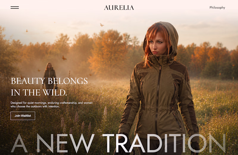
11 votes
Closed