
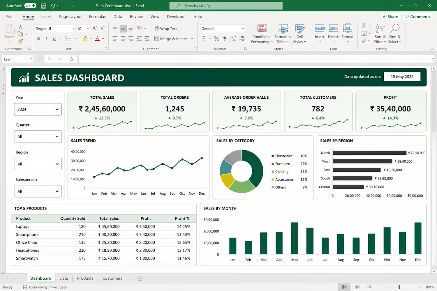
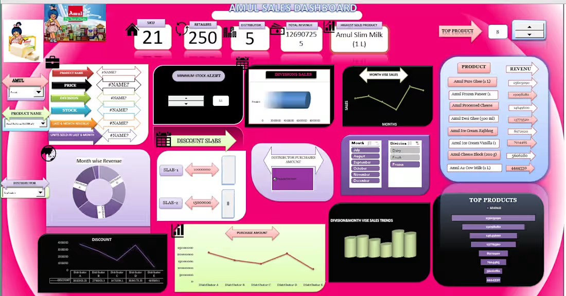
Amul Sales Dashboard
0
0
🌦️ Rainfall vs. Temperature: What Do the Charts Reveal?
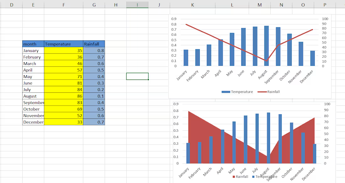
Here's one of my recent Excel Data Visualization projects, where I explored the relationship between Monthly Temperature and Rainfall through interactive-style chart visualizations.
📊 What I worked on:
Organized and structured monthly temperature and rainfall data.
Created a Combination Chart using Column and Line Charts.
Designed an Area and Column Chart for visual comparison.
Used a secondary axis to represent two different measurement scales.
Presented seasonal patterns in a simple and visually understandable format.
Key Learning: Data becomes more meaningful when it's presented visually. The right visualization makes trends, patterns, and comparisons easier to understand.
🛠️ Tool Used: Microsoft Excel
📈 Skills: Data Visualization | Combo Charts | Secondary Axis | Data Presentation | Excel
This is a small project, but every project is a step towards becoming better at turning data into insights!
1
26
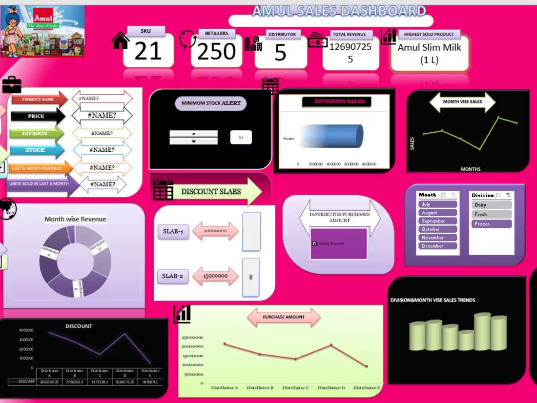
Amul Sales Dashboard | Excel Data Analysis & Visualization
I created this interactive Amul Sales Dashboard in Microsoft Excel to analyze sales performance and convert raw sales data into clear, actionable insights.
What I worked on:
Cleaned and organized sales data for accurate analysis
Analyzed sales, revenue, retailers, distributors, products and monthly performance
Created interactive charts, graphs and KPI cards
Used Excel-based data analysis to identify top-performing products and sales trends
Designed a user-friendly dashboard for quick business insights
Highlighted important metrics such as total revenue, retailers, distributors, sales trends and product performance
Skills demonstrated:
Data Entry | Data Cleaning | Microsoft Excel | Data Analysis | Dashboard Creation | Charts & Visualization | Pivot Tables | Business Reporting
This project demonstrates my ability to take raw/structured data and turn it into a clean, visually appealing dashboard that makes business information easier to understand and use for decision-making.
0
36