
Zakaria Yerrou
I design and build WordPress sites that actually convert
Ready for work
Zakaria is ready for their next project!
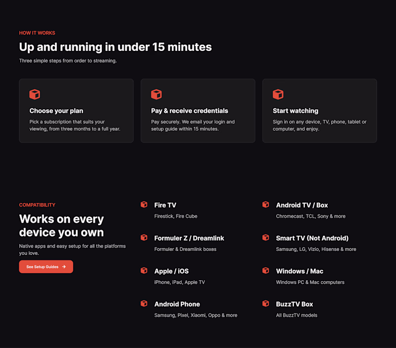
I’d love your opinion on this one: should the tags and icons use the primary color, or should I bring in the tertiary color as the accent? I can also adjust the shade lighter or darker, but I want the version that feels best overall. What would you go with?
2 voted
50%
2 voted
50%

4 votes
Closed
🎮 NormShift – Figma Make turned into a multiplayer city simulator
2-4 players drag cultural norms → watch the isometric city + apps transform live.
Play the game (Please check it out from desktop for optimal experience)
Built during #FigmaMakeathon to prove Figma Make can power...
So far the best submission on #ATCP #Capcut #CapCutAI challenge, serves as an ad itself!
🔥 Anime Editor Transformation , CapCut AI Challenge
I created two variations for this challenge:Variation 01: An anime-style video editor struggling with long nights and complex software, until he discovers CapCut AI and unlocks his creativity.
Variation 02: A short teaser for...
Sharing my submission for the Wispr Flow x Lovable Valentine’s Challenge
I built a cinematic, password‑protected memory timeline experience where couples can privately capture their story as a series of soft, atmospheric “moments” instead of cliché hearts. I used Wispr Flow to...