
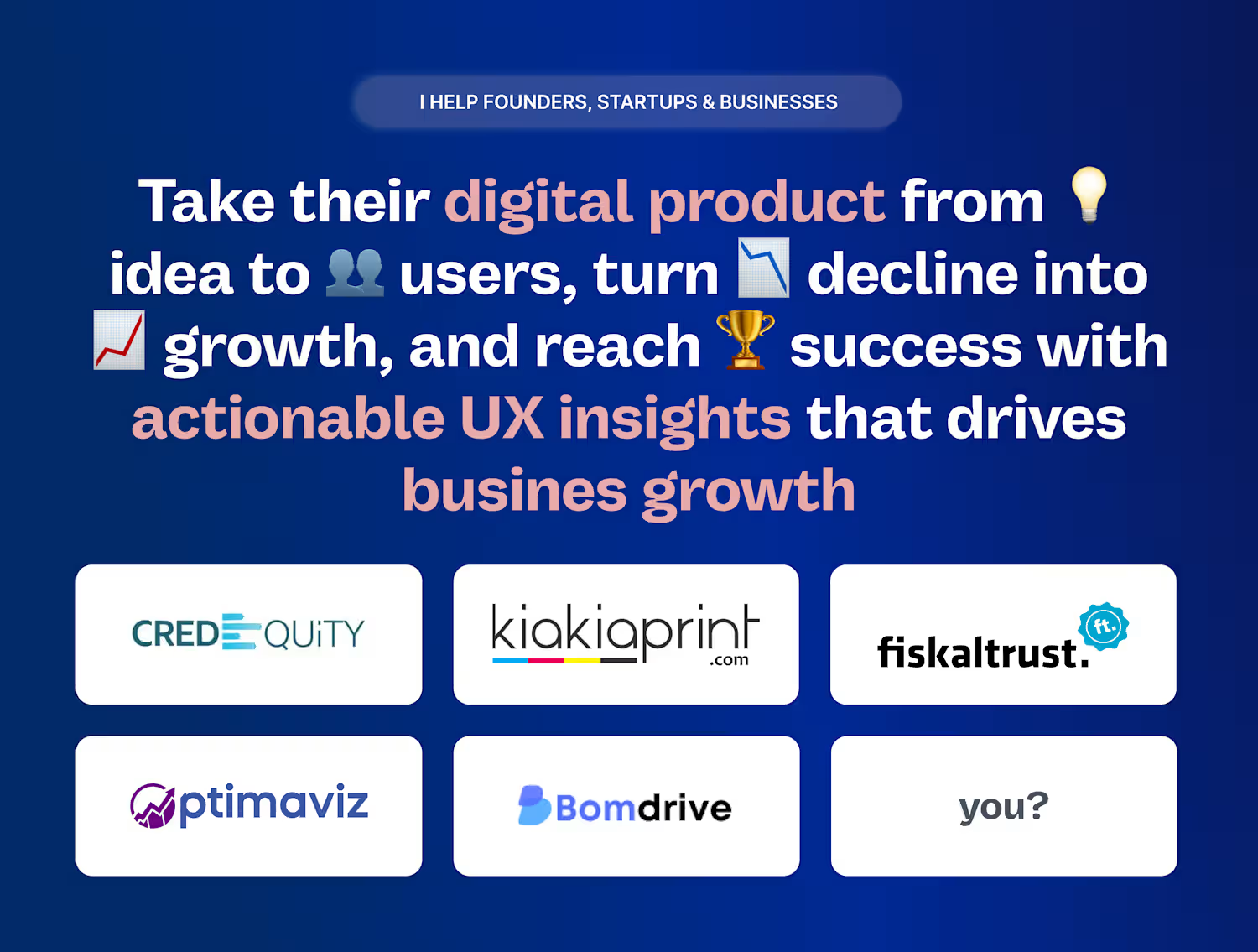
Banjoko Timothy
Help Founders Design SaaS & Apps That Fuel Growth & Revenue
- 5.00
- Rating
- 39
- Followers
A single pixel can cost you thousands in revenue.
It's about the subtle friction hiding in plain sight.
The navigation that makes users think twice, the button that doesn't feel clickable, the form that overwhelms before they even start.
I've seen startups lose 40% of their conversions because their primary CTA blended into the background.
Others hemorrhage users at checkout because the path felt uncertain.
The brain processes visual information in milliseconds.
If users have to decode your interface, they're already gone.
Every extra click is a chance to lose them.
Every moment of confusion is revenue walking away.
The magic happens in the details:
🎯 Navigation that guides, not confuses
🔥 CTAs that scream "click me" without saying a word
🧠 Layouts that reduce cognitive load, not increase it
4
63
The MVP Mistake: Confusing Minimum with Mediocre
They launched their MVP, and nobody used it.
Not because the idea was wrong, but because the execution was sloppy.
I recently reviewed a promising app where the founder said, "We kept it simple, just the core features." Yet, the app had broken flows, misaligned buttons, inconsistent typography, and generic error messages.
Their reasoning: "It's just an MVP. We'll polish it later."
Here's what they missed: Users don't care that it's your first version. They are asking: "Does this solve my problem?" and "Can I trust this company?"
A rushed, buggy MVP tells them your entire business is the same way.
MVP means cutting features, not quality.
✅ Focus on: Flawless core functionality, a consistent visual language, smooth user flows, and a professional polish.
2
2
59
Most founders fear failure, but in product building, failure is the real teacher. Every feature flop, user drop-off, or idea that didn’t land is just feedback in disguise. The faster you fail, test, and iterate, the closer you get to product-market fit. Winning isn’t avoiding mistakes; it’s learning from them. Build. Learn. Evolve. Repeat, that’s how great products are born.
I help founders turn messy ideas into products users love. Open to collaborations and growth-driven projects.
0
71
A founder told me, We want users to explore all our features.
Minutes in, I felt like I was exploring Narnia
Founders love their products so much that they sometimes forget users don’t share the same context (or patience)
That’s why I love helping founders simplify. Because simplicity isn’t about removing features, it’s about removing friction
When you simplify
✅ Users understand faster
✅ Conversions rise
✅ Retention improves
✅ Everyone finally breathes
I’ve learned that clarity isn’t just design, it’s growth
A product that’s simple to use feels smarter, scales faster, and earns more trust. I help founders clean up their “feature soup” and turn it into a product users actually get (and love)
My goal is to help founders create products that not only make users’ lives easier but also help the business thrive in the market
2
1
64
A founder I once worked with had a brilliant idea.
The vision was bold, the energy was high, and the team was talented.
However, there was one problem they were unsure about.
🎯 Endless meetings.
🎯 Conflicting opinions.
🎯 Weeks of wireframes and Slack debate
Yet no one really knew what users wanted.
By the time they launched, they’d built something no one actually needed.
So we paused.
Scrapped the fluff.
And ran a Design Sprint just 5 focused days.
Day 1: Aligned with the real problem.
Day 2–3: Sketched and voted on solutions.
Day 4: Built a prototype.
Day 5: Tested it with real users.
In less than a week, they gained clarity that months of “planning” had never provided.
This is where I come in.
I help startups sprint from chaos to clarity, turning half-formed ideas into validated, testable products users actually want.
32
220
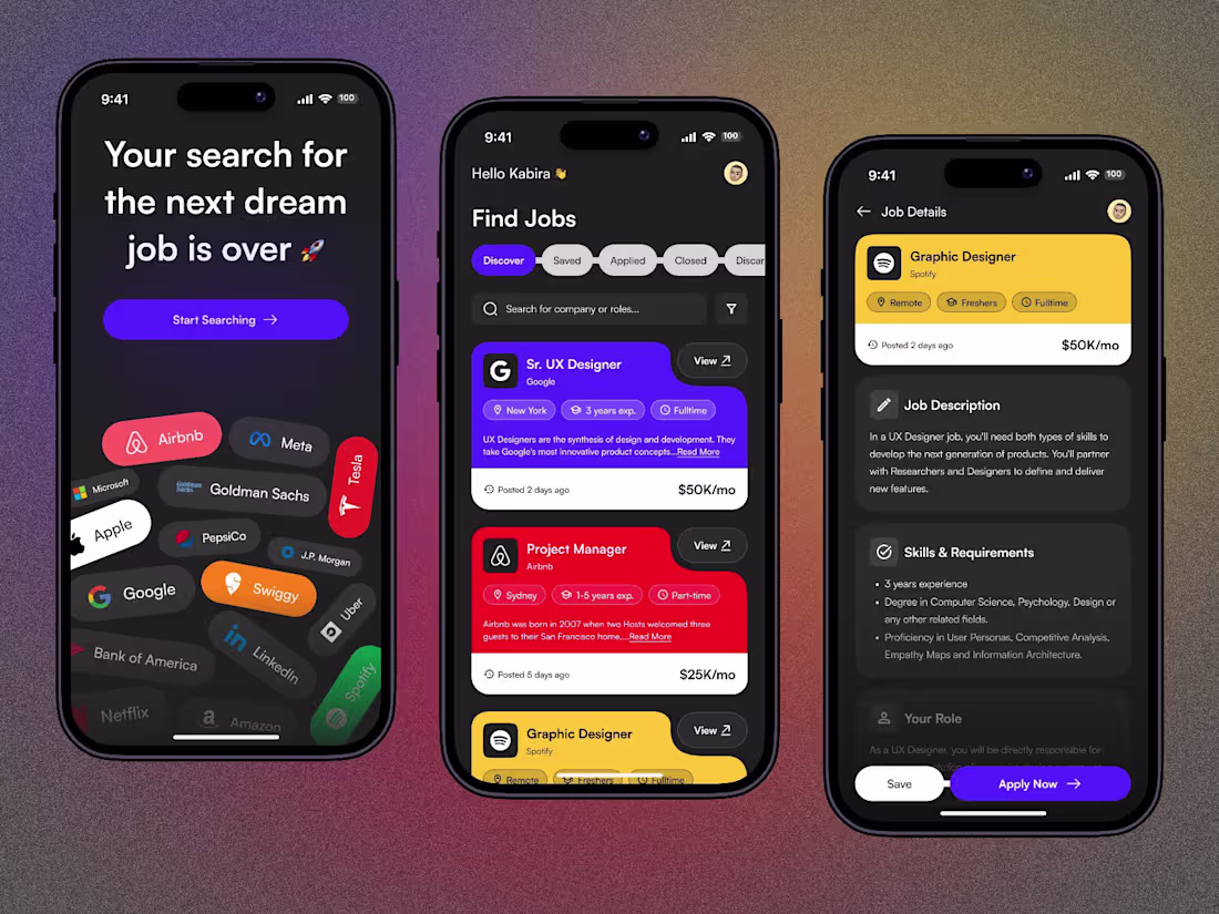
And finally made it through on here
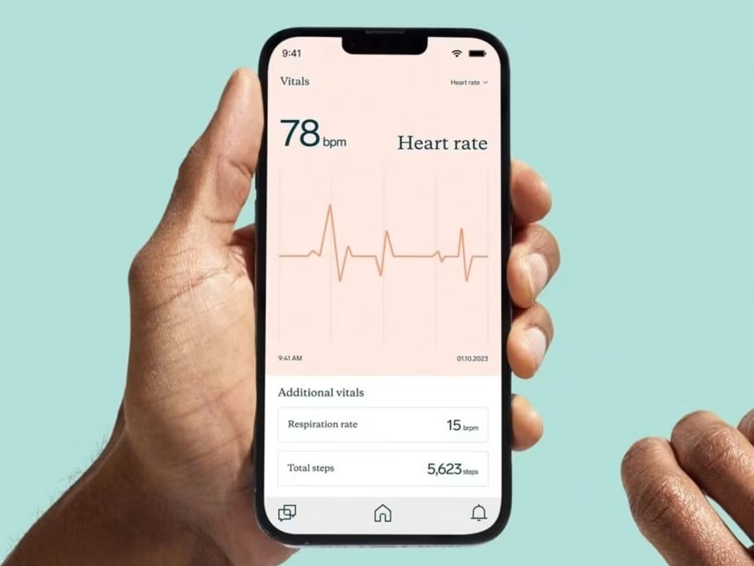
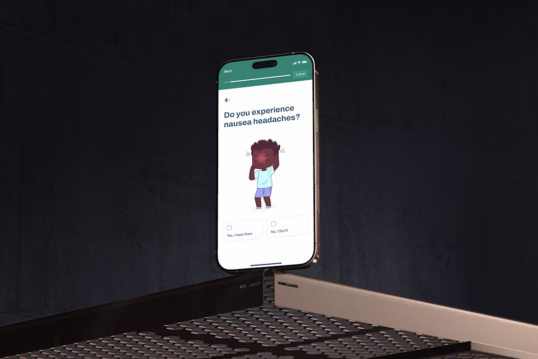
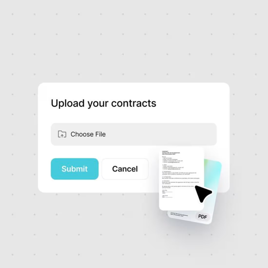
Here is a recent project I am currently working on. will share more updates soon
2
28
196

Dashboard - ClassTopBase Revamping | Product Designer
1
81
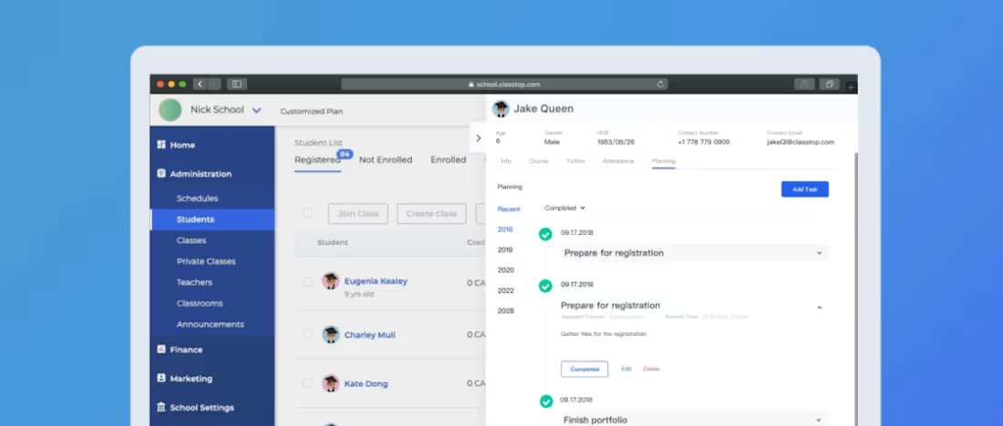
Planning - ClassTopBase | Product Designer
1
44

Promo App | Product Designer
1
40