Dashboard - ClassTopBase Revamping | Product Designer
A dashboard feature for school management software for after-schools
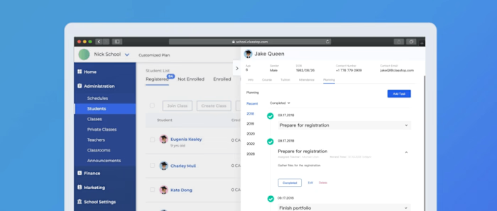
ClassTopBase is a school management software for after-school. It allows school administrators to manage students, teachers, and classes. I have worked on many aspects of this product, including shaping new features and implementing design systems. Here, I will talk about the dashboard I designed for ClassTopBase.
The Users
School administrators from after-schools that have 50-200 students.
My role and who I worked with
Product Designer working with developers and PM.
Tools Used
Figma, Adobe Photoshop
The problem
With many new features added to ClassTopBase, it became a comprehensive tool to fulfill daily management needs for after-schools. However, there is no place to provide an overview of how their schools are doing. The school administrators have to go into each channel, look through the stats, and surmise how the school is doing.
The solution
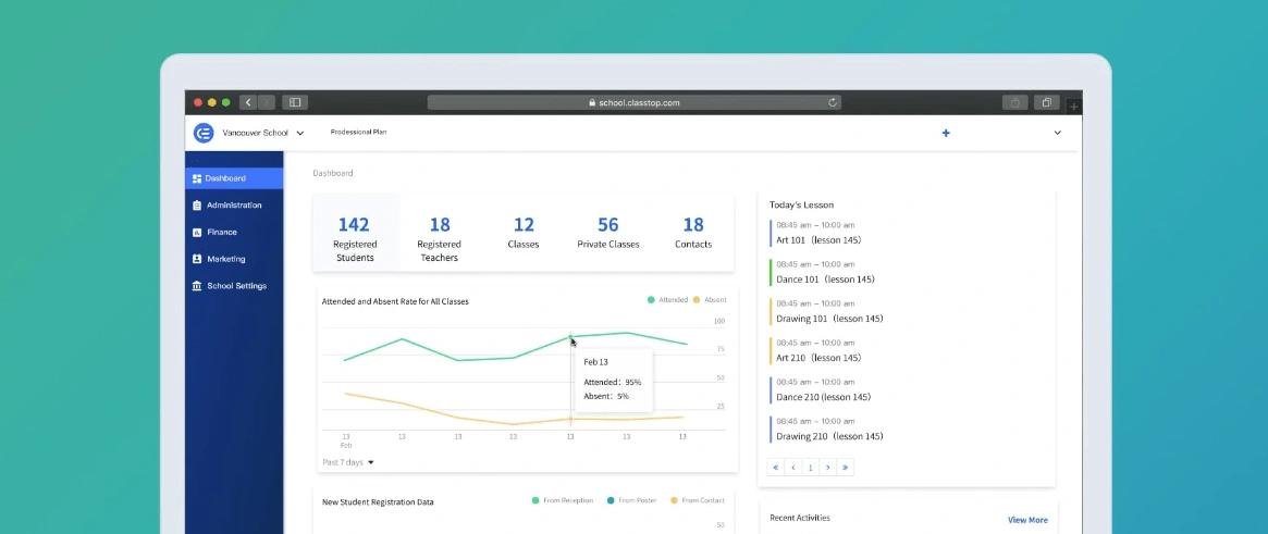
We created a dashboard showing the essential status and quick actions to manage their schools.
Impact and results
The dashboard quickly became a welcome feature of our product, as it offers a way to get an overview of the status with quick access to useful functions.
My Process
Brain Storming - Wireframe - Design - Build
Brain Storming
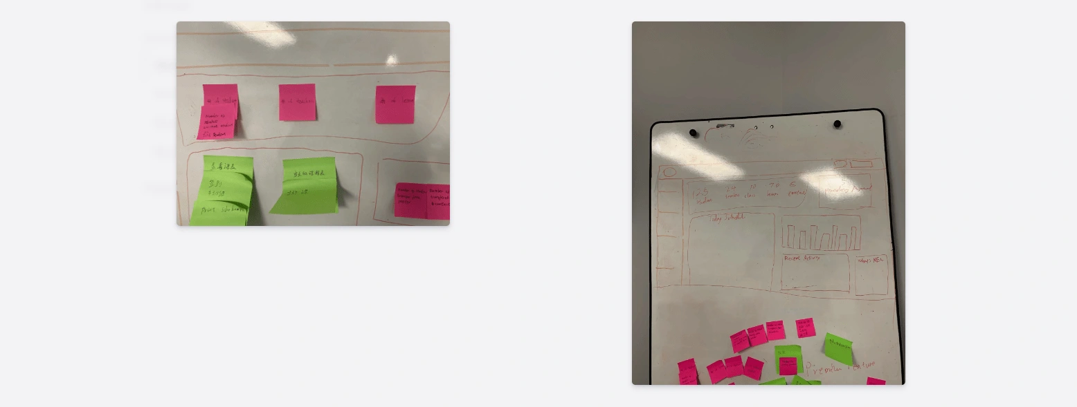
I facilitated a workshop where I ask all of our teammates to join. We first identified all the information we can provide, then categorized them into three categories: Features, Navigation, and Metrics. We then started choosing what information goes on the dashboard. During the process, I challenged the team, including me, to consider whether a metric is useful to the users and its importance compared to other information. The goal was to have a helpful dashboard without overloading it with information.

Wireframe
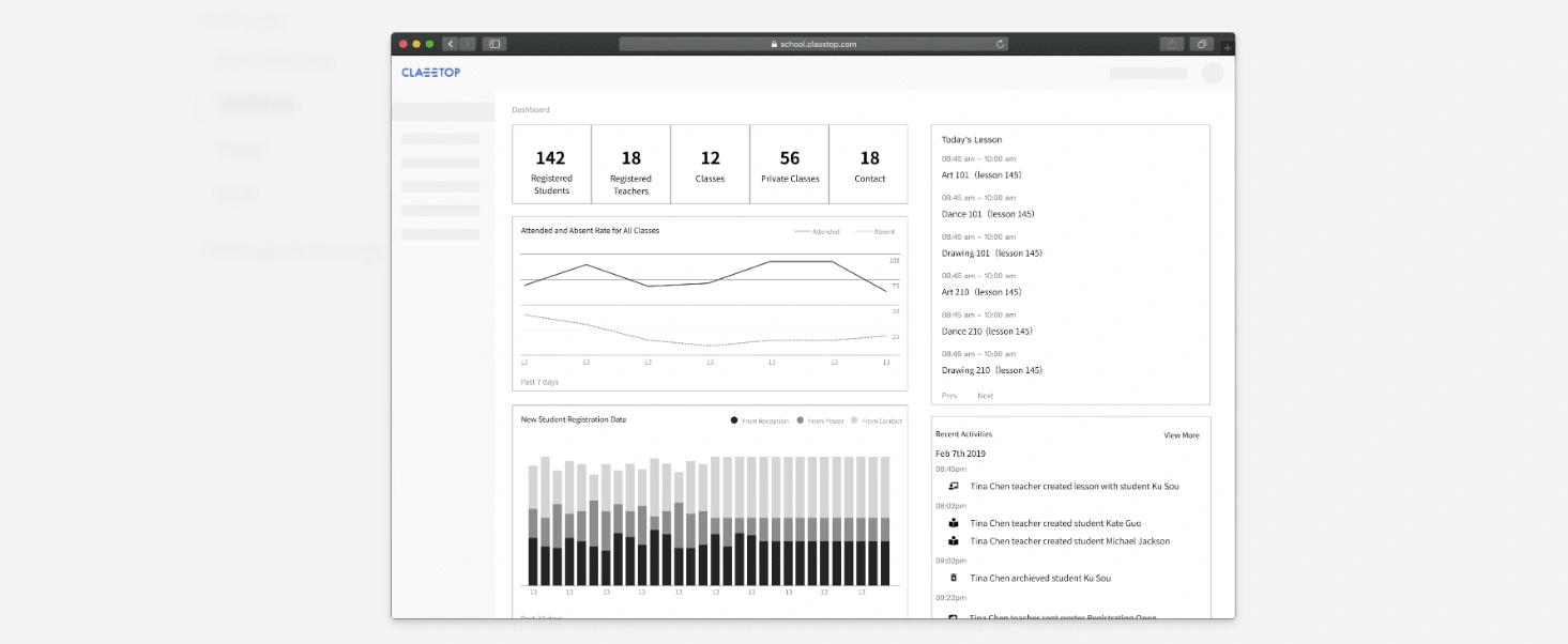
At the end of the workshop, we nailed down to the five pieces of information to show.
Numeric status on basic information about the school
A quick check for how many students, teachers, and classes the school have. It also acts as a shortcut to the correlative pages.

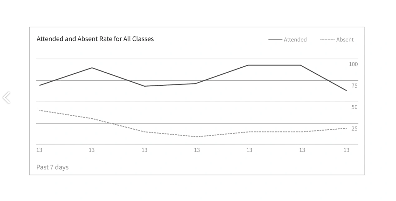
All the check-in statuses of students
Having an idea about how the classes run. Do students go to classes? What's the percentage of students who are attending classes?
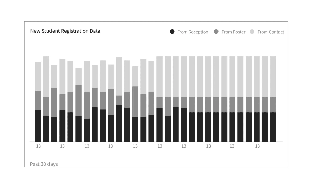
Status on how many students registered from different marketing channels
Indicating the performance of how the school is doing at recruiting new students. Which channel is the best? Which channel needs more work?
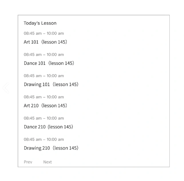
Class schedule for the day
Giving a glaze on what classes would happen today, so staff could take action right on the dashboard.
Recent activities performed by administers
Staff would know what happened in recent management activities.

I mocked up the wireframe for those five metrics and put them into two categories. On the left hand of the dashboard, it would show all the data of the school. On the right side, it would show the event of the school. By grouping metrics together, administrators can glaze through the dashboard and have an overview.
Design
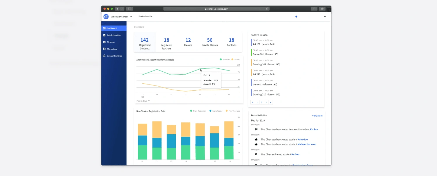
The UI design was restively simple. Most of the parts were following our design system. When I picked the color of the graph, I chose to use a different color palate from our design system color. Many of our exciting colors were associated with buttons or clickable items. I don't want to break the user's mental modal on what certain color means in our software. It also provided a fresh look that didn't blend in with other components. I used a plugin to make sure those colors are accessible for color-blind people as well.

Building
Like many of our other projects, the developers would build the project based on the design. When they had questions about the feature, we would sit together and figure it out. I would also work on the CSS to make sure the end project is consistent with the design. By the end of the development, I would test the feature to find all the bugs and get it ready for release.
Challenges & Key Learnings
It was hard to decide what metrics should stay on the dashboard. We tended to think every metric would be useful; users would want to see all the metrics. However, it's easy to overwhelm users with information and not communicate the most important metrics. This is worth noting when designing for data-driven platforms.
If you want to collaborate on a similar project, feel free to view my services in the button below and we can start a conversation.
Like this project
Posted Aug 10, 2023
We created a dashboard showing the essential status and quick actions to manage their schools.
Likes
1
Views
83

