
Luis Accorsi
Product & Web Design for Startups to Fortune 500s since 2001
- 2x
- Hired
- 78
- Followers
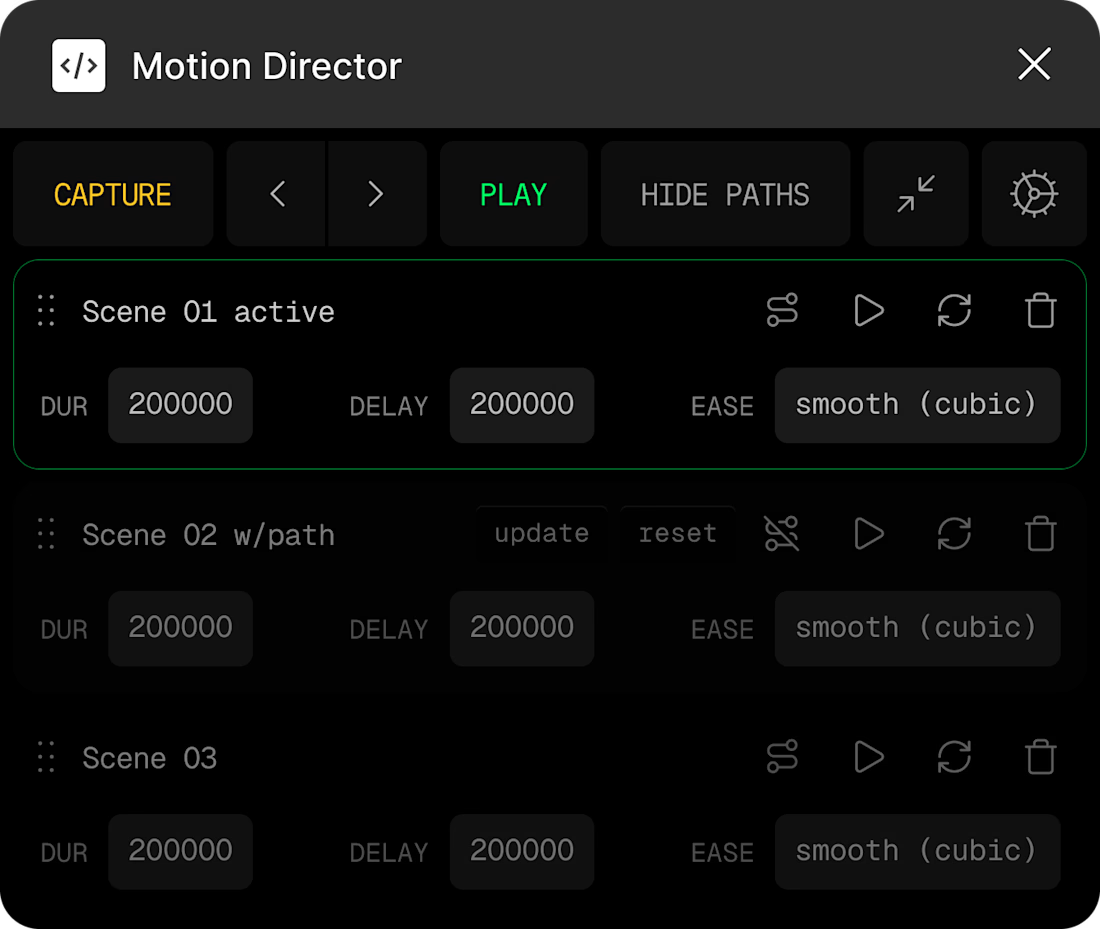
Polishing and perfecting my Figma plugin.
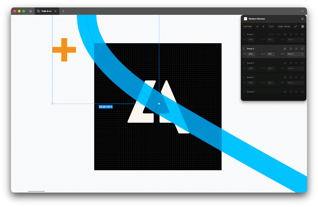
I'm biased toward the infinite trail because it was one of the most realistic textures that Framer Workshop built, and it brings back a lot of childhood memories.
For those who don’t like it, you can disable all the cursor effects whenever you want. 👮
0 voted
0%
2 voted
100%
2 votes
Closed
I've just returned from some time offline with my family and friends, and I haven’t had the chance to check this gift yet.
My journey here has just started, and I have to thank you, Contra. Without your push, I probably wouldn’t have started posting my work.
It was an amazing year...
Image compression is unfair with tiny UIs like this and make every single detail look burry 😢
Please, check out these 4x pngs and help me pick the best.
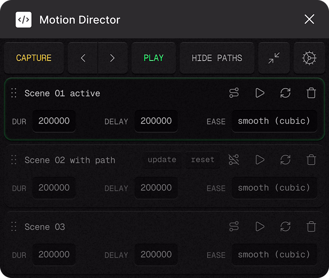
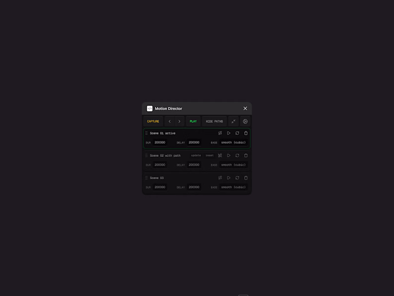
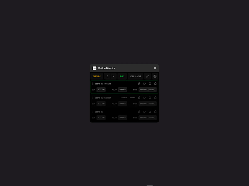
Trying two slightly different visual directions for my Figma plugin.
A grainy UI gives it personality and depth, but the minimal B/W version stays out of the way and feels “invisible”.
What’s better for a plugin: character or neutrality?
0 voted
0%
2 voted
100%
2 votes
Closed