The network for creativity
Join 1.25M professional creatives like you
Connect with clients, get discovered, and run your business 100% commission-free
Creatives on Contra have earned over $150M and we are just getting started
Back to feedPost
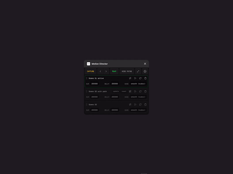
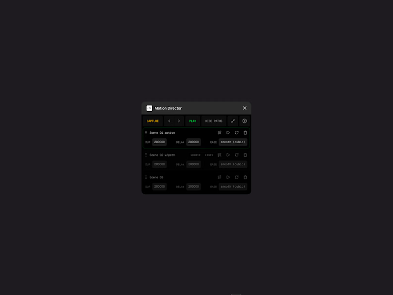
Image compression is unfair with tiny UIs like this and make every single detail look burry 😢
Please, check out these 4x pngs and help me pick the best.
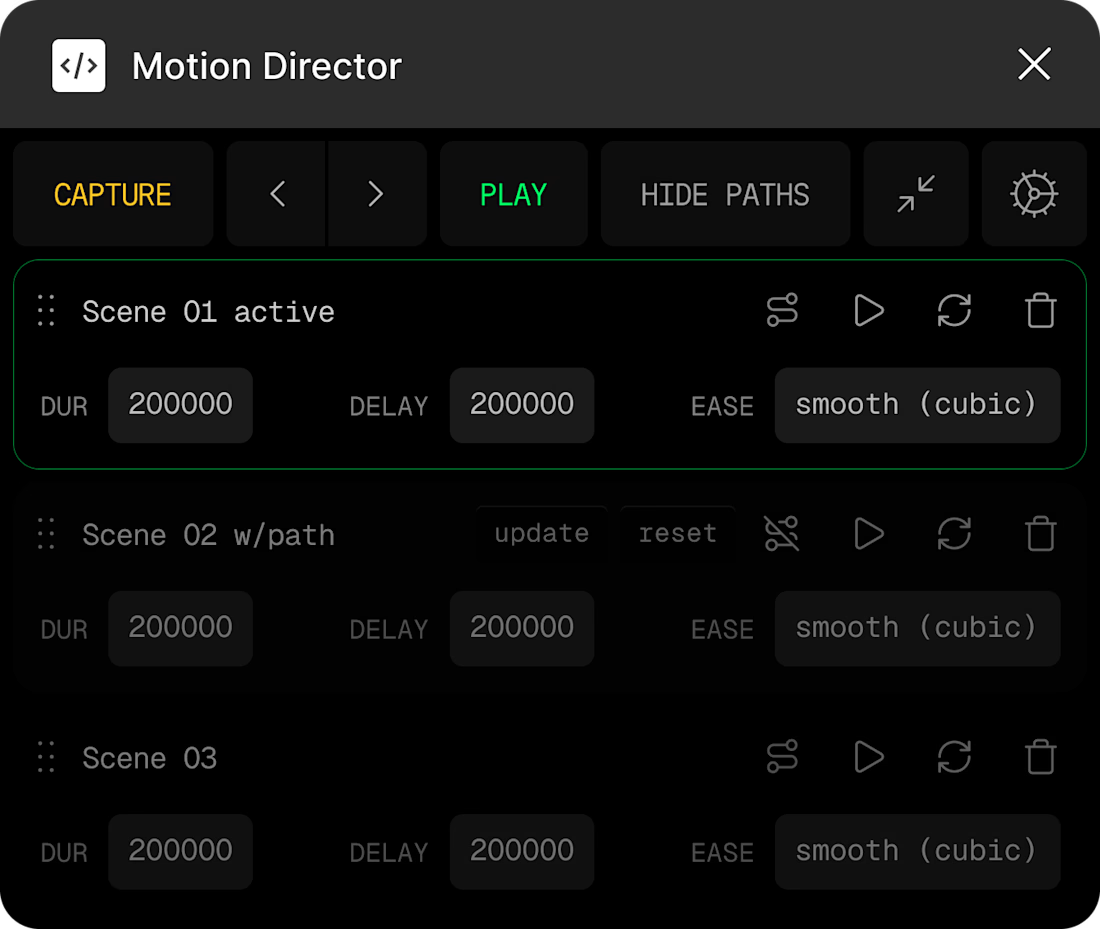
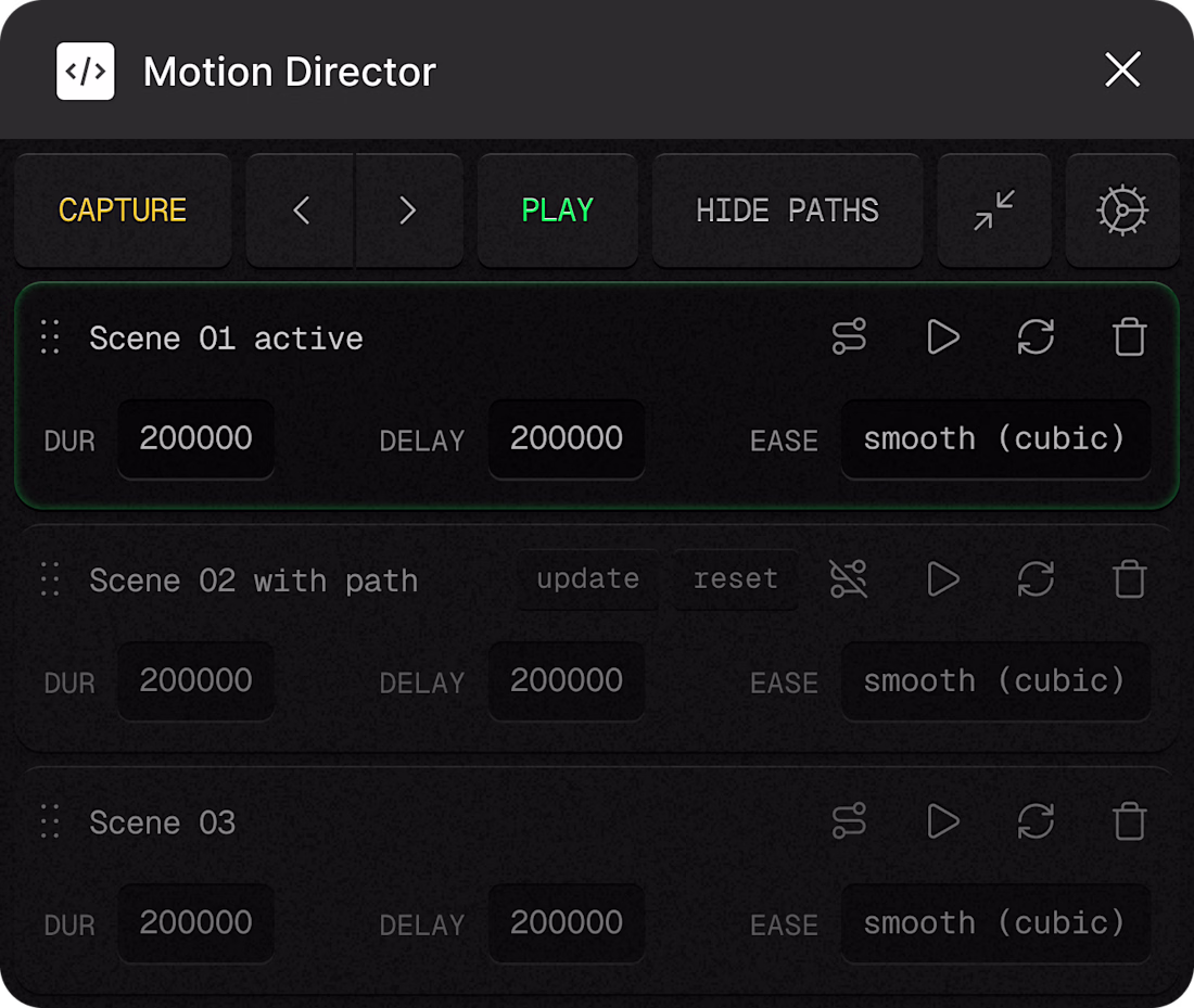
Trying two slightly different visual directions for my Figma plugin.
A grainy UI gives it personality and depth, but the minimal B/W version stays out of the way and feels “invisible”.
What’s better for a plugin: character or neutrality?
0 voted
0%
2 voted
100%
2 votes
Closed
The network for creativity
Join 1.25M professional creatives like you
Connect with clients, get discovered, and run your business 100% commission-free
Creatives on Contra have earned over $150M and we are just getting started
Trending
Claude
Claude has entered the design space. How are you using Claude Design?
Contra University
Learn from expert creatives how to earn more using next-gen AI tools.
creativeaiflow
Creative AI workflows are evolving. What tools do you use, and what are their strengths and weaknesses?
freelancerlife
Freelancer life is wins, pivots, and everything in between. What’s yours right now?