
Zoheb shaikh
Turning your casual scrollers into obsessed buyers
New to Contra
Zoheb is ready for their next project!
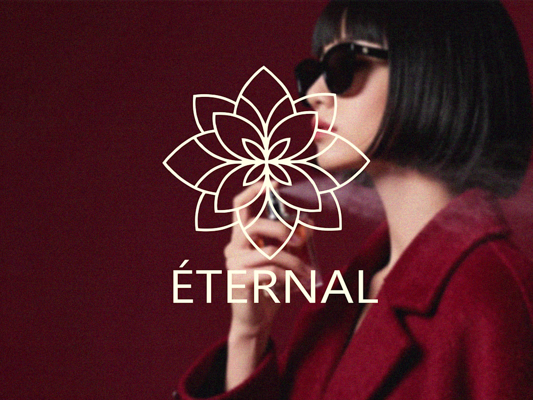
ÉTERNAL: Premium Geometric Logo Design & Identity Concept
"Éternal" is a luxury fragrance brand concept with a primary focus on a strong, memorable, and timeless logo design. The goal of this project was to create a mark that defines elegance and modern luxury. I designed an intricate, symmetrical floral-geometric emblem, paired with clean typography to establish a high-end brand identity.
Design Details & Application
The Core Logo: The logo mark is based on a symmetrical geometric lotus/flower structure, visually representing luxury, purity, and the blooming nature of a fragrance. Its precise linework gives it a premium, sophisticated feel.
1
52
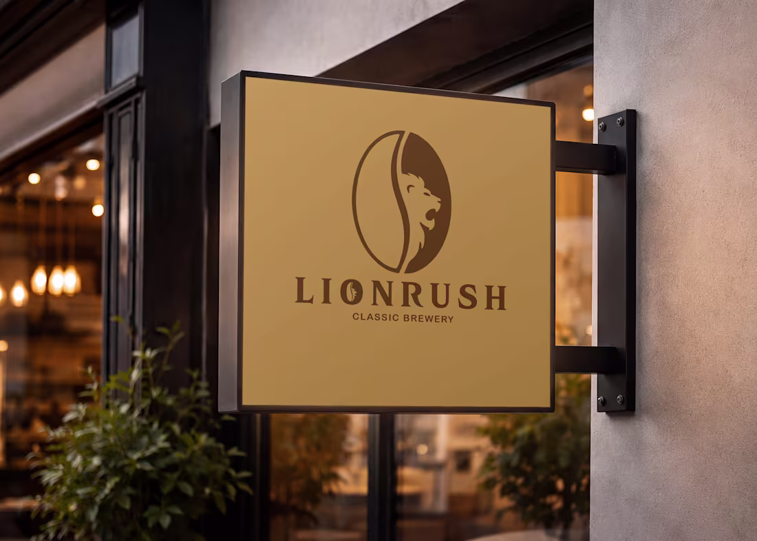
LIONRUSH | Custom Logo Design & Brand Concept.
This project centers around the custom logo design for "Lionrush," a conceptual classic brewery and coffee brand. The main objective was to craft a strong, memorable emblem that immediately communicates premium quality, boldness, and the rich essence of coffee.
The Logo Concept & Execution:
The core of this project is the primary logo—a clever and seamless fusion of a roaring lion's profile with a coffee bean.
The Lion: Symbolizes strength, leadership, and a bold flavor profile.
The Coffee Bean: Represents the core product and grounds the design in the cafe/brewery industry.
I created this vector logo focusing on clean lines, balance, and scalability, ensuring it looks sharp whether printed on a small business card or a large storefront.
0
85
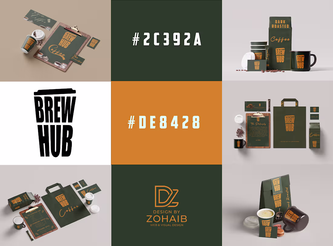
Brew Hub: Artisanal Cafe Brand Identity & Packaging
Brew Hub is a conceptual brand identity and passion project I created to explore the intersection of minimalist typography, negative space, and premium packaging design. The goal was to build a complete visual story for a modern artisanal roastery from scratch.
Visual Direction & Aesthetic
The brand's aesthetic is driven by an earthy "Forest Green & Warm Gold" color palette, reflecting the natural origins of coffee beans and the warmth of the roasting process. The typography pairing is intentional—using an elegant, expressive script for the brand's philosophy and a clean, condensed sans-serif for the main logo to maintain a balanced, modern look. Subtle mandala-inspired background patterns were integrated to add a touch of heritage and artisanal depth to the print materials.
0
81
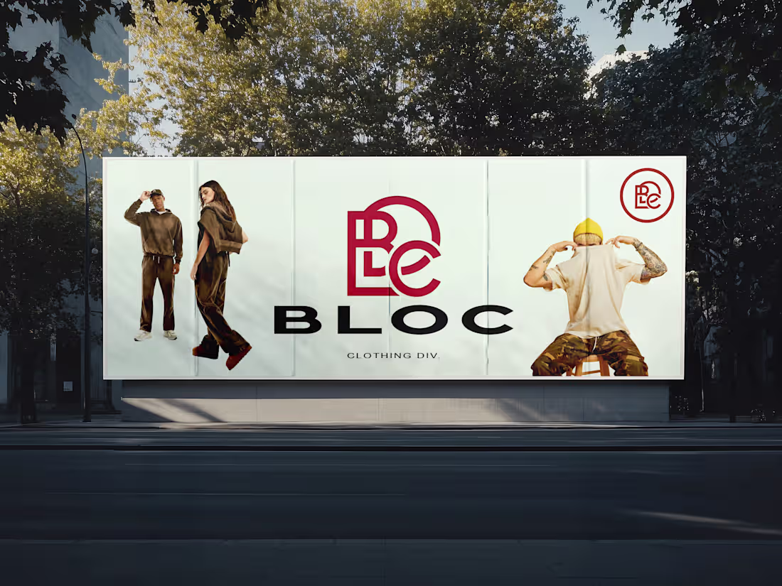
BLOC Clothing Div. - Brand Identity & Logo Design
A bold, modern, and minimalist logo design for BLOC Clothing Div. The main goal of this project was to create a brand identity that strongly represents streetwear culture and urban fashion. I designed a unique monogram (BLC) that is highly recognizable and scales perfectly across t-shirts, tote bags, billboards, and digital banners.
My Role: Brand Identity Designer
Deliverables: Custom Logo Design, Typography Selection, 3D & Real-world Apparel Mockups.
0
87
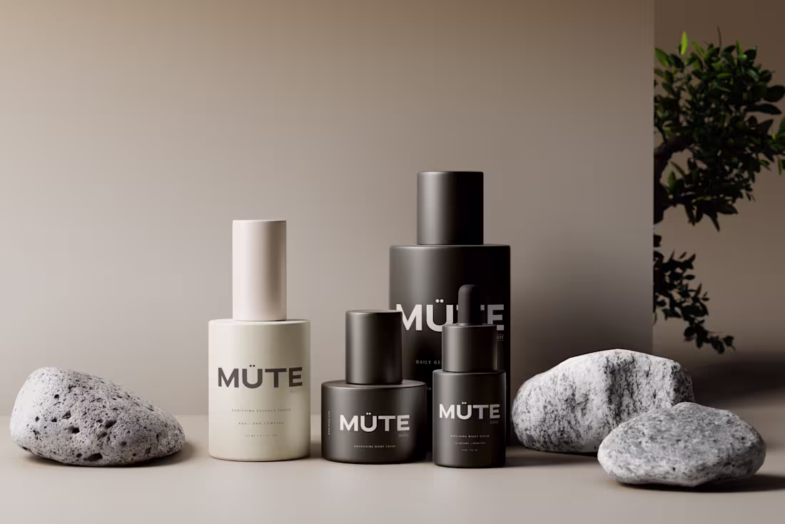
Premium 3D Branding & Packaging Design for Skincare & Beauty
In the saturated beauty market, being loud isn't the goal—being memorable is. I specialize in crafting minimalist, high-end brand identities that speak through 'Quiet Luxury' and sophisticated design principles.
Through this service, I help emerging and established beauty brands move beyond flat 2D designs. Using advanced 3D compositing and realistic lighting (as seen in my MÜTE series), I create a tactile and premium visual ecosystem that builds instant trust with your customers.
Whether you need a full brand identity from scratch I deliver designs that are portfolio-ready and market-driven
2
1
114
Rosaura: Premium Skincare Brand Identity & Visual System
Rosaura is a conceptual branding project designed to demonstrate how a minimalist visual system can adapt to diverse brand personalities. I developed a cohesive identity for a high-end skincare line, focusing on botanical elegance and modern typography."
My Process:
Identity Design: Created a custom botanical rose icon to represent organic purity.
Color Theory: Developed four distinct color palettes (Sage, Terracotta, Navy, and Neutral) to show the brand's versatility across different market segments.
Layout & Composition: Focused on clean, airy layouts that highlight product premiumness and readability.
0
90
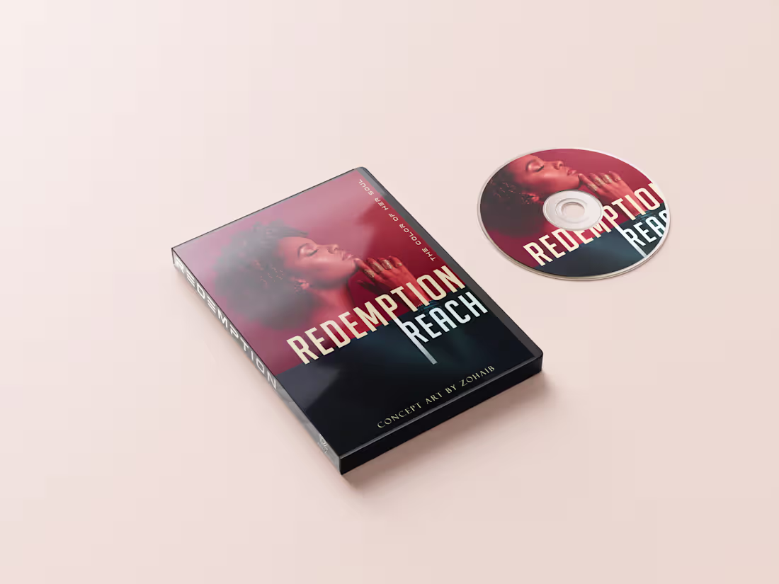
Redemption Reach - Cinematic DVD Packaging & Concept Art
"Redemption Reach" is a personal concept project focused on creating high-end, studio-quality physical packaging for a fictional cinematic drama. The objective was to design artwork that immediately communicates a moody, intense narrative before the viewer even reads the synopsis.
The Visual Approach
To achieve a premium, dramatic look, I focused on deep color grading, utilizing rich reds and deep shadows. The composition relies on striking character imagery combined with clean, modern typography. The layout was carefully structured to maintain a cohesive visual identity across the front cover, spine, back panel, and the physical disc itself.
0
102
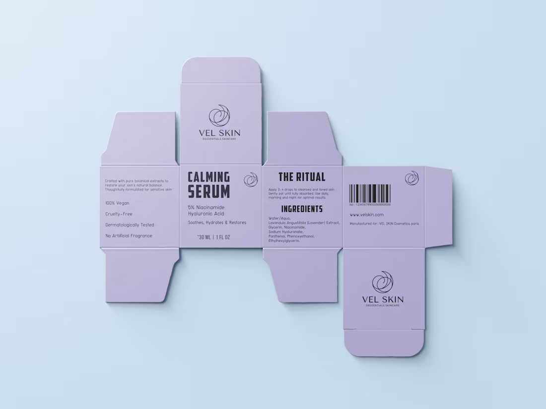
Vel Skin: Minimalist Skincare Packaging & Branding
Project Overview
This is a conceptual skincare branding project focused on delivering a premium, clean, and minimalist aesthetic. To reflect the soothing nature of the product, I designed a visual identity that pairs a soft lavender color palette with a sleek line-art logo and refined typography, creating a high-end, calming feel.
Services Provided
Packaging Design
Brand Identity
Typography
3D Product Presentation
The Design Process
Color Palette: Selected a soft lavender background (#E6E6FA) to visually communicate the calming and restoring properties of the skincare serum.
Typography Hierarchy: Utilized a clean, bold sans-serif typeface for the brand name, contrasted with lighter weights for the subtext. This structured hierarchy ensures essential information (like active ingredients and volume) is highly legible without cluttering the negative space.
Print-Ready Layout: Before rendering the 3D mockup, the design was constructed on an accurate flat die line panel, demonstrating an understanding of technical print standards and structural packaging layout.
0
112
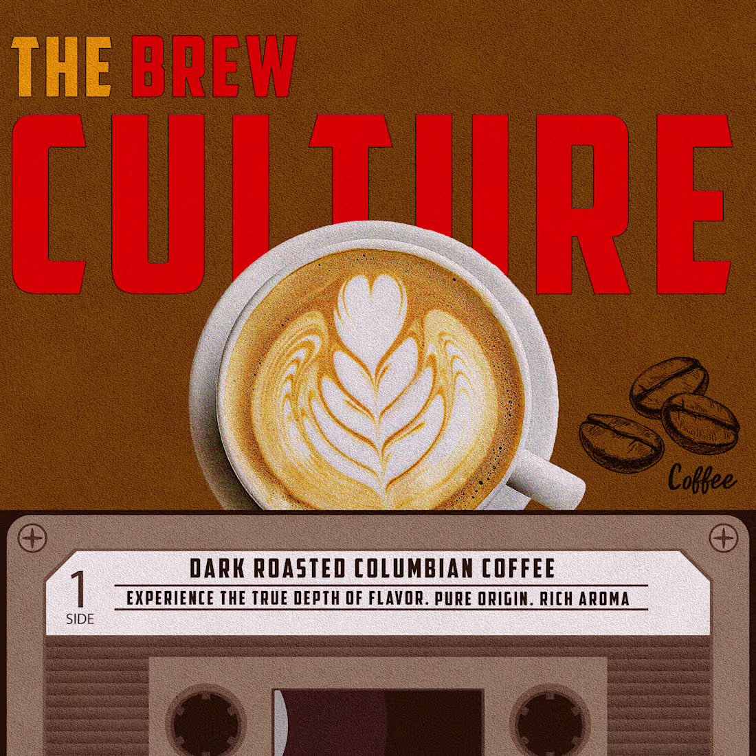
The Brew Culture" Coffee & Cassette Vintage Fusion Poster.
A creative conceptual poster that blends coffee culture with vintage audio nostalgia. The design features a realistic integration of a stylized coffee cup and a custom-labeled vintage cassette tape. Key Features: Mastered complex visual integration to remove 'halo' effects from the coffee cup, adding subtle shadows for realism. Uses specific typography layout on a cassette label for product details
1
169
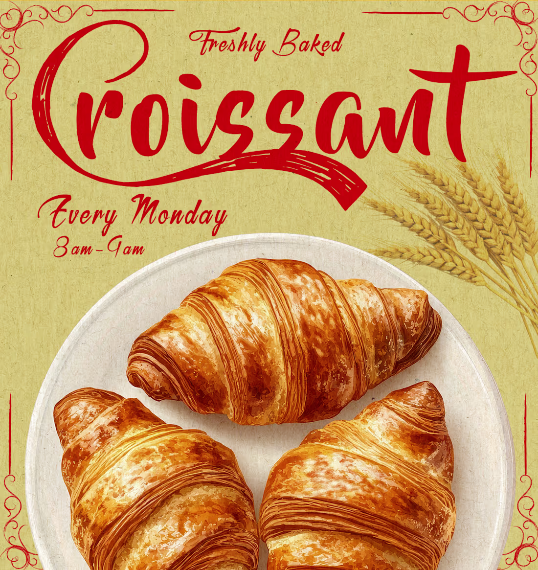
Retro Artisan Cafe Poster: Typography & Illustration
Designed a vintage-inspired promotional poster for an artisan bakery. The goal was to evoke a sense of traditional, hand-crafted baking and warm, rustic charm. I focused on creating a nostalgic aesthetic that immediately catches the eye and communicates quality.
Design Details:
Typography: Custom, bold script lettering for the main subject ("Croissant") with elegant flourishes to create a classic, premium feel.
Color Palette: A warm, inviting blend of mustard yellows, deep reds, and toasted browns to complement the bakery theme.
Visual Hierarchy: Strategically placed the main illustration and typography to guide the viewer's eye smoothly from the headline to the promotion details (Every Monday, 8am-9am).
Textures: Applied subtle paper grain and edge distressing to enhance the retro, tactile feel of the advertisement.
My Role: Graphic Design, Layout Strategy, and Typography.
0
169
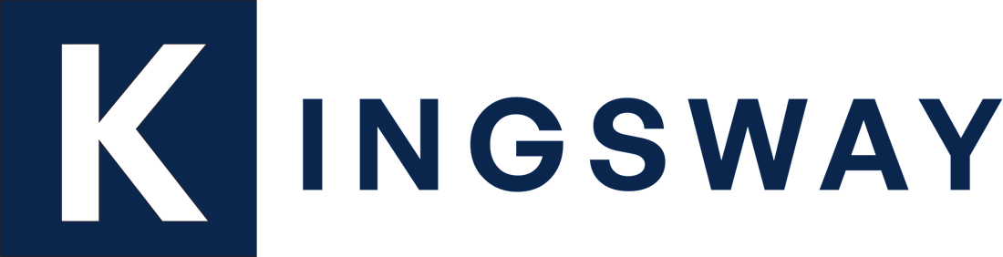
Minimalist Corporate Brand Identity & Logo Design..
Kingsway is a real estate firm focused on delivering premium and reliable services to their clients. They needed a brand identity that projected authority, stability, and modern professionalism while remaining highly recognizable.
The Challenge
The objective was to design a logo that avoided visual clutter. The client required a versatile mark that could function seamlessly across various touchpoints—from large corporate signage and print materials to digital platforms and tiny social media avatars—without losing its impact or legibility.
My Approach & Solution
I opted for a minimalist, geometric wordmark paired with a strong letter mark.
The Emblem: By isolating the "K" inside a solid structural block, I created a powerful standalone icon. This block represents a solid foundation and acts as an immediate visual anchor, perfect for use as a favicon or app icon.
Typography: I selected a bold, highly legible, and modern sans-serif typeface. The clean lines communicate transparency and forward-thinking, while the weight of the letters grounds the brand.
Color Palette: I chose a monochromatic deep navy blue (#0A2540 or similar). In color psychology, deep blue evokes feelings of trust, intelligence, security, and corporate authority—perfectly aligning with Kingsway's brand values.
0
138
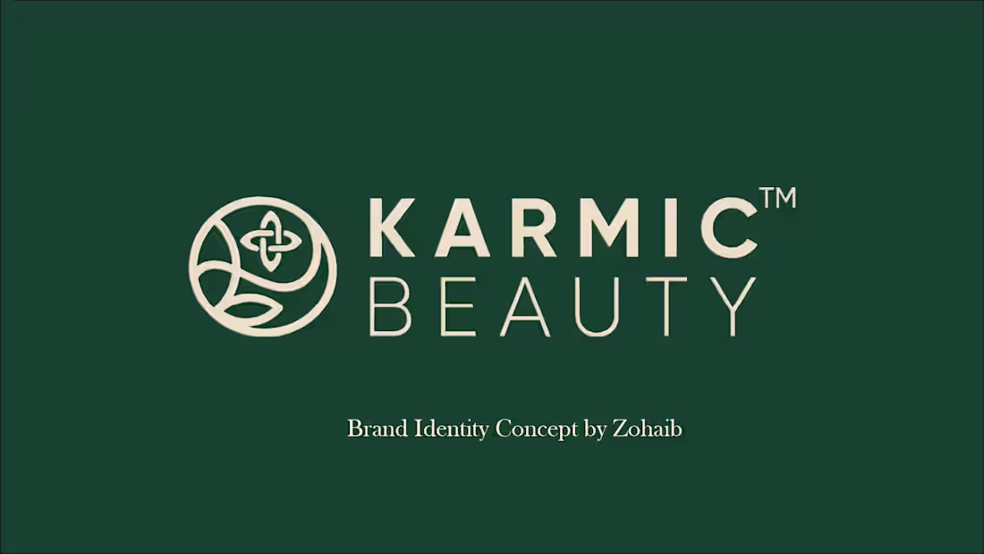
Brand Identity & Packaging Concept: Karmic Beauty.
A comprehensive brand identity and packaging concept for 'Karmic Beauty,' a luxurious and organic skincare line. The primary objective was to encapsulate the brand's commitment to natural, sulfate-free ingredients while establishing a highly sophisticated and premium presence in the beauty market.
1
224
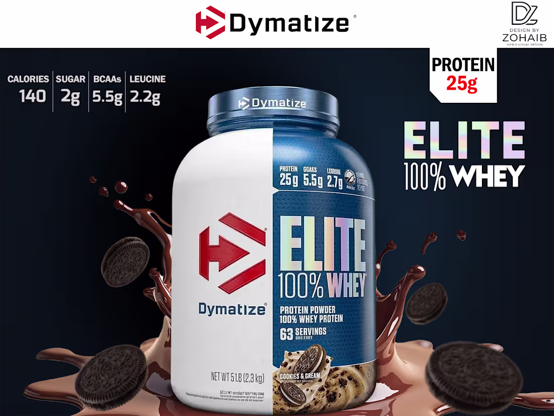
Dymatize Elite Whey - Social Media Ad Concept.
Designing for the fitness industry requires understanding exactly what the target audience looks for. For this Dymatize Elite Whey promotional banner, I focused on creating a high-energy, premium visual experience that speaks directly to those dedicated to muscle gain, fat loss, and serious recovery.
The composition is balanced with dynamic chocolate splashes and cookie elements for appetite appeal. To keep the layout looking premium and not overly crowded, I utilized the upper negative space by creating a subtle, custom-made geometric pattern. The ultimate goal was to blend advanced Photoshop masking, precise typography, and composition techniques with an authentic understanding of fitness marketing.
0
151
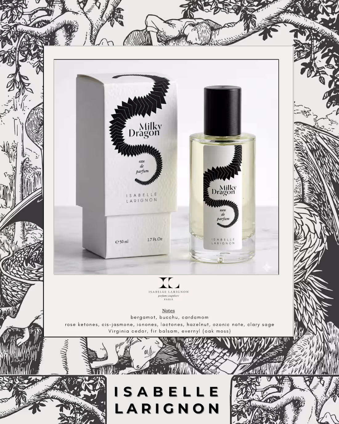
Story-Driven Aesthetic Perfume Layout.
A visual ode to the art of niche perfumery. Fragrance is invisible, so the visual storytelling needs to be powerful. This design balances the brand's maximalist, story-driven packaging illustration with a clean, modern frame. The focus was on highlighting the product as a piece of art, appealing to an audience that values craftsmanship and exclusivity.
0
204
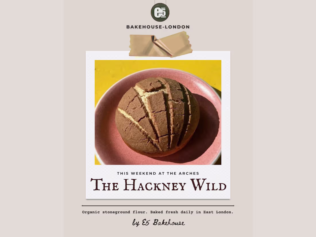
Rustic & Authentic Bakery Visual Identity.
Capturing the tactile, organic essence of artisan baking. For this concept, I stepped away from overly polished graphics and embraced raw textures, warm earthy tones, and refined typography. The goal was to create a digital storefront that feels as authentic, handcrafted, and welcoming as the brand's physical bakery. It's about making the audience almost smell the fresh sourdough through their screens.
0
192
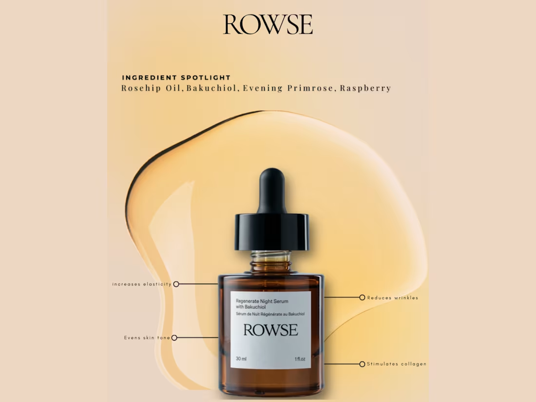
Editorial Skincare Ingredient Spotlight.
Transforming skincare education into a premium editorial experience. Modern beauty brands need to educate their audience without looking like a textbook. This layout uses precise, minimalist annotations, clean typography, and a warm, sunlit aesthetic to communicate product benefits. It perfectly balances information with a luxurious, high-end 'Vogue-style' visual hierarchy.
0
174
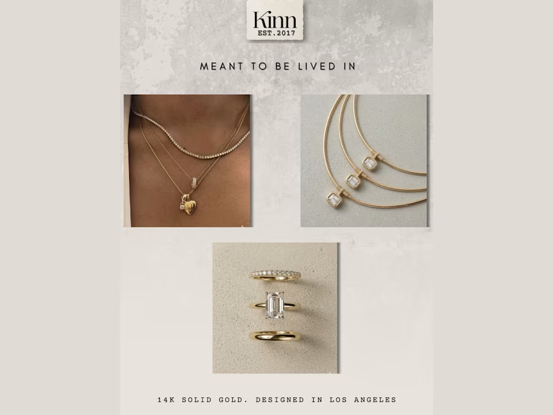
Minimalist Fine Jewelry Editorial Grid.
Curating a 'modern heirloom' aesthetic. Fine jewelry requires a delicate touch. For this lookbook concept, I completely removed harsh borders, utilizing strategic negative space and seamless image placement to create a cohesive grid. Paired with elegant, wide-spaced typography, the layout showcases the gold pieces in a way that feels timeless, editorial, and undeniably expensive.
0
149