
Zidhan Ibrahim
Creative Director & Brand Strategist
Profile in progress
Zidhan is building their profile!

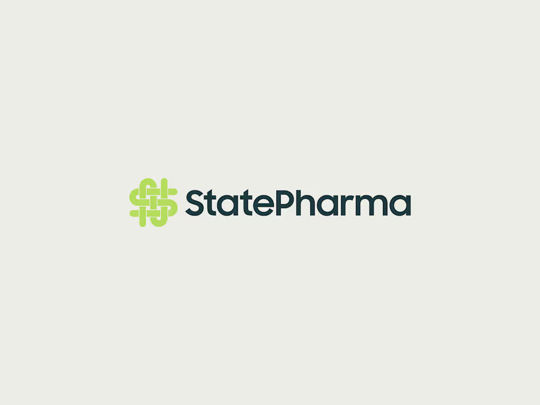
StatePharma - Brand Identity System
A complete brand identity system for StatePharma, a 100% government-owned pharmaceutical and medical supply corporation. The brief called for a visual language that communicates institutional authority and public trust, while staying approachable across every citizen-facing touchpoint - from signage to social media.
The logo-mark is built from five layered meanings: the letters S and P, an infinity symbol representing uninterrupted supply, a heart representing care for every island and every citizen, and a pill shape representing medicine itself. Every element had to earn its place in a single mark trusted by an entire population, not just a target demographic.
The system extends across signage, uniforms, lanyards and ID cards, letterheads, business cards, and social media templates in both English and Dhivehi, ensuring consistency whether the brand is seen on a building, a staff member, or a phone screen.
Deliverables: Logo and brand mark, full color and typography system, signage, staff uniforms, ID and lanyard design, stationery suite, social media templates (bilingual), brand guidelines.
0
11
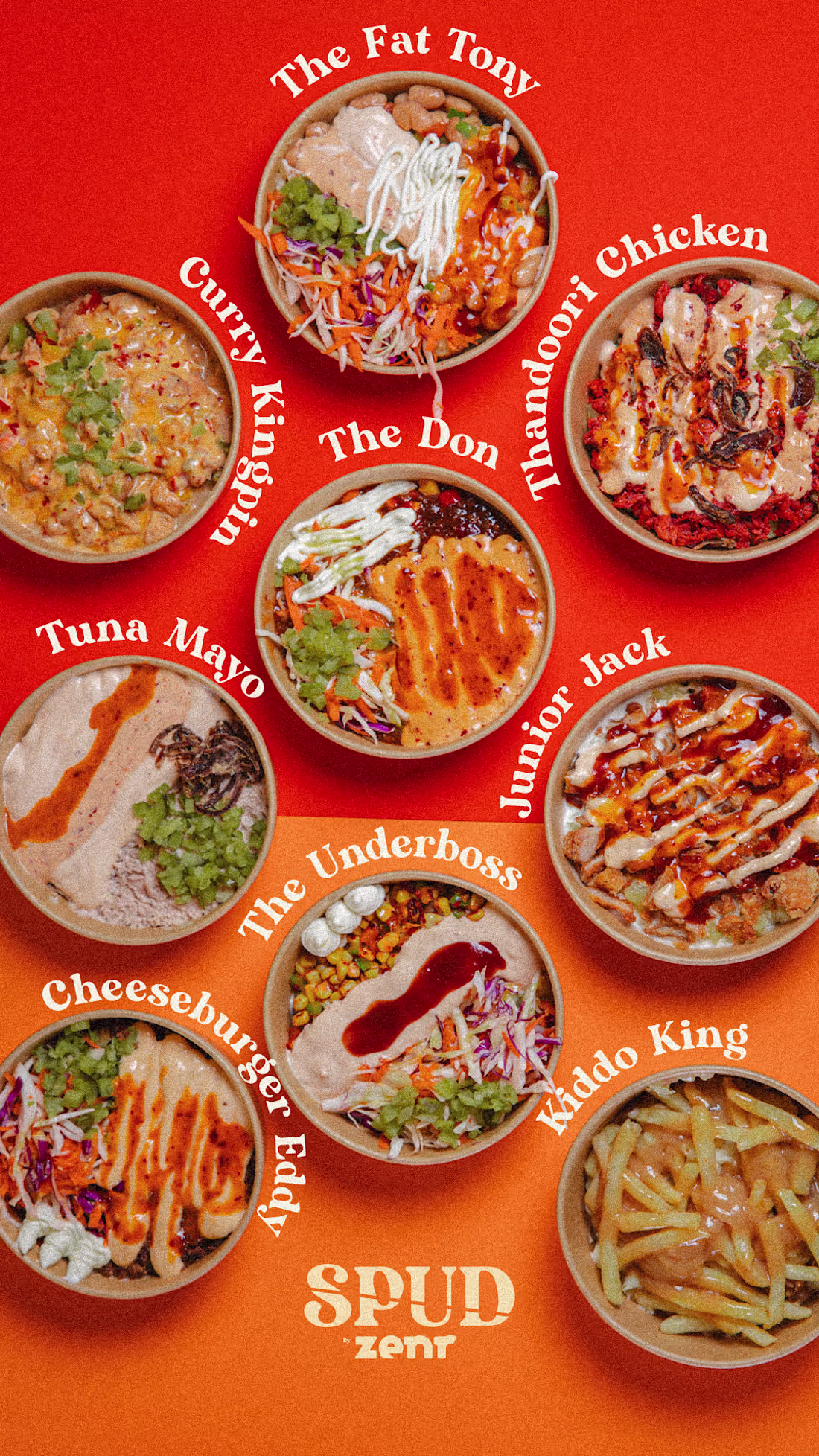
Spuds Menu Design, For Social Media
0
25
Spud by Zenr - Menu Design
A two-page food menu designed for Spud by Zenr, a casual dining and delivery brand built around playful branding and a youthful tone of voice.
The challenge was to organize a large, varied menu (burgers, wraps, pasta, rice bowls, pizza, sides, salads) without it feeling like a dense price list. I used a warm cream and tan palette, hand-drawn arrows, and the brand's signature lowercase "ze-" naming convention to keep every section feeling consistent and on-brand, while letting food photography lead each block.
Layout was built around clear visual hierarchy: category names anchor each section, pricing sits cleanly beside each item, and add-ons are visually separated so they read as optional rather than cluttering the main offer. The goal was a menu customers actually want to read, not just scan for prices.
Deliverables: Print-ready two-page menu design, layout system for future menu updates, photography direction for food styling.
0
49