
Zayed Hossain
UI/UX & SaaS Builder Helping Founders Launch MVPs Fast
Profile in progress
Zayed is building their profile!
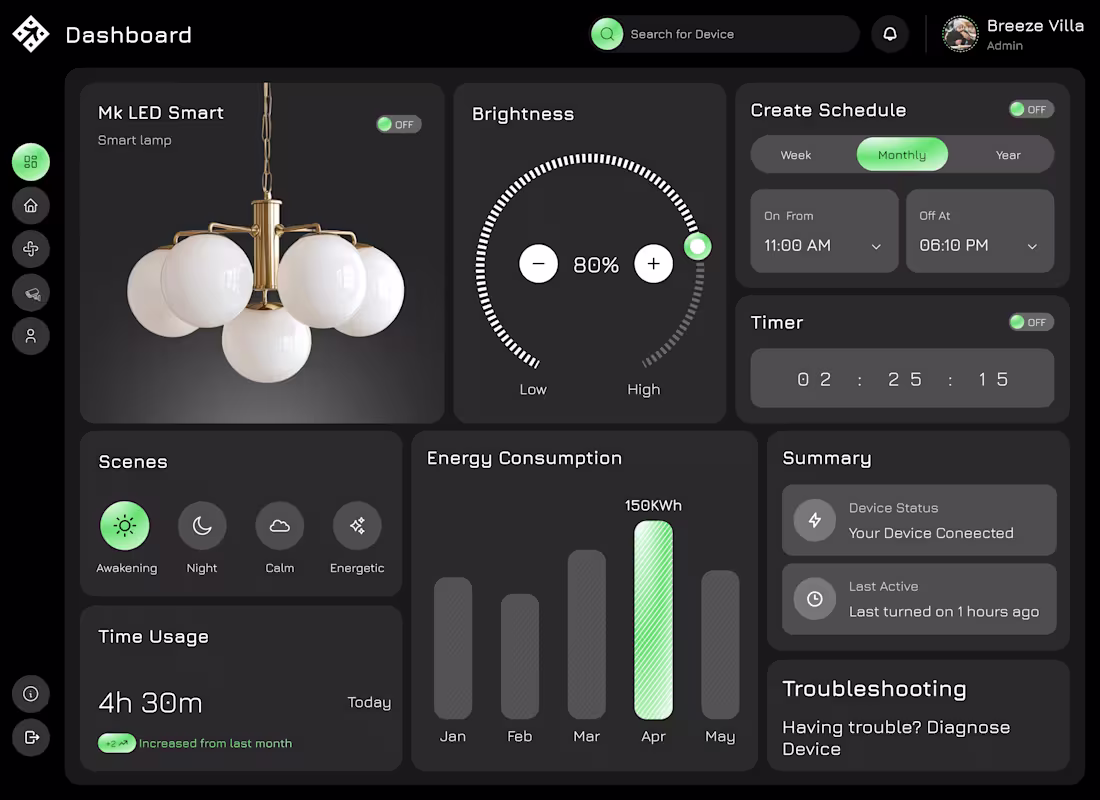
This concept explores a smart home dashboard designed to make device control simple, clear, and intuitive.
The main focus was reducing complexity, turning multiple controls and data points into an experience that feels easy to understand at a glance.
Key highlights of the design:
Centralized control for smart devices with a clean, structured layout
Interactive brightness control for quick adjustments
Scheduling and timer features designed for effortless setup
Clear visualization of energy consumption and usage patterns
Organized sections for scenes, status, and troubleshooting
The dark UI helps reduce visual fatigue while maintaining a modern, premium feel, especially for products that are used frequently.
The overall goal was to create a dashboard where users don’t have to think too much, everything is accessible, readable, and actionable in seconds.
0
24
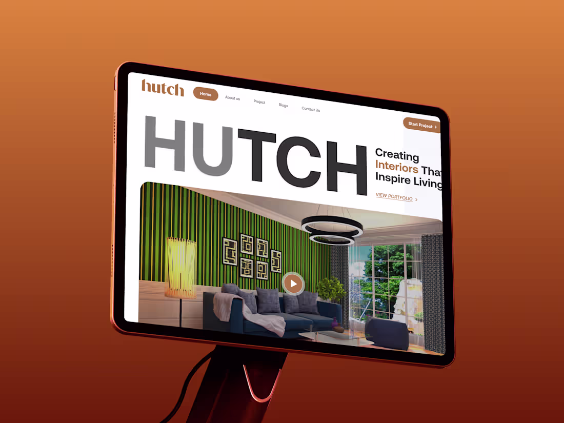
This project focuses on designing a clean and modern website experience for an interior-focused brand.
The goal was to create a strong first impression while keeping the experience simple and easy to navigate. I focused on clear typography, balanced layout, and visual hierarchy so users can quickly understand the brand and explore its work.
The design highlights:
A bold hero section that immediately communicates the brand identity
Clean layout to showcase interior projects without distraction
Smooth user flow from landing to portfolio and contact
Modern UI with a minimal, premium feel
The overall approach was to combine aesthetics with usability, making sure the website not only looks visually appealing but also guides users toward taking action.
0
34
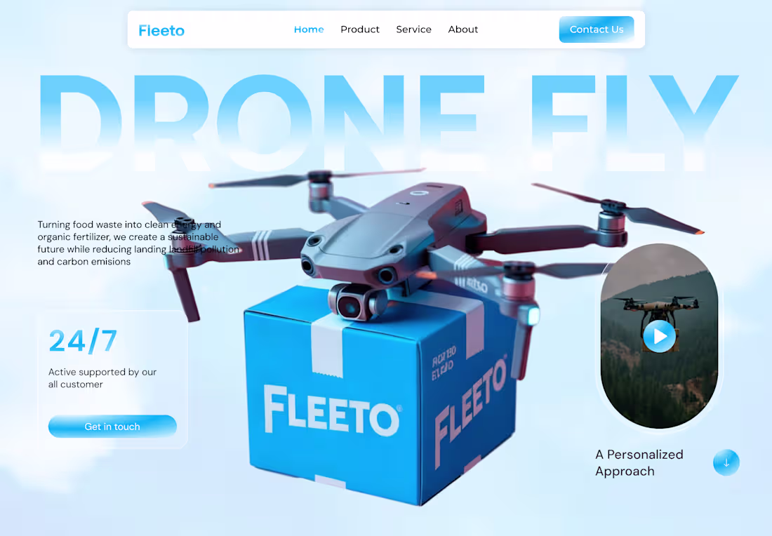
Most landing pages try to say everything…
and end up saying nothing.
So for this concept, I focused on one thing: clarity.
This is a drone delivery landing page for Fleeto —
built around a simple idea:
👉 Show the product
👉 Show the value
👉 Guide the user
No unnecessary noise.
You land → you understand → you take action.
From the clean hero section to the soft UI elements,
everything is designed to feel light, modern, and easy to trust.
Because in the end…
Users don’t spend time trying to figure things out.
They leave.
Good design isn’t about adding more sections.
It’s about removing confusion.
#UIUX #LandingPage #WebDesign #SaaS #ProductDesign #UXDesign #UIDesign
0
54
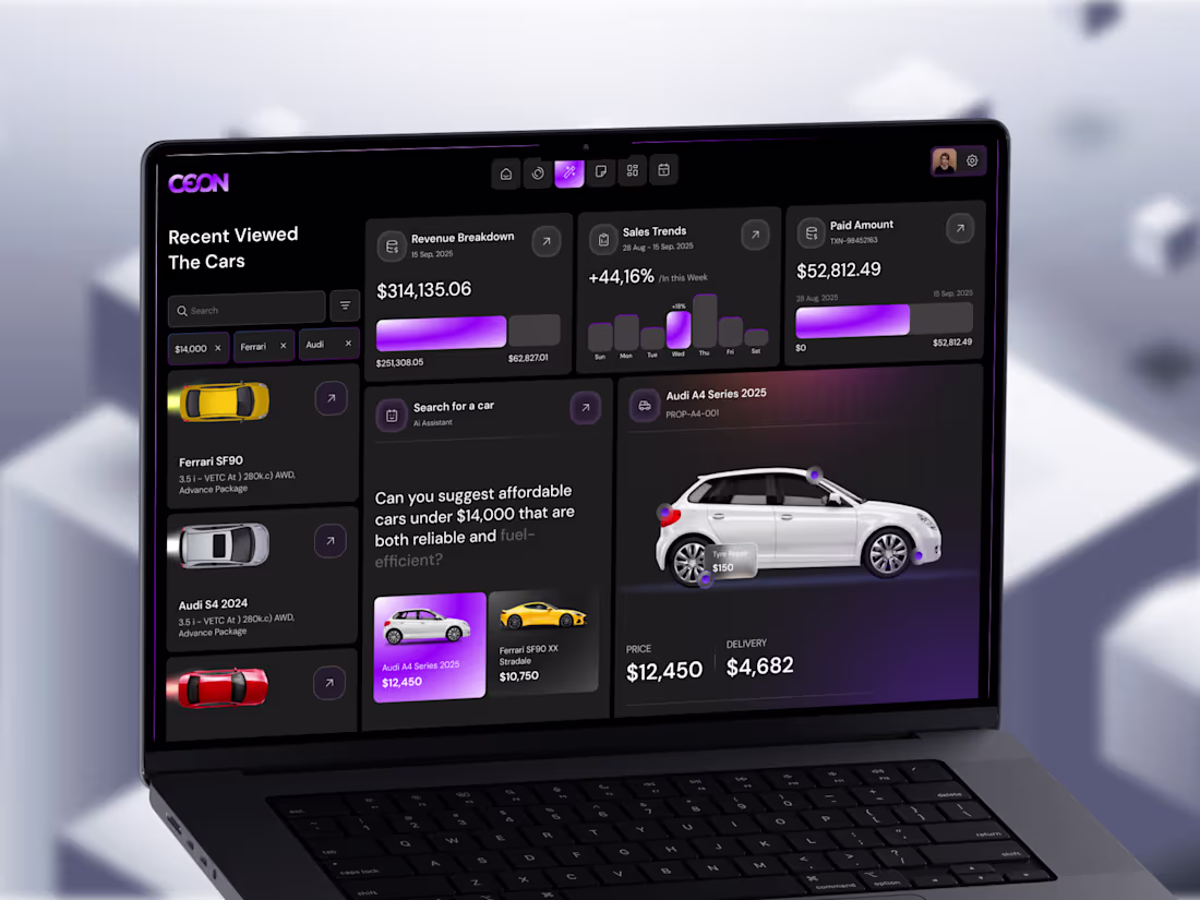
Turning data into decisions - not just dashboards.
Most dashboards look good at first glance.
But when you actually try to use them… it gets confusing fast.
So I explored a different approach.
Instead of adding more charts and numbers,
I focused on making the experience easier to think through.
This automotive analytics concept is built around a simple idea:
help users understand what’s going on — and what to do next.
Here’s what I focused on:
Showing revenue and sales insights clearly, without clutter
Adding an AI-assisted search to make finding the right car easier
Keeping comparisons simple (price, delivery, key details)
Using visual hierarchy to guide attention naturally
Designing a dark UI that feels comfortable for long sessions
The goal wasn’t just to make it look modern.
It was to reduce mental effort and make actions feel obvious.
Because in real products, people don’t need more data.
They need clarity.
And from a business side, this matters more than most people think:
Clear interfaces convert better
Less confusion means fewer drop-offs
Faster decisions = better user experience
And overall, the product just feels more premium
If your product already has data but still feels hard to use,
it’s probably not a data problem.
It’s a clarity problem.
And that’s exactly where good design makes the difference.
0
59