Pro
Yoonah Bae
Product Designer • SaaS & Mobile Apps
Ready for work
Yoonah is ready for their next project!
Color contrast isn’t enough on its own, so I’m trying out textures as a second cue to improve accessibility.
What are the best practices for using patterns to support users who can’t rely on color alone without making the chart feel busy or distracting?
2
18
162
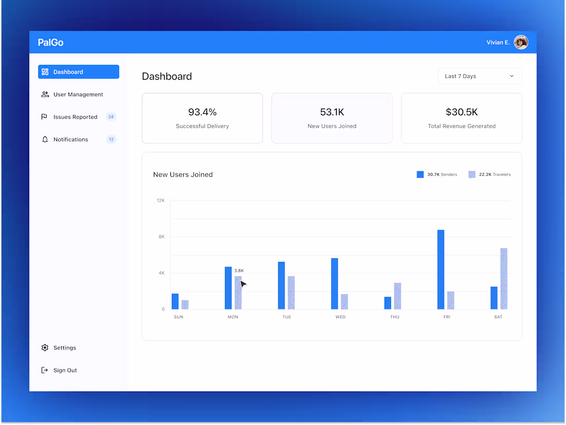
A community-powered app built on trust.
Many immigrants in the U.S. regularly send care packages home, medicine, comfort foods, and small reminders of love. But shipping is slow, expensive, and often unreliable.
My client saw families struggling with this and imagined a simpler path: travelers already fly with unused luggage space…
What if that space could help someone send something meaningful home, while the traveler earns money in return?
This vision shaped our UX approach:
• Reduced friction by standardizing luggage sizes, fixed pricing, and simple packing rules.
• Strengthened trust through ID verification, clear policies, and plain-language guidelines.
• Empowered users with easy reporting tools and transparent expectations that keep the community safe.
21
204
Several designers had contributed to the product over time, each building on the previous work, which naturally created some inconsistencies and gaps.
And my role was to bring everything together, aligning, filling missing states, removing redundancy, and providing clear annotations to support the dev team.
Problem
People want to turn their closet into cash, but selling is tedious. Writing descriptions, comparing prices, and managing multiple listings takes more time than it’s worth, so great pieces end up sitting in the closet.
Solution
CNTRL removes the friction. Users snap a photo or search the item, and AI creates the description, shows pricing trends, and recommends the best platforms. The app cross-posts automatically and delists everywhere once the item sells, helping users make money faster with far less effort.
4
28
282
Hi fellow designers 👋
Sharing one of my favorite MVPs I designed with an amazing client and team.
ChartSync: Patient-Owned Medical Records
Problem: When patients switch insurance or move states, their medical history often gets lost, leading to endless PDF searches, duplicate tests, and having to retell their story because their records are scattered everywhere.
Solution: We designed a mobile app that lets patients capture files, medications, vitals, and auto-organize their records, and instantly send or receive medical files via QR code with any practitioners without downloading the app.
Now in Beta:
https://play.google.com/store/apps/details?id=com.chartsync.chartsync&hl=en_US
Open to any design or case-study showcase tips from this community. ✨
2
20
232