
Yamila Villegas
Web App UX/UI Designer
New to Contra
Yamila is ready for their next project!
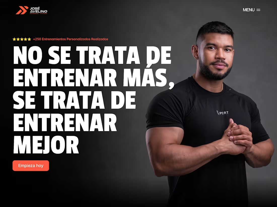
Most people don't need more motivation to train — they need someone who actually knows what they're doing and a plan that fits their real life. That's the whole premise of this site. Every design decision, from the heavy typography to the dark intensity of the layout, is there to communicate one thing: this trainer is serious, and so are his results. 'Let's work together' leads straight to a booking form, because once the site does its job, the next step has to be frictionless.
0
31
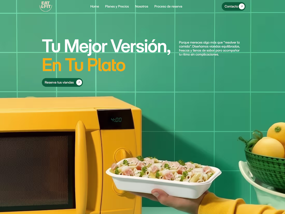
Eating well isn't the hard part — the hard part is finding the time to make it happen. This site skips the wellness lecture and gets straight to the point: here's the food, here are the plans, here's how you order. Fresh palette, real food photography, and a flow so clear that going from 'this looks good' to 'I want this delivered' takes about thirty seconds and one click.
0
24
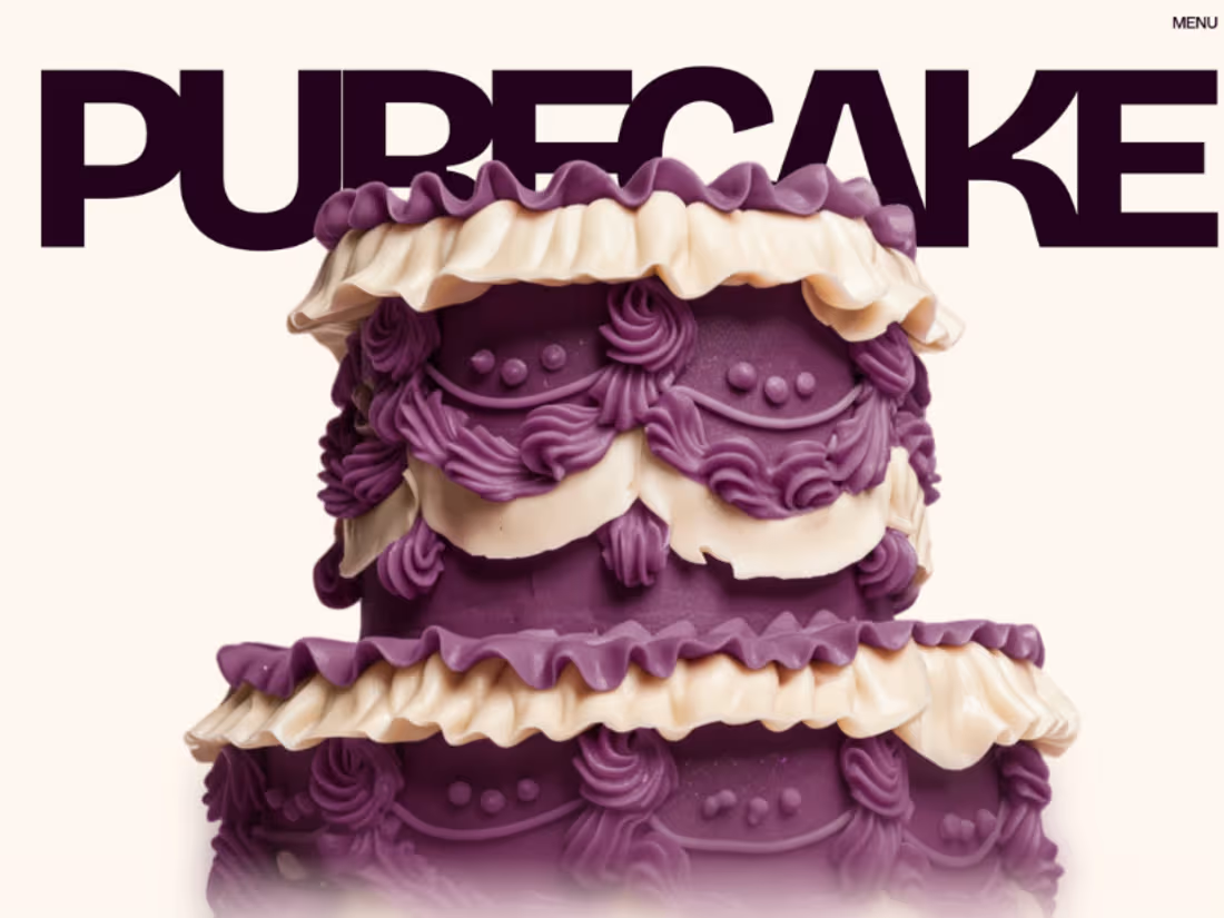
This website was designed to reflect the elegance and detail behind handcrafted pastry. The idea was to let the product speak first — using a clean layout, soft tones, and a strong visual focus to highlight each creation.
The goal was to create something that feels as carefully made as the cakes themselves — a digital space where every detail matters, and where each piece is presented as something unique, designed to be part of a special moment.
1
107
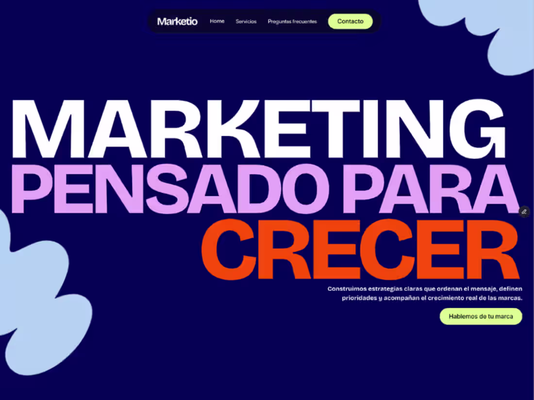
I designed this website with a clear idea in mind: make marketing feel simple, structured, and focused on real growth. The concept started from strong typography and bold color contrasts to immediately grab attention and communicate confidence.
The layout is intentionally clean and organized, guiding the user through each section without distractions. Every block has a purpose — to explain, to position, or to lead toward action.
More than just visuals, the goal was to create something that feels strategic and easy to understand. A design that not only looks strong, but helps communicate ideas clearly and move brands forward.
1
122
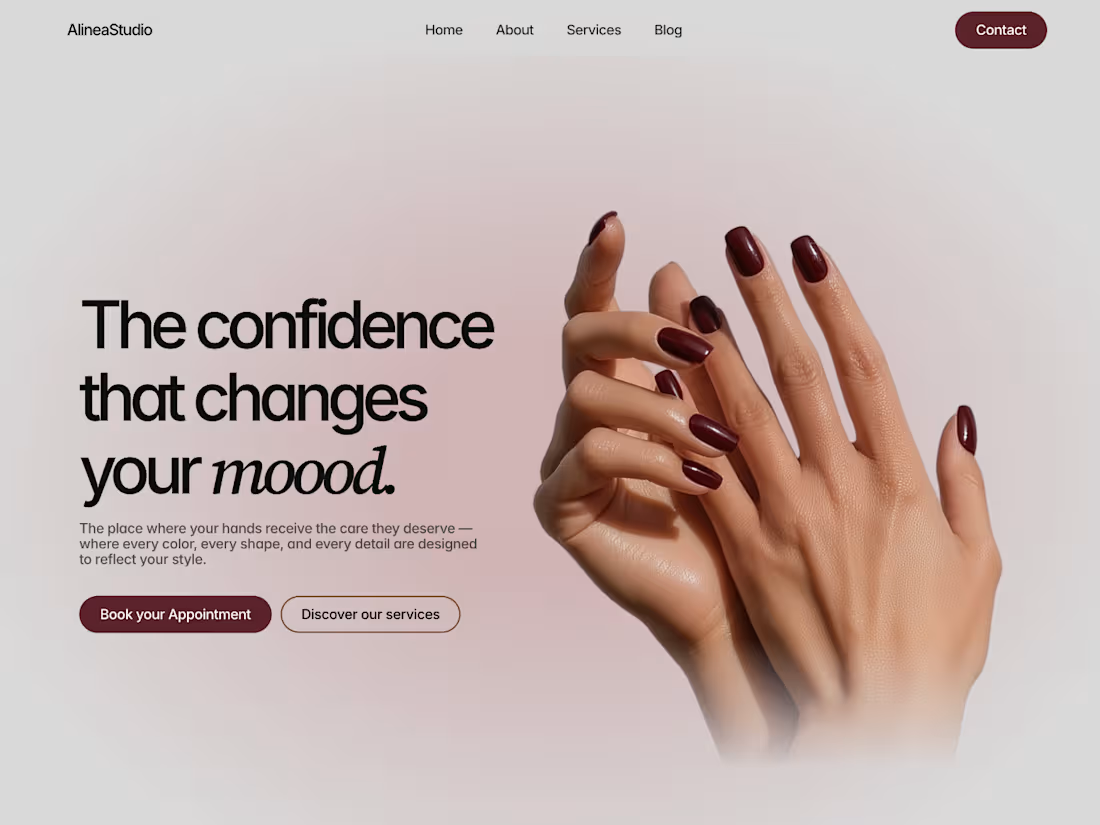
Nail studios live and die by their visual identity — if the website doesn't feel as polished as the service, the client moves on before they even see the work. This site is designed to fix that: soft tones, editorial layout, and a gallery that makes every design look like something worth booking. Each service has its own 'Book now' so there's no friction between 'I love this' and 'I want this' — just a straight path to the appointment.
0
31
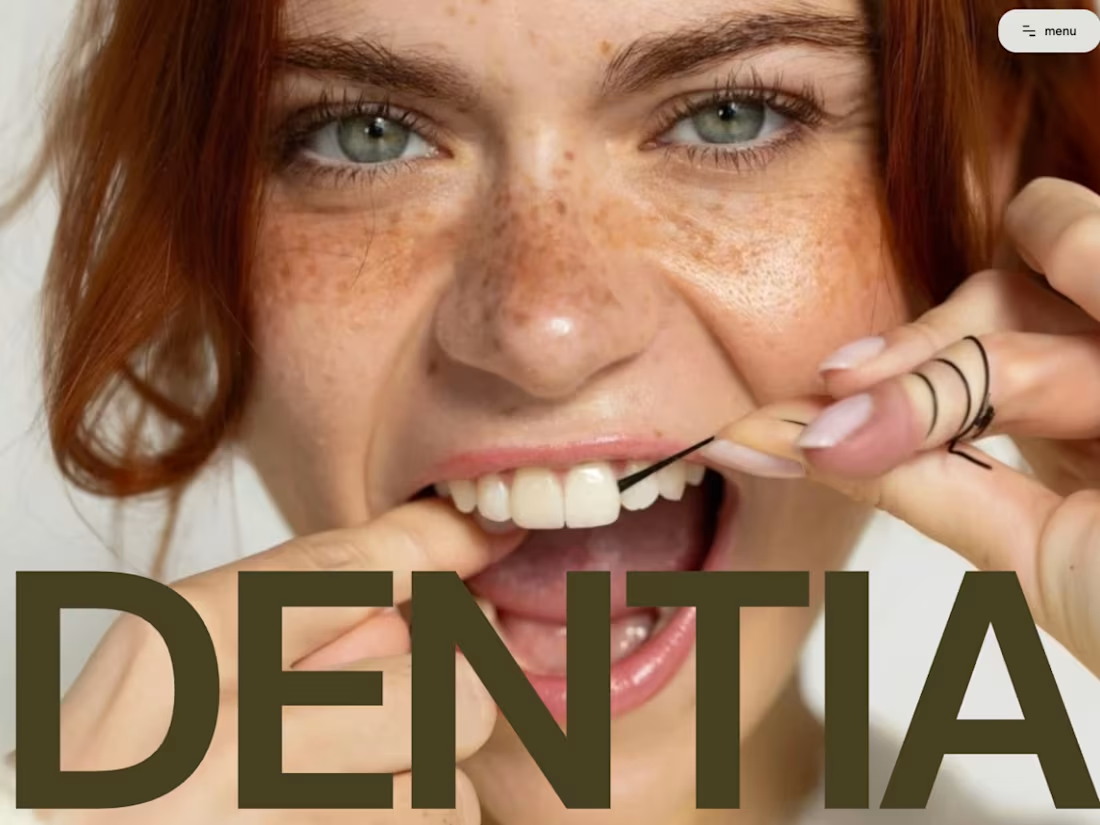
Dental clinics have a trust problem — most of their websites make them look cold, clinical, and kind of scary. This one is designed for a younger audience that expects the same aesthetic from their dentist as they do from any other brand they follow. Warm tones, editorial layout, real spaces that actually look inviting — because when the site feels this good, booking that first appointment stops feeling like something you keep putting off.
0
50
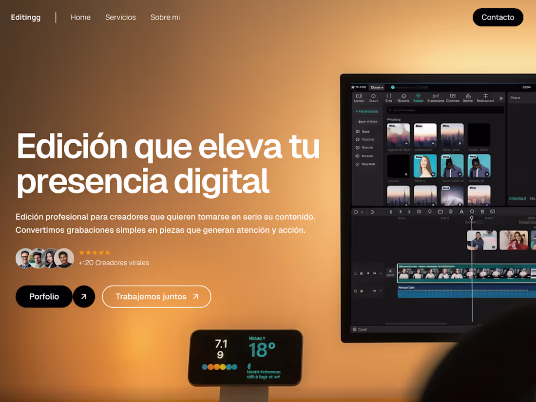
Video editors struggle to stand out online because everyone shows a reel and calls it a day. This site is built for an editor who wants to attract serious creators — the ones who already know that good editing is the difference between a video that gets skipped and one that gets shared. The design speaks directly to that: dark, high-energy, results-focused. Less 'look at my work,' more 'here's what your content could become.' And when they're ready, a single 'Let's work together' drops them straight into a booking form to make it happen.
0
37
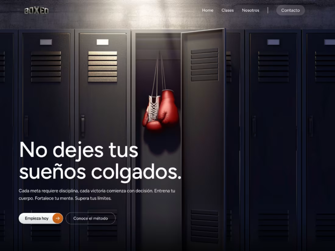
This website was designed for a boxing training brand focused on discipline, strength, and personal growth. The concept centers around intensity and mindset, using a dark, minimal aesthetic combined with strong visual storytelling to create an immersive first impression.
The hero section immediately captures attention with a symbolic image that reflects commitment and perseverance, reinforced by bold, motivational copy. The layout is clean and focused, guiding users naturally toward action while highlighting the brand’s philosophy: training both body and mind.
Every element was built to feel powerful, direct, and intentional — creating not just a website, but an experience that connects with people who are ready to push their limits.
1
116
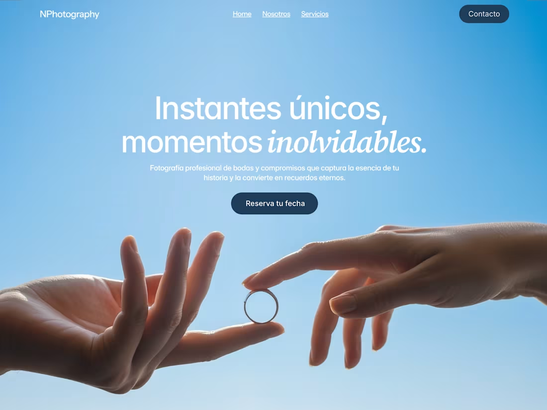
Photographers lose clients every day not because of their work, but because their website doesn't do enough. A scattered portfolio with no clear next step, no sense of the experience, no reason to reach out today. This site is built to fix that — the gallery builds the emotional connection, the copy sets the tone, and every section moves the visitor one step closer to hitting that booking button. Because great photography deserves a site that actually converts.
0
39
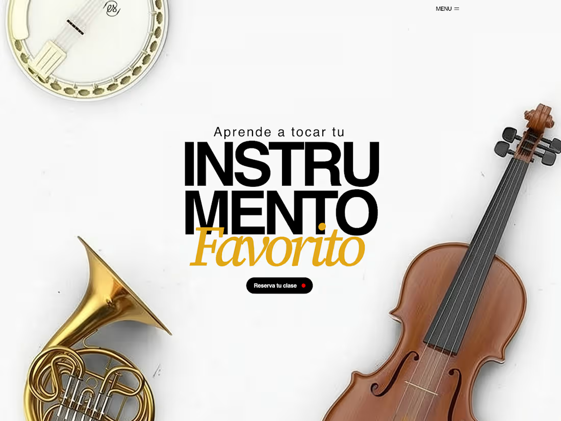
Music schools often feel intimidating online — too formal, too classical, too far from the person who's just thinking 'I wish I had learned guitar.' This site is designed to close that gap. A layout warm enough to feel inviting, but structured enough to make taking that first class feel simple and within reach.
0
55
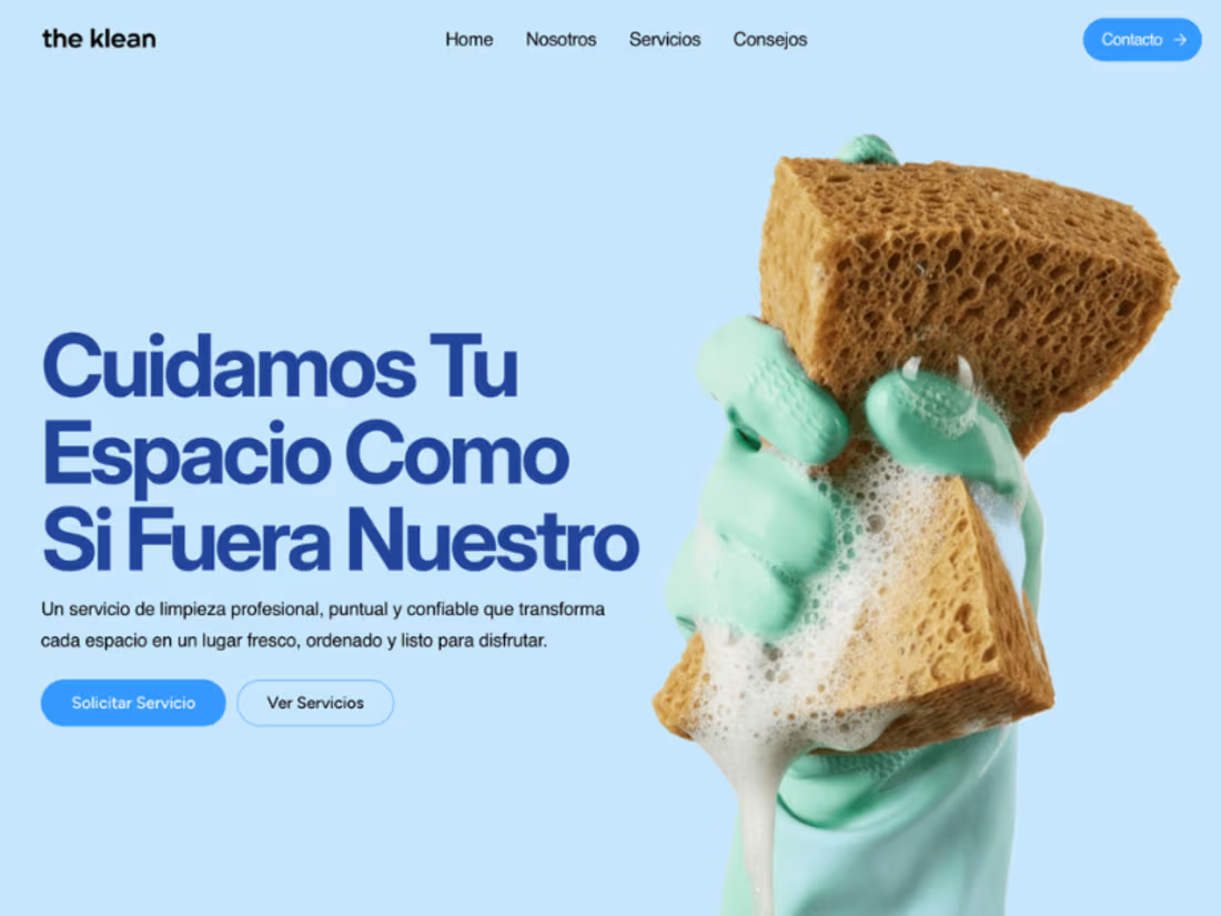
Cleaning services are usually either too corporate or too generic — I wanted this one to feel different. The soft blue palette and the 3D sponge visual were a deliberate choice to make the brand feel fresh and a little unexpected. Bold typography to anchor the layout, real photos in the service cards to build trust, and a structure that guides you from 'what do they do' to 'I want to hire them' without any friction.
0
69
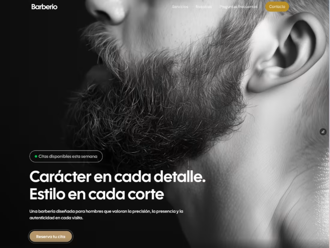
Barbershops rarely have websites that match the experience they actually offer — they either look outdated or too generic. This site solves that. A design that communicates quality and attention to detail before the client reads a single word, so by the time they get to the services, booking feels like the obvious next step.
0
52
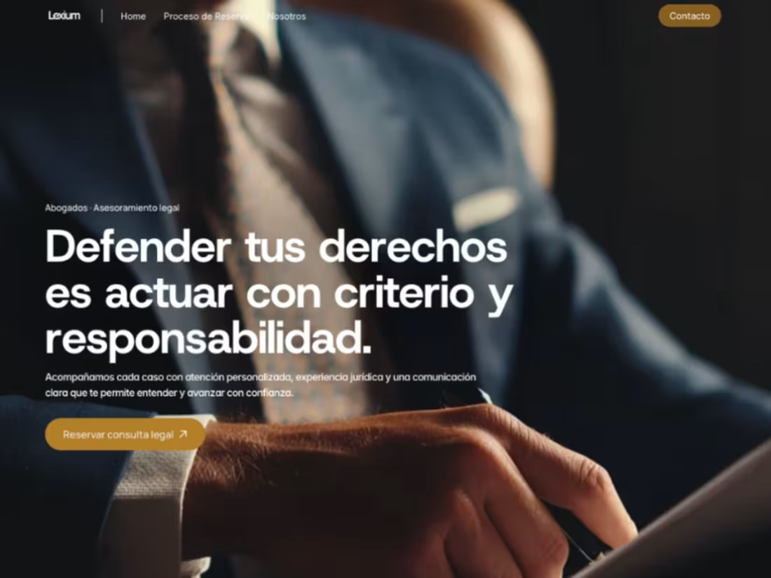
This is a modern website for a law firm focused on clarity and trust.
I designed a clean, minimal layout with strong typography and a refined dark style to convey professionalism and confidence.
The structure is simple and intuitive, making it easy for users to understand services and take action.
The goal was to create a clear, elegant experience that feels reliable from the first interaction.
1
131
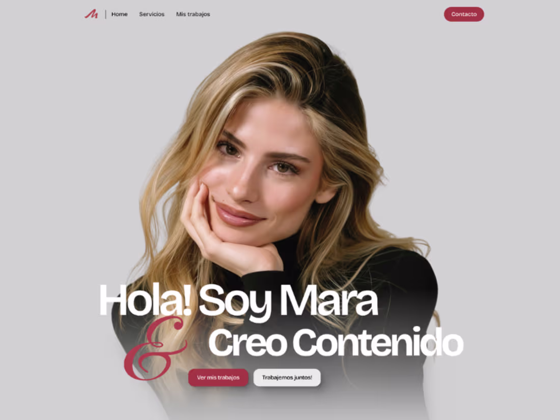
Content creators usually struggle with one thing: looking professional online without losing the personality that makes people follow them in the first place. This site solves exactly that — a design that feels personal and bold enough to match the energy of someone who lives in front of a camera, while still being structured enough to convert a brand visit into a real conversation.
0
62