
Javier Traveset
Product & Web Design
Ready for work
Javier is ready for their next project!

👋 Hello, everyone! I am very excited to share with you my first post in this space, in which I will delve directly into a key aspect of my work.
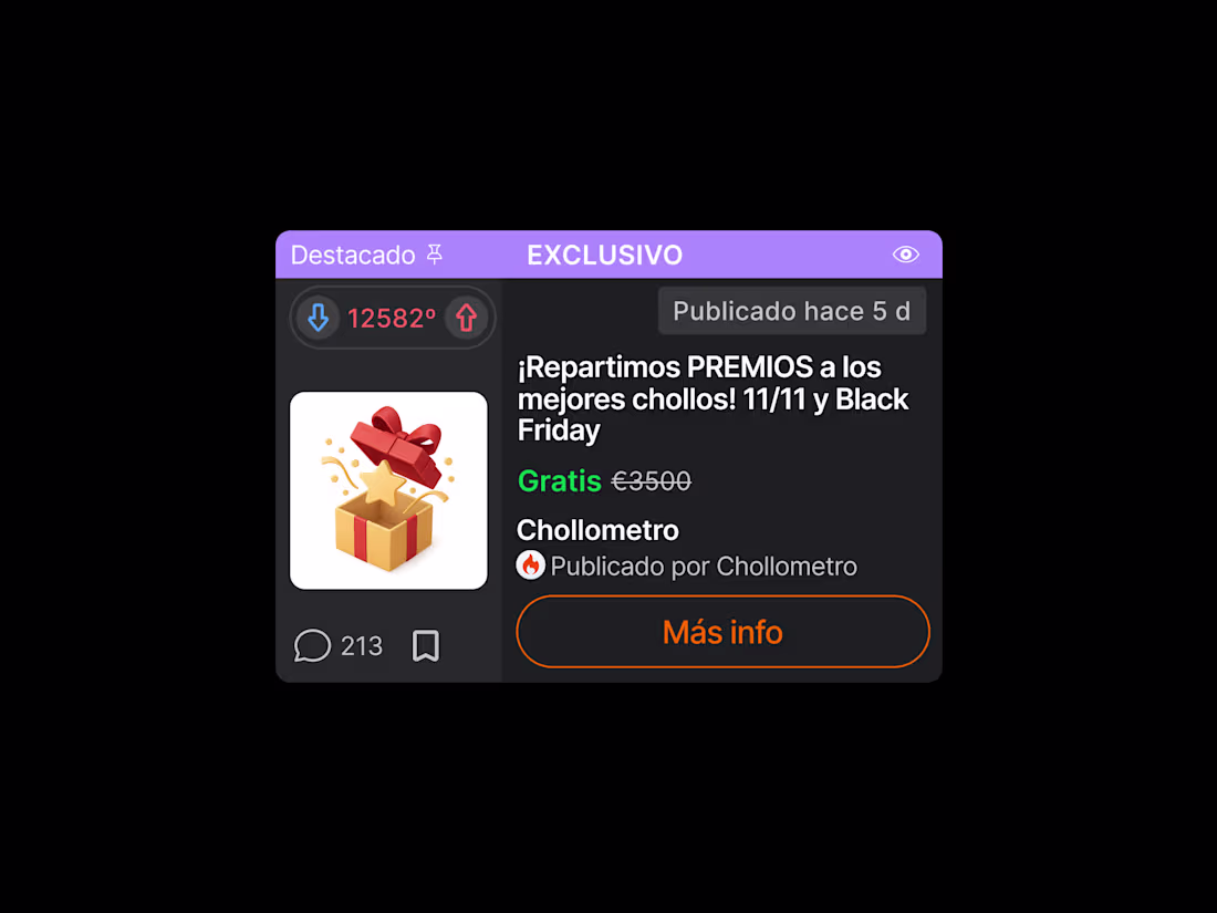
🤓 This use case presents a key excerpt from the product card redesign for the Chollometro app, focusing on establishing component consistency across the various card variants.
🔍 The comprehensive analysis addressed the lack of harmony in fundamental elements such as iconography, alignment, and margins (spacing), by applying visual hierarchy principles and reinforcing brand identity with the corporate colour palette.
👈 Original Product Card 🆚 New Proposal 👉
13
97
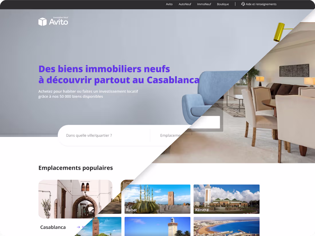
AVITO IMMOBILIER NEUF - Website Redesign Concept
0
4
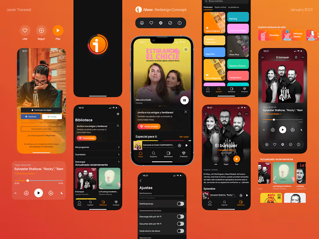
iVoox APP Redesign Concept
0
3
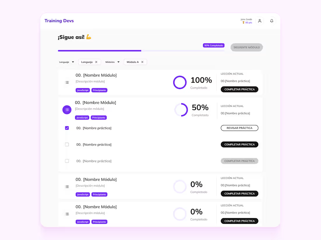
Training Devs, Software LMS
0
2