
Wisdom Alfred
Senior UI/UX Designer
Profile in progress
Wisdom is building their profile!

I know icons do a lot. But what if banks and other fintechs can show a little humanity and trust from the start of an app where you see real humans. The psychological state of humans have been programmed to be drawn to situations where they find their kind. Your founder does not have to tell you this. As a designer, you determine the journey of the design; the scope of your brief will tell you where and where not to use icons or images.
Sometimes, you don't have to think too much about your design. Just be human. Think of yourself as a user rather than a designer and you will find the answers to the questions you have. #figma #figmamake #fintech #bankapp #ui/ux #usersfirst
1
40
Big brands can make mistakes. Stay with me.
Founders may not have time to test a product, but as a designer, you should test your features and be ready to reiterate based on feedbacks. It is a growth strategy.
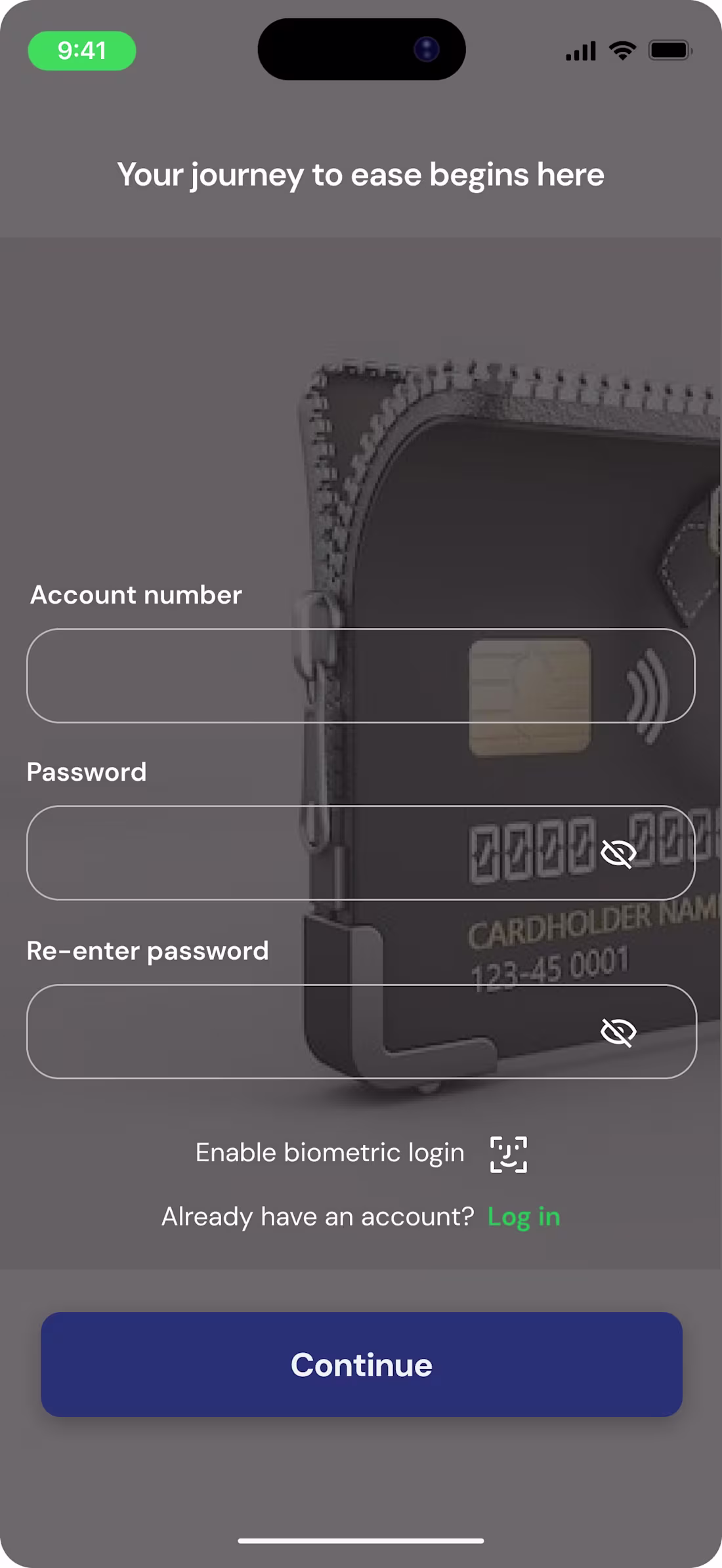
Using the Raenest App, I came across a few user experience issues that I though would be best showing to them rather than telling (They fixed one out of all).
Using a black text on an orange background does not create visual ease. As much as we thought that was some general knowledge, it could be have been an oversight. So I thought to remind the team that white gives more visual ease and would not create mental tension against an orange background.
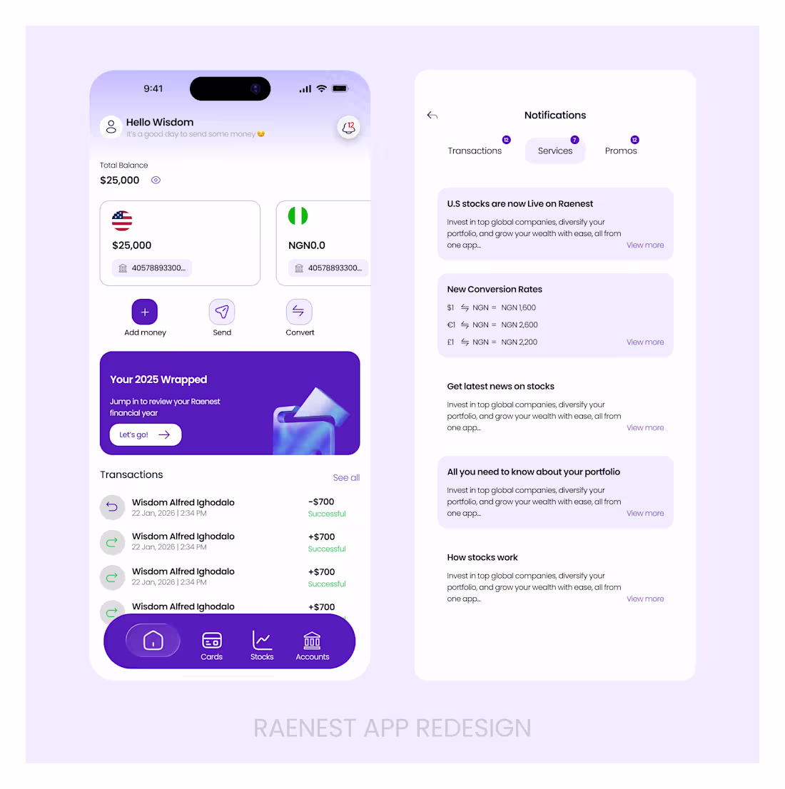
Then I thought a little upgrade to the menu bar would do.
You can see the remaining suggested upgrades in the photos
1
38