Wiandi Saputra
Editorial poster designer with a sharp eye for bold type
New to Contra
Wiandi is building their profile!
Every poster you see was made on a phone — no laptop, no desktop, just Alight Motion and obsession. I'm also red-green colorblind, yet I design anyway, letting emotion lead where eyes fall short. From exhibition vibes to concert gig aesthetics, this is my world — built from nothing but a screen and a story to tell.
2
17
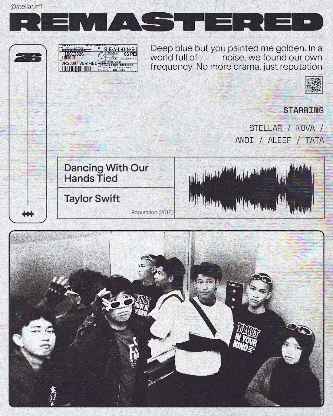
Remastered — because I found my people. This poster is a tribute to my new squad, the ones who replaced betrayal with belonging. Built around Taylor Swift's Dancing With Our Hands Tied, it captures the feeling of moving forward with people who actually stay. New chapter, new frequency, no more drama.
1
16
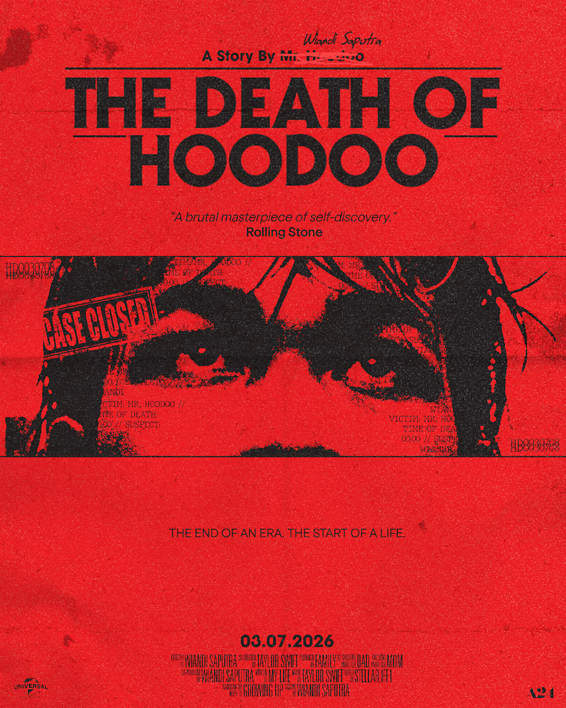
Mr. Hoodoo was my alter ego — the version of me I hid behind. This poster marks his death. Designed as a fake movie poster in A24 style, it's my visual declaration of self-acceptance: burying the false self to finally live as who I truly am. The end of an era. The start of a life.
0
4
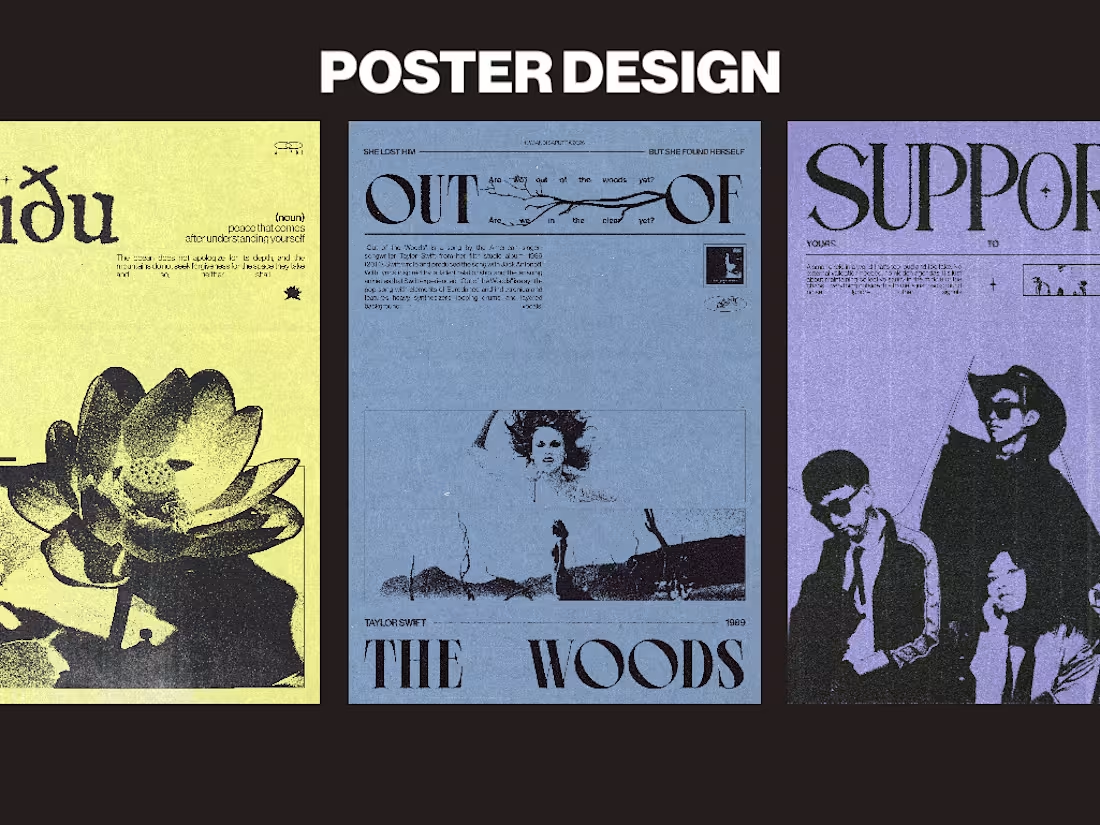
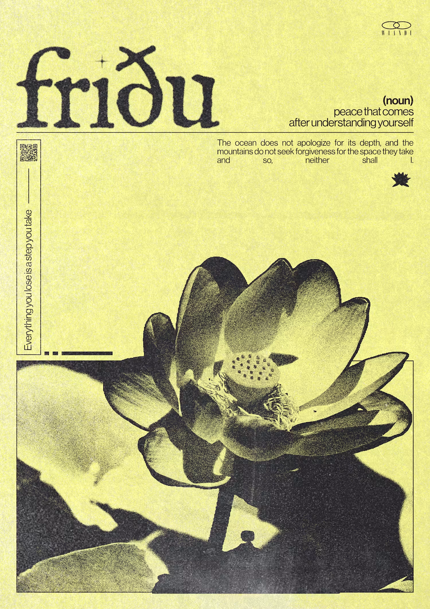
Three posters, three chapters of my life. Fridu was born in my season of self-acceptance — learning to make peace with who I am. Out of the Woods captures my fight to escape darkness and the weight of past mistakes. Support is my voice for friendship that doesn't fade — loyalty until the end. These aren't just designs. They're me.
0
4
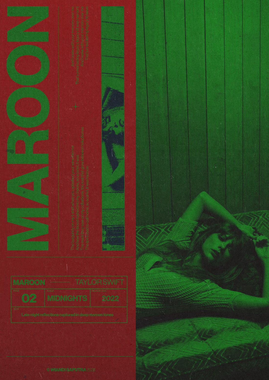
Maroon by Taylor Swift is one of my favorite songs. I designed this poster as a personal tribute, blending bold typography with a duotone red and green palette. What makes this personal: I'm red-green colorblind, yet I intentionally chose this color clash to challenge my own perception and let emotion guide the design instead of sight.
0
4