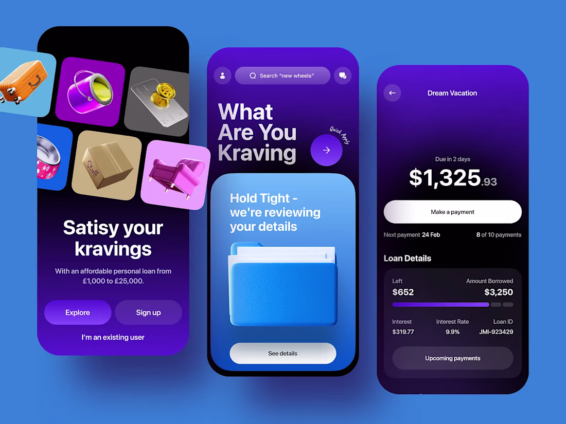
Most tech landing pages rely on more sections, more copy, and more effects.
Blendr took the opposite approach.
We built a landing page experience around a custom 3D product model, cinematic animation, and a cleaner structure that lets the visuals carry the story naturally.
Finance apps already deal with user anxiety. The interface shouldn’t add more.
For this mobile app concept, we designed a cleaner home screen experience with focused UX/UI decisions and controlled 3D animation that adds depth without creating clutter.
Most lending apps focus so much on functionality that they forget how stressful financial decisions already feel.
For Kraving, we designed a softer mobile experience with card-based UX, cleaner user flows, and subtle 3D animation that adds warmth without distracting from...
Most crypto-finance landing pages overload the user in the first five seconds.
For Vortex FX, we designed a cleaner approach: banking card visuals, tokenomics, and 3D animation combined inside a structured landing page system built to feel modern without losing clarity.