Wasabie studio
Creative Studio Specializing in Web & Brand Design
New to Contra
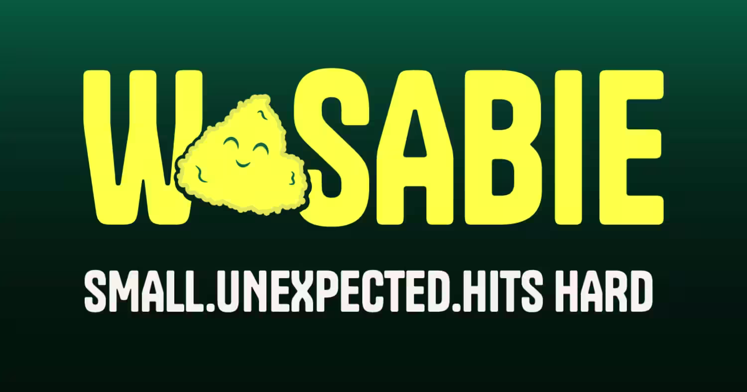
Wasabie is ready for their next project!
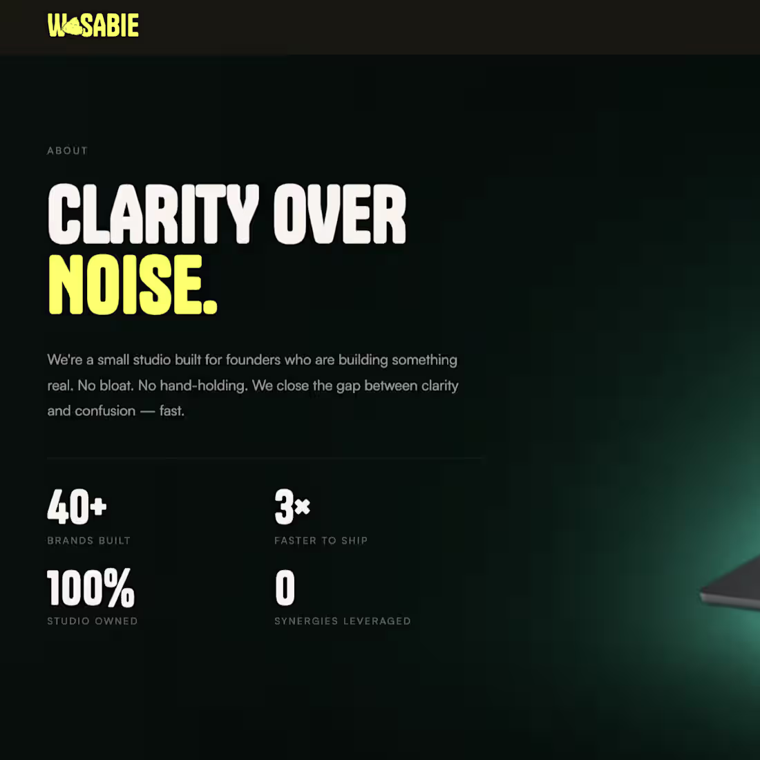
Built our own site this way. Laptop closed. Opens as you scroll. Brand reveals itself.
No video file. No heavy assets. Just scroll through the work.
Here's the thinking if a studio can't make its own site interesting, why would a client trust it with theirs?
Check out- wasabie.in (http://wasabie.in)
0
54
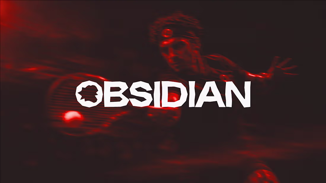
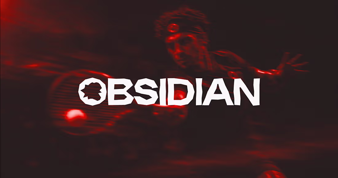
Most logos try to look perfect. Ours is intentionally broken.
Obsidian forms when volcanic glass cools too fast to crystallize, and it cracks into sharp, jagged edges instead of smooth curves. We built the logo the same way. No symmetry. No clean lines. Every notch is on purpose.
Would you keep a "flawed" logo like this, or smooth it out for safety?
Curious what you'd do.
0
27
Obsidian Brand Identity Design
0
0

Gourmet Planet — Luxury Dining Community Website
0
1